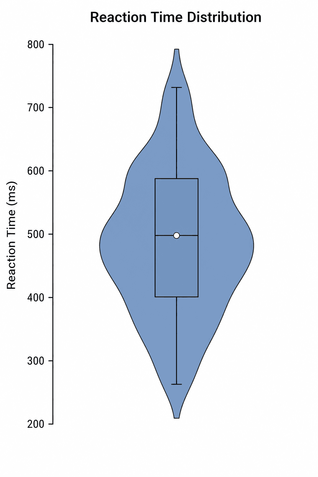
A violin plot can look persuasive even when it is poorly supported by the data. A very small group may be smoothed into an impressive shape, a wide violin may be mistaken for a larger sample, or an arbitrary bandwidth may hide two genuine modes. Before making the figure, decide whether distribution shape—not only the median—is central to the result.
SciDraw's Violin Plot Maker creates the first figure from a structured file and then opens it in SciVis for visual refinement. The six included examples use real downloadable CSV structures, so you can inspect the expected columns before replacing the values.
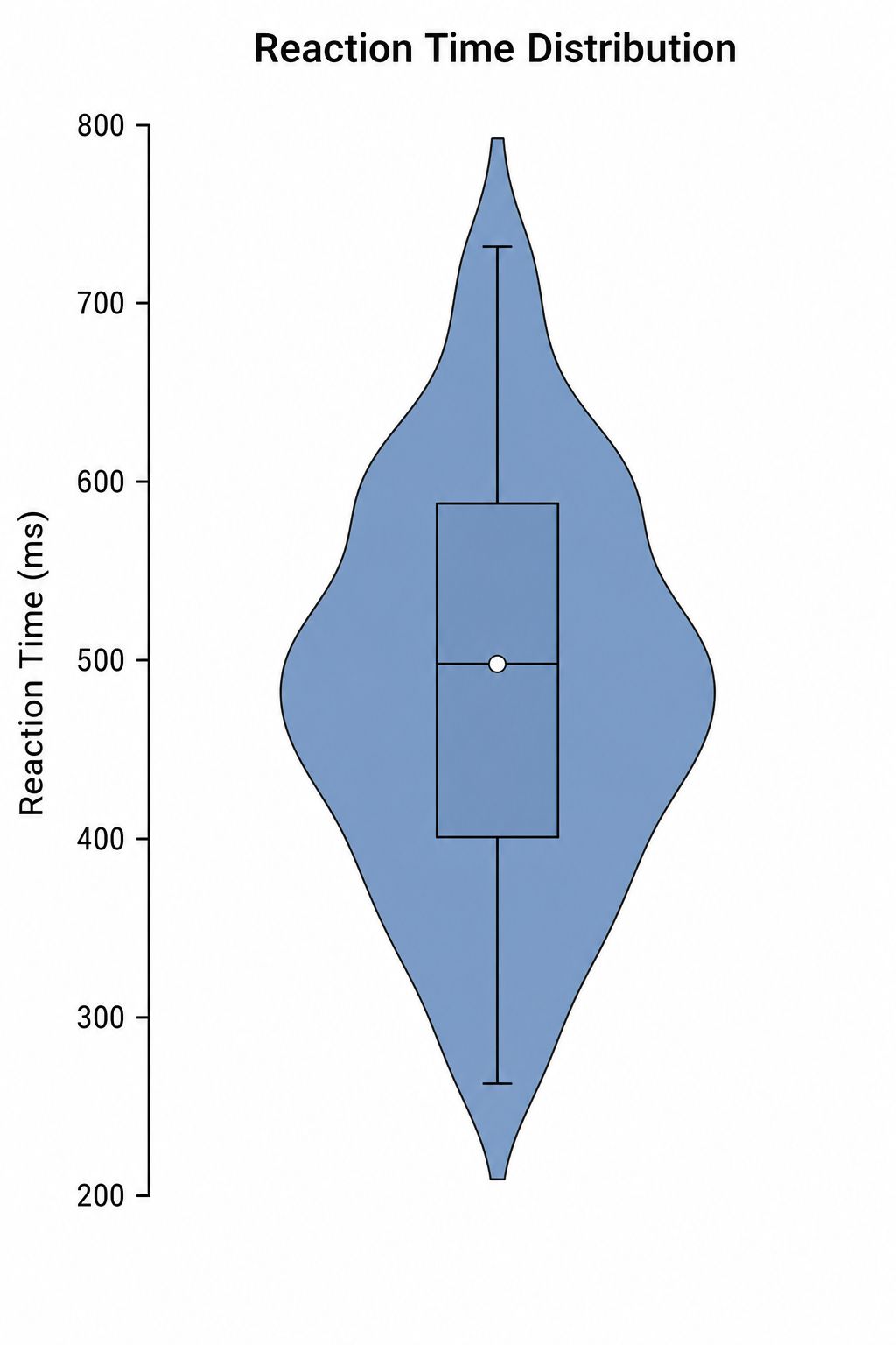
Common violin plot mistakes
- Interpreting width as sample size: width usually represents estimated density, not the number of observations.
- Using a violin for tiny groups: with few observations, show the raw points and consider a dot or box plot instead.
- Hiding the bandwidth: smoothing controls the apparent number and location of peaks.
- Comparing different scales: every group should share the same measurement scale and transformation.
- Showing only the density: a median, quartiles, box, or raw points help readers interpret the shape.
What data does a violin plot need?
Use one row per observation. The simplest long-format table contains:
| Column | Purpose | Example |
|---|---|---|
sample_id | Stable observation identifier | Control_01 |
group | Category shown on the axis | Control |
value | Numeric measurement | 42.58 |
Download the single-violin sample CSV or the grouped sample CSV to see the exact structure. Units belong in the axis label or column name, not inside numeric cells.
Step 1: Choose the comparison you need
Open the Violin Plot Maker. Start with a single distribution when you are checking one measurement, or use grouped violins for treatment arms, cohorts, tissues, time points, or experimental conditions. A split violin is appropriate only when two subgroups share a meaningful category and direct half-to-half comparison is helpful.
Step 2: Upload CSV or Excel data
Upload one CSV, TSV, TXT, XLSX, or XLS file. Excel imports the first worksheet. Remove merged cells, totals, notes, and decorative headers before upload. Missing measurements should remain missing rather than being converted to zero.
Step 3: Generate and verify the figure
Check that every category is present and that the plotted range matches the source data. The widest part of a violin indicates where the estimated density is highest. A narrow tail indicates relatively few observations in that range; it does not prove that a rare biological subpopulation exists.
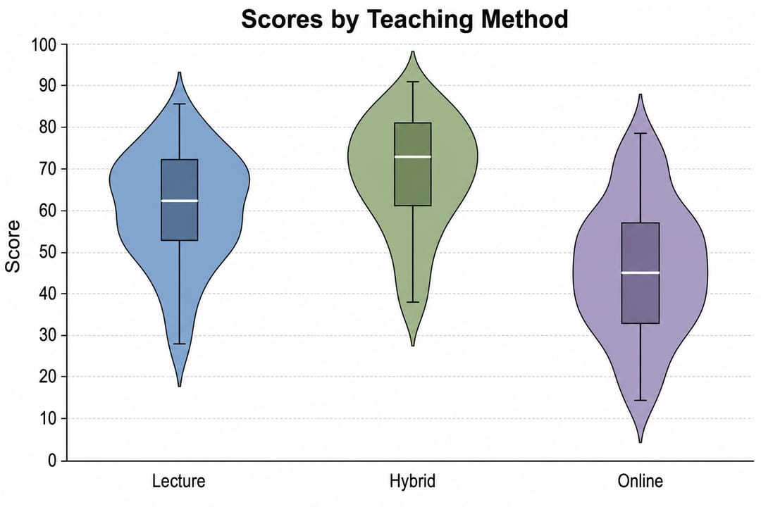
If the conclusion depends on a shoulder, secondary peak, or long tail, compare the violin with the raw values. Small changes in bandwidth can alter those features.
Step 4: Add raw points and summaries
Continue editing in SciVis to add jittered observations, an internal box plot, a median marker, or restrained annotations. Raw points are particularly valuable for small or uneven groups because they reveal sample size and clustering directly.
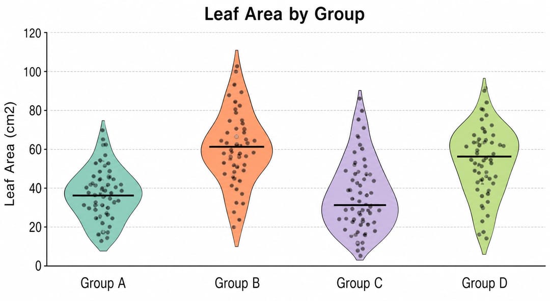
Use color for meaningful groups, not decoration. Keep opacity high enough to distinguish the density outline but low enough for overlapping points to remain visible. If the outcome is paired, use the Paired Dot Plot Maker instead of implying independence.
How to interpret a violin plot
Read the figure in layers:
- Compare the location of the median or central mass.
- Compare the spread and tail behavior on a common scale.
- Look for skew or multiple dense regions.
- Check the number and placement of raw observations.
- Confirm any statistical claim with the analysis, not with the shape alone.
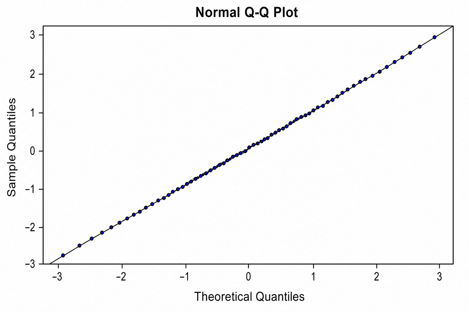
A violin plot is descriptive. It does not test whether groups differ and it does not establish normality.
Violin plot, box plot, or density plot?
- Use a violin plot for side-by-side distribution shapes with a compact group summary.
- Use a box plot when quartiles and outliers matter more than fine density shape.
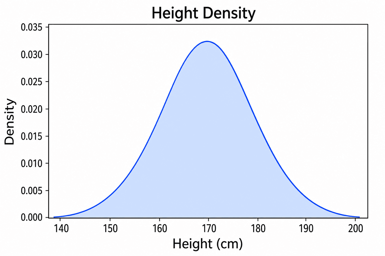
- Use a density plot when overlapping smooth curves make the comparison clearer.
- Use a beeswarm plot when every observation should remain visible without density estimation.
FAQ
Can I make a violin plot without Python or R?
Yes. Upload a supported data file to the Violin Plot Maker, generate the chart, and edit the result in SciVis without writing plotting code.
How many observations should each violin contain?
There is no universal cutoff. The density estimate becomes unstable with small groups, so show raw points and avoid interpreting subtle shape differences when data are sparse.
Can I use unequal group sizes?
Yes, but show or report the sample size. Standard violin widths do not automatically communicate how many observations are in each group.
Does a violin plot prove a distribution is bimodal?
No. A second bulge can depend on bandwidth and sample size. Inspect the raw observations and use an appropriate statistical or domain-specific analysis before making a multimodality claim.
Create the figure
Start with the Violin Plot Maker, verify the density against the raw values, and use the scientific data visualization guide when you need to compare it with another chart family.