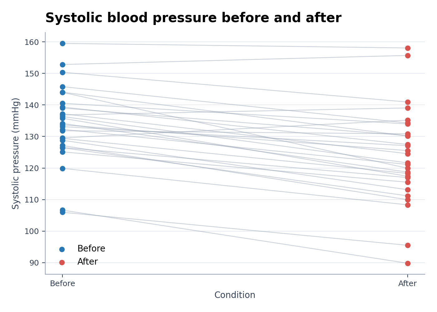
Paired Dot Plot Maker
Create Paired Dot Plot Maker from experimental or research data
Create before-and-after paired dot plots from matched observations. Connect valid subject pairs and preserve individual changes for scientific reporting.
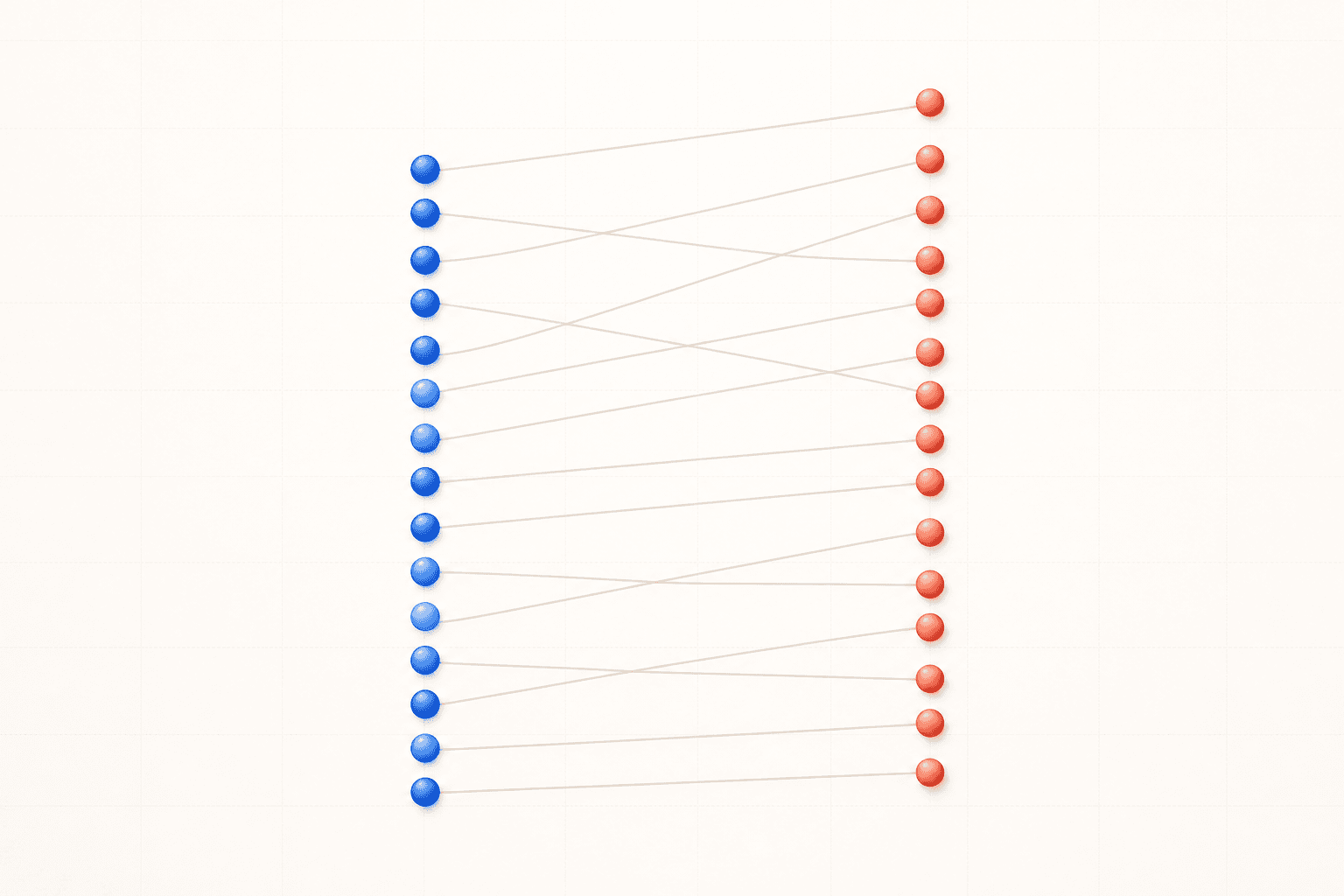
Paired Dot Plot Maker examples
Explore six ready-to-use datasets and visual styles for real research scenarios.
What does Paired Dot Plot Maker show?
Paired Dot Plot Maker connects repeated measurements from the same subject, specimen, site, or experimental unit. It preserves individual direction and magnitude of change that a bar chart of group means would hide.
Data requirements for Paired Dot Plot Maker
- Use one row per measurement with subject, condition, and numeric value columns, or one row per subject with separate condition columns.
- Each pair must share a stable subject or sample identifier.
- Do not silently treat unmatched observations as paired.
- Add optional group, time, or treatment columns when multiple paired comparisons are shown.
Research examples for Paired Dot Plot Maker
- Before-and-After Paired Dot Plot
- Clinical Paired Data Plot
- Connected Dot Plot for Pre/Post Scores
- Dumbbell-Style Treatment Comparison
- Paired Gene Expression Plot
- Matched Instrument Comparison Plot
Why use a paired dot plot?
- Show whether participants move in the same or opposite directions.
- Preserve within-subject variability and heterogeneous responses.
- Reveal missing or unmatched measurements before inference.
- Present pre/post, left/right, matched-control, or repeated-assay data transparently.
How to use Paired Dot Plot Maker
Choose an example or upload one CSV, TSV, TXT, XLSX, or XLS file, check the detected columns, generate the chart, and continue editing it in SciVis. For Excel files, the first worksheet is imported.
What a clear paired dot plot should include
- One visible marker per observation and one line per valid pair.
- Condition labels and measurement units.
- A stable pairing identifier used only for matching, not as a plotted value.
- A summary statistic only when it does not obscure the individual trajectories.
Paired dot plot or ordinary dot plot?
Use a paired dot plot when observations are linked by design, such as before and after treatment in the same participant. Use an ordinary dot or beeswarm plot for independent groups. Connecting unrelated observations invents a relationship that is not present in the study.
Paired Dot Plot Maker FAQ
Which columns does Paired Dot Plot Maker need?
Provide subject, condition, and value columns. Every valid pair must share the same subject or sample identifier across conditions.
What should I do with an incomplete pair?
Keep the missingness explicit and follow the analysis plan. Do not connect the observation to another subject or impute a value only to complete the visual pair.
Can I edit a figure after creating it with Paired Dot Plot Maker?
Yes. Open the figure generated with Paired Dot Plot Maker in SciVis to change labels, colors, annotations, layout, and other visual settings.
Can I use figures from Paired Dot Plot Maker in a research paper?
Yes. Paired Dot Plot Maker is designed to produce clean, publication-ready scientific figures. Always verify values and journal requirements before submission.
Can Paired Dot Plot Maker export high-resolution figures?
Yes. After editing a Paired Dot Plot Maker figure in SciVis, you can export it in formats suitable for papers, posters, slides, and reports.
Do I need coding experience to use Paired Dot Plot Maker?
No. Paired Dot Plot Maker creates the first version through a guided upload workflow, while SciVis provides visual controls for refinements.
Learn how to use Paired Dot Plot Maker with research data
Review chart selection, required data columns, interpretation, and related scientific visualization workflows before preparing your final figure.
Explore More Tools
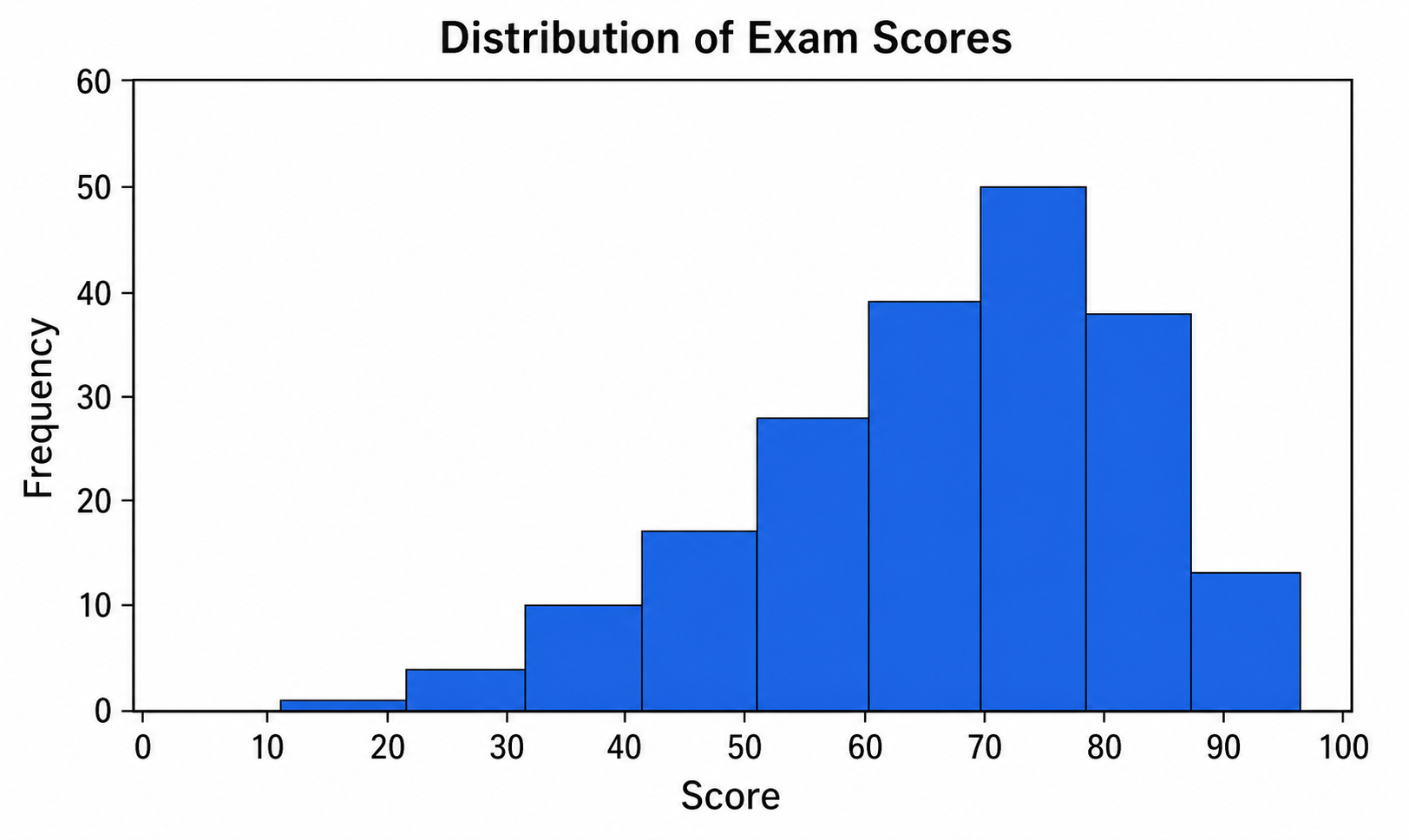
Histogram Maker
Use Histogram Maker with CSV or Excel data. Python renders the chart; refine labels, styling, and export in SciVis.
Try it free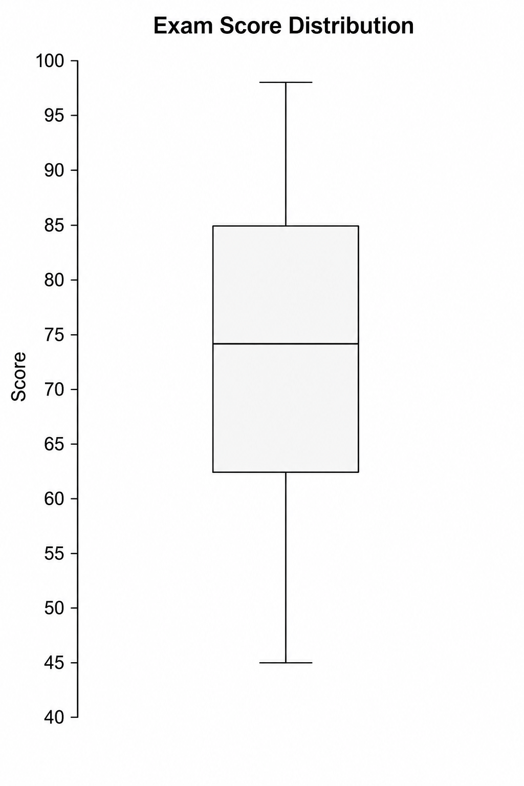
Box Plot Maker
Use Box Plot Maker with CSV or Excel data. Python renders the chart; refine labels, styling, and export in SciVis.
Try it free
Violin Plot Maker
Use Violin Plot Maker with CSV or Excel data. Python renders the chart; refine labels, styling, and export in SciVis.
Try it freeCreate a figure with Paired Dot Plot Maker
Start with sample data or upload one supported data file, then finish the figure in SciVis.