Бесплатный конструктор скрипичной диаграммы
Создавайте Бесплатный конструктор скрипичной диаграммы по экспериментальным и исследовательским данным
Создавайте «Одиночная скрипичная диаграмма» с помощью Конструктор скрипичной диаграммы из CSV или Excel. Доступны отрисовка Python, правка в SciVis и экспорт.
Создать научный график
Перетащите файл данных сюда или нажмите, чтобы загрузить
CSV, TSV, TXT, Excel · Макс. 5MB
Предпросмотр
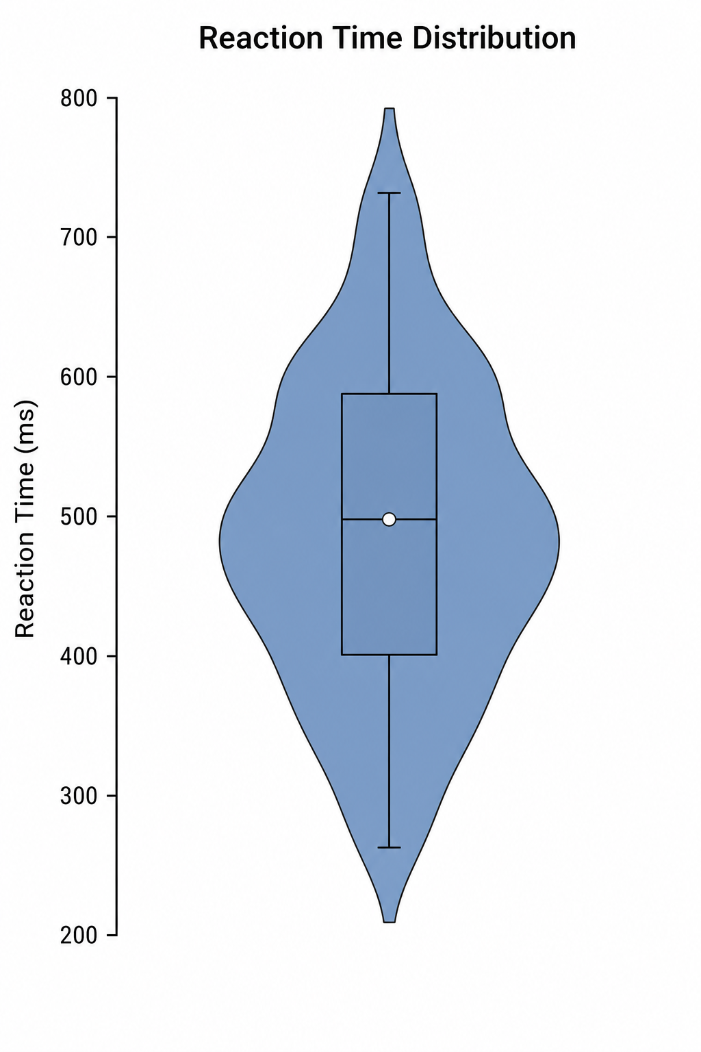 Пример
Предпросмотр использует выбранный набор примеров. Постройте его с помощью Python или загрузите собственные данные.
Примеры Конструктор скрипичной диаграммы с данными для скачивания
Откройте пример, чтобы изучить график, скачать CSV или загрузить те же данные в генератор выше.
Что показывает Конструктор скрипичной диаграммы?
Конструктор скрипичной диаграммы преобразует структурированные научные данные в статистическое представление, для которого предназначен этот тип графика. Он подходит для «Одиночная скрипичная диаграмма», «Сгруппированная скрипичная диаграмма» и близких задач; Python создаёт воспроизводимую первую версию, а SciVis помогает оформить результат.
Требования к данным для Конструктор скрипичной диаграммы
- Пример полей: sample_id, group, value.
- Одна строка должна соответствовать одному наблюдению, категории, моменту времени или корректной паре.
- Измерения хранятся как числа, а единицы указываются в названии столбца.
- Пустые ячейки считаются пропусками; итоговые строки и примечания перед загрузкой удаляются.
Научные примеры для Конструктор скрипичной диаграммы
- Одиночная скрипичная диаграмма
- Сгруппированная скрипичная диаграмма
- Разделённая скрипичная диаграмма
- Скрипичная диаграмма с точками
- Горизонтальная скрипичная диаграмма
- Бимодальная скрипичная диаграмма
Зачем использовать Конструктор скрипичной диаграммы для научных данных?
- Сначала проверьте сопоставление полей на встроенном примере «Одиночная скрипичная диаграмма».
- Перенесите визуальную структуру примера «Сгруппированная скрипичная диаграмма» на сопоставимый набор данных.
- Используйте отрисовку Python без самостоятельного написания и отладки кода.
- Сохраните рассчитанные значения и доработайте подписи, цвета и экспорт в SciVis.
Как пользоваться Бесплатный конструктор скрипичной диаграммы
Выберите пример или загрузите один файл CSV, TSV, TXT, XLSX либо XLS. Проверьте распознанные столбцы, создайте график и отредактируйте его в SciVis. Для Excel используется первый лист.
Что должно быть в понятном Конструктор скрипичной диаграммы
- Оси, группы или узлы последовательно сопоставлены с полями sample_id, group, value.
- Заголовок называет результат или сравнение, которое показывает Конструктор скрипичной диаграммы.
- Подписи, единицы, легенды и необходимые опорные линии легко читаются.
- Сдержанная палитра и достаточное разрешение подходят для статей, постеров и слайдов.
Конструктор скрипичной диаграммы или Конструктор ящиков с усами?
Выбирайте Конструктор скрипичной диаграммы, когда столбцы и исследовательский вопрос соответствуют его статистической структуре. Если главное — альтернативное сравнение, используйте Конструктор ящиков с усами, чтобы не исказить данные визуальным кодированием.
Частые вопросы о Бесплатный конструктор скрипичной диаграммы
Какие столбцы нужны для Конструктор скрипичной диаграммы?
Приложенный CSV показывает рекомендуемую структуру. Типичные поля: sample_id, group, value; допустимы и другие названия с теми же ролями.
Когда использовать Конструктор скрипичной диаграммы, а не Конструктор ящиков с усами?
Используйте Конструктор скрипичной диаграммы для статистической связи, которую этот график кодирует напрямую. Выберите Конструктор ящиков с усами, если его сравнение лучше отвечает исследовательскому вопросу.
Можно ли редактировать график после создания в Бесплатный конструктор скрипичной диаграммы?
Да. Откройте созданный в Бесплатный конструктор скрипичной диаграммы результат в SciVis, чтобы изменить подписи, цвета, аннотации, компоновку и другие параметры оформления.
Можно ли использовать графики Бесплатный конструктор скрипичной диаграммы в научной статье?
Да. Бесплатный конструктор скрипичной диаграммы предназначен для ясных научных иллюстраций. Перед отправкой обязательно проверьте значения и требования выбранного журнала.
Поддерживает ли Бесплатный конструктор скрипичной диаграммы экспорт в высоком разрешении?
Да. После редактирования графика Бесплатный конструктор скрипичной диаграммы в SciVis его можно экспортировать для статьи, постера, презентации или отчета.
Нужно ли программировать для работы с Бесплатный конструктор скрипичной диаграммы?
Нет. Пошаговая загрузка в Бесплатный конструктор скрипичной диаграммы создает первый вариант, а визуальные инструменты SciVis позволяют его доработать.
Построение графиков типа Бесплатный конструктор скрипичной диаграммы по исследовательским данным
Изучите правила выбора типа графика, требования к структуре таблиц, принципы интерпретации и смежные методы визуализации перед подготовкой финальной иллюстрации для публикации.
Другие инструменты
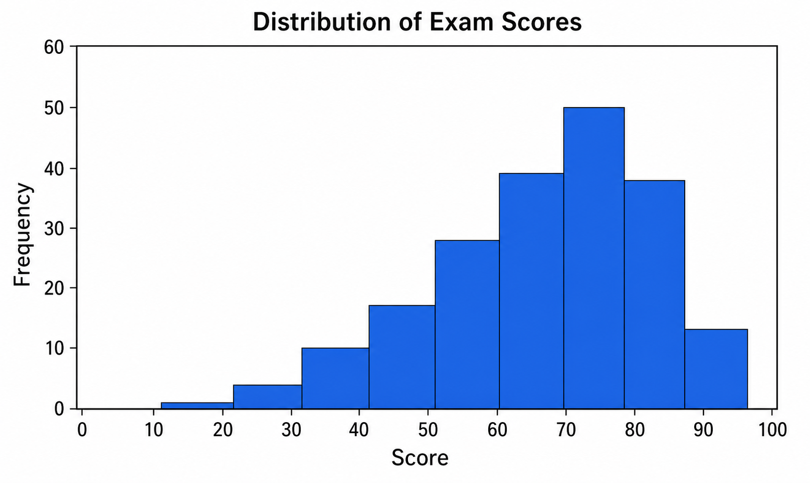
Конструктор гистограмм
Используйте Конструктор гистограмм для данных CSV или Excel и дорабатывайте в SciVis график, построенный Python.
Попробовать бесплатно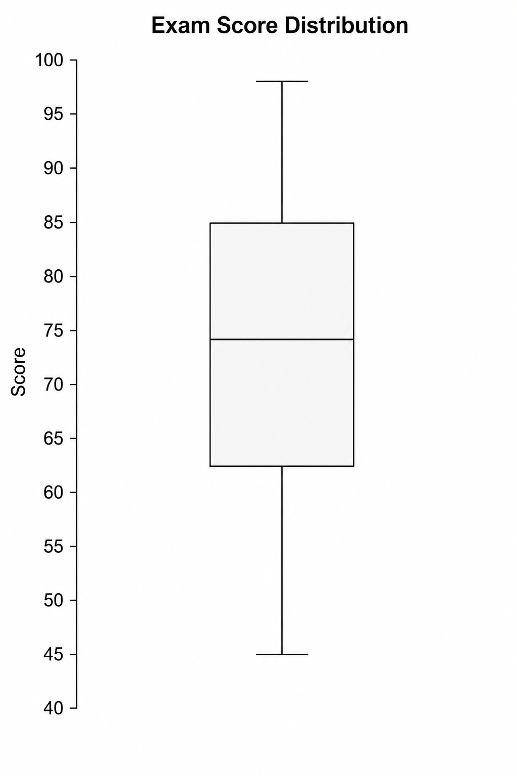
Конструктор ящиков с усами
Используйте Конструктор ящиков с усами для данных CSV или Excel и дорабатывайте в SciVis график, построенный Python.
Попробовать бесплатно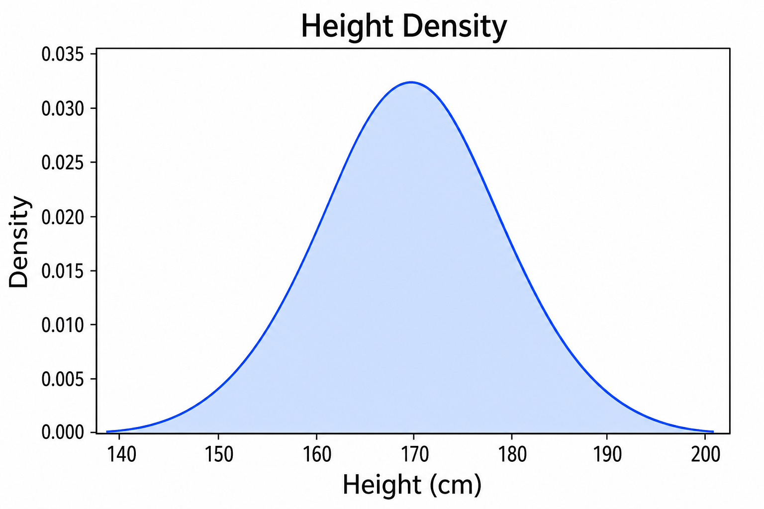
Конструктор графика плотности
Используйте Конструктор графика плотности для данных CSV или Excel и дорабатывайте в SciVis график, построенный Python.
Попробовать бесплатноСоздать график в Бесплатный конструктор скрипичной диаграммы
Начните с примера или одного поддерживаемого файла и завершите оформление в SciVis.