A Manhattan plot can summarize millions of association tests, but it cannot repair a flawed genome-wide association study. Population structure, phenotype definition, imputation quality, relatedness, allele frequency filters, and multiple-testing control are settled in the analysis—not in the plotting step. Build the figure only from a reviewed result table.
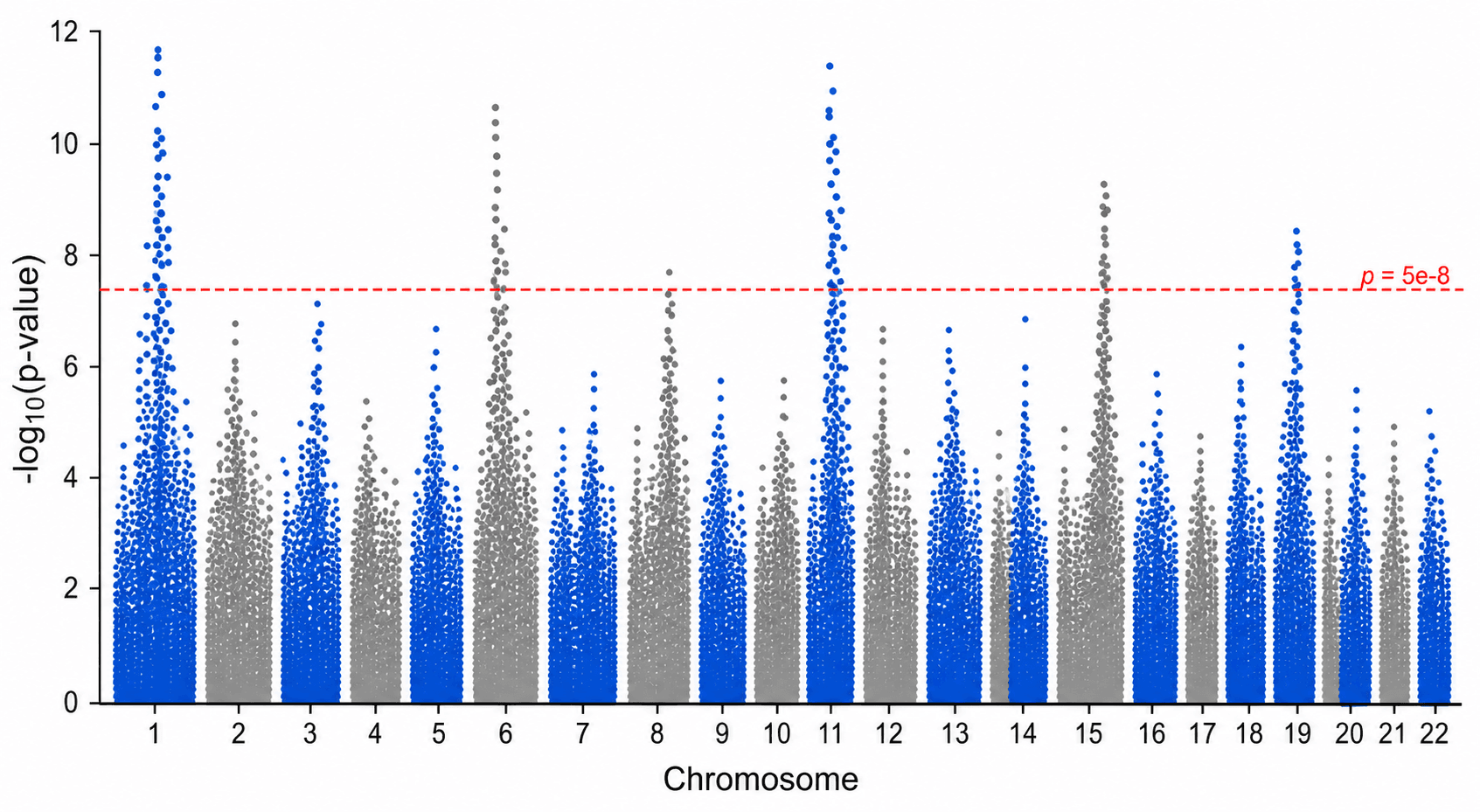
SciDraw's Manhattan Plot Generator maps chromosome position against -log10(p) and opens the chart in SciVis for refinement. The six examples cover basic, genome-wide, annotated, highlighted, suggestive-threshold, and Miami-style layouts.
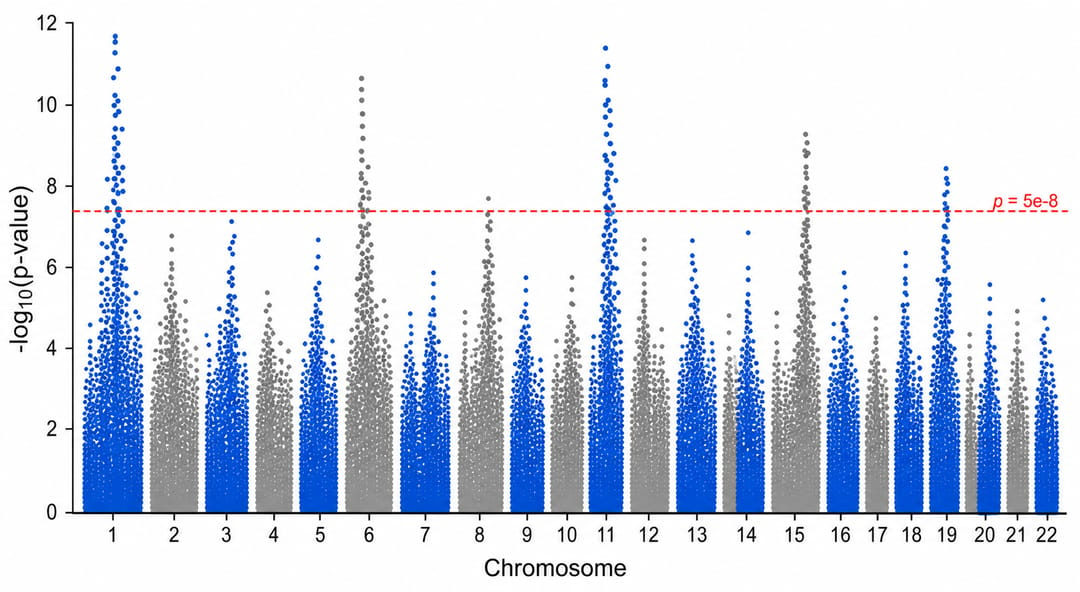
Common Manhattan plot mistakes
- Plotting unvalidated p-values: nonnumeric, zero, negative, or greater-than-one values break the transformation or indicate an upstream problem.
- Sorting chromosomes alphabetically: that can place chromosome 10 before chromosome 2 and misorder sex chromosomes.
- Applying a universal threshold blindly:
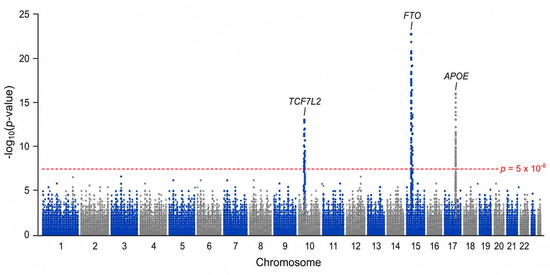
5 × 10⁻⁸is a common conventional GWAS threshold, not a rule for every organism, marker set, phenotype, or analysis. - Labeling every significant variant: correlated variants in one locus can create an unreadable wall of labels.
- Interpreting a peak as a causal gene: association identifies a region for follow-up; it does not by itself establish the causal variant, gene, or mechanism.
What data does a Manhattan plot need?
Use one row per tested variant:
| Column | Purpose | Example |
|---|---|---|
snp | Variant identifier | rs100102 |
chromosome | Chromosome or contig | 3 |
position_bp | Base-pair position | 18420351 |
p_value | Association p-value before transformation | 2.4e-9 |
trait | Optional phenotype or series label | Trait_A |
annotated_locus | Optional locus label | Locus 3q |
Inspect the basic Manhattan CSV or annotated-peaks CSV. Keep p-values numeric and preserve enough precision to distinguish strong signals.
Step 1: Export a reviewed association table
Complete quality control and association modeling in the appropriate genetics workflow. The plotting table should contain the final variants you intend to display, with consistent genome build, chromosome labels, and base-pair coordinates. Document the genome build in the caption or methods.
Step 2: Upload CSV or Excel data
Open the Manhattan Plot Generator, choose an example, or upload CSV, TSV, TXT, XLSX, or XLS. Excel imports the first worksheet. Check that chromosome and position identify each genomic location and that every p-value satisfies 0 < p ≤ 1.
Step 3: Generate and verify the transformation
The y-axis should represent -log10(p), so smaller p-values appear higher. For example, p = 10⁻⁸ becomes 8. Confirm several points manually and verify that chromosomes appear in genomic order with alternating colors used only to separate adjacent chromosomes.
The frequently used genome-wide line at 5 × 10⁻⁸ corresponds to approximately 7.30 on a -log10(p) axis. Your analysis may require a threshold derived from the number and dependence of tests, a study-specific protocol, or a field-specific convention.
Step 4: Label loci, not every point
Annotate sentinel variants or independently defined loci and explain the selection rule. Closely linked variants often form a peak because of linkage disequilibrium; they should not be presented as independent discoveries.
If a suggestive threshold is useful for exploratory context, style it differently from the primary significance threshold and identify both in the legend or caption.
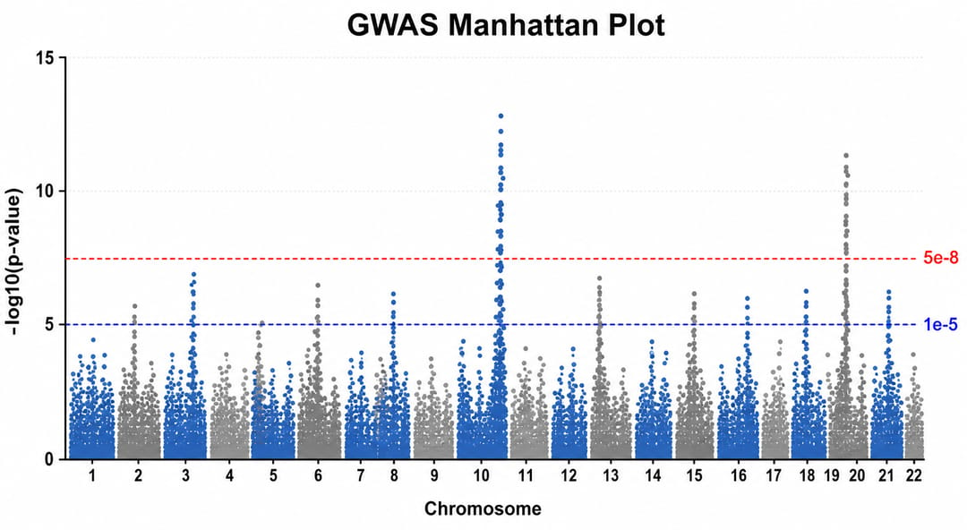
Continue in SciVis to refine threshold lines, chromosome labels, annotation leaders, colors, and layout. Do not move points or edit their values for visual convenience.
How to interpret a Manhattan plot
Each point is a tested variant. Its horizontal position is its genomic location and its vertical position is the strength of statistical evidence expressed as -log10(p). A high cluster indicates a region containing associated, often correlated variants.
Before calling a locus noteworthy, check the prespecified threshold, effect size and uncertainty, allele frequency, imputation or genotype quality, genomic inflation, regional association pattern, replication evidence, and the full analysis protocol. The plot alone does not convey those safeguards.
Manhattan plot, Miami plot, or regional association plot?
- Use a Manhattan plot for a genome-wide overview of one association analysis.
- Use a Miami plot for two aligned genome-wide series displayed above and below a shared chromosome axis.
- Use a regional association plot to inspect one locus with local linkage disequilibrium and gene context.
- Use a Volcano Plot Generator for effect size versus significance in differential-expression or similar feature-level analyses; it does not preserve genomic position.
FAQ
Does SciDraw run the GWAS?
No. It visualizes a prepared association-results table. Quality control, modeling, correction for structure or relatedness, and inferential decisions remain in your analysis workflow.
Should every study use 5 × 10⁻⁸?
No. It is a widely used conventional threshold for many human GWAS, but the defensible threshold depends on the study design, organism, marker set, dependence structure, and analysis plan.
What should I do with p-values reported as zero?
Return to the analysis output and export values with sufficient numerical precision, such as log p-values when supported. Replacing zero with an arbitrary number can misrepresent the evidence.
Can I label genes instead of variants?
You may annotate a nearby or candidate gene when the mapping method is stated, but proximity does not prove causality. Keep the sentinel variant or locus definition available in the caption or supplement.
Create the figure
Start with the Manhattan Plot Generator, verify the input and thresholds against the analysis record, and consult the scientific data visualization guide for related figure types.