Free Manhattan Plot Generator
Create a GWAS Manhattan plot from plain text
Describe your genome-wide association study, the chromosomes to show, and the significance thresholds you want, and AI draws a clean Manhattan plot with -log10(p) on the y-axis and labeled peaks — ready for genetics lectures, lab figures, and paper drafts.
Manhattan plot examples
Click any example to load its prompt, or use it as a starting point for your own GWAS plot.
What is a Manhattan plot?
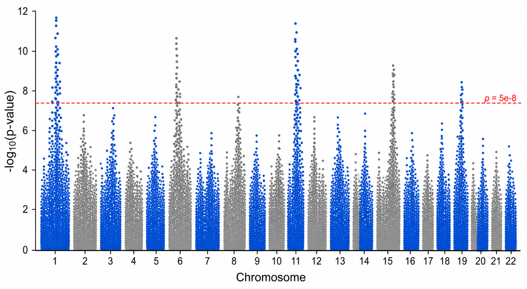
A Manhattan plot is the standard figure for summarizing a genome-wide association study (GWAS). Each point is a single genetic variant (SNP) plotted by its genomic position along the x-axis and by the strength of its association with a trait on the y-axis, shown as -log10(p-value). Because chromosomes are laid out end to end with adjacent ones in alternating colors, clusters of strongly associated variants form tall 'skyscraper' peaks that resemble a city skyline — which is where the name comes from. SciDraw AI turns your text description into a clean, publication-style Manhattan plot, so you can illustrate a GWAS layout without writing R or Python.
Why use a Manhattan plot generator?
- Get a clear GWAS Manhattan plot in seconds for a talk, lecture, or figure mock-up.
- Show the genome-wide significance line at 5e-8 and a suggestive line without fiddling with plotting code.
- Lay out all chromosomes in alternating colors with labeled peaks, no design skills required.
- Create teaching figures that explain how GWAS results, p-values, and loci are read.
- Quickly draft Miami plots and annotated layouts before you have final summary statistics.
How to make a Manhattan plot
Describe the plot in plain language: which chromosomes to span (1-22 and X), how high the -log10(p) axis should go, whether to draw the genome-wide significance line at 5e-8 and a suggestive line at 1e-5, and which peaks to label with a nearest-gene name. Mention if you want a Miami plot comparing two traits or specific loci highlighted. SciDraw AI then draws a clean Manhattan plot with alternating chromosome colors and tidy annotations, and you can refine the prompt and regenerate until it looks right.
Parts of a Manhattan plot
- X-axis: genomic position grouped by chromosome (1-22 and X), with adjacent chromosomes in alternating colors
- Y-axis: -log10(p-value), so the strongest associations sit highest on the plot
- Genome-wide significance line: a horizontal line at p = 5e-8 (-log10 p ~ 7.3)
- Suggestive line: an optional lower line at p = 1e-5 marking weaker signals
- Peaks and loci: clusters of points ('skyscrapers') that rise above the threshold
- Gene annotations: labels naming the nearest gene at each top locus
Manhattan plot FAQ
What is a Manhattan plot?
A Manhattan plot is the standard figure for a genome-wide association study (GWAS). Each point is a genetic variant placed by its position along the genome on the x-axis and by its -log10(p-value) on the y-axis. Chromosomes are drawn end to end in alternating colors, so strongly associated regions form tall peaks that look like a city skyline — hence 'Manhattan' plot.
Why is the y-axis -log10(p) instead of the raw p-value?
GWAS p-values span many orders of magnitude, from near 1 down to 1e-50 or smaller, so a raw scale would crush every meaningful signal against the axis. Taking -log10(p) turns those tiny p-values into large positive numbers: p = 0.01 becomes 2, p = 5e-8 becomes about 7.3, and p = 1e-20 becomes 20. The stronger the association, the higher the point, which is exactly what makes the peaks readable.
What is the genome-wide significance threshold of 5e-8 and why that value?
The genome-wide significance threshold is p = 5e-8, drawn as a horizontal line at -log10 p of about 7.3. It comes from a Bonferroni-style correction for testing roughly one million independent common variants across the genome (0.05 / 1,000,000 = 5e-8). Variants whose peaks cross this line are usually reported as genome-wide significant, while a looser suggestive line at 1e-5 flags weaker candidate signals worth follow-up.
What is the difference between a Manhattan plot and a QQ plot in GWAS?
A Manhattan plot shows where associations fall along the genome and how strong they are, so you can read off which loci are significant. A QQ plot instead checks the whole distribution of test statistics: it plots observed -log10(p) against the values expected under no association. The two are complementary — the QQ plot diagnoses inflation or confounding across the study, while the Manhattan plot shows the specific loci.
Is the Manhattan plot generator free?
Each generation uses a small number of credits. New accounts receive free credits to start, so you can make Manhattan plots right away, with paid plans available if you need to generate many GWAS figures on a regular basis.
Can I use these plots for publication or real research?
The figures from SciDraw AI are illustrative — they are great for teaching, slides, posters, and layout mock-ups, but they are drawn from your description, not from real data. For an actual GWAS result you must plot your own summary statistics (per-SNP positions and p-values) with a tool such as R or Python so that every point and peak reflects the real analysis.
Explore More Tools

Histogram Maker
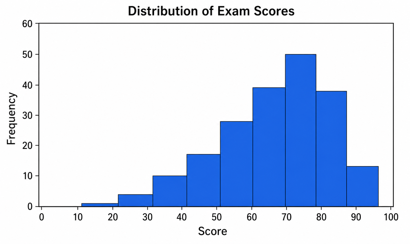
Turn data and bins into a clean, labeled frequency histogram with an optional normal curve.
Try it free
Box Plot Maker
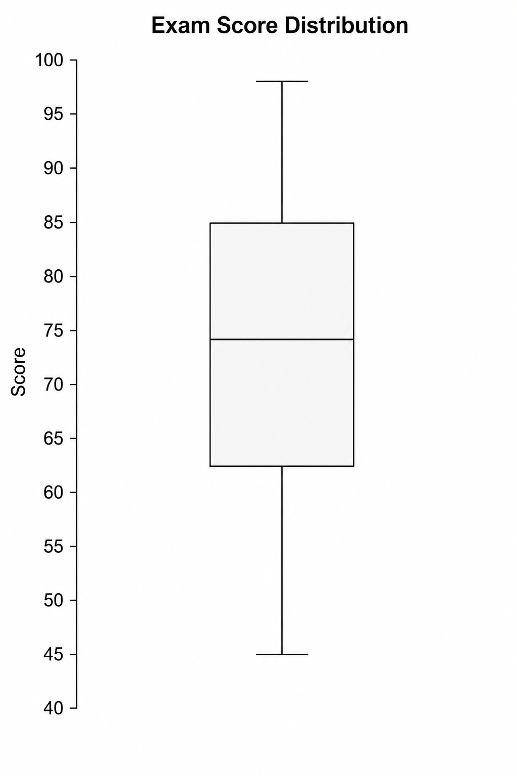
Generate clean, labeled box-and-whisker plots with quartiles, whiskers, and outliers from a plain-text description.
Try it free
Violin Plot Maker
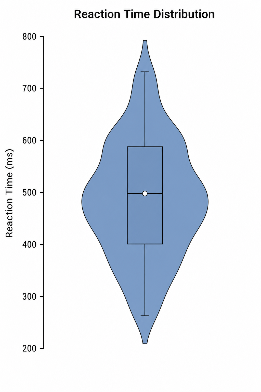
Create labeled violin plots with inner box plots and density shapes from a plain-text description.
Try it freeDraw your Manhattan plot now
Describe your GWAS layout, significance lines, and peaks, and get a clean genome-wide association plot in seconds. Start free with SciDraw AI.