Generatore di grafici a vulcano
Trasforma i dati di espressione differenziale in una figura pronta per la pubblicazione
Descrivi i tuoi risultati di RNA-seq, proteomica o espressione differenziale e l'AI disegna un grafico a vulcano pulito, con soglie di significatività, geni up- e down-regolati colorati e i principali hit etichettati, pronto per manoscritti e presentazioni.
Esempi di grafici a vulcano
Clicca su un esempio per caricarne il prompt, oppure usalo come punto di partenza per il tuo grafico a vulcano.
Cosa fa questo generatore di grafici a vulcano?
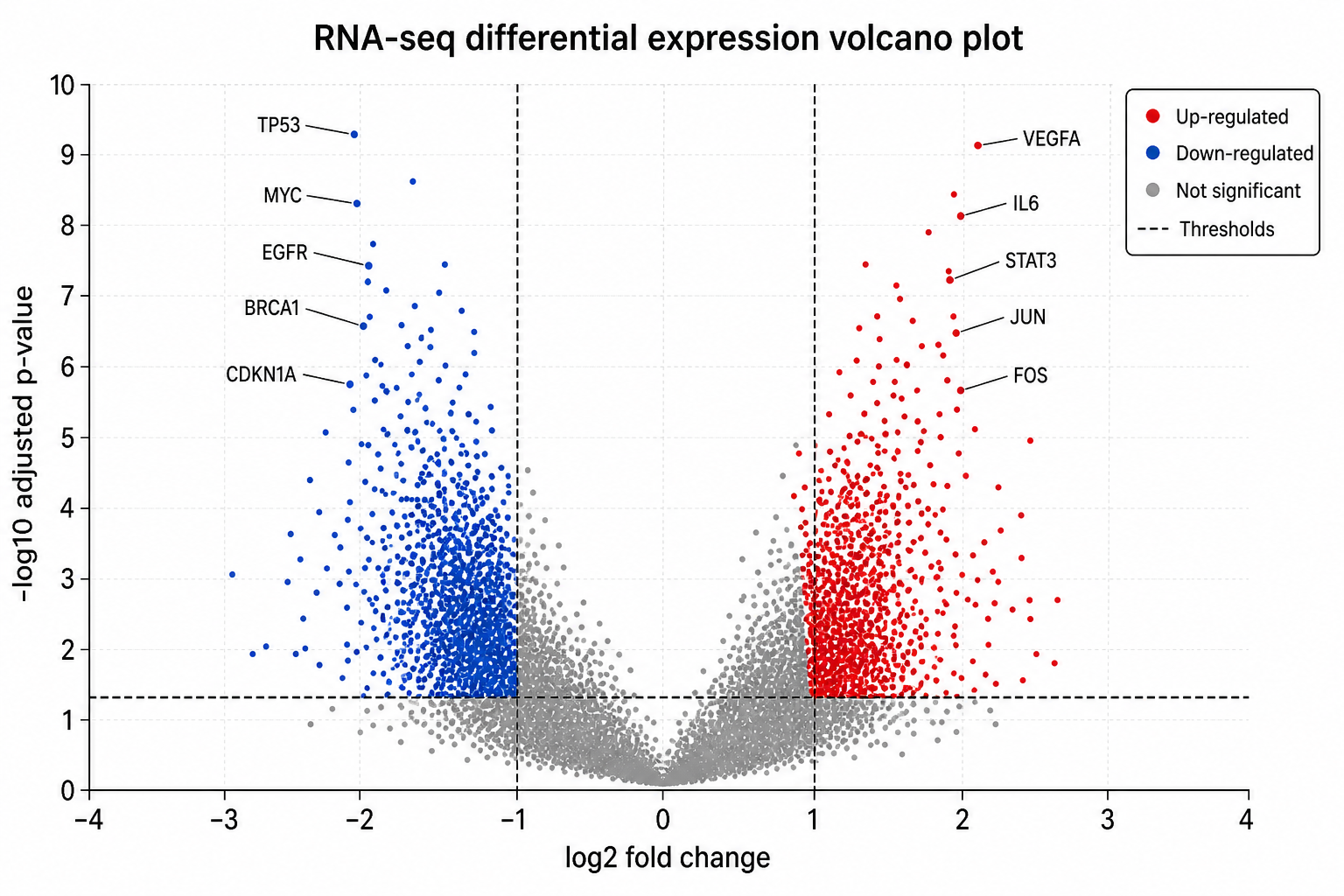
Trasforma la descrizione dei tuoi risultati di espressione differenziale in un grafico a vulcano pulito e annotato: lo scatter plot che riporta il log2 fold change sull'asse x e la significatività statistica (−log10 del p-value) sull'asse y. Descrivi il tuo confronto, le soglie e i geni che vuoi evidenziare, e l'AI disegna i punti, le linee tratteggiate dei cutoff e le etichette, in modo che le feature significativamente up- e down-regolate risaltino a colpo d'occhio, senza scrivere codice di plotting né annotare a mano.
Perché usare un generatore di grafici a vulcano
- Il grafico a vulcano è il modo standard per mostrare l'espressione differenziale in un'unica figura.
- Programmare in R o Python un grafico curato e ben etichettato richiede tempo e diverse iterazioni.
- Le soglie di fold change e significatività rendono evidenti gli hit importanti a qualsiasi lettore.
- I ricercatori hanno bisogno di figure pulite e presentabili per articoli, poster e presentazioni in tempi rapidi.
- Rigenerare a partire da una descrizione è più veloce che rilanciare uno script ogni volta che cambiano etichette o cutoff.
Come realizzare un grafico a vulcano
Descrivi il tuo confronto (ad esempio trattato vs controllo), indica quali assi e unità vuoi — log2 fold change contro −log10 del p-value o del p-value aggiustato — e imposta le soglie, come |log2FC| > 1 e padj < 0,05. Specifica quali geni o proteine etichettare e come colorare i punti up- e down-regolati. Genera la figura, poi controlla soglie, colori ed etichette e affinala finché non corrisponde ai tuoi dati.
Le parti di un grafico a vulcano
- Asse x — log2 fold change (entità e direzione dell'effetto).
- Asse y — −log10 del p-value o del p-value aggiustato (significatività).
- Linee di soglia — cutoff tratteggiati per fold change e significatività.
- Punti up-regolati — feature significative con fold change positivo.
- Punti down-regolati — feature significative con fold change negativo.
- Etichette dei geni — i nomi delle feature principali o selezionate di interesse.
Domande frequenti sul generatore di grafici a vulcano
Cos'è un grafico a vulcano?
Un grafico a vulcano è uno scatter plot usato per mostrare l'espressione differenziale. Riporta il log2 fold change sull'asse x e la significatività statistica (−log10 del p-value) sull'asse y, così le feature più significative e con la variazione maggiore compaiono in alto a sinistra e in alto a destra.
Quali dati servono per un grafico a vulcano?
Per ogni feature (gene, proteina o metabolita) serve un fold change (di solito log2) e un p-value o p-value aggiustato. Descrivili insieme alle tue soglie, e puoi indicare le feature specifiche che vuoi etichettare.
Posso etichettare geni specifici?
Sì. Indica nella descrizione i geni o le proteine che vuoi annotare e il generatore li evidenzia ed etichetta; puoi anche chiedere di etichettare le N feature più significative.
Posso usare i p-value aggiustati?
Sì. Puoi specificare i p-value aggiustati (ad esempio FDR o padj) per l'asse y e impostare la soglia di significatività, come padj < 0,05, nel tuo prompt.
È adatto per RNA-seq e proteomica?
Sì. Lo stesso formato di grafico a vulcano funziona per RNA-seq, proteomica, confronti di geni marcatori single-cell, metabolomica e altre analisi di abbondanza differenziale: basta descrivere i dati e le soglie.
Posso esportare una figura modificabile?
SciDraw AI può esportare in formati vettoriali, così puoi modificare etichette, colori e soglie in un secondo momento. Verifica sempre la figura rispetto ai dati di base prima di inviarla.
Scopri altri strumenti
Generatore di illustrazioni mediche
Crea diagrammi anatomici, schemi clinici e visual didattici
Provalo gratis
Generatore di Illustrazioni Cliniche
Crea diagrammi anatomici e figure per procedure chirurgiche
Provalo gratis
Creatore di infografiche mediche
Infografiche mediche e materiali di educazione sanitaria
Provalo gratisTi servono altre figure scientifiche?
Genera grafici a foresta, curve di sopravvivenza, diagrammi di pathway e altre figure scientifiche con SciDraw AI.