A smooth density curve can hide as much as it reveals. Too much smoothing merges distinct subpopulations; too little turns sampling noise into a row of artificial peaks. A defensible density plot therefore needs both clean observations and an explicit check that the visible shape is stable.
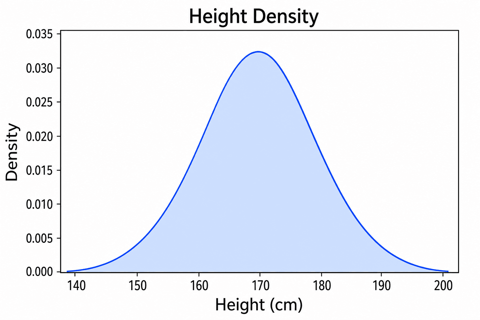
SciDraw's Density Plot Maker turns a CSV or Excel table into a kernel density estimate and then opens the result in SciVis for editing. Six example datasets cover single, grouped, skewed, bimodal, histogram-overlay, and ridgeline-style distributions.
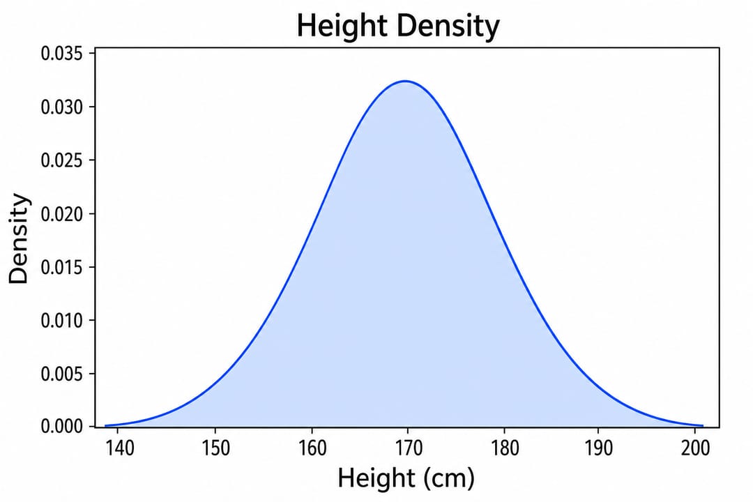
Common density plot mistakes
- Treating density as count: the y-axis is estimated probability density; the total area normally integrates to one.
- Ignoring bandwidth: bandwidth controls smoothness and can change the apparent number of modes.
- Comparing groups on different scales: transformations and units must be consistent.
- Using sparse data: a smooth curve can imply more evidence than a small sample contains.
- Cropping tails: truncating the x-axis may hide extreme or clinically important observations.
What data does a density plot need?
Use a long-format table with one row per observation:
| Column | Purpose | Example |
|---|---|---|
sample_id | Observation identifier | Control_01 |
group | Optional comparison group | Control |
value | Numeric measurement | 38.92 |
Inspect the single-density CSV or group-comparison CSV. Keep units outside the numeric cells and represent missing values consistently.
Step 1: Decide whether smoothing is appropriate
Density plots work best for continuous measurements with enough observations to support a distribution estimate. For discrete counts with few possible values, a histogram, ECDF, or dot plot may be more honest. For a small sample, overlay raw points or use the Beeswarm Plot Maker.
Step 2: Upload CSV or Excel data
Open the Density Plot Maker, choose an example, or upload CSV, TSV, TXT, XLSX, or XLS. Excel imports the first worksheet. Check that the measurement column is numeric and that group names do not contain accidental spelling variants.
Step 3: Generate and inspect the bandwidth
The initial curve provides a useful starting estimate, not proof of the underlying distribution. Compare the result with a slightly narrower and wider bandwidth. Major structure should remain interpretable; peaks that appear only under one extreme setting should not drive the conclusion.
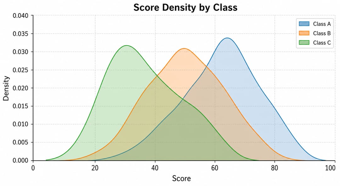
When curves overlap, use semi-transparent fills or distinct outlines. Avoid using more groups than the figure can support, and do not rely on color alone when the chart may be printed or viewed by readers with color-vision deficiency.
Step 4: Add context in SciVis
Continue editing to revise axis titles, group labels, colors, annotations, and layout. A rug plot or histogram overlay can show where the observations actually lie, helping readers distinguish a well-supported peak from a smoothing artifact.
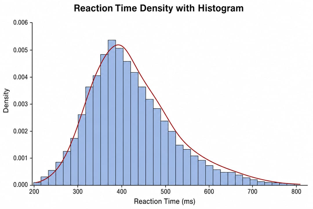
Document log transformations and exclude invalid measurements through a reproducible cleaning step rather than deleting visually inconvenient points inside the chart editor.
How to interpret a density plot
Read the x-axis as the measured value and the curve height as the relative concentration of observations around that value. Compare the location, spread, skew, and tails of groups. Because density curves are normalized, two equally tall curves do not imply equal sample sizes.
The area between two x values represents an estimated proportion only when the density has been correctly normalized and the model assumptions are appropriate.
Density plot, histogram, ECDF, or violin plot?
- Use a Histogram Maker when actual bin counts are important.
- Use an ECDF Plot Generator when you want a distribution view without bandwidth selection.
- Use a Violin Plot Maker for compact side-by-side group distributions.
- Use a density plot when smooth shape and overlapping group comparison are the main goals.
FAQ
Can I create a density plot without Python or R?
Yes. Upload the observations to the Density Plot Maker, generate the chart, and refine it in SciVis.
What does the y-axis mean?
It shows estimated probability density, not the number of samples. Density values can exceed one when the x range is narrow; the area under a normalized curve is the important quantity.
How do I choose bandwidth?
Use a reasonable automatic starting point, inspect nearby values, and select a setting that communicates stable structure without chasing noise. Report the method when distribution shape is central to the claim.
Can density curves be compared when group sizes differ?
Yes, normalized curves compare shape, but they hide sample-size differences. Report group sizes or add raw observations when that context matters.
Create the figure
Start with the Density Plot Maker, validate the smooth curve against the observations, and use the scientific data visualization guide to choose an alternative when smoothing is not appropriate.