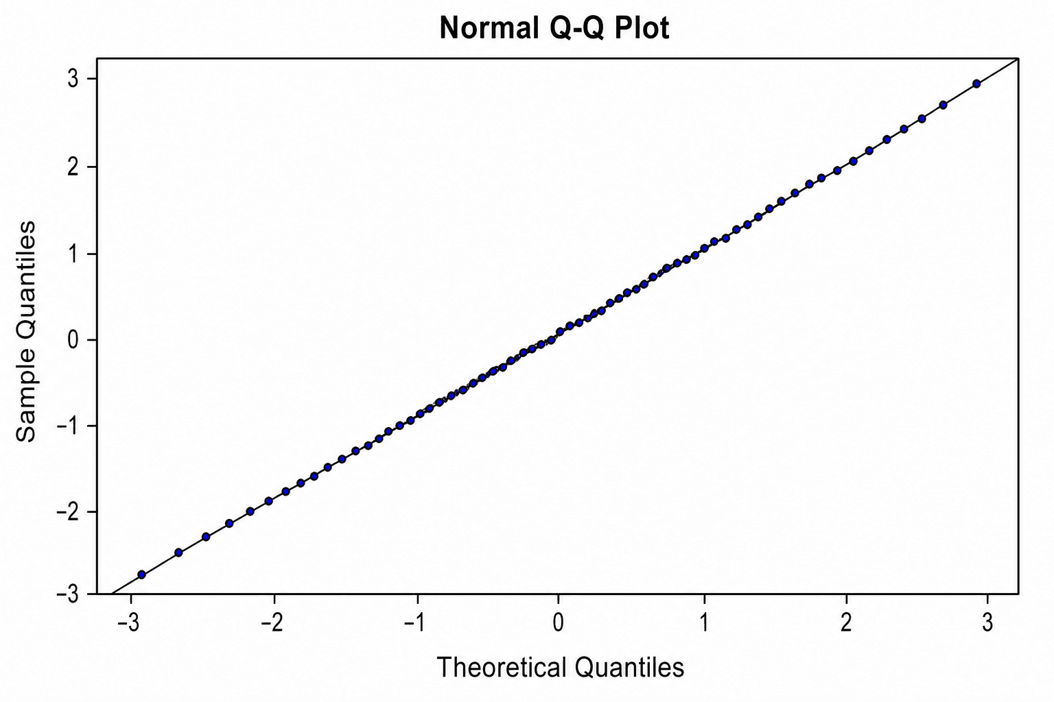
Un gráfico Q-Q (cuantil-cuantil) es una herramienta de diagnóstico visual, no un certificado de normalidad de tipo aprobado/reprobado. Que los puntos sigan de cerca la línea de referencia indica una concordancia aproximada con la distribución teórica seleccionada; las desviaciones pueden ser reflejo de asimetría, colas pesadas, valores atípicos (outliers), dependencia, redondeo de datos o, simplemente, de un tamaño de muestra limitado. La pregunta verdaderamente útil en la práctica científica no es si cada punto se alinea de forma perfectamente recta, sino si la desviación observada compromete la validez del análisis estadístico que planea realizar.
La herramienta Q-Q Plot Maker de SciDraw genera este diagnóstico a partir de archivos CSV o Excel y lo abre directamente en SciVis para su personalización. Entre sus plantillas de ejemplo se incluyen un ajuste normal aproximado, colas pesadas, asimetría a la derecha, análisis de residuos, comparación de dos muestras y bandas de confianza.
Errores comunes al interpretar gráficos Q-Q
- Dar excesiva importancia al ruido en los extremos: en muestras pequeñas, los valores extremos presentan una alta variabilidad inherente.
- Utilizar una distribución de referencia incorrecta: un gráfico Q-Q perfectamente alineado con la normal carece de sentido si el modelo estadístico asume otra distribución de base.
- Ignorar la definición de la línea de ajuste: las líneas trazadas a través de los cuartiles no son idénticas a las líneas de ajuste basadas en parámetros de localización y escala.
- Catalogar un punto aislado como error de medición: investigue la procedencia y la influencia de dicho dato antes de excluirlo del análisis.
- Sustituir los contrastes formales por el gráfico: el gráfico Q-Q complementa el diagnóstico del modelo y el criterio del investigador, pero no los reemplaza.
¿Qué estructura de datos requiere un gráfico Q-Q?
Los ejemplos integrados en la herramienta emplean columnas de cuantiles explícitas:
| Columna | Propósito | Ejemplo |
|---|---|---|
quantile_rank | Posición ordenada | 1 |
theoretical_quantile | Cuantil esperado bajo la distribución de referencia | -2.394 |
observed_quantile | Valor observado ordenado | -2.1098 |
sample | Etiqueta opcional de la serie | Sample A |
lower_95, upper_95 | Límites opcionales de la banda de confianza | -3.036, -1.7519 |
Puede examinar el CSV de muestra para ajuste normal o el CSV de muestra con banda de confianza. Los cuantiles teóricos deben calcularse bajo la misma convención de probabilidad y distribución de referencia que requiera su estudio.
Paso 1: Definir el objetivo del diagnóstico
Utilice un gráfico Q-Q de una sola muestra para contrastar los valores observados o los residuos de un modelo frente a una distribución teórica conocida. Si lo que necesita es comparar los cuantiles de dos muestras empíricas distintas, recurra a un gráfico Q-Q de dos muestras. Para verificar los supuestos de una regresión, represente gráficamente los residuos generados por el modelo ajustado en lugar de las variables de respuesta brutas.
Paso 2: Cargar los datos en CSV o Excel
Acceda al Q-Q Plot Maker, seleccione uno de los ejemplos predefinidos o suba su propio archivo en formato CSV, TSV, TXT, XLSX o XLS. En el caso de archivos de Excel, la herramienta importará la primera hoja de trabajo. Asegúrese de que las columnas de cuantiles contengan valores numéricos, estén ordenadas de manera consistente y no incluyan unidades de medida ni texto de comentarios.
Paso 3: Generar y analizar el patrón visual
Examine en primer lugar el comportamiento de las observaciones centrales y, posteriormente, el de las colas. Una alineación adecuada en el centro que se desvía progresivamente en ambos extremos suele indicar que la muestra presenta colas más pesadas o más ligeras que la distribución de referencia. Por otro lado, una curvatura sistemática hacia un lado denota asimetría (skewness).
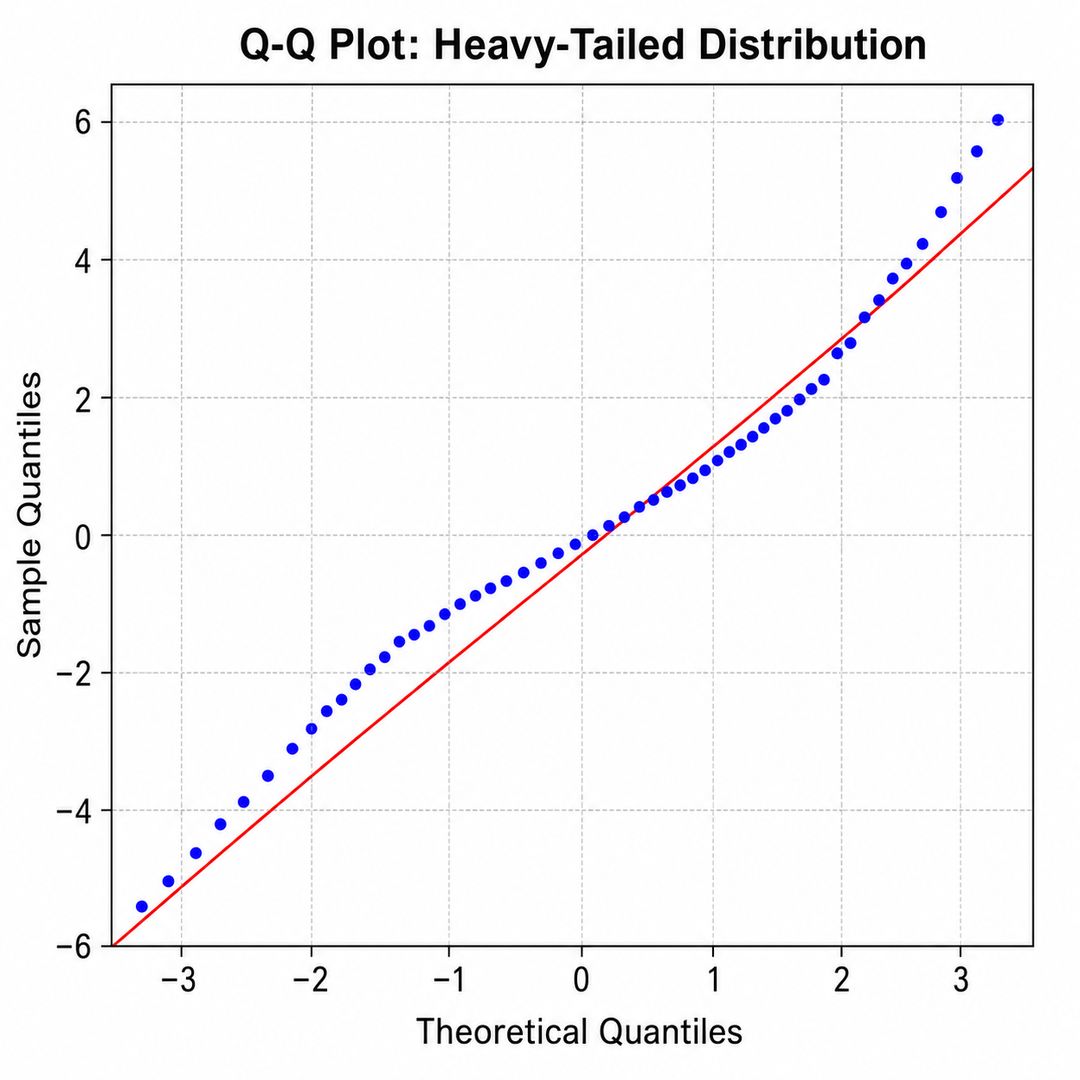
Evite atribuir una causa única basándose únicamente en la geometría del gráfico. Patrones visuales similares pueden originarse por la presencia de valores atípicos, la mezcla de diferentes poblaciones, la existencia de dependencia entre observaciones o la especificación incorrecta del modelo estadístico.
Paso 4: Incorporar bandas de confianza y contexto
La envoltura o banda de confianza delimita visualmente el rango de variación esperable debido al error de muestreo bajo el modelo de referencia. Los puntos que quedan fuera de estos límites requieren especial atención; no obstante, recuerde que la amplitud de la banda no es fija, sino que depende del tamaño muestral, del método de estimación y del nivel de confianza establecido.
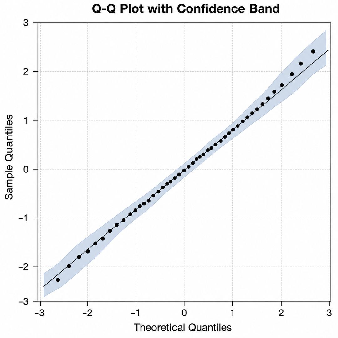
Continúe la edición en SciVis para especificar la distribución de referencia, el tamaño de la muestra, el origen de los residuos, el nivel de confianza y cualquier observación que resulte atípica. Si representa varios grupos simultáneamente, mantenga una escala común y añada una leyenda que identifique claramente cada serie de datos.
Guía de interpretación de las formas comunes en gráficos Q-Q
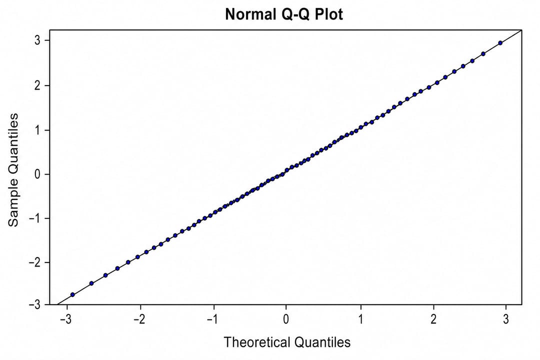
- Puntos alineados sobre la diagonal: la muestra es razonablemente compatible con la distribución de referencia en el rango de datos analizado.
- Desviaciones en forma de "S" en los extremos: indica que la muestra posee colas más pesadas o más ligeras que la referencia, dependiendo de la dirección de la curva.
- Curvatura constante hacia arriba o hacia abajo: sugiere asimetría en la distribución de la muestra.
- Uno o dos puntos muy distantes de la tendencia: señalan la presencia de valores extremos, posibles errores de registro o datos con alta influencia en el modelo.
- Diferencias en la pendiente o en la intersección: reflejan discrepancias en la localización o en la escala. En un gráfico Q-Q de dos muestras, esto indica que ambas comparten la forma de la distribución pero difieren en su valor central o en su dispersión.
La interpretación del gráfico siempre debe realizarse en conjunto con el tamaño de la muestra, el diseño experimental, las transformaciones de datos aplicadas, el diagnóstico de residuos y el método estadístico que se pretenda emplear.
¿Gráfico Q-Q o prueba de normalidad formal?
El gráfico Q-Q revela con precisión en qué zona y de qué manera se desvía una distribución respecto a la referencia. Por el contrario, las pruebas de hipótesis formales reducen toda la información a un único estadístico y a un valor p, lo que suele traducirse en una falta de potencia en muestras pequeñas o en una sensibilidad excesiva ante desviaciones irrelevantes en muestras grandes. Se recomienda utilizar ambos enfoques de manera complementaria y evaluar si el método estadístico principal es robusto frente al tipo de desviación detectada.
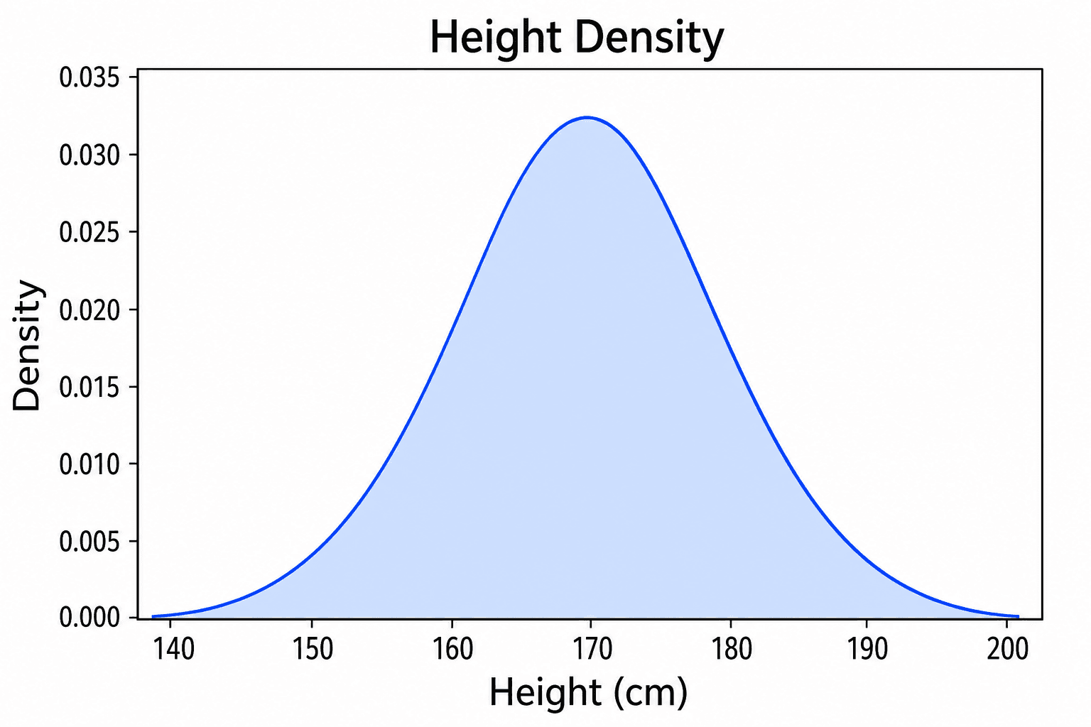
Para analizar la distribución original de los datos, herramientas como el Histogram Maker, el Density Plot Maker o el ECDF Plot Generator ofrecen perspectivas adicionales de gran utilidad.
Preguntas frecuentes (FAQ)
¿Un gráfico Q-Q lineal demuestra que mis datos siguen una distribución normal?
No. Únicamente demuestra compatibilidad visual con una distribución normal de referencia para el tamaño de muestra disponible. No constituye una prueba matemática de que la población de origen sea perfectamente normal.
¿Se deben eliminar los puntos que queden fuera de la banda de confianza?
No. Lo correcto es investigar su origen y su nivel de influencia. La exclusión de datos debe fundamentarse en criterios metodológicos sólidos o en errores documentados de la calidad del dato, nunca en la conveniencia estética del gráfico.
¿Es válido aplicar un gráfico Q-Q a los residuos de un modelo?
Sí. El análisis de residuos mediante gráficos Q-Q es una práctica estándar. Sin embargo, recuerde que la normalidad es solo uno de los supuestos del modelo; también debe verificar la homogeneidad de la varianza, la independencia, la existencia de puntos de apalancamiento (leverage) y la correcta especificación del modelo.
¿Es posible comparar dos muestras empíricas directamente?
Sí. Un gráfico Q-Q de dos muestras compara directamente los cuantiles empíricos correspondientes de ambos conjuntos de datos. Si los puntos se sitúan cerca de la diagonal, las distribuciones comparten una forma similar, mientras que la pendiente y la intersección con los ejes revelarán las diferencias en su escala y localización.
Genere su gráfico de diagnóstico
Comience a trabajar con el Q-Q Plot Maker, defina con claridad la distribución de referencia y consulte nuestra guía de visualización de datos científicos para complementar su análisis con otros gráficos de distribución.