Free Box Plot Maker
Create a labeled box-and-whisker plot from plain text
Describe your data, groups, and five-number summary, and AI draws a clean, professional box plot with quartiles, whiskers, and outliers — ready for statistics homework, data analysis, and research papers.
Box plot examples
Click any example to load its prompt, or use it as a starting point for your own box plot.
What is a box plot?
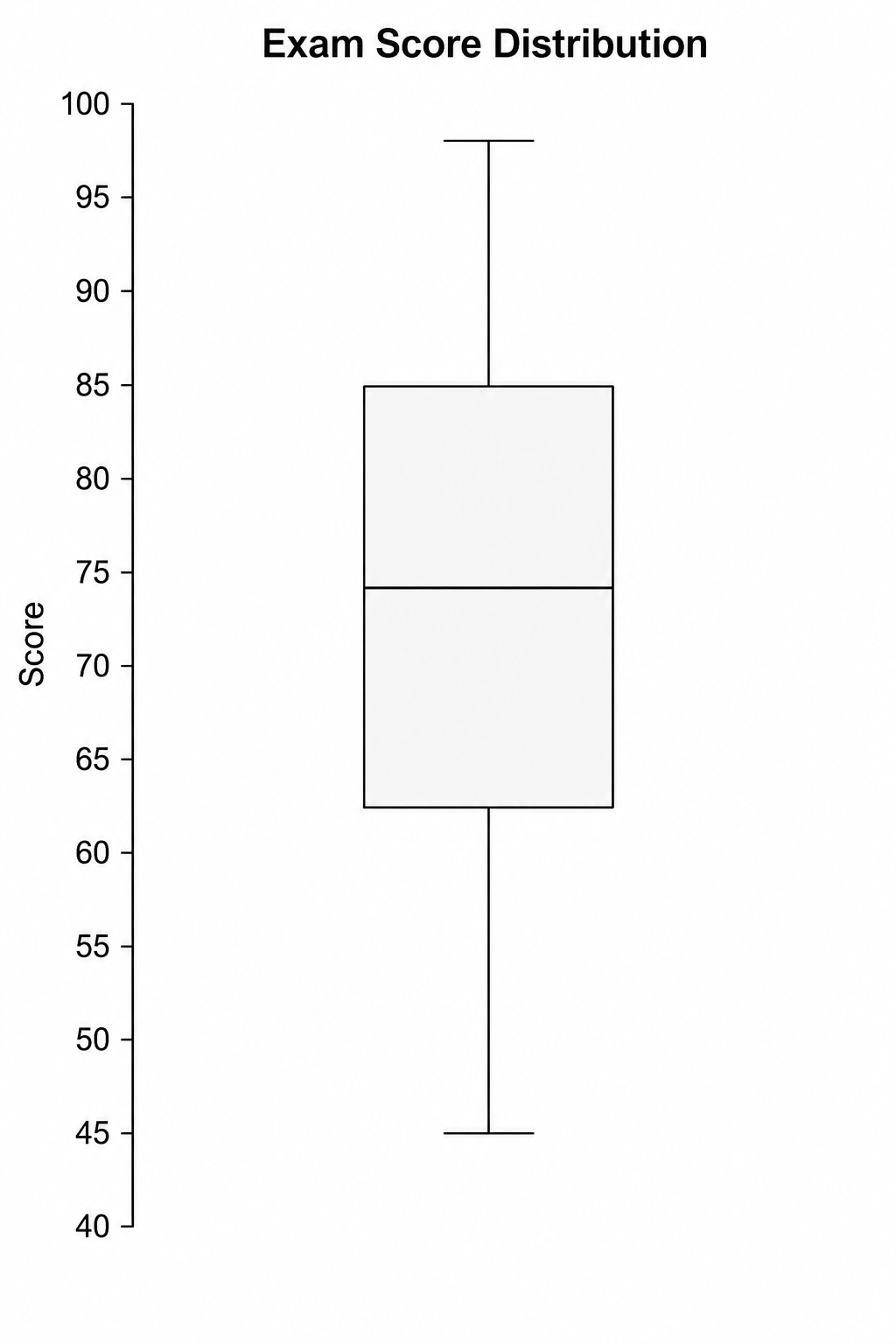
A box plot (also called a box-and-whisker plot or boxplot) is a graph that summarizes a distribution using its five-number summary — the minimum, first quartile (Q1), median, third quartile (Q3), and maximum — drawn as a box with whiskers and outlier points. This box plot maker turns a plain-text description into a clean, labeled box-and-whisker plot — you describe your data, groups, and quartiles, and the AI produces a properly proportioned figure with a median line, box, whiskers, and outliers, all without spreadsheets or coding.
Why use a box plot maker
- Box plots are the standard way to compare distributions, spread, skew, and outliers across groups in statistics, science, and business.
- Building a publication-quality box-and-whisker plot in Excel, R, or Python takes formatting work that distracts from the analysis.
- Students learning quartiles, the IQR, and the five-number summary understand them far better from a clearly labeled box plot.
- Instructors and researchers need quick, presentable box plots for slides, lab reports, and papers.
- Changing the groups, quartiles, or outliers and regenerating is much faster than editing chart code by hand.
How to make a box-and-whisker plot
Name the variable on the value axis and describe your data or its five-number summary — minimum, Q1, median, Q3, and maximum — for each group. Then add any visual features you need: side-by-side grouped boxes, outlier points beyond 1.5×IQR, a horizontal layout, notches for the median confidence interval, or raw data points overlaid on each box. Generate the box plot, check the boxes, whiskers, and outliers, and refine the description if anything is unclear.
Parts of a box plot
- Median line — the line inside the box marking the middle value (Q2) of the data.
- Box — the rectangle spanning Q1 to Q3, representing the interquartile range (IQR) and the middle 50% of values.
- Whiskers — the lines extending from the box to the smallest and largest values within 1.5×IQR.
- Outliers — individual points beyond the whiskers, flagging unusually high or low observations.
- Five-number summary — the minimum, Q1, median, Q3, and maximum that define the shape of the box and whiskers.
- Axis & title — the labeled value scale and a short caption describing what the box plot shows.
Box Plot Maker FAQ
What is a box plot?
A box plot is a graph that summarizes the distribution of a dataset using its five-number summary — minimum, first quartile, median, third quartile, and maximum. Also called a box-and-whisker plot or boxplot, it is used to compare spread, skew, and outliers across one or more groups.
How do I make a box-and-whisker plot online?
Describe your data or its five-number summary — minimum, Q1, median, Q3, and maximum — plus any groups and outliers. This online box plot maker then generates a clean, labeled box-and-whisker plot for you, with no spreadsheets, formulas, or coding required.
What do the box, whiskers, and outliers mean?
The box spans the first quartile (Q1) to the third quartile (Q3) and contains the middle 50% of the data, with a line marking the median inside. The whiskers reach the smallest and largest values within 1.5 times the interquartile range (IQR), and any points beyond the whiskers are plotted individually as outliers.
What is the difference between a box plot and a histogram?
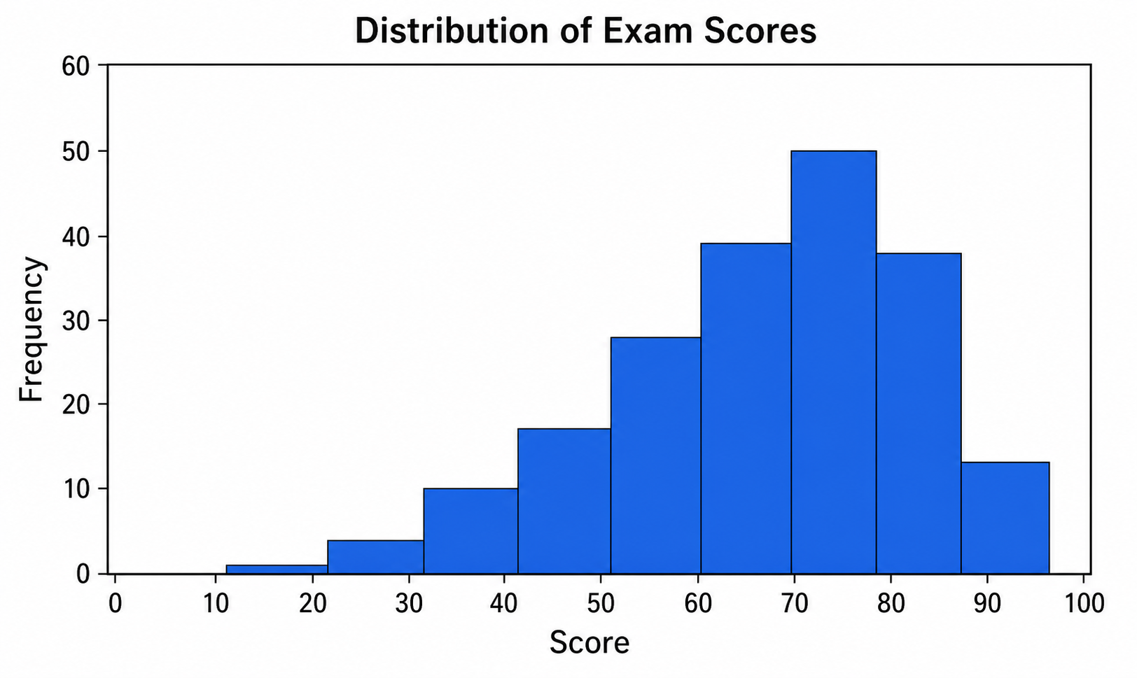
A box plot summarizes a distribution with a compact five-number summary, making it ideal for comparing spread and outliers across several groups at a glance. A histogram shows the full shape of a single distribution by binning values into bars. Use a box plot to compare groups, and a histogram when you want to see the detailed shape of one distribution.
Is it free?
Each generation uses a small number of credits. New accounts receive free credits, so you can make a box plot without any subscription.
Is this suitable for class, research, or reports?
Yes. The box plot generator produces clean, labeled figures suitable for classroom assignments, lab reports, posters, and research papers. Always verify that the quartiles, whiskers, and outliers match your actual data before using the figure in a formal report.
Explore More Tools

Histogram Maker
Turn data and bins into a clean, labeled frequency histogram with an optional normal curve.
Try it free
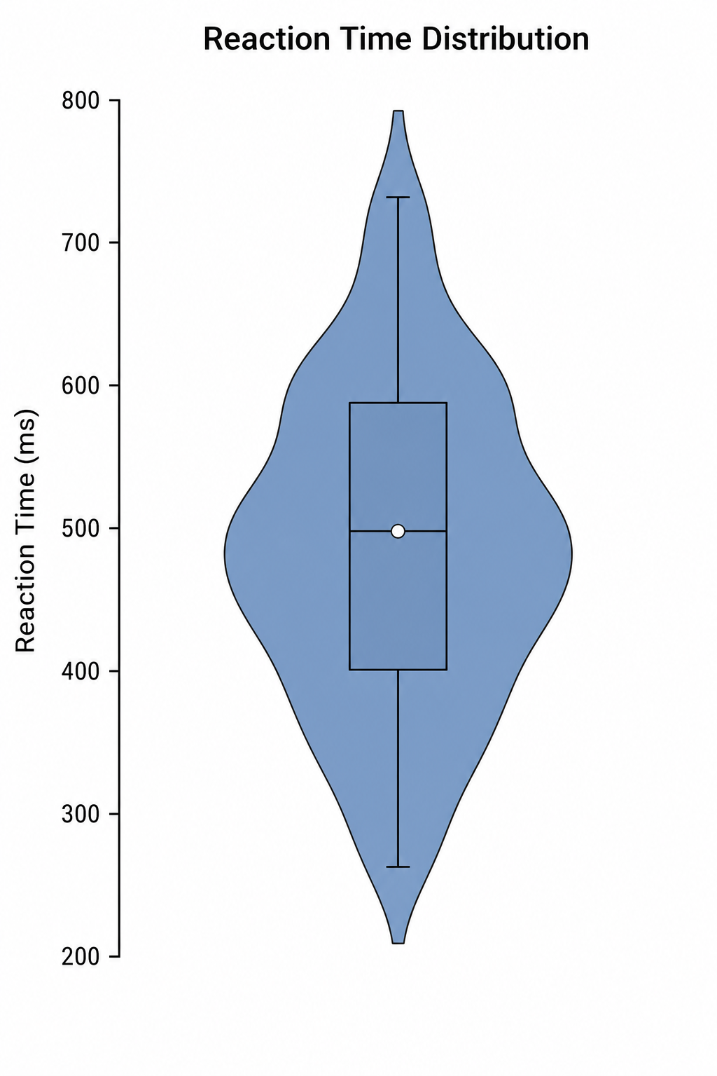
Violin Plot Maker
Create labeled violin plots with inner box plots and density shapes from a plain-text description.
Try it free
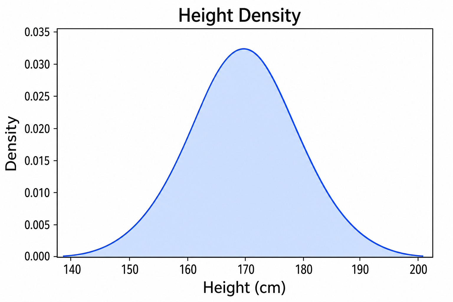
Density Plot Maker
Generate smooth KDE density curves and ridgeline plots from a plain-text description.
Try it freeNeed other statistical or scientific graphs?
Generate histograms, violin plots, and scatter plots, and more scientific figures with SciDraw AI.