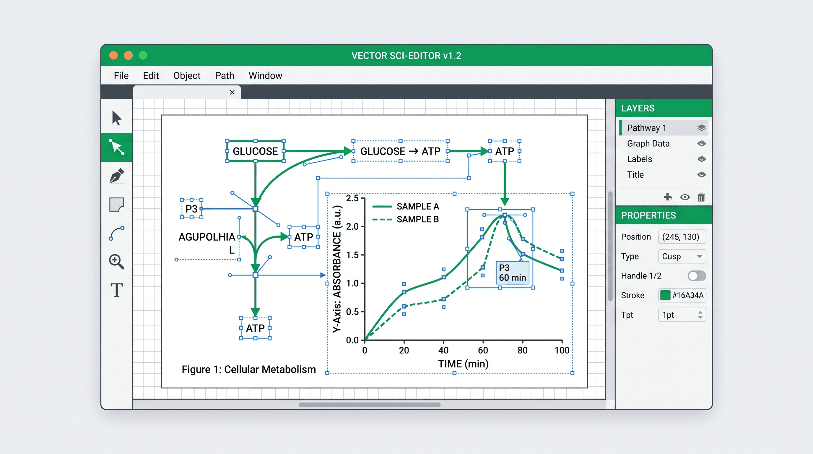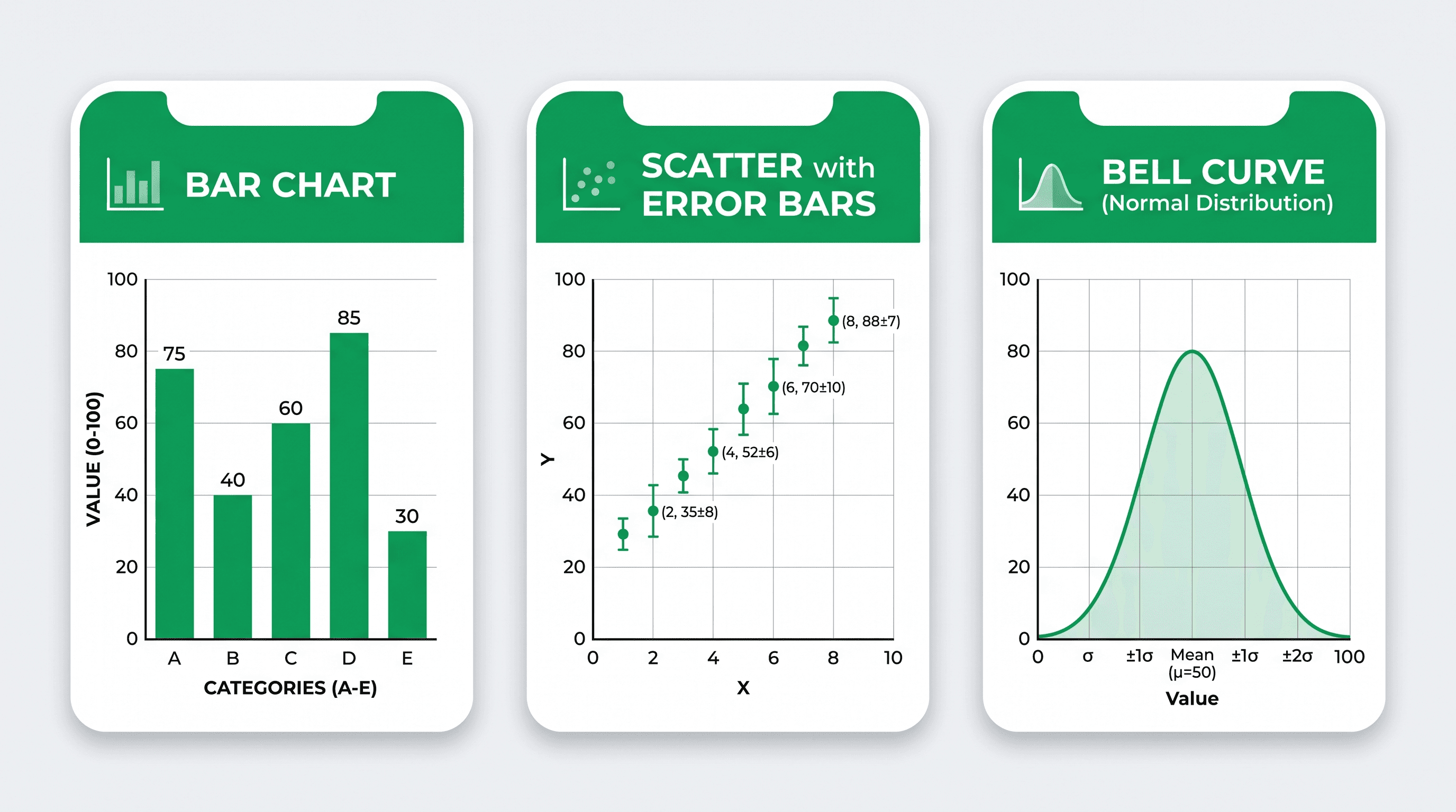
The right OriginPro alternative depends on what you are actually replacing. OriginPro combines worksheet-based data handling, more than 100 built-in and extended graph types, curve fitting, peak analysis, statistics, signal processing, automation, and project management. A lighter chart maker may replace the final plotting step, but it will not replace that entire analytical environment.
This comparison separates analysis, reproducibility, and figure production so you can choose a workflow without accidentally dropping a required capability.
Common mistakes when replacing OriginPro
- Comparing only chart counts: the decisive feature may be nonlinear fitting, peak deconvolution, batch processing, or a required import format.
- Assuming no-code means no validation: every figure still needs checked units, transformations, missing values, thresholds, and statistical provenance.
- Confusing plotting with analysis: a tool that visualizes prepared results should not be used to imply that it calculated those results.
- Ignoring reproducibility: manual point-and-click editing needs a saved project, template, transformation record, or source table that another researcher can audit.
- Buying for one familiar workflow: inventory your recurring analyses and outputs before optimizing for a single figure.
- Overlooking operating systems and collaboration: desktop-only, browser-based, scripted, and institutional environments have different deployment costs.
OriginPro price and capability baseline
OriginLab describes Origin as a graphing and data-analysis package and OriginPro as the edition with additional tools for peak and surface fitting, statistics, signal processing, and image processing. Its current product page also highlights automatic recalculation, reusable graph templates, batch operations, Apps, embedded Python, and an R console (Origin and OriginPro product overview).
On August 31, 2026, the US commercial store listed OriginPro 2026b at $755 per year or $2,360 for a node-locked perpetual license. Standard Origin was listed at $550 per year or $1,730 node-locked perpetual (OriginLab US store). Academic, student, government, multi-user, and regional pricing can differ, so verify the current quote before purchasing.
Quick comparison
| Option | Best fit | Analysis included | Coding | Cost model |
|---|---|---|---|---|
| SciDraw SciVis | Turning prepared CSV/Excel tables into editable scientific charts | No statistical testing or model fitting | No | Browser SaaS |
| R + RStudio | Reproducible statistics, custom figures, reports, and pipelines | Extensive through R packages | Yes | Open-source desktop edition available |
| Python + Jupyter + Matplotlib | Programmable analysis, automation, and custom visualization | Extensive through the Python ecosystem | Yes | Open source |
| SciDAVis | Desktop worksheet, fitting, and plotting with a familiar scientific-GUI model | Built-in statistics, FFT, filters, and fitting | Optional | Open source |
| GraphPad Prism | Guided biostatistics and graphing for biomedical research | Purpose-built statistical workflows and nonlinear regression | No | Commercial subscription or perpetual license |
| Spreadsheet software | Familiar data cleanup and straightforward office charts | Formula and add-in dependent | No | Commercial or open-source options |
No row is a universal replacement. The useful comparison is whether the option covers the specific calculations, audit trail, graph types, and export requirements in your lab.
1. SciDraw SciVis: for prepared data that needs a scientific figure
SciVis is the narrowest alternative in this list. It accepts CSV, TSV, TXT, XLSX, and XLS files, provides 46 purpose-built chart tools, and lets researchers refine the generated result without writing plotting code. Export options include PNG, PDF, EPS, TIFF, and an editable Excel workbook.
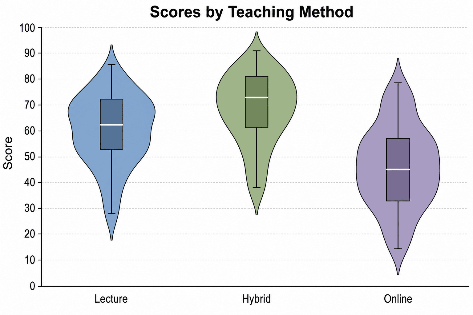
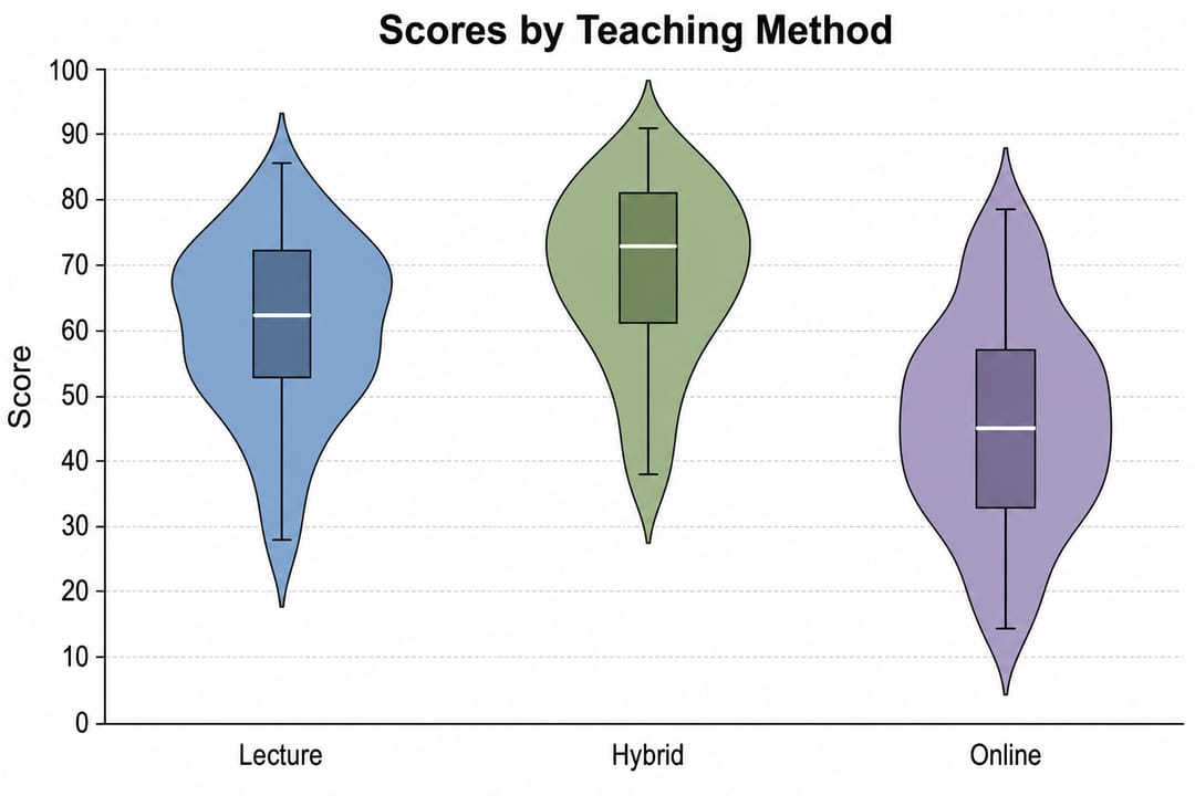
That makes it suitable when the statistics already exist and the remaining job is to map a clean table into a forest plot, Kaplan–Meier curve, violin plot, volcano plot, Manhattan plot, UpSet plot, or another supported figure.
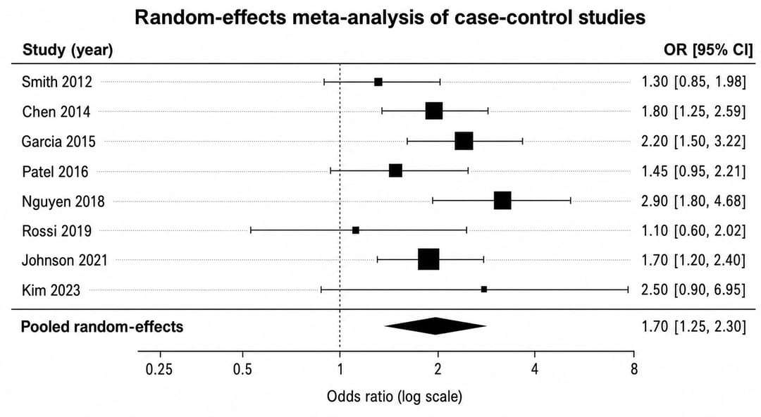
Use it when: collaborators need a browser-based, no-code path from a prepared table to a customizable figure.
Do not use it as a substitute for: nonlinear regression, hypothesis testing, peak fitting, signal processing, GWAS, survival-model estimation, or any other upstream analysis. Run and document those calculations in an appropriate statistical environment, then visualize the reviewed output.
Explore the scientific data visualization guide or open a specific tool such as the Forest Plot Generator, Violin Plot Maker, or Q-Q Plot Maker.
2. R and RStudio: for reproducible statistics and publication workflows
R is a strong choice when code, packages, and reports should capture the complete path from raw data to analysis and figure. The free open-source edition of RStudio provides an editor, data viewer, debugging, project management, Git integration, and support for Quarto and R Markdown (RStudio official overview).
The tradeoff is learning and maintaining code. Package versions, environments, plotting themes, and data transformations must be managed deliberately. For a lab that repeats analyses or needs exact regeneration, that overhead often produces a better audit trail than manual editing.
Use it when: you need reproducible statistics, domain packages, scripted batch processing, or publication documents generated from the same analysis.
Consider another option when: occasional users only need to turn a reviewed table into a standard chart and do not have programming support.
3. Python, Jupyter, and Matplotlib: for programmable custom workflows
Matplotlib supports static, animated, and interactive visualizations, publication-quality output, extensive customization, and multiple export formats. Jupyter combines code, narrative, equations, and rich output in shareable computational documents and supports many programming languages.
Python is especially useful when visualization belongs inside a larger pipeline for data engineering, simulation, machine learning, image processing, or automated reporting. The ecosystem can reproduce most plotting tasks and extend far beyond a desktop graphing application.
Use it when: the same code should clean data, calculate results, generate many figures, and integrate with other systems.
Consider another option when: the team lacks Python expertise or needs a tightly guided statistical interface rather than a general programming environment.
4. SciDAVis: for an open-source desktop scientific GUI
SciDAVis organizes tables, matrices, 2D and 3D plots, notes, and scripts in projects. Its official feature summary lists column and row statistics, convolution and deconvolution, FFT-based filters, linear and nonlinear fitting, multi-peak fitting, and export formats including PNG, EPS, PDF, and SVG.
The interface model is closer to a traditional scientific desktop application than a notebook or browser chart tool. However, teams should test current platform compatibility, file exchange, documentation, and maintenance expectations against their environment before standardizing on it.
Use it when: an open-source desktop worksheet-and-plot workflow is more important than a modern browser interface or a large programming ecosystem.
Consider another option when: you need OriginPro-specific Apps, institutional support, or highly specialized current analysis modules.
5. GraphPad Prism: for guided biostatistics and biomedical figures
Prism combines structured data tables, guided statistical choices, nonlinear regression, power and sample-size tools, and scientific graphing. The official feature page lists tests and workflows such as t tests, ANOVA, nonparametric comparisons, multiple-testing procedures, and estimation plots (GraphPad Prism features).
On August 31, 2026, GraphPad listed personal academic subscriptions at $260 per year, student subscriptions at $142 per year, corporate subscriptions at $520 per year, and a $50 monthly option. Prism 11 perpetual licenses were $1,600 academic and $3,200 corporate (GraphPad pricing).
Use it when: your work fits Prism's guided biostatistical model and biomedical graph conventions.
Consider another option when: you need OriginPro-style signal processing, extensive engineering workflows, fully scripted pipelines, or only a lightweight last-mile chart editor. See the detailed GraphPad Prism alternatives comparison.
6. Excel, LibreOffice Calc, or another spreadsheet: for familiar basic charts
Spreadsheet tools are often already approved by an institution and are useful for inspecting tables, applying formulas, making straightforward line, scatter, bar, and combination charts, and handing a workbook to collaborators. They can be a pragmatic choice for small, transparent workflows.
Their flexibility also creates risk: copied formulas, manual range selection, hidden rows, and one-off formatting can be hard to audit. Specialized scientific charts, uncertainty displays, statistical models, and batch regeneration may require add-ins or a separate analysis tool.
Use them when: the dataset and chart are simple, the team already works in spreadsheets, and the calculation trail is documented.
Consider another option when: the analysis is specialized, figures must be regenerated at scale, or manual workbook state would be difficult to review.
Which workflow fits which job?
- Choose OriginPro when its integrated fitting, peak analysis, signal processing, templates, or Apps are central and the licensing cost is justified.
- Choose R or Python when reproducibility, automation, custom methods, and a broad package ecosystem outweigh the learning curve.
- Evaluate SciDAVis when you want an open-source scientific desktop GUI and its current feature set covers your analyses.
- Evaluate Prism when guided biostatistics and biomedical graphing match the study designs your lab uses most.
- Use SciVis when the calculations are already complete and the bottleneck is creating and refining a supported scientific chart from CSV or Excel.
- Use a spreadsheet for uncomplicated, reviewable tables and charts—not as an invisible substitute for a statistical pipeline.
Many labs will use two tools. A defensible pattern is to analyze in R, Python, Prism, or OriginPro; export a tidy result table with units and provenance; create the figure in a chart-focused tool; and archive both the analysis record and the exact plotted data.
FAQ
Is there a free equivalent to OriginPro?
There is no single free tool with an identical set of OriginPro features. R, Python/Jupyter, and SciDAVis cover different portions of the workflow. Compare your required fitting, signal processing, statistics, graph types, import formats, automation, and support needs before migrating.
Can SciDraw replace OriginPro?
Only for a limited last-mile plotting workflow. SciVis can turn prepared CSV or Excel data into supported scientific charts and refine their presentation, but it does not replace OriginPro's statistical analysis, curve and surface fitting, peak fitting, or signal processing.
Is R or Python better than OriginPro?
They offer a different tradeoff. Code-based workflows provide broad extensibility and reproducibility, while OriginPro provides an integrated scientific desktop interface and vendor-supported analysis tools. The better fit depends on methods, skills, collaboration, and validation requirements.
What should I preserve when moving away from OriginPro?
Archive the raw data, cleaned tables, transformations, analysis settings, fitted models, statistical output, graph templates, exact plotted values, software versions, and export files. Reproduce several representative projects before retiring an existing workflow.
Sources and review date
Product capabilities and public prices were checked against vendor or project pages on August 31, 2026. Pricing and feature sets change; verify the current terms with each provider before purchasing or standardizing a lab workflow.