在生醫與生命科學領域中,GraphPad Prism 憑藉著將生物統計與圖表繪製整合於單一桌面端工作流的優勢,成為許多實驗室的標配。然而,這款軟體的授權費用相當高昂:根據 GraphPad 目前公佈的定價,個人學術年費訂閱價格為 260 美元,此外還提供學生版、團隊版、企業版及買斷制(perpetual)等方案。對於只需要其中部分功能(例如僅需繪圖或僅需統計)的科研人員來說,免費的統計環境、專業的數據分析套件,或是基於瀏覽器的線上繪圖工具,或許是更具性價比且高效的選擇。
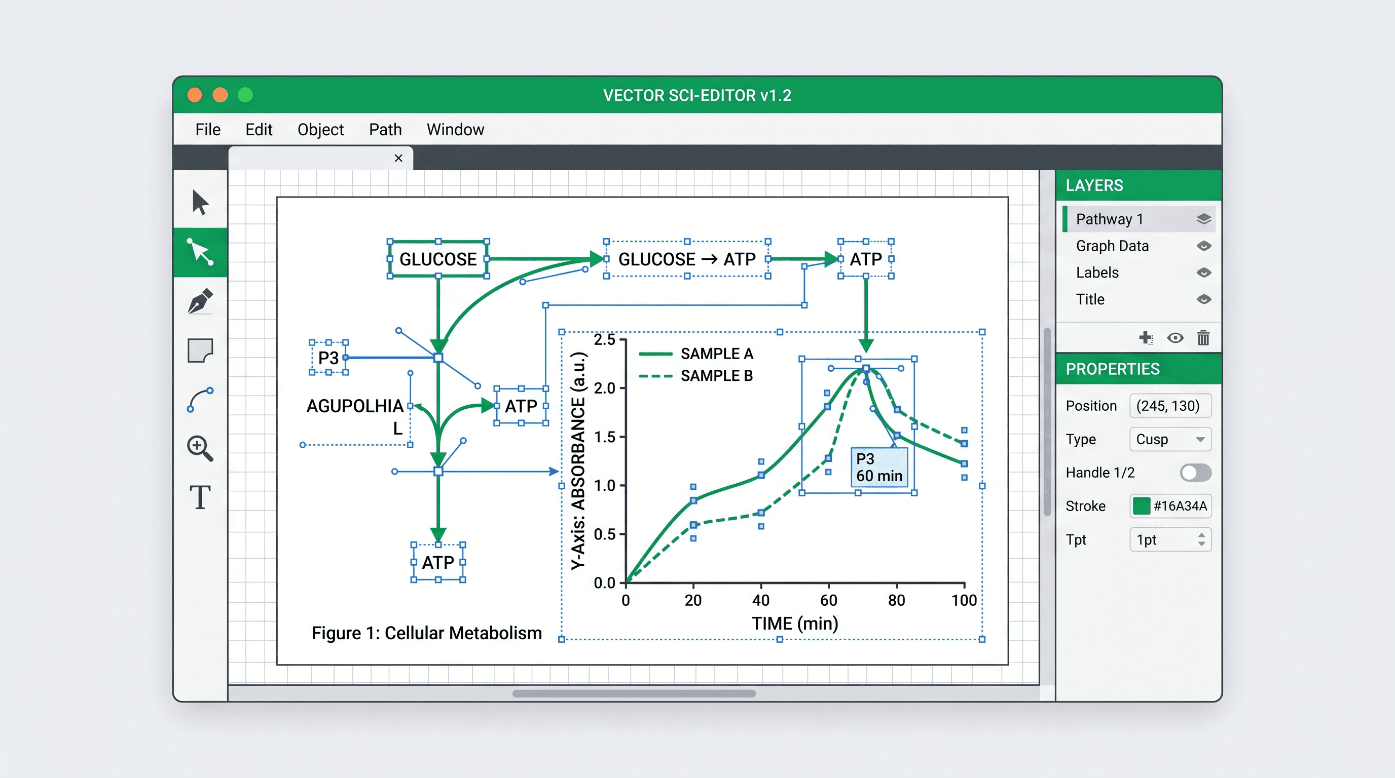
本指南將為您釐清三個經常被混淆的科研需求:計算統計數據、將現有的結果表格轉化為圖表,以及繪製論文中與數據圖並排的示意圖(schematic figures)。目前市面上並沒有任何單一工具能在這三方面同時做到完美。
透過本指南,您將掌握:
- Prism 的核心優勢與局限(明確您想替代的具體功能)
- 7 款實用的 Prism 替代方案(涵蓋開源工具與商業軟體)
- 基於分析能力、程式碼需求、插圖繪製與授權模式的綜合對比
- AI 輔助繪圖工具如何幫助忙碌的科研人員
- 常見問題解答(FAQ),解決您在轉換工具時的疑慮
為什麼科研人員開始尋找 Prism 的替代方案?
GraphPad Prism 是專為生物醫學研究設計的工具,其最大價值在於將統計檢定、曲線擬合(curve fitting)、存活分析(survival analysis)與圖表輸出緊密結合。如果您需要這種高度整合的工作流,它確實無可替代。但如果您面臨以下需求,則可能需要尋找其他工具:實驗室需要可重複驗證的程式碼(reproducible code)、需要 Linux 系統支援、需要更進階的工程數據分析、預算有限、希望從已完成的表格中更快速地生成圖表,或者需要繪製 Prism 無法勝任的學術示意圖。
本篇評估中所涉及的價格與產品細節,均已於 2026 年 8 月 31 日對照官方頁面進行核對,包含 GraphPad 購買頁面 與 OriginLab 產品概述。軟體售價可能會因地區、身份資格、授權類型及稅率而有所不同,購買前請務必確認最新報價。
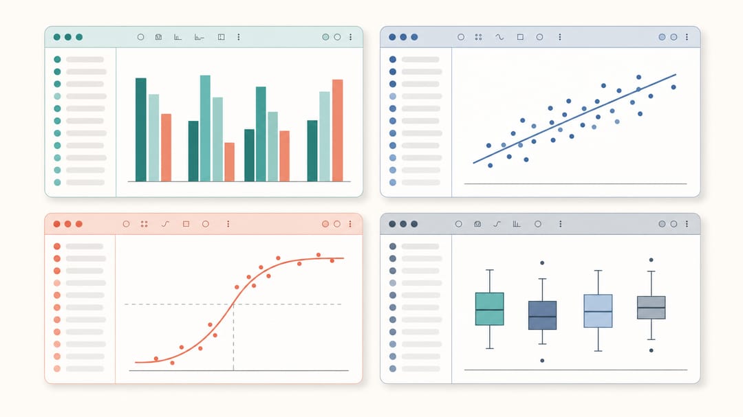 從圖形介面(GUI)統計套件到程式碼編寫環境,每款替代工具都適合不同的科研工作流。
Prism 與 7 款替代方案快速對比
| 工具 | 主要定位 | 是否內建分析功能 | 是否需要編寫程式碼 | 授權模式 |
|---|---|---|---|---|
| GraphPad Prism | 引導式生醫統計 + 繪圖 | 是 | 否 | 商業授權 |
| R / ggplot2 | 可重複性統計 + 客製化圖表 | 透過 R 套件實現 | 是 | 開源免費 |
| Python / Matplotlib + Seaborn | 程式化分析 + 資料視覺化 | 透過 Python 套件實現 | 是 | 開源免費 |
| JASP | 引導式傳統統計 + 貝氏統計 | 是 | 否 | 開源免費 |
| OriginPro | 整合型工程與實驗室數據分析 | 是 | 否 | 商業授權 |
| SciDAVis | 桌面端工作表、擬合與繪圖 | 內建部分分析工具 | 可選 | 開源免費 |
| SciDraw AI | 快速生成 CSV/Excel 圖表 + 學術示意圖 | 否 | 否 | 試用點數 + 付費方案 |
| BioRender | 學術示意圖與生物圖示繪製 | 否 | 否 | 教育免費版 + 付費發表方案 |
1. GraphPad Prism(業界標竿)
費用: 個人學術訂閱版每年 260 美元;個人企業訂閱版每年 520 美元;另有學生版、團隊版、按月訂閱及買斷制等方案。
Prism 的核心優勢在於其工作流的高度整合:統計分析與圖表輸出緊密連動。當您運行單因子變異數分析(ANOVA)時,對應的長條圖會自動同步更新。單變數統計、存活分析和非線性迴歸等操作,基本上都能一鍵完成。
優點:
- 統計分析與圖表輸出高度連動
- 內建豐富的曲線擬合(curve-fitting)資料庫
- 提供專為生醫設計的圖表類型與引導式分析流程
- 擁有完善的官方說明文件與龐大的使用者社群
缺點:
- 大多數使用者需採用訂閱制;買斷制授權的前期投入成本極高
- 與 ggplot2 相比,圖表客製化的自由度較受限
- 不支援 Linux 原生系統
- 如果只需要繪圖而不需要統計功能,顯得大材小用
最適合: 需要在同一工具中完成統計與繪圖的生物學、藥理學等實驗室第一線科研人員。
2. R / ggplot2
費用: 免費(開源)
對於需要發表高水平論文的科研人員來說,R 語言搭配 ggplot2 可能是最強大的 免費 GraphPad 替代方案。其「圖形語法(grammar of graphics)」設計讓您可以精準控制每一個視覺細節——包含字型、大小、顏色、分面排版(facet layout)與主題,並能輸出任何解析度的印刷級 PDF 或 SVG 向量圖。
搭配 ggpubr、rstatix 和 ggsignif 等擴充套件,可以輕鬆繪製出類似 Prism 風格的顯著性標記線與自動統計檢定標註;而 cowplot 則能完美處理多合一拼圖(multi-panel figure)的排版。
優點:
- 完全免費且開源
- 近乎無限的客製化空間
- 具備極佳的可重複性(程式碼即代表可被稽核的圖表)
- 龐大的生態系與套件庫(如 Bioconductor 等)
- 可輸出任意 DPI 的 SVG/PDF 向量圖
缺點:
- 對於沒有程式背景的人來說,學習曲線非常陡峭
- 缺乏直觀的圖形介面(GUI)來輸入統計資料
- 偵錯(debugging)程式碼較為耗時
最適合: 計算生物學家、生物統計學家,以及極度重視研究可重複性(reproducibility)的科研人員。
3. Python / Matplotlib + Seaborn
費用: 免費(開源)
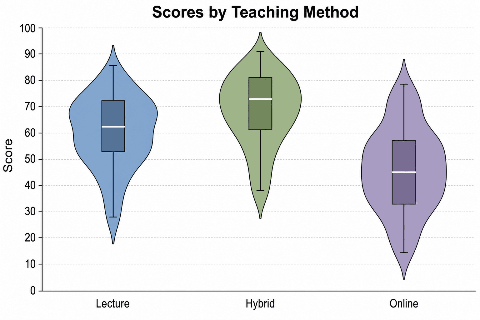
Python 是目前數據科學領域的首選腳本語言,而 matplotlib 搭配 seaborn 幾乎可以涵蓋您在 Prism 中製作的所有統計圖表類型。Seaborn 簡化了小提琴圖(violin plots)、熱圖(heatmaps)和成對關係圖(pair grids)的繪製;statannotations 則能幫您加上顯著性標記。
搭配 Jupyter Notebook,能讓數據分析過程具備互動性且易於分享,非常適合需要協同合作的實驗室團隊。
優點:
- 免費且在大學學術界普及率極高
- 與 Pandas、SciPy、scikit-learn 等數據科學套件無縫整合
- 對熱圖與多圖排版(multi-panel)的支援度極佳
- Jupyter Notebook 格式便於重現與分享成果
缺點:
- Matplotlib 的預設美學風格需要花時間調整
- 開箱即用的精緻度略遜於 ggplot2
- 需要具備一定的程式編寫能力
最適合: 已經使用 Python 進行數據處理,或研究領域涉及機器學習(ML)的實驗室。
4. JASP
費用: 免費(由阿姆斯特丹大學開發的開源軟體)
JASP 提供直觀的點選式(point-and-click)操作介面,涵蓋了傳統(frequentist)統計與貝氏(Bayesian)統計分析,並能直接輸出美觀、符合 APA 格式的報告表格。雖然它並非定位為專業繪圖工具,但其生成的圖表乾淨俐落,非常適合用於論文的補充材料(supplementary figures)。
優點:
- 完全免費,無任何隱藏限制
- 將貝氏分析(Bayesian analysis)列為核心功能
- 能直接輸出排版美觀的分析結果表格
- 非常適合心理學與社會科學研究
缺點:
- 圖表客製化功能較為有限
- 並非專為實驗室常見圖表(如劑量反應曲線、存活曲線)而設計
- 缺乏腳本/程式碼控制介面
最適合: 心理學、社會科學研究者,以及需要使用貝氏統計來替代傳統 ANOVA/t 檢定的科研人員。
5. OriginPro
費用: 依地區與身份資格而異;目前北美商業版商店中,OriginPro 2026b 的個人單機鎖定版(node-locked)年費為 755 美元,或買斷授權 2,360 美元。
OriginPro 是 Prism 在商業軟體中最直接的競爭對手。它在工程學與光譜數據分析(如訊號處理、3D 曲面圖、峰值擬合)方面實力更為雄厚,同時也完全能勝任生醫圖表的繪製。使用者還可以透過 OriginLab App Center 下載社群開發的擴充套件。
優點:
- 極適合處理複雜的實驗室儀器數據
- 對 3D 圖與等高線圖(contour plots)的支援度極佳
- 可透過 LabTalk 腳本進行強大的自動化操作
- 提供買斷制(perpetual)授權選項
缺點:
- 商業授權費用昂貴
- 採用 Windows 優先的桌面端工作流;Mac 使用者需自行確認目前支援的虛擬環境配置
- 學習曲線比 Prism 更為陡峭
最適合: 工程學實驗室、物理學家、化學家與光譜學研究人員。
6. SciDAVis
費用: 免費且開源
SciDAVis 是一款傳統的桌面端科研繪圖軟體,其專案架構圍繞著數據表、矩陣、2D/3D 圖表、筆記以及可選的腳本功能展開。根據官方功能介紹,它支援行列統計、基於 FFT 的濾波器、線性與非線性擬合、多峰擬合,並支援匯出 PNG、EPS、PDF 和 SVG 等格式。
優點:
- 開源的桌面端應用程式
- 工作表與專案管理模式符合傳統科研 GUI 軟體使用者的習慣
- 內建實用的數據分析與曲線擬合功能
- 同時支援點陣圖與向量圖格式匯出
缺點:
- 在將其定為實驗室標準工具前,團隊需自行測試其在不同作業系統上的相容性與檔案交換穩定度
- 社群生態與技術支援規模遠小於 R 或 Python
- 無法完全替代 Prism 的所有分析功能與工作流
最適合: 偏好開源桌面端圖形介面,且其研究所需的分析方法已涵蓋在該軟體現有工具集中的研究人員。
7. SciDraw AI
費用: 付費方案每月 20 美元起,含每月 300 點數;一次性點數包 9.90 美元起(100 點數),且永不過期。每張 SciVis 圖表需消耗 10 點數。註冊即贈送 10 點數,免費帳號每天可領 5 點數且當日失效,因此免費額度僅足以試用,無法支撐長期作圖需求
SciDraw 目前涵蓋了學術發表工作流中兩個緊密相鄰的環節。首先,SciVis 支援匯入 CSV、TSV、TXT、XLSX 或 XLS 數據,並能透過 Python 渲染技術生成 46 種專業的科研圖表。使用者可以透過對話指令進一步微調細節,並匯出為 PNG、PDF、EPS、TIFF 格式,甚至能匯出為可在 Excel 中直接編輯的原始圖表檔案。其次,其學術示意圖生成器則專門用於繪製實驗流程圖、信號通路圖、解剖構造圖以及概念模型圖。
這使得 SciDraw 在您「已經完成統計分析,下一步需要將結果視覺化」時顯得格外實用。例如,您可以將差異表達分析表直接匯入火山圖生成器;將效應量估計與信賴區間匯入森林圖生成器;將存活分析數據匯入卡普蘭-麥爾估計圖生成器;或將分析結果匯入劑量反應曲線生成器。需要注意的是,SciDraw 本身並不幫您計算底層的統計模型。
優點:
- 無需任何程式編寫或設計基礎
- 支援匯入 CSV 與 Excel 數據,提供 46 種圖表工作流
- 基於 Python 渲染,生成後可透過無程式碼(no-code)視覺化調整
- 可在同一平台上同時繪製數據圖與學術示意圖
- 支援匯出期刊發表格式,以及可在 Excel 中二次編輯的原始圖表
- 內建論文圖表品質檢查工具
- 註冊贈送的點數足以在付費前完整試用圖表工作流
- 有助於在整篇論文中保持視覺風格的一致性
缺點:
- 無法取代統計檢定、迴歸模型、存活率估算或統合分析(meta-analysis)軟體
- 生成的圖表與 AI 插圖仍需經過科研人員的人工專業審核
- 與客製化的 R 或 Python 工作流相比,程式碼層級的微調自由度較低
最適合: 已經擁有乾淨的數據結果表格,希望在不寫程式的情況下快速製作或美化論文圖表的科研人員,特別是當該論文同時需要示意圖或圖形摘要(graphical abstracts)時。
8. BioRender
費用: 提供基礎教育版;截至 2026 年 8 月 31 日,學術個人版(Academic Individual)費用為每年 420 美元或每月 39 美元。
BioRender 專為繪製生物醫學領域的圖示化示意圖而設計,例如細胞結構、蛋白質構型和實驗流程圖。其免費版僅限於教學與教育用途;根據其現行條款,若要在學術期刊發表含有 BioRender 內容的圖表,必須訂閱符合資格的付費方案。其學術個人訂閱方案即包含期刊發表授權。
優點:
- 內建極為豐富的生物學圖示庫(包含胞器、細胞、實驗儀器等)
- 視覺風格乾淨且高度統一
- 基於網頁端,無需安裝任何軟體
缺點:
- 發表學術期刊必須使用符合資格的付費授權
- 無法用於繪製數據圖表或進行統計分析
- 由於範本固定,不同論文中的插圖容易顯得千篇一律
最適合: 細胞生物學、免疫學、神經科學等需要大量生物學圖示與示意圖的研究領域。
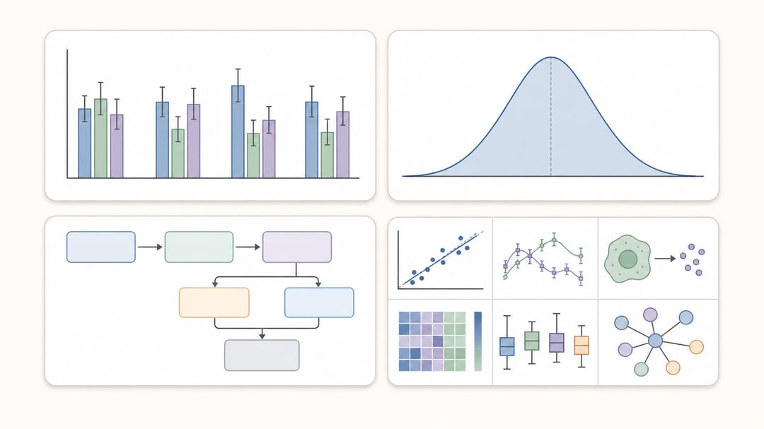 輸出品質涵蓋了數據驅動的圖表、乾淨的實驗示意圖以及統計學視覺效果。
核心功能對決:圖表輸出品質與成本對比
| 工具 | 支援匯入數據表 | 內建統計分析 | 無程式碼繪圖 | 繪製學術示意圖 | 典型輸出格式 |
|---|---|---|---|---|---|
| GraphPad Prism | 是 | 是 | 是 | 否 | 點陣圖 + 向量數據圖 |
| R / ggplot2 | 是 | 透過 R 套件 | 否 | 否 | SVG/PDF/PNG 等 |
| Python / matplotlib | 是 | 透過 Python 套件 | 否 | 否 | SVG/PDF/PNG 等 |
| JASP | 是 | 是 | 是 | 否 | 分析表格 + 統計圖 |
| OriginPro | 是 | 是 | 是 | 否 | 工程/科研數據圖 |
| SciDAVis | 是 | 內建部分工具 | 是 | 否 | 科研桌面端圖表 |
| SciDraw AI | CSV/TSV/Excel | 否 | 是 | 是 | PNG/PDF/EPS/TIFF/可編輯 XLSX |
| BioRender | 否 | 否 | 否 | 是 | 生物學示意圖 |
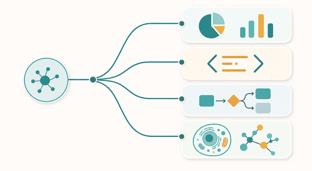 根據您的首要需求——統計、程式編寫、示意圖或生物圖示——選擇最合適的工具。
如何選擇最適合您的 Prism 替代方案?
如果您手上有原始數據,且需要進行統計檢定與繪圖: R/ggplot2 是最強大的免費替代方案。雖然它的學習曲線較陡,但非常值得投資。如果您的實驗室已經在使用 Python,那麼 Python/matplotlib 是更好的選擇。而當您需要引導式的生醫統計工作流時,Prism 依然具有其獨特吸引力。
如果您需要圖形介面且不想寫程式: 進行傳統與貝氏統計分析可選擇 JASP;進行工程與物理科學的整合分析可選擇 OriginPro;若開源桌面端工具已能滿足您的分析需求,則可選擇 SciDAVis。
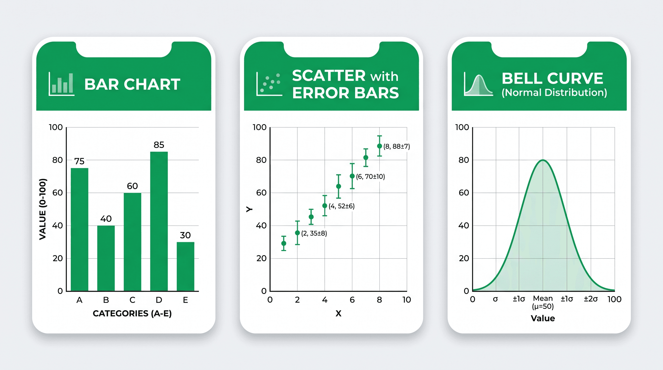
如果您已經完成分析,只想在不寫程式的情況下製作可編輯的圖表: 直接將結果表格上傳至 SciVis,或直接使用專屬的圖表生成器,例如盒鬚圖生成器、小提琴圖生成器或散佈圖生成器。
如果您同時需要繪製流程圖、示意圖與插圖: SciDraw 完美填補了 Prism、R 和 Python 在示意圖繪製上的空白。您可以使用學術示意圖生成器來繪製示意圖面板,並在投稿前使用圖表品質檢查工具進行確認。
如果您需要生物學專用的圖示素材: BioRender 是為此工作流量身打造的工具;但在將其內容用於論文發表前,請務必確認您目前的方案是否擁有發表授權。
常見問題解答 (FAQ)
是否有完全免費的 GraphPad Prism 替代方案? 有的。R 語言搭配 ggplot2,以及 Python 搭配 matplotlib/seaborn 都是完全免費的,且能製作出達到發表等級的圖表。JASP 則提供完全免費的統計分析功能。SciDraw 則無法長期免費使用:註冊贈送 10 點數,免費帳號每天可領 5 點數且當日失效,而每張圖表需消耗 10 點數,付費方案為每月 20 美元起。此外,它也不能取代統計分析軟體。
在生醫研究中,我可以用 R 語言完全取代 Prism 嗎?
對於絕大多數圖表類型(如條形圖、散佈圖、盒鬚圖、存活曲線、劑量反應曲線)來說,答案是肯定的。透過 ggpubr、survival 和 drc 等套件,可以重現 Prism 最常用的分析功能。主要的權衡在於您需要投入時間學習 R 語言。
哪款工具最適合用來繪製論文「方法(Methods)」章節的流程圖? SciDraw AI 和 BioRender 是專為此類工作流設計的。如果您沒有設計背景,但希望利用 AI 生成專業的示意圖,可以從學術示意圖生成器開始。
GraphPad Prism 支援 Linux 系統嗎? 根據 GraphPad 目前公佈的 Prism 11 系統需求,該軟體僅支援 Windows 和 macOS,並未提供原生 Linux 版本。使用 Linux 系統的實驗室可以評估 R、Python、JASP 或 SciDAVis 是否能滿足其分析需求。
製作鐘形圖 / 常態分佈圖最好的免費工具是什麼? SciDraw AI 上的鐘形圖生成器可以立即生成乾淨、帶有標籤的常態分佈圖,無需進行任何複雜設定。
SciDraw AI 可以完全取代 Prism 嗎? 無法完全取代。SciDraw 可以將整理好的 CSV 或 Excel 結果表格轉化為圖表,並能繪製 Prism 無法處理的學術示意圖。但它無法取代 Prism 的統計檢定、曲線擬合或分析模型。在實際科研中,一個合理且嚴謹的工作流是:先在 Prism、R、Python、JASP 或其他經過驗證的軟體中計算並確認統計結果,接著在需要快速生成與美化發表圖表時,使用 SciDraw 來提升視覺呈現效果。