Kostenloser Q-Q-Diagramm-Maker
Kostenloser Q-Q-Diagramm-Maker aus Versuchs- und Forschungsdaten erzeugen
Erstellen Sie Normales Q-Q-Diagramm (gute Passung) mit Q-Q-Diagramm-Maker aus CSV oder Excel. Python-Darstellung, SciVis-Bearbeitung und Export sind enthalten.
Wissenschaftliches Diagramm erstellen
Ziehen Sie eine Datendatei hierher oder klicken Sie zum Hochladen
CSV, TSV, TXT, Excel · Max. 5MB
Vorschau
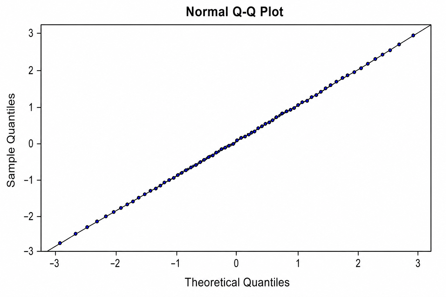 Beispiel
Die Vorschau verwendet den gewählten Beispieldatensatz. Erzeugen Sie sie mit Python neu oder laden Sie eigene Daten hoch.
Beispiele und Datensätze für Q-Q-Diagramm-Maker
Öffnen Sie ein Beispiel, prüfen Sie die Grafik, laden Sie die CSV herunter oder übernehmen Sie dieselben Daten in den Generator.
Was zeigt Q-Q-Diagramm-Maker?
Q-Q-Diagramm-Maker überführt strukturierte Forschungsdaten in die statistische Darstellung, für die dieser Diagrammtyp gedacht ist. Geeignet ist er unter anderem für Normales Q-Q-Diagramm (gute Passung) und Rechtsschiefes Q-Q-Diagramm; Python erzeugt die reproduzierbare Erstfassung, SciVis übernimmt die visuelle Nachbearbeitung.
Datenanforderungen für Q-Q-Diagramm-Maker
- Beispielhafte Felder: quantile_rank, theoretical_quantile, observed_quantile, sample, lower_95, upper_95.
- Eine Zeile steht für eine Beobachtung, Kategorie, einen Zeitpunkt oder ein gültiges Paar.
- Messwerte werden numerisch gespeichert; Einheiten gehören in den Spaltennamen.
- Leere Zellen gelten als fehlend; Summenzeilen und Notizen sollten vor dem Upload entfernt werden.
Forschungsbeispiele für Q-Q-Diagramm-Maker
- Normales Q-Q-Diagramm (gute Passung)
- Rechtsschiefes Q-Q-Diagramm
- Q-Q-Diagramm mit schweren Rändern
- Q-Q-Diagramm der Regressionsresiduen
- Zwei-Stichproben-Q-Q-Diagramm
- Q-Q-Diagramm mit Konfidenzband
Warum Q-Q-Diagramm-Maker für Forschungsdaten nutzen?
- Prüfen Sie die Feldzuordnung zunächst mit dem enthaltenen Beispiel Normales Q-Q-Diagramm (gute Passung).
- Übertragen Sie die visuelle Struktur von Rechtsschiefes Q-Q-Diagramm auf einen vergleichbaren Datensatz.
- Nutzen Sie die Python-Darstellung, ohne Plot-Code selbst zu schreiben oder zu debuggen.
- Lassen Sie die erzeugten Werte unverändert und verfeinern Sie Beschriftung, Farben und Export in SciVis.
So verwenden Sie Kostenloser Q-Q-Diagramm-Maker
Wählen Sie ein Beispiel oder laden Sie eine CSV-, TSV-, TXT-, XLSX- oder XLS-Datei hoch. Prüfen Sie die erkannten Spalten, erzeugen Sie das Diagramm und bearbeiten Sie es in SciVis. Bei Excel wird das erste Tabellenblatt verwendet.
Merkmale einer gut lesbaren Darstellung mit Q-Q-Diagramm-Maker
- Achsen, Gruppen oder Knoten werden konsistent aus quantile_rank, theoretical_quantile, observed_quantile, sample, lower_95, upper_95 abgeleitet.
- Der Titel nennt Ergebnis oder Vergleich, den Q-Q-Diagramm-Maker zeigt.
- Beschriftungen, Einheiten, Legenden und methodisch nötige Referenzlinien bleiben gut lesbar.
- Zurückhaltende Farben und ausreichende Auflösung eignen sich für Paper, Poster und Folien.
Q-Q-Diagramm-Maker oder Histogramm-Maker?
Wählen Sie Q-Q-Diagramm-Maker, wenn Datenstruktur und Forschungsfrage zu dieser statistischen Darstellung passen. Steht der alternative Vergleich im Mittelpunkt, ist Histogramm-Maker die passendere Wahl.
Häufige Fragen zu Kostenloser Q-Q-Diagramm-Maker
Welche Spalten benötigt Q-Q-Diagramm-Maker?
Die beigefügte CSV zeigt die empfohlene Struktur. Typische Felder sind quantile_rank, theoretical_quantile, observed_quantile, sample, lower_95, upper_95; gleichbedeutende Spaltennamen sind ebenfalls möglich.
Wann ist Q-Q-Diagramm-Maker besser geeignet als Histogramm-Maker?
Verwenden Sie Q-Q-Diagramm-Maker für die statistische Beziehung, die dieser Diagrammtyp gezielt abbildet. Für den alternativen Vergleich eignet sich Histogramm-Maker.
Kann ich eine mit Kostenloser Q-Q-Diagramm-Maker erstellte Grafik weiter bearbeiten?
Ja. Öffnen Sie die mit Kostenloser Q-Q-Diagramm-Maker erzeugte Grafik in SciVis und ändern Sie Beschriftungen, Farben, Anmerkungen, Layout und weitere visuelle Einstellungen.
Kann ich Abbildungen aus Kostenloser Q-Q-Diagramm-Maker in einer Publikation verwenden?
Ja. Kostenloser Q-Q-Diagramm-Maker ist auf klare wissenschaftliche Abbildungen ausgelegt. Prüfen Sie vor der Einreichung dennoch alle Werte und die Vorgaben der Zeitschrift.
Kann Kostenloser Q-Q-Diagramm-Maker hochauflösende Grafiken ausgeben?
Ja. Nach der Bearbeitung einer Kostenloser Q-Q-Diagramm-Maker-Abbildung in SciVis können Sie sie passend für Artikel, Poster, Folien und Berichte exportieren.
Brauche ich Programmierkenntnisse für Kostenloser Q-Q-Diagramm-Maker?
Nein. Der geführte Upload in Kostenloser Q-Q-Diagramm-Maker erzeugt den ersten Entwurf; die Feinabstimmung erfolgt mit den visuellen Werkzeugen in SciVis.
So visualisieren Sie Ihre Forschungsdaten mit Kostenloser Q-Q-Diagramm-Maker
Erfahren Sie mehr über Diagrammauswahl, erforderliche Datenstruktur, Interpretation und wissenschaftliche Workflows, bevor Sie Ihre finale Abbildung für das Paper erstellen.
Weitere Tools entdecken
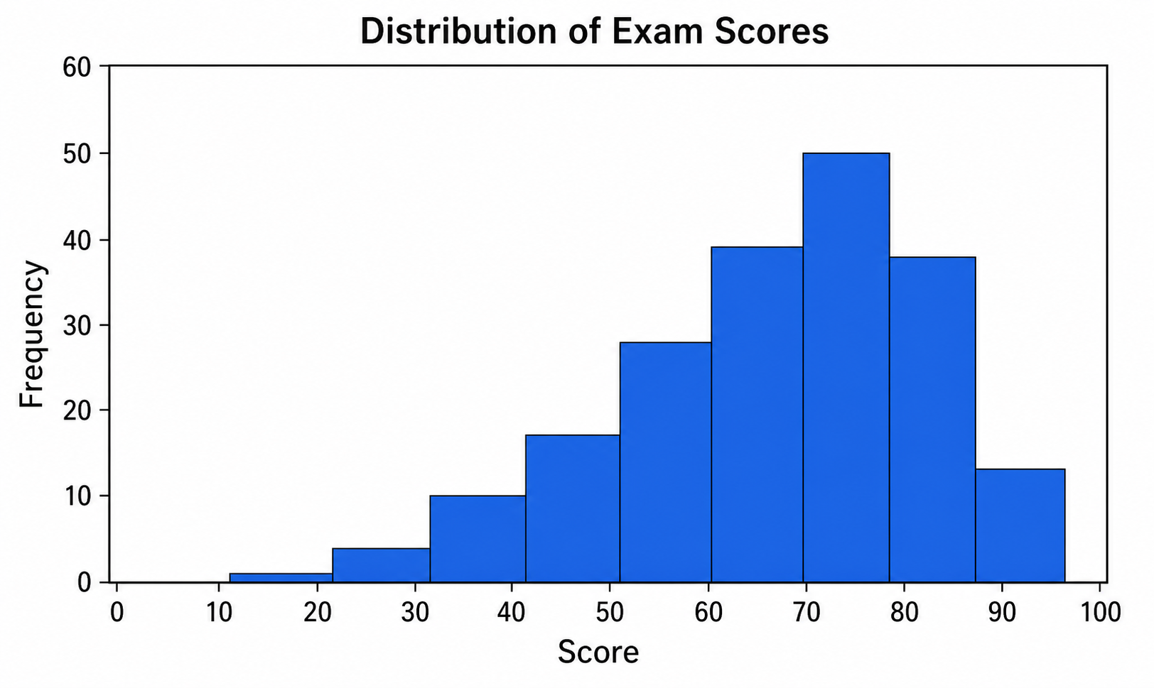
Histogramm-Maker
Nutzen Sie Histogramm-Maker für CSV- oder Excel-Daten und verfeinern Sie die mit Python erstellte Grafik in SciVis.
Kostenlos testen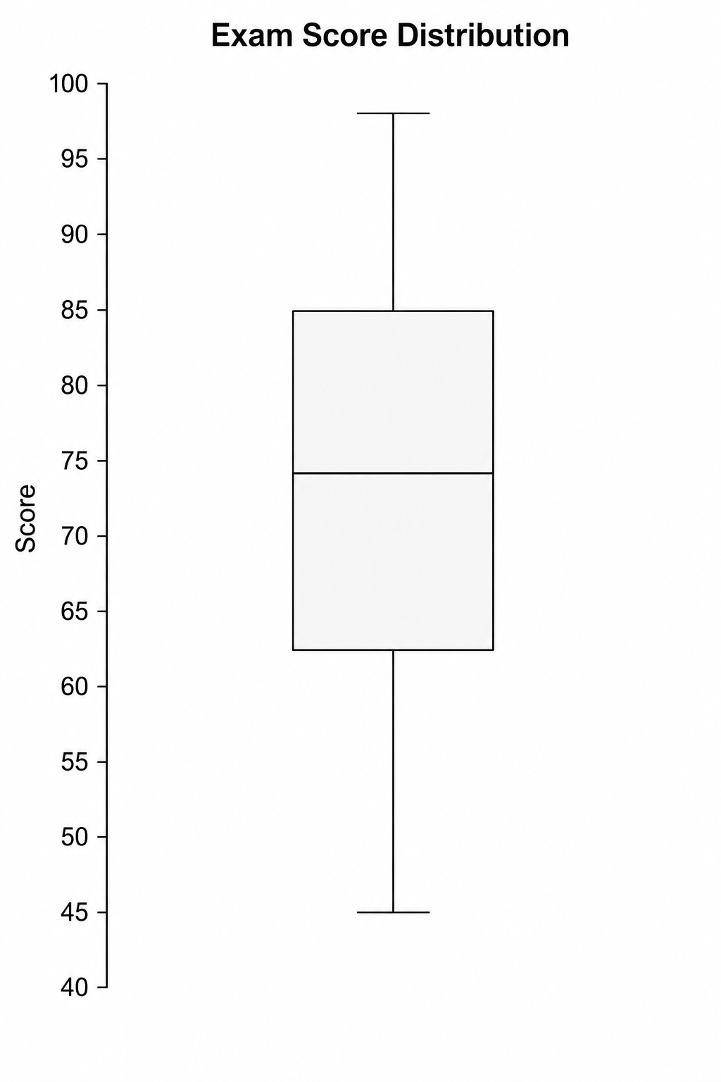
Boxplot-Maker
Nutzen Sie Boxplot-Maker für CSV- oder Excel-Daten und verfeinern Sie die mit Python erstellte Grafik in SciVis.
Kostenlos testen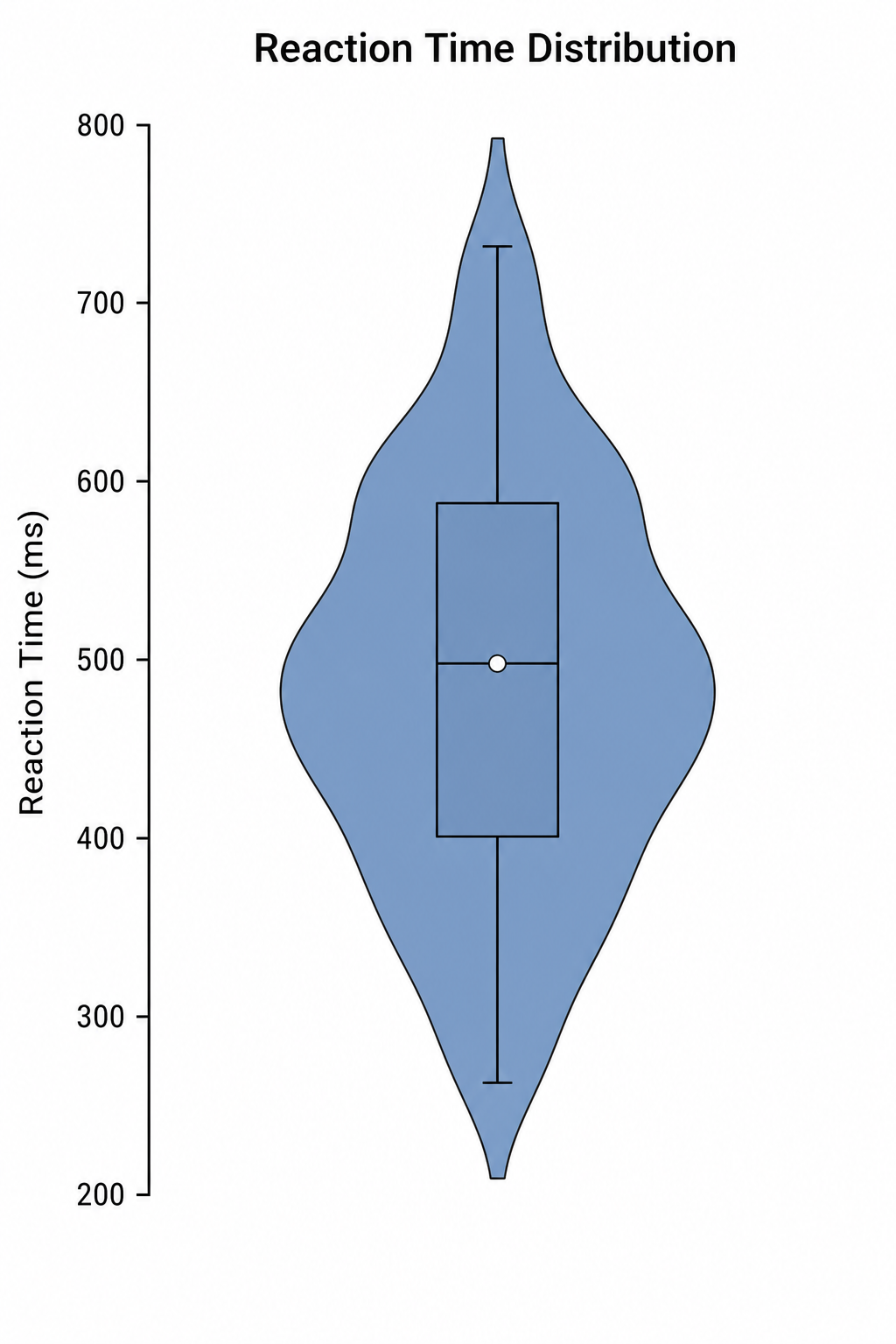
Violindiagramm-Maker
Nutzen Sie Violindiagramm-Maker für CSV- oder Excel-Daten und verfeinern Sie die mit Python erstellte Grafik in SciVis.
Kostenlos testenEine Abbildung mit Kostenloser Q-Q-Diagramm-Maker erstellen
Beginnen Sie mit Beispieldaten oder einer unterstützten Datendatei und stellen Sie die Abbildung in SciVis fertig.