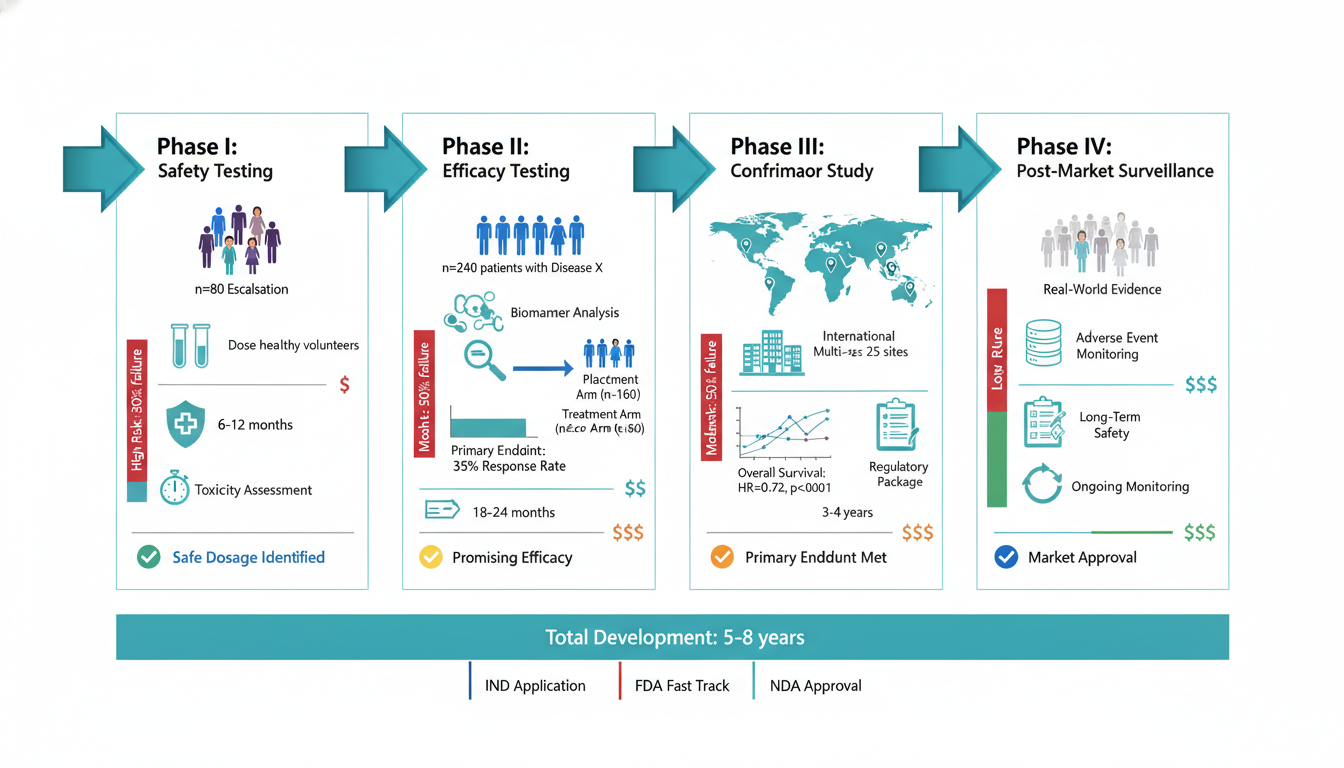
AI Textbook Illustrations and Medical Infographics: Explaining Science to Non-Specialists
How to compress complex science into visuals non-experts will actually read — textbook illustrations and medical infographics share one design playbook. Covers density rules, safe palettes, patient-education compliance, prompt templates, and FAQ.
Textbook illustrations and medical infographics look like different jobs — one goes inside a chapter, the other goes on a clinic wall or into a patient handout. But they share the same hard problem: the reader has no specialist background, and any missing label or wrong detail will cause real misunderstanding.
This article covers them together because they share a design playbook: how to compress a complex idea into a visual a non-expert will actually finish reading, without losing scientific accuracy. Prompt templates and FAQ at the end.
If you've made paper figures before, your first instinct will be to reuse that design language. It usually fails — too dense, too jargon-heavy, too high a barrier for students or patients.
The fundamental differences:
More Posts
Create your scientific figures with AI
Thousands of researchers use SciDraw AI to make publication-ready figures for papers, grants, and journal submissions — in minutes, with no design skills.
The most common failure mode is "textbook thinking" — packing all chapter content into one figure. Students see a wall of arrows and labels and remember nothing.
Reverse the instinct: one textbook illustration carries at most one core concept. If a chapter section has three concepts, make three illustrations. Don't make a "chapter overview" image.
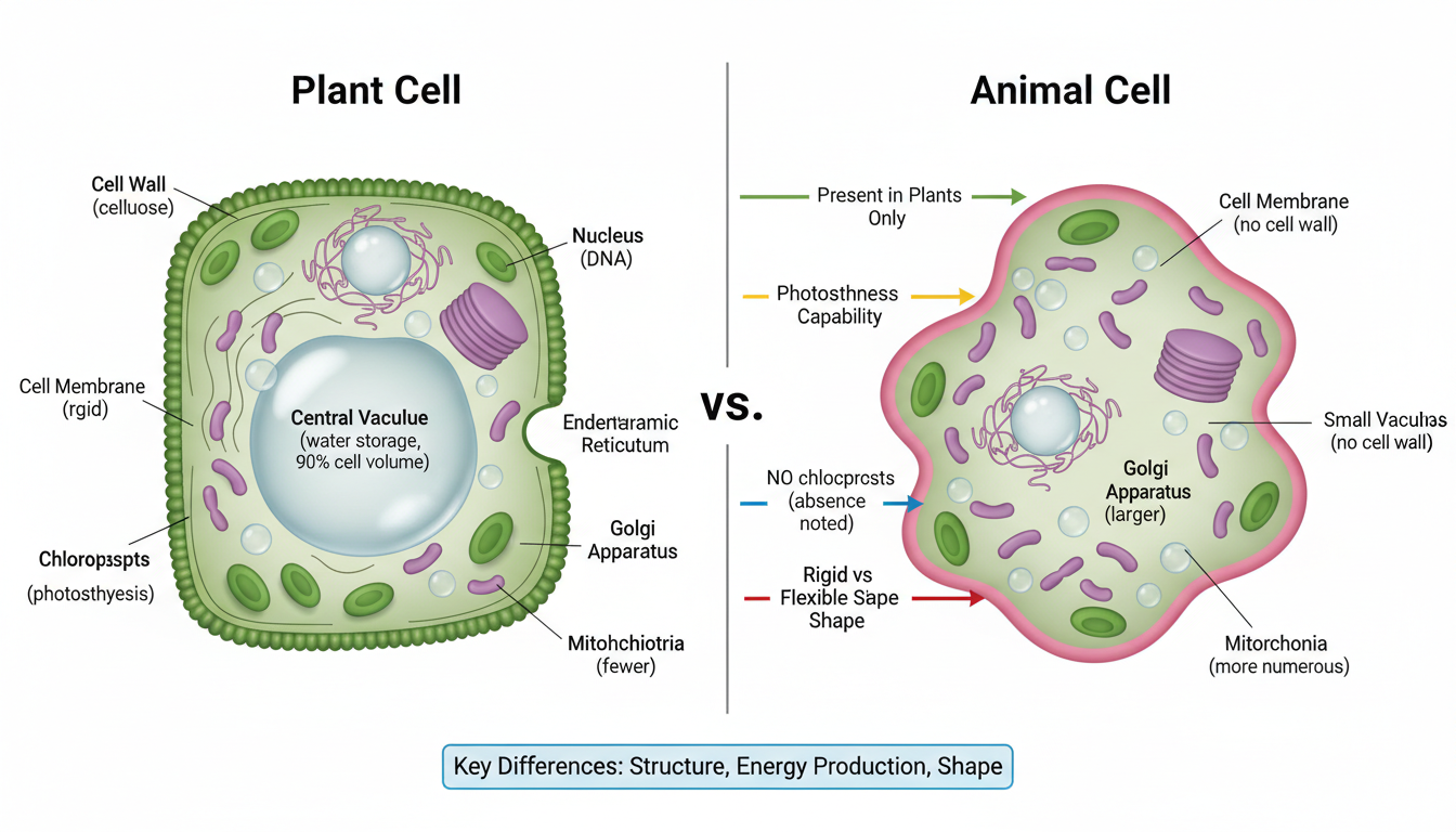
1. Comparison illustrations: A vs. B differences (cell types, healthy vs. diseased state, cross-species comparison)
Design rule: side-by-side or stacked, shape and color must distinguish the two from across the room. Don't rely on tiny labels.
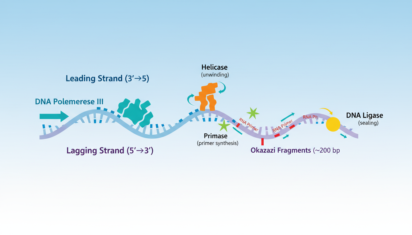
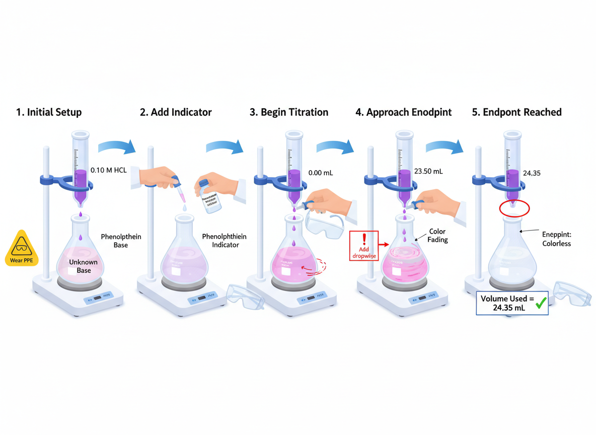
2. Process diagrams: stages of a dynamic process (photosynthesis, DNA replication, cell division)
Design rule: split the process into 3–5 stages, each as its own small image, connected by arrows. Don't superimpose all stages in one master image — students lose track of what happened in between.
Design rule: full external view first, then a "cut-away" or "zoom-in" showing internals, with proportions preserved. Don't draw a vessel bigger than the heart it sits in.
Create a textbook illustration for a science chapter.Target audience: undergraduate students with no specialized background.Concept: [one core concept, e.g., differences between plant and animal cells]Layout: [side-by-side comparison / staged process / cut-away anatomy]Style: clean educational illustration, soft warm colors (3-4 main colors), labeled in short nouns, generous whitespace for caption.Avoid: cluttered details, more than one concept, rainbow palette, photorealistic medical imagery.
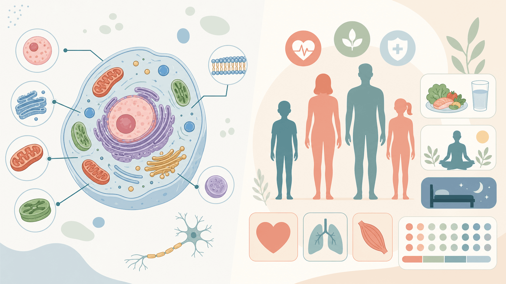
Medical infographics are harder than textbook illustrations because the reader is often emotionally compromised — newly diagnosed, holding test results, processing a surgical consent form. A poorly designed infographic in this state only adds anxiety.
Three main scenarios:
Patient education: explaining a condition, a treatment process, medication guidance
Clinical workflow diagrams: for clinicians and medical students
Public health communication: vaccines, infectious disease prevention, health habits
The most common failure is reusing medical textbook imagery — pathology slides, gross specimen photos, vascular dissection diagrams. These are fine in a professional context, but on a clinic wall or in a patient handout they cause unnecessary fear.
Design rules:
Avoid red and black as primary colors (red triggers blood/danger associations)
Avoid photorealistic organ pathology (use schematic illustrations instead)
Use second person ("you should…" rather than "the patient should…")
Critical steps as icon + short phrase, no jargon ("take medication daily" not "ensure consistent daily pharmacological compliance")
Use arrows for time order, not complex network graphs
Always include a clear "when to contact a doctor" callout — this is what patients care about most
Public health visuals live in subway stations, hallways, and social feeds. Readers give 5 seconds. Design logic is closer to a graphical abstract — one image, one call to action.
Design rules:
One image = one action ("get an annual checkup," "get the HPV vaccine")
Make the data prominent (one big number plus a one-line note beats a paragraph)
Icons over illustrations (icons read faster; illustrations distract)
Use square or vertical aspect ratios for social media, not horizontal
Create a medical infographic for [patient education / clinical workflow / public health].Topic: [core topic, e.g., daily diabetes management]Target audience: [patients themselves / clinicians / general public]Layout: [vertical flow / decision tree / one-visual-one-callout]Tone: warm, reassuring, non-frightening. Use blue/teal/soft green palette, avoid red as decoration.Visual style: simple flat icons, clear labels, generous whitespace, no anatomical horror imagery.Add: clear "when to contact a doctor" callout if patient-facing.
Whether you're making a textbook or a medical infographic, these five always apply:
1. Before drawing, answer: "What should the reader do after seeing this?"
Not "what does this image explain," but "what action / memory / change does this trigger in the reader."
Textbook: student remembers one concept
Patient education: patient knows the next step
Public health: someone decides to get vaccinated or screened
If you can't answer this question, the image will be unfocused.
2. Density ceiling: 7±2 distinct elements per image
Human short-term memory holds 7±2 items. Beyond that, readers either give up or fail to remember. Aim for 5–7 in textbook illustrations, 4–6 in medical infographics.
3. Color rule: 3 main colors plus 1 accent
Cap at 4 colors. Use the accent only on the most critical information (textbook core concept, medical warning).
4. Type hierarchy: title > label > note
Title is at least 1.5× the label size; label is at least 1.5× the note size. A clear hierarchy means readers know what to look at first without effort.
5. Readable at business-card size
Final test: shrink the image to roughly business-card size (5×9 cm). If the main structure and colors still differentiate, you pass. If everything blurs together, density is too high.
Educational and medical visuals don't follow the same workflow as paper figures — usually you're not making "one dense research figure" but a series of stylistically consistent illustrations for a chapter or campaign.
Practical workflow:
Build a chapter or campaign brief: list the concepts, decide how many images, define what each image teaches
Generate single illustrations: use the template above for the first draft of each
Lock style consistency across the set: reuse the same style prompt for every image so the visual voice doesn't drift
Localize for translation: textbooks often need bilingual versions; generate the original, then re-run with localized labels
Show fast drafts to subject experts before polish: physicians and authors should review for accuracy first, before you spend time on visual refinement
As drafts, yes. For a publishable textbook, expert review is mandatory. AI commonly mislabels structures, gets proportions wrong, or labels organs on the wrong side. You cannot skip the subject-matter review.
Yes. Any patient-facing medical visual should: (1) be reviewed by a clinician or pharmacist, (2) carry a "for reference only — consult a physician" disclaimer, (3) avoid specific dosages and treatment plans unless the material is approved by an institution or medical society. AI gives you visual assets, not medical authority.
Flat vector illustration is the safest — works for both color and black-and-white printing, handles enlargement and reduction well, and integrates naturally with textbook typography. Avoid watercolor, 3D rendering, and ultra-minimalist line styles — they age poorly and feel disjointed in later editions.
In medical contexts, red carries specific meaning — blood, danger, warning. Large red areas trigger subconscious anxiety. Blue, teal, and warm gray are safer health communication palettes. Use red only for the most critical warning ("if you have these symptoms, seek immediate care"), never as decoration.
Easiest method: reuse a fixed style prompt. Define your "color / line weight / label font / whitespace" rules once, paste them at the start of every prompt. The AI maintains consistent style. For long-term projects, save this style prompt as a template.
Generally no. Real pathology photos are emotionally overwhelming for patients. Professional illustrations preserve the information without the visual shock. Photographs are appropriate for medical student training but not for patient-facing materials.
If you're producing a textbook series or a patient education campaign, plan the entire visual set on SciDraw AI before generating individual images. A consistent set matters more than any single illustration looking great in isolation.
Davie Chen is a researcher at the Faculty of Animation and Intermedia, University of Arts in Poznan, studying generative AI for scientific figure creation, patent illustration, and manuscript drafting. SciDraw AI is one of the research-to-product tools built from this work.