Punktdiagramm-Generator
Verwandle deine Daten in ein klares, beschriftetes Punktdiagramm
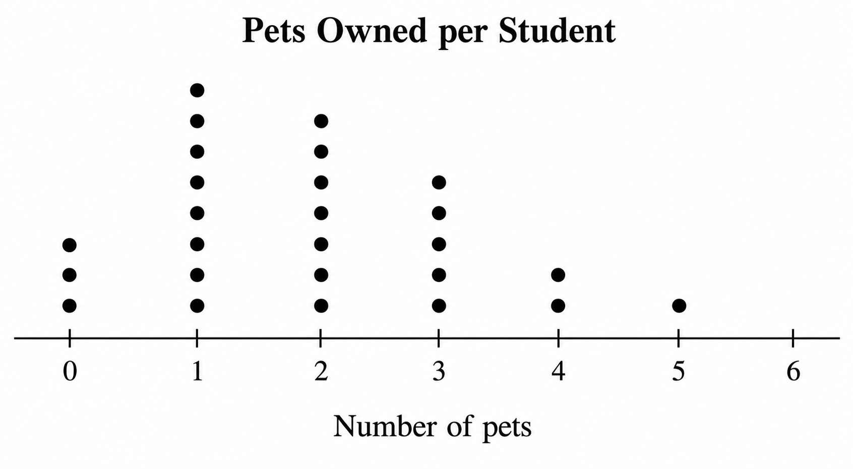
Beschreibe deine Werte und die KI zeichnet ein klares Punktdiagramm – Häufigkeitspunkte gestapelt über einem Zahlenstrahl (das Liniendiagramm aus dem Statistikunterricht) oder ein nach Rang geordnetes Cleveland-Punktdiagramm zum Vergleich von Kategorien. Erhalte ein betiteltes, beschriftetes Diagramm, fertig für Hausaufgaben, Arbeitsblätter, Veröffentlichungen und Folien, ohne dass Tabellenkalkulation oder Zeichenwerkzeuge nötig sind.
Beispiele für Punktdiagramme
Klicke auf ein Beispiel, um seinen Prompt zu laden, oder nutze es als Ausgangspunkt für dein eigenes Punktdiagramm.
Was ist ein Punktdiagramm?
Ein Punktdiagramm ist ein einfaches statistisches Diagramm, das die Verteilung eines Datensatzes zeigt, indem für jeden Wert ein Punkt über seiner Position auf einem Zahlenstrahl gestapelt wird, sodass die Höhe jeder Spalte die Häufigkeit dieses Werts offenbart. Im Statistikunterricht – und an US-Grundschulen, wo es oft „Liniendiagramm“ genannt wird – ist dieses Häufigkeits-Punktdiagramm eine der ersten Methoden, mit denen Schüler lernen, Form, Lage und Streuung darzustellen. Ein zweites, verwandtes Diagramm trägt denselben Namen: das Cleveland-Punktdiagramm, das je Kategorie einen einzelnen Punkt entlang einer Achse platziert, als klarere Alternative zu einem Balkendiagramm. Dieser Generator verwandelt eine Beschreibung deiner Daten in eine der beiden Arten, vollständig beschriftet.
Warum einen Punktdiagramm-Maker nutzen
- Häufigkeits-Punktdiagramme machen Form, Lage, Streuung, Häufungen und Ausreißer kleiner Datensätze leicht erkennbar.
- Jeden Punkt von Hand auf einem Zahlenstrahl zu zeichnen und auszurichten ist langsam und fehleranfällig.
- Lehrkräfte und Schüler brauchen schnell ordentliche Liniendiagramme für Arbeitsblätter, Hausaufgaben und die Tafel.
- Ein Cleveland-Punktdiagramm vergleicht Kategorien mit weniger Tinte und Unordnung als ein Balkendiagramm.
- Aus einer Beschreibung neu zu erzeugen ist schneller als neu zu zeichnen, jedes Mal wenn sich Daten, Beschriftungen oder Skala ändern.
So erstellst du ein Punktdiagramm
Entscheide, welche Art du brauchst – ein Häufigkeits-Punktdiagramm (Liniendiagramm) über einem Zahlenstrahl oder ein Cleveland-Punktdiagramm, das Kategorien ordnet. Liste deine Werte oder Anzahlen und den Achsenbereich auf, beschreibe dann die Beschriftungen, den Titel und ob ein Punkt für mehr als eine Anzahl steht. Erstelle das Diagramm, prüfe dann, ob jeder Wert über dem richtigen Teilstrich sitzt und die Achse beschriftet ist. Verfeinere Skala, Farben oder Annotationen wie den Mittelwert, bis es zu deinen Daten passt.
Bestandteile eines Punktdiagramms
- Zahlenstrahl oder Achse – die horizontale Skala mit gleichmäßig verteilten Teilstrichen.
- Punkte – eine Markierung pro Datenpunkt, über dem Wert gestapelt, den sie darstellt.
- Spalten – die Höhe jedes Stapels zeigt die Häufigkeit dieses Werts.
- Achsenbeschriftung & Titel – worum es bei den Daten geht und was gemessen wird.
- Legende – ein Hinweis, wenn ein Punkt (oder X) für mehr als eine Anzahl steht.
- Annotationen – optionale Mittelwertlinie, Median, Spannweite oder Farblegende für Gruppen.
FAQ zum Punktdiagramm-Generator
Was ist ein Punktdiagramm?
Ein Punktdiagramm zeigt einen Datensatz, indem für jeden Wert ein Punkt über seiner Stelle auf einem Zahlenstrahl gestapelt wird, sodass die Höhe jeder Spalte zeigt, wie oft dieser Wert vorkommt. Es macht Form, Lage, Streuung und etwaige Ausreißer kleiner Datensätze leicht ablesbar. Derselbe Name umfasst auch das Cleveland-Punktdiagramm, das je Kategorie einen Punkt verwendet, als ordentliche Alternative zu einem Balkendiagramm.
Wie erstelle ich ein Punktdiagramm online?
Beschreibe einfach deine Daten in einfacher Sprache – die Werte oder Anzahlen, den Bereich des Zahlenstrahls, die Achsenbeschriftung und einen Titel – und der Generator zeichnet ein klares, beschriftetes Punktdiagramm. Es ist nicht nötig, Punkte von Hand einzuzeichnen oder eine Tabellenkalkulation einzurichten; du kannst sofort neu erzeugen, wenn sich Daten oder Skala ändern.
Was ist der Unterschied zwischen einem Punktdiagramm, einem Liniendiagramm und einem Balkendiagramm?
Ein Punktdiagramm und ein Liniendiagramm sind dasselbe Diagramm – viele US-Grundschulen nennen das Häufigkeits-Punktdiagramm „Liniendiagramm“ und verwenden gestapelte X-Markierungen statt Punkte. Beide zeigen einzelne Datenpunkte über einem Zahlenstrahl. Ein Balkendiagramm hingegen verwendet durchgehende Balken für gruppierte Summen, sodass ein Punktdiagramm jeden Wert sichtbar hält, während ein Balkendiagramm Anzahlen zusammenfasst.
Kann ich ein Cleveland-Punktdiagramm erstellen?
Ja. Beschreibe die Kategorien und ihre Werte und fordere ein Cleveland-Punktdiagramm an, und der Generator ordnet die Kategorien mit je einem Punkt entlang der Achse. Du kannst auch eine gruppierte oder Hantel-Variante anfordern, die zwei Punkte pro Zeile setzt und sie verbindet, um die Veränderung zwischen zwei Reihen zu zeigen.
Ist der Punktdiagramm-Generator kostenlos?
Ja, du kannst Punktdiagramme kostenlos erstellen. SciDraw AI läuft mit einem Guthabensystem mit kostenlosem Startguthaben, sodass du Liniendiagramme und Cleveland-Punktdiagramme für Unterricht, Hausaufgaben oder eine schnelle Abbildung ohne Einrichtung erstellen kannst.
Kann ich es für ein Arbeitsblatt im Unterricht oder Hausaufgaben verwenden?
Auf jeden Fall. Der Liniendiagramm-Maker ist für den Unterricht gebaut – gib ihm einen kleinen Datensatz und einen Titel, und er erzeugt ein ordentliches Häufigkeits-Punktdiagramm mit X-Markierungen oder Punkten, fertig zum Einfügen in ein Arbeitsblatt, eine Hausaufgabe oder eine Folie. Überprüfe das Diagramm immer anhand deiner Daten, bevor du es teilst.
Weitere Tools entdecken
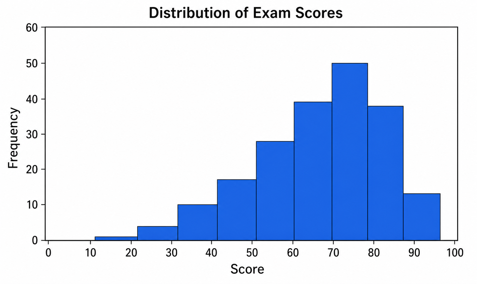
Histogramm-Maker
Verwandle Daten und Klassen in ein klares, beschriftetes Häufigkeitshistogramm mit optionaler Normalverteilungskurve.
Kostenlos testen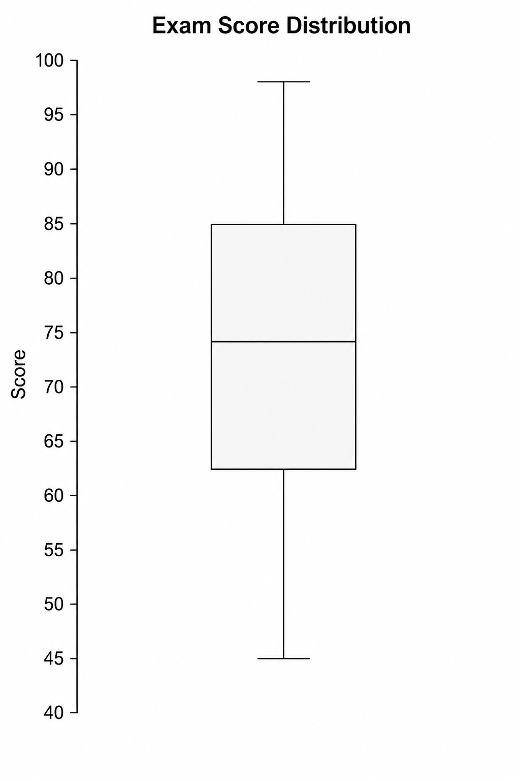
Boxplot-Maker
Erzeuge klare, beschriftete Box-Whisker-Plots mit Quartilen, Whiskern und Ausreißern aus einer einfachen Textbeschreibung.
Kostenlos testen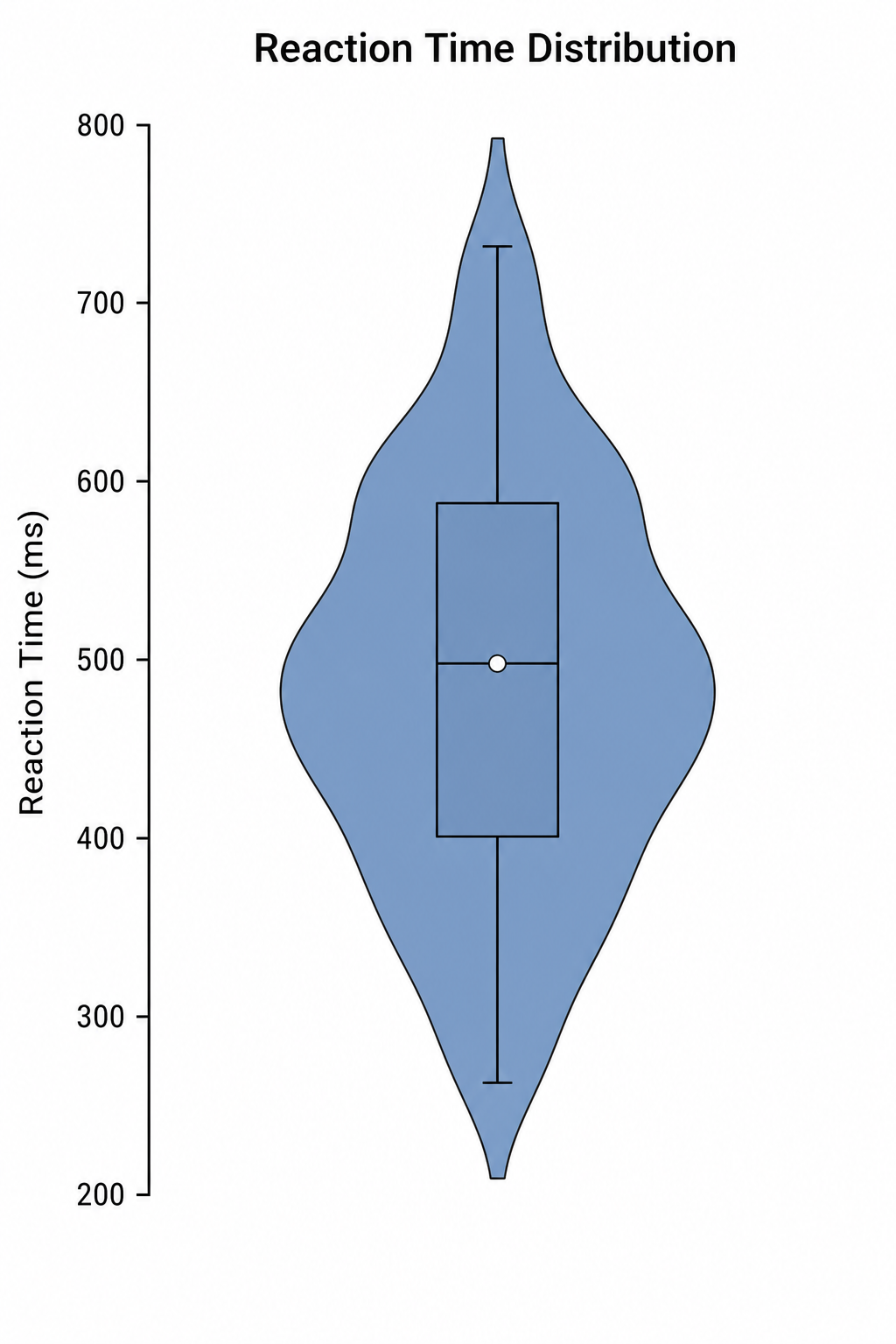
Violindiagramm-Maker
Erstelle beschriftete Violindiagramme mit innenliegenden Boxplots und Dichteformen aus einer einfachen Textbeschreibung.
Kostenlos testenBrauchst du weitere Statistik-Diagramme?
Erstelle Punktdiagramme, Glockenkurven, Boxplots und weitere Abbildungen für Unterricht und Forschung mit SciDraw AI.