![Visual Abstract Maker: Free Online Tool for Research Papers [2026]](/_next/image?url=https%3A%2F%2Fpub-8c0ddfa5c0454d40822bc9944fe6f303.r2.dev%2Fimages%2Fblog%2Fvisual-abstract-maker-cover.png&w=3840&q=75 "Visual Abstract Maker: Free Online Tool for Research Papers [2026]")
Visual abstracts have rapidly become one of the most effective ways to communicate research findings beyond the traditional journal audience. Originally popularized by medical journals and academic societies on social media, visual abstracts are now used across nearly every discipline to increase the reach and accessibility of published work.
This guide covers everything you need to know about creating visual abstracts -- what they are, how they differ from graphical abstracts, design principles, and which tools can help you produce them efficiently.
What Is a Visual Abstract?
A visual abstract is a visual summary of a research paper designed primarily for digital sharing. Unlike a traditional text abstract, a visual abstract uses icons, illustrations, data highlights, and concise text blocks to convey the key findings of a study in a single image.
Visual abstracts are typically:
- Designed for social media platforms (Twitter/X, LinkedIn, Instagram)
- Optimized for screen viewing rather than print
- Focused on outcomes and key takeaways
- Branded with journal or institutional logos
- Sized for easy sharing (usually 1080x1080 or 1200x628 pixels)
The format originated in surgery and medicine, where journals like Annals of Surgery began requiring visual abstracts alongside published papers. Today, the practice has spread to engineering, social sciences, environmental science, and more.
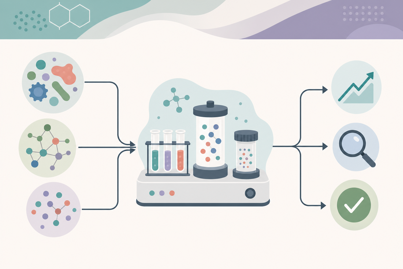 A visual abstract condenses a study's key findings into one shareable image.
Why Visual Abstracts Matter for Researchers
The case for visual abstracts goes well beyond aesthetics. Research consistently shows that visual content outperforms text-only content on digital platforms.
Measured Impact of Visual Abstracts
| Metric | Text Abstract Only | With Visual Abstract |
|---|---|---|
| Twitter impressions | Baseline | +7x higher |
| Article page views | Baseline | +30-50% increase |
| Altmetric score boost | Baseline | +2-3x higher |
| Time to first 100 views | 2-4 weeks | 2-5 days |
| Conference poster engagement | Baseline | +40% more conversations |
A 2021 study in JAMA Network Open found that tweets containing visual abstracts received significantly more engagement than those with text alone. For researchers looking to amplify their work through science communication and social media, visual abstracts are one of the highest-impact investments of time.
Who Benefits Most
- Early-career researchers building visibility for their publications
- Lab PIs promoting group research output
- Journal editors increasing article reach on social media
- Conference presenters summarizing poster or talk content
- Science communicators translating complex findings for broader audiences
Visual Abstract vs Graphical Abstract
These two terms are often used interchangeably, but they serve different purposes and follow different conventions. Understanding the distinction is important because journals may require one, the other, or both.
| Feature | Visual Abstract | Graphical Abstract |
|---|---|---|
| Primary purpose | Social media sharing | Journal table of contents |
| Audience | General/broad | Domain specialists |
| Required by journal | Rarely required | Often required (Elsevier, ACS, Cell Press) |
| Design style | Infographic, bold, engaging | Schematic, technical, precise |
| Typical dimensions | 1080x1080 or 1200x628 px | Journal-specific (varies widely) |
| Text content | Headline findings, plain language | Minimal text, technical labels |
| Branding | Journal/institution logos common | Usually unbranded |
| Color palette | Bold, high-contrast | Muted, publication-appropriate |
| Submission format | PNG or JPEG | TIFF, EPS, or high-res PNG |
If you need to create a graphical abstract for journal submission, see our graphical abstract maker guide for journal-specific requirements and templates. The step-by-step graphical abstract creation guide also covers the technical submission process in detail.
How to Create a Visual Abstract: Step-by-Step
Step 1: Identify Your Core Message
Before opening any design tool, answer these questions:
- What is the single most important finding of this paper?
- Who is the target audience for this visual abstract?
- What action do you want viewers to take (read the paper, visit your lab page, attend your talk)?
Distill your research into one sentence that a non-specialist could understand. This becomes the headline of your visual abstract.
Step 2: Select Your Key Data Points
Choose 2-4 supporting data points that reinforce your core message. These might include:
- The primary statistical finding (e.g., "42% reduction in infection rates")
- Sample size or study scope (e.g., "N = 3,200 patients across 12 hospitals")
- A comparison result (e.g., "3x faster processing than conventional methods")
- A timeline or process summary
Avoid cramming too much data into the visual. The goal is to intrigue viewers enough to read the full paper, not to replace it.
Step 3: Choose a Layout Structure
Most effective visual abstracts follow one of these proven layouts:
Top-Down Flow: Title at top, key visual in the center, findings at the bottom. Works well for single-outcome studies.
Left-Right Split: Problem on the left, solution on the right. Effective for intervention studies and clinical trials.
Three-Panel: Background, methods, results in three equal sections. Good for process-oriented research.
Hub-and-Spoke: Central concept with radiating findings. Suitable for review articles or multi-variable studies.
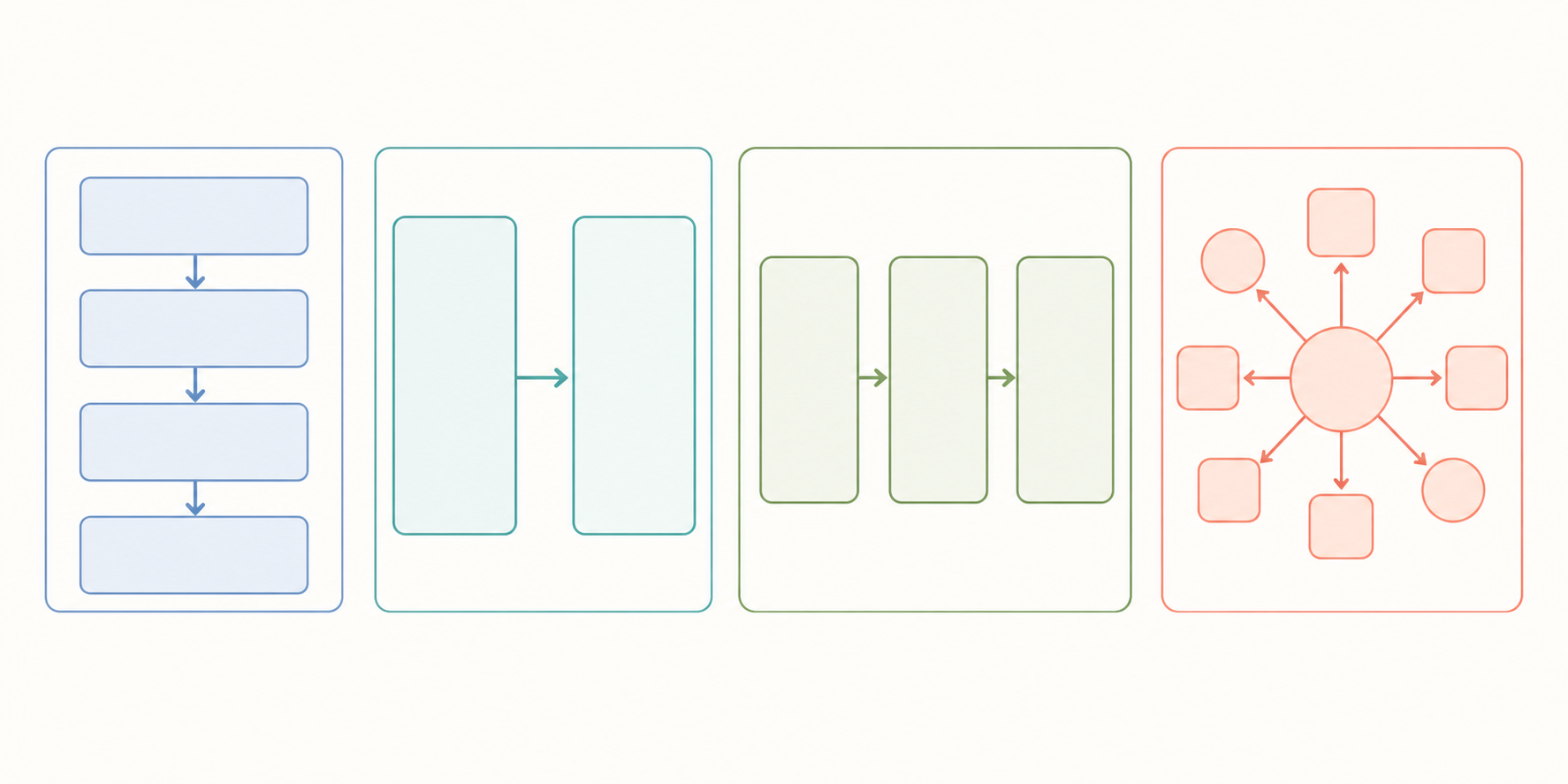 Proven layout structures for visual abstracts, from top-down flow to hub-and-spoke.
Step 4: Design the Visual
Using your chosen layout, assemble the visual abstract with these components:
- Title bar: Paper title or simplified headline
- Visual elements: Icons, simplified diagrams, or representative images
- Data highlights: Key numbers in large, bold text
- Source attribution: DOI, journal name, and author information
- Call to action: "Read the full paper" with a link or QR code
For the visual elements, AI-powered tools can generate scientific illustrations that match your research domain. SciDraw AI's AI drawing tool can create custom scientific visuals from text descriptions, which is particularly useful when you need domain-specific imagery.
Step 5: Optimize for Your Platform
Different platforms have different optimal dimensions and requirements:
| Platform | Recommended Size | Format | Notes |
|---|---|---|---|
| Twitter/X | 1200 x 675 px | PNG | Landscape performs best |
| 1200 x 628 px | PNG | Square also works well | |
| 1080 x 1080 px | PNG/JPG | Square required for feed | |
| Conference poster | 1920 x 1080 px | PNG | Wide format for screens |
| Email newsletter | 600 x 600 px | PNG/JPG | Keep file size under 500KB |
Visual Abstract Design Principles
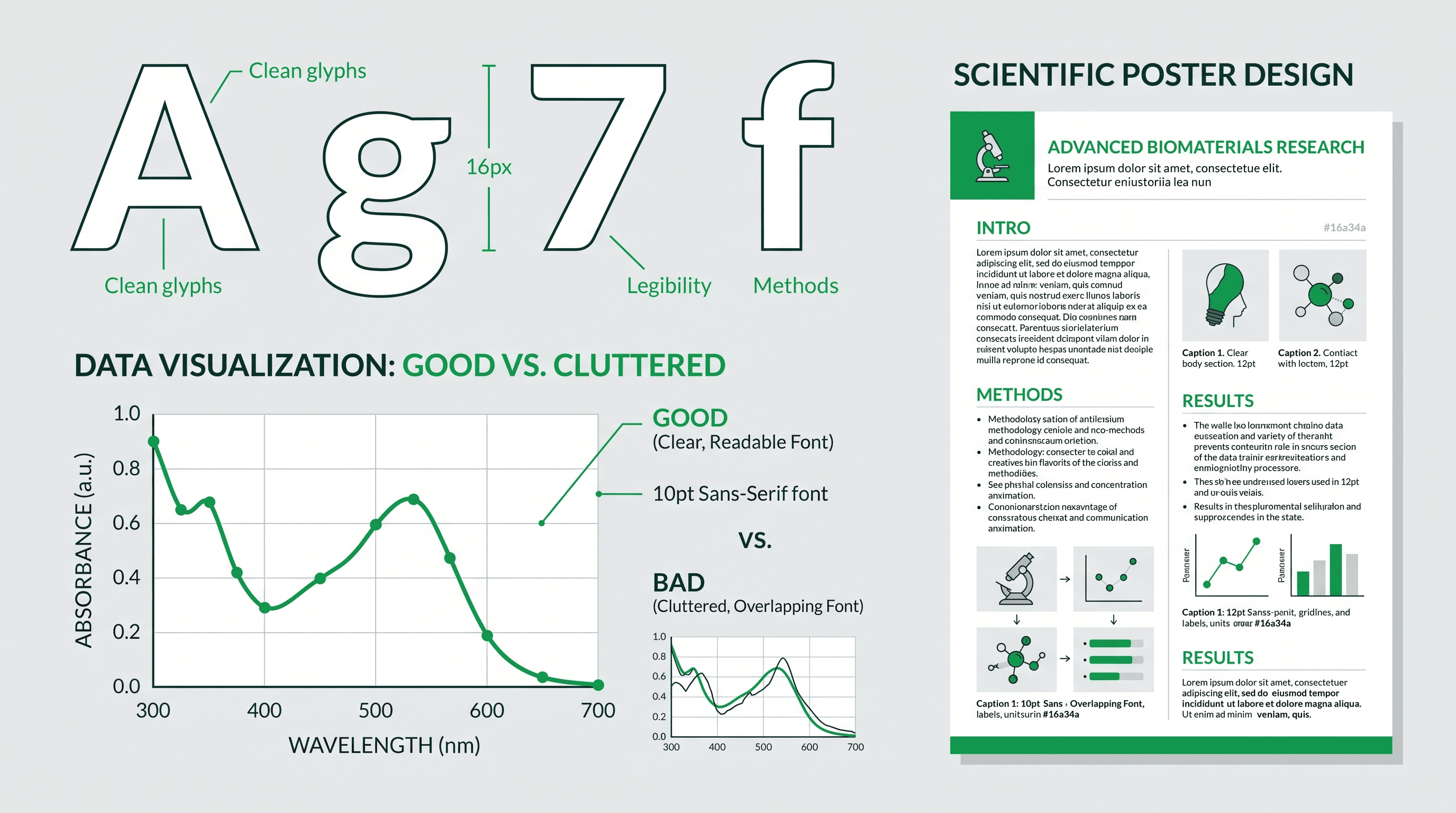
Typography
- Use no more than two fonts: one for headings, one for body text
- Minimum font size of 24pt for any text (it will be viewed on mobile screens)
- Sans-serif fonts work best for screen readability (Inter, Helvetica, Open Sans)
- Avoid italics for key findings -- use bold or color instead
Color
- Limit your palette to 3-4 colors maximum
- Use your institution or journal's brand colors when available
- Ensure sufficient contrast between text and background (WCAG AA minimum)
- Use color consistently: one color for findings, another for context
Layout and Whitespace
- Maintain generous margins (at least 5% of total width on each side)
- Use alignment grids to keep elements organized
- Leave breathing room between sections
- Avoid filling every pixel -- whitespace guides the eye
Visual Hierarchy
The viewer's eye should follow a clear path:
- Title or headline (largest text)
- Key visual or illustration (center of attention)
- Supporting data points (secondary emphasis)
- Source and attribution (smallest, bottom of image)
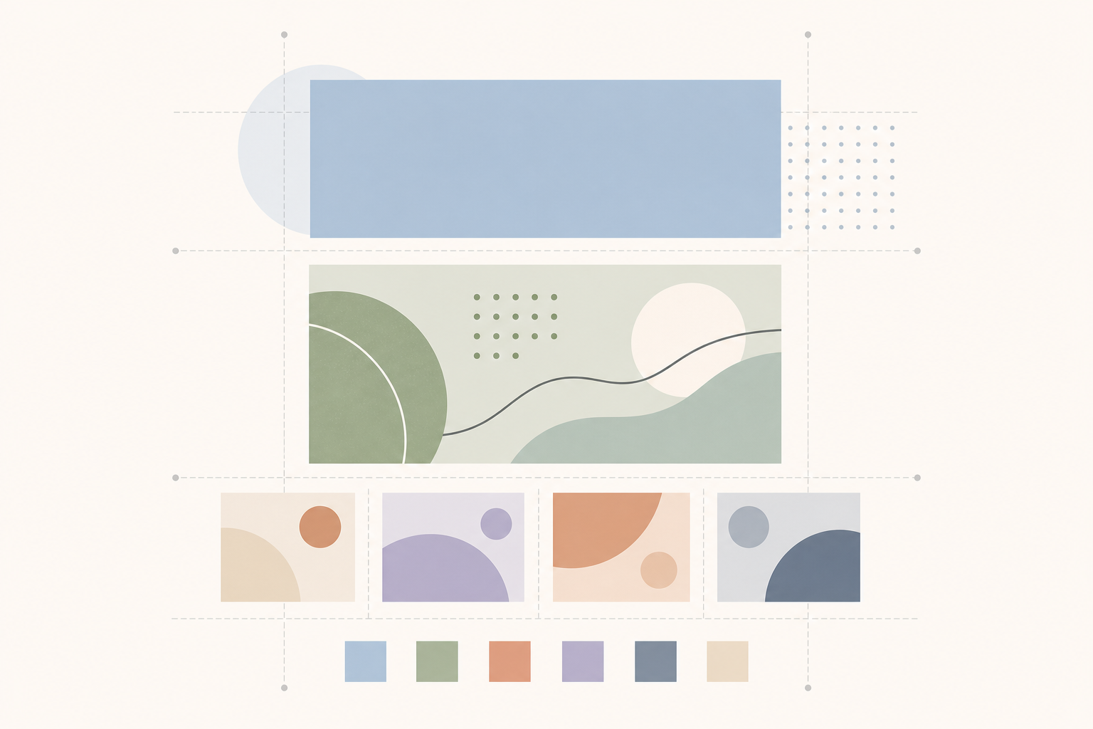 Strong design principles guide the viewer's eye through a clear visual hierarchy.
Visual Abstract Templates by Research Field
Medical and Clinical Research
Medical visual abstracts typically follow a structured format:
- Study design (RCT, cohort, meta-analysis) prominently displayed
- Patient population with demographic summary
- Intervention vs. control comparison
- Primary outcome with effect size and confidence interval
- Clinical significance statement
Use icons representing patient groups, anatomical structures, and clinical procedures. The AI scientific illustration tool can generate medical imagery suited to these templates.
Engineering and Technology
Engineering visual abstracts often emphasize:
- Before/after performance comparisons
- System architecture or process flow diagrams
- Material properties or specifications
- Efficiency metrics with quantitative results
Diagrams and schematics work particularly well in this domain, as engineering audiences expect technical precision even in summary formats.
Social Sciences
Social science visual abstracts tend to focus on:
- Population or sample characteristics
- Research question framed as a clear question
- Methodology (surveys, interviews, mixed methods)
- Key qualitative or quantitative findings
- Policy implications
Maps, demographic icons, and relationship diagrams are common visual elements. Keep technical jargon to a minimum since social science visual abstracts often reach policy audiences.
Environmental and Earth Sciences
These visual abstracts frequently include:
- Geographic scope with maps or satellite imagery
- Temporal trends with simplified charts
- Environmental indicators (temperature, concentration, biodiversity metrics)
- Impact statements linking findings to broader implications
Satellite imagery, ecosystem diagrams, and geographic overlays make effective visual elements for these fields.
Tools for Creating Visual Abstracts
AI-Powered Tools
SciDraw AI is purpose-built for scientific visual content. It uses AI to generate scientific illustrations, diagrams, and visual elements from text prompts. The platform offers templates optimized for research communication and supports export in formats suitable for both social media and publication. The free tier provides enough credits to create several visual abstracts. Try it at SciDraw AI Drawing.
Design Platforms
Canva offers pre-built infographic templates that can be adapted for visual abstracts. While not science-specific, its drag-and-drop interface makes it accessible for researchers without design training. The free tier covers basic needs, though premium templates require a subscription.
PowerPoint/Keynote remain popular choices because most researchers already know how to use them. While they lack AI generation or scientific icon libraries, they provide sufficient layout control for simple visual abstracts.
Scientific Illustration Tools
BioRender offers a large library of pre-drawn scientific illustrations, making it well-suited for life science visual abstracts. The free tier is limited to low-resolution exports. For researchers exploring alternatives, see our comprehensive comparison of scientific illustration tools.
Adobe Illustrator provides the most precise control over vector graphics but requires significant design expertise and a monthly subscription. It is best suited for researchers who create visual content regularly.
Free Icon and Illustration Libraries
BioIcons and Servier Medical Art provide free, Creative Commons-licensed scientific illustrations that can be incorporated into visual abstracts created in any tool. These libraries are particularly valuable for life science and medical researchers.
Best Practices Checklist
Before sharing your visual abstract, verify the following:
- Core finding is immediately visible within 3 seconds of viewing
- All text is readable at mobile screen size
- Color palette has sufficient contrast for accessibility
- Source attribution (DOI, journal, authors) is included
- Image dimensions match your target platform
- File size is under 5MB (under 500KB for email)
- No copyrighted images are used without permission
- Data presented accurately represents the paper's findings
- Institutional or journal branding guidelines are followed
Common Mistakes to Avoid
Overloading with information. A visual abstract is not a poster. If you have more than 4-5 key points, you are including too much. Prioritize ruthlessly.
Using low-resolution images. Pixelated icons or blurry charts destroy credibility. Always use vector graphics or high-resolution rasters (300 DPI minimum for any embedded images).
Ignoring mobile viewers. The majority of social media consumption happens on phones. If your text is unreadable on a 6-inch screen, your visual abstract will not achieve its purpose.
Skipping the source attribution. Always include the DOI, journal name, and author list. Without attribution, viewers cannot find or cite the original paper.
Making it look like an advertisement. Visual abstracts should inform, not sell. Avoid promotional language and focus on the research findings themselves.
Create Your Visual Abstract with SciDraw AI
Ready to create a visual abstract for your next publication or conference presentation? SciDraw AI offers:
- Free credits to get started immediately
- AI-generated scientific illustrations tailored to your research domain
- Templates optimized for social media and conference formats
- Multiple export sizes for every platform
- No design skills required -- describe what you need in plain text
Visit SciDraw AI Drawing to create your first visual abstract in minutes.
Related Guides
- Graphical Abstract Maker: Free AI Tool for Research Papers -- AI-powered graphical abstract creation for journal submissions
- How to Create a Graphical Abstract: Complete Guide -- step-by-step process from layout to submission
- Scientific Infographics for Research Papers -- turn complex data into visual summaries for publications
- Science Communication with AI -- using AI tools to amplify your research on social media
- Graphical Abstract Maker Tool -- free online graphical abstract creator