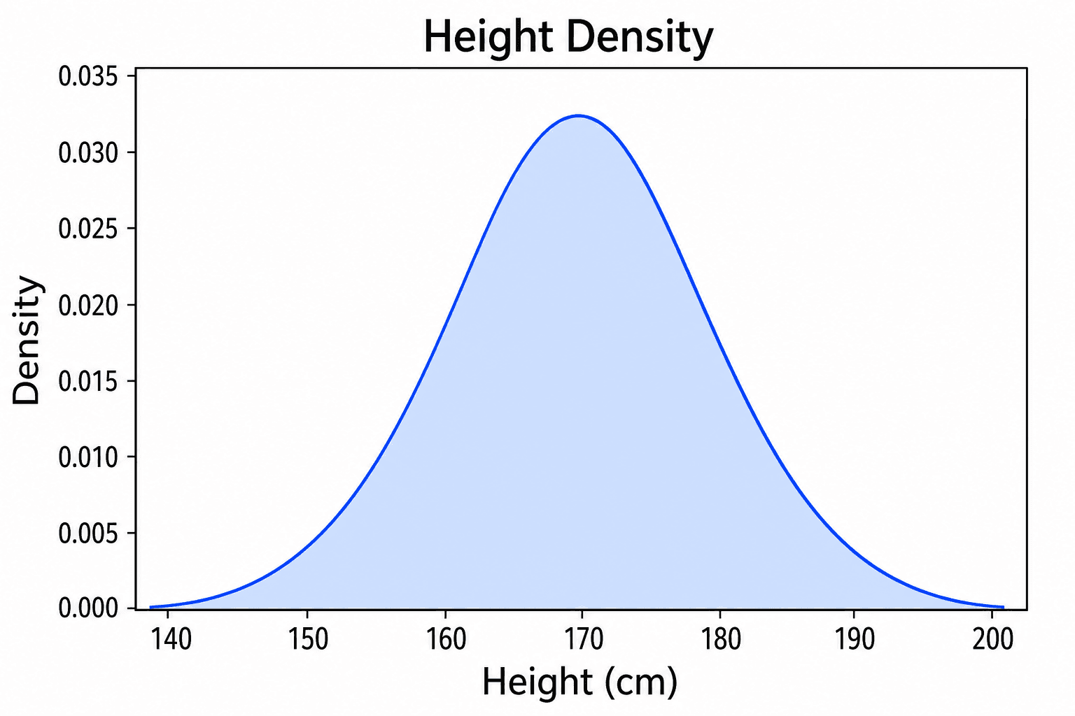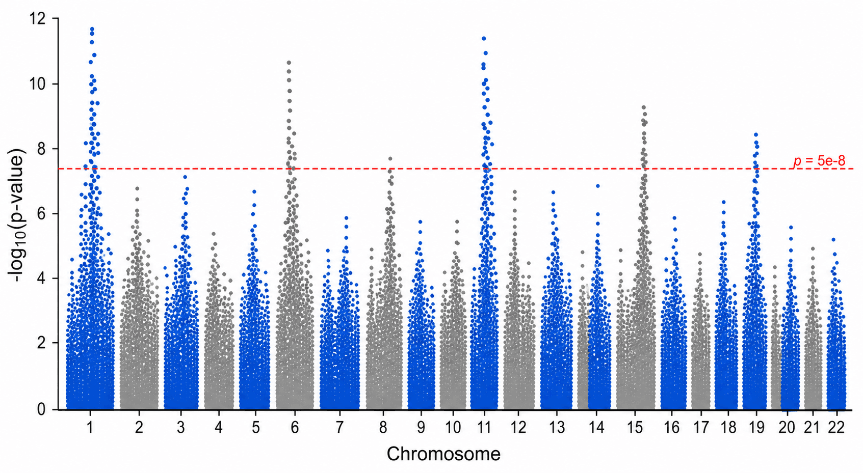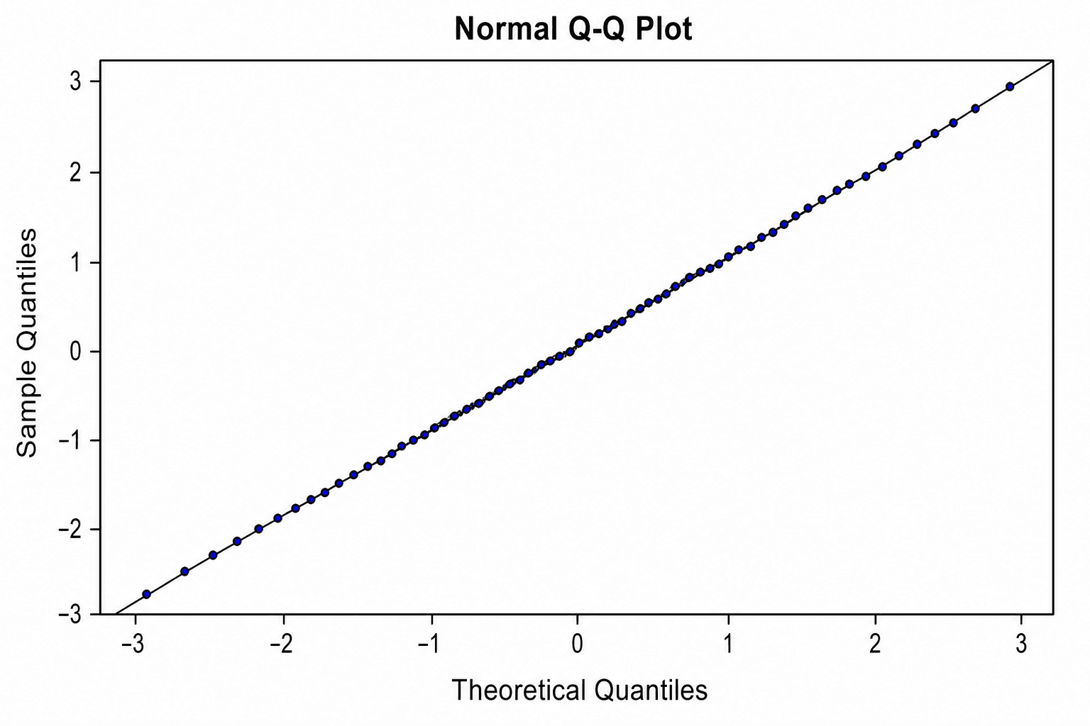
Bell curves show up everywhere in science — test scores, measurement errors, biological traits, and statistical analyses all tend to cluster around a central value with predictable spread. Yet producing a clean, properly labeled normal distribution graph often takes more time than it should.
This guide walks you through exactly how to make a bell curve, from understanding the math to building it in Excel or Google Sheets — and then shows you a faster path with an AI-powered tool.
What you'll learn:
- What mean and standard deviation actually control on a bell curve
- The 68–95–99.7 rule and why it matters
- Step-by-step instructions for Excel and Google Sheets
- How to label standard deviation regions and z-scores
- A quick reference table for common normal distribution values
- How SciDraw AI's bell curve generator can do the heavy lifting in seconds
What Is a Bell Curve?
A bell curve is the visual representation of a normal distribution — a symmetric, unimodal probability distribution described by just two parameters:
- Mean (μ): the center of the curve; where the peak sits
- Standard deviation (σ): how spread out the data is; larger σ = wider, flatter curve
The probability density function (PDF) that defines the curve is:
f(x) = (1 / (σ√(2π))) × e^(-(x−μ)² / (2σ²))You don't need to memorize the formula to make a great chart — but understanding what μ and σ do will help you build and label the curve correctly.
What Mean and Standard Deviation Control
| Parameter | Effect on the curve |
|---|---|
| Increase μ | Shifts the entire curve right |
| Decrease μ | Shifts the entire curve left |
| Increase σ | Curve becomes wider and flatter |
| Decrease σ | Curve becomes narrower and taller |
| σ = 1, μ = 0 | Standard normal distribution |
This is worth internalizing: the shape is always the same bell, just repositioned and rescaled.
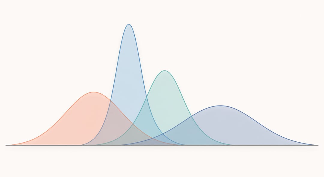 Changing the mean slides the curve along the axis, while changing the standard deviation stretches or compresses its width.
The 68–95–99.7 Rule
One of the most useful properties of a normal distribution is how data clusters around the mean:
| Region | Coverage |
|---|---|
| μ ± 1σ | ≈ 68.27% of data |
| μ ± 2σ | ≈ 95.45% of data |
| μ ± 3σ | ≈ 99.73% of data |
| μ ± 4σ | ≈ 99.994% of data |
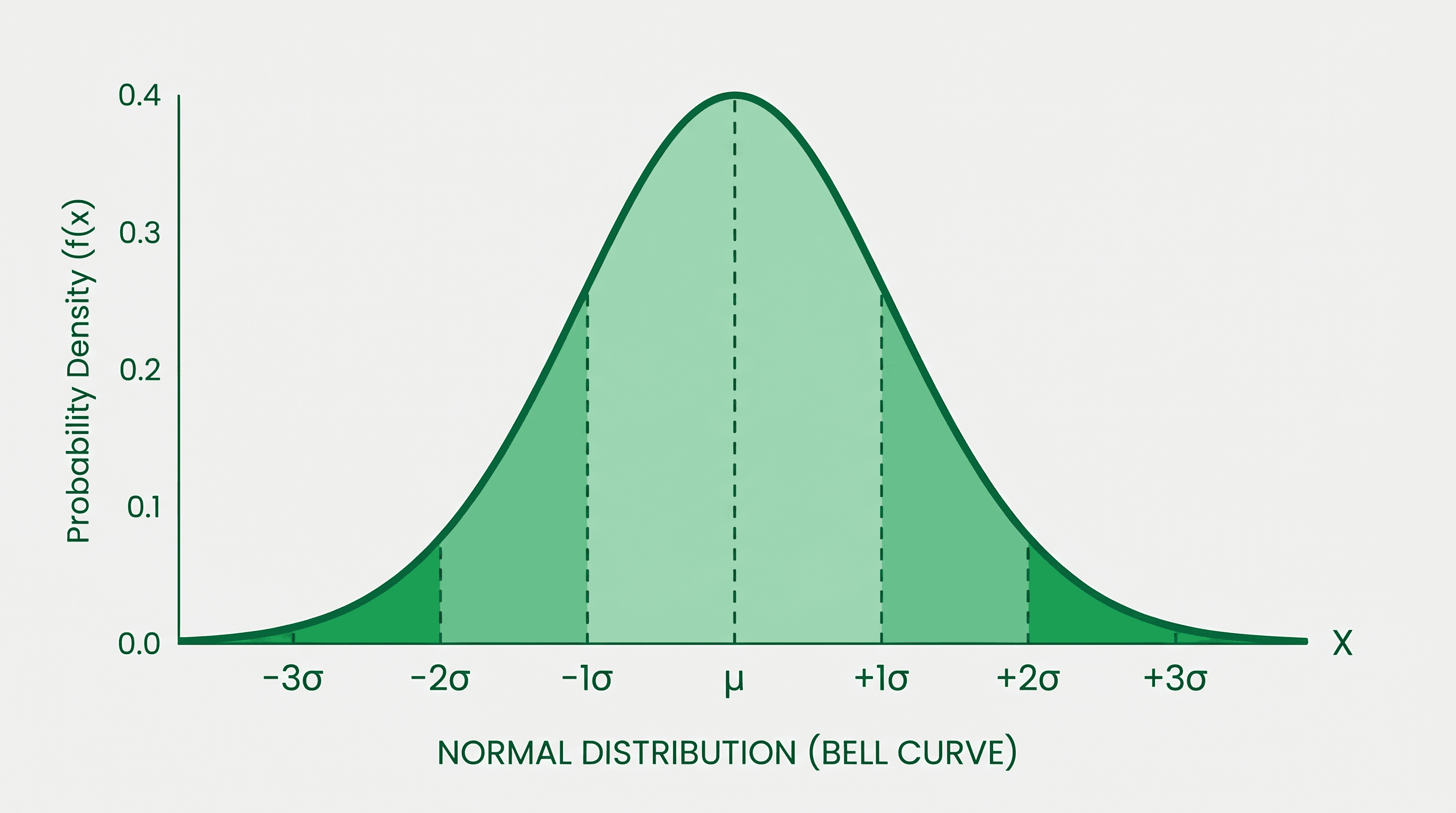
This rule lets you communicate statistical spread at a glance. A labeled bell curve that marks the ±1σ, ±2σ, and ±3σ boundaries gives readers immediate intuition about the data — which is exactly why journal figures, textbooks, and presentations use them so often.
Z-scores
A z-score tells you how many standard deviations a particular value is from the mean:
z = (x − μ) / σFor example, if μ = 100 and σ = 15 (as in many IQ tests), a score of 130 has z = 2.0, placing it at the +2σ boundary — in the top ≈ 2.3% of the distribution.
Labeling your bell curve with z-score tick marks (−3, −2, −1, 0, +1, +2, +3) makes it publication-ready and reader-friendly.
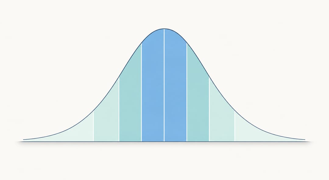 The 68–95–99.7 rule visualized: shaded bands show how much of the data falls within each standard deviation of the mean.
How to Make a Bell Curve in Excel
Step 1: Set Your Parameters
In a blank sheet, enter your mean and standard deviation in two cells (e.g., B1 = 0, B2 = 1 for a standard normal curve).
Step 2: Create the X-axis Values
In column A, generate a sequence of x values spanning ±4σ from the mean. With μ = 0, σ = 1, you want values from −4 to +4 in small increments (0.1 works well — that's 81 rows).
- A1:
−4 - A2:
=A1+0.1 - Drag down to A81 (stops at 4.0)
Step 3: Calculate the Normal PDF Values
In column B, enter the Excel formula for the normal distribution:
=NORM.DIST(A1, $B$1, $B$2, FALSE)A1= the x value$B$1= mean (absolute reference)$B$2= standard deviation (absolute reference)FALSE= PDF (not cumulative)
Drag the formula down to match all x values.
Step 4: Insert a Line Chart
- Select columns A and B (your x and y data).
- Go to Insert → Charts → Line Chart (choose "Line with Smooth Lines" for a clean bell shape).
- Excel will plot x values on the horizontal axis and PDF values on the vertical axis.
Step 5: Label SD Regions
To mark the ±1σ, ±2σ, ±3σ boundaries, add vertical dashed lines:
- Create a small helper table with x values at −3, −2, −1, 0, 1, 2, 3 and their corresponding PDF values (use
NORM.DISTagain). - Add this as a second data series (type: Scatter with Lines).
- Format those lines as dashed, and add data labels showing "−1σ", "+1σ", etc.
Alternatively, use shaded area series to color the 68%, 95%, and 99.7% bands — this is more visually compelling but requires a few extra data columns for each region boundary.
Step 6: Polish the Chart
- Remove gridlines for a cleaner look.
- Set the y-axis minimum to 0.
- Add a chart title and axis labels.
- Export as PNG or SVG for use in your document.
How to Make a Bell Curve in Google Sheets
The process mirrors Excel closely.
Step 1–2: Same as Excel
Set up your parameters and generate x values in column A using the same −4 to +4 range with 0.1 increments.
Step 3: Use NORMDIST
Google Sheets uses a slightly different function name:
=NORMDIST(A1, mean, stdev, FALSE)Replace mean and stdev with your cell references (e.g., $D$1, $D$2).
Step 4: Insert a Smooth Line Chart
- Select your two columns.
- Insert → Chart.
- In the Chart Editor, choose Smooth Line Chart.
- Set Column A as the X-axis.
Step 5: Label and Export
Google Sheets' chart customization is more limited than Excel's, but you can:
- Add text annotations manually via the chart editor.
- Download as PNG or SVG from the chart's overflow menu.
For journal-quality figures, Google Sheets exports often need refinement in a dedicated tool.
Quick Reference: Normal Distribution Values
| x (z-score) | Cumulative probability | % of data below |
|---|---|---|
| −3.0 | 0.0013 | 0.13% |
| −2.0 | 0.0228 | 2.28% |
| −1.0 | 0.1587 | 15.87% |
| 0.0 | 0.5000 | 50.00% |
| +1.0 | 0.8413 | 84.13% |
| +2.0 | 0.9772 | 97.72% |
| +3.0 | 0.9987 | 99.87% |
Use this table to annotate your curve with exact probability labels at each z-score boundary.
Excel vs. Google Sheets vs. AI Tools: Comparison
| Method | Speed | Customization | Export quality | Learning curve |
|---|---|---|---|---|
| Excel | Medium | High | Good (PNG/SVG) | Moderate |
| Google Sheets | Medium | Medium | Fair (PNG) | Low–Moderate |
| Python (matplotlib) | Slow (setup) | Very high | Excellent (PDF/SVG) | High |
| SciDraw AI | Fast | Good | Excellent | Very low |
For researchers who need a clean, labeled bell curve quickly — without wrestling with chart editors or writing code — an AI-powered scientific figure maker removes most of the friction.
The Faster Path: Make a Bell Curve with SciDraw AI
Building a bell curve in Excel takes 20–30 minutes if you want it labeled correctly. The manual steps — generating x values, writing the PDF formula, creating helper series for SD bands, formatting the axes — add up quickly.
SciDraw AI's bell curve generator lets you describe the figure you need in plain language and generates a properly formatted, labeled normal distribution graph in seconds. You can specify:
- Mean and standard deviation values
- Which SD regions to shade (±1σ, ±2σ, ±3σ)
- Z-score labels
- Color scheme and style (publication-ready or presentation-ready)
The output is a clean scientific figure you can download and drop directly into your paper, slide deck, or report.
For teams producing multiple statistical figures, the scientific figure maker handles normal distributions alongside histograms, box plots, scatter plots, and more — all from text prompts.
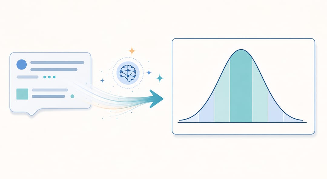 With SciDraw AI, a short text description becomes a clean, publication-ready bell curve in seconds.
Frequently Asked Questions
Q: What's the difference between a bell curve and a histogram? A: A histogram shows actual observed frequencies from your data as discrete bars. A bell curve (normal distribution) is a theoretical probability density function. You can overlay a bell curve on a histogram to show how well your data fits the normal distribution.
Q: How do I choose the right mean and standard deviation?
A: Use the actual mean and standard deviation of your dataset (calculated with AVERAGE and STDEV in Excel/Sheets). If you're illustrating a concept rather than real data, use μ = 0, σ = 1 (the standard normal distribution).
Q: Can I make a bell curve with real data points marked on it? A: Yes. After drawing the curve, add a scatter series with your individual data points plotted along the x-axis at y = 0 (or a small offset). This shows where each observation falls relative to the distribution.
Q: How many x-axis points do I need for a smooth curve? A: At least 50–80 points across the ±4σ range gives a smooth appearance in most chart tools. Using increments of 0.1σ is a reliable default.
Q: What does it mean if my data doesn't fit a bell curve? A: It could indicate skewness (asymmetric distribution), multiple subpopulations (bimodal), or outliers. Many statistical tests assume normality, so checking the fit matters before applying them.
Q: Is a normal distribution the same as a Gaussian distribution? A: Yes — "normal distribution," "Gaussian distribution," and "bell curve" all refer to the same probability distribution. "Gaussian" is the term more common in physics and engineering; "normal" is standard in statistics.