How to Draw a Research Roadmap for a Grant Proposal: From Specific Aims to Visual Strategy
What a research roadmap actually is, what reviewers look for in 30 seconds, and AI prompt templates that produce a first draft. For PIs and postdocs writing NIH, NSF, ERC, JSPS, NRF, MRC, and Wellcome proposals.
When grant season hits — NIH cycles, NSF deadlines, ERC, MRC, Wellcome, JSPS, you name it — the research roadmap is the figure that gives PIs the most trouble. Unlike a paper figure, there's no template. Unlike a Gantt chart, you can't fake it. Reviewers actively use this figure to decide whether your plan is clear, executable, and innovative. A vague roadmap can sink an otherwise strong proposal.
This article breaks down what a research roadmap actually is, what reviewers look for, and gives templates you can run through AI to produce a first draft. The audience is PIs and postdocs writing R01s, R21s, NSF proposals, ERC starting/consolidator grants, JSPS Kakenhi, NRF grants, MRC/Wellcome submissions, and similar.
New PIs often blur these three. Their goals are completely different:
More Posts
Create your scientific figures with AI
Thousands of researchers use SciDraw AI to make publication-ready figures for papers, grants, and journal submissions — in minutes, with no design skills.
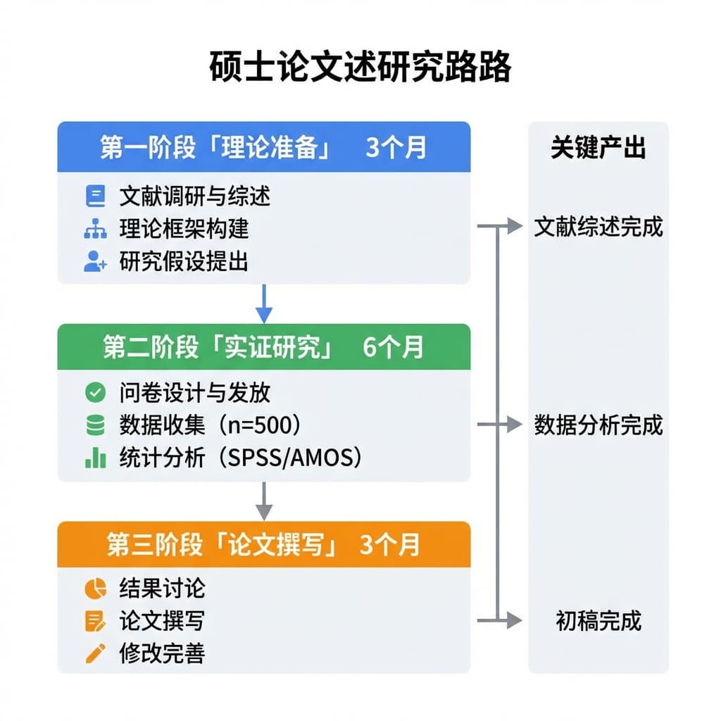
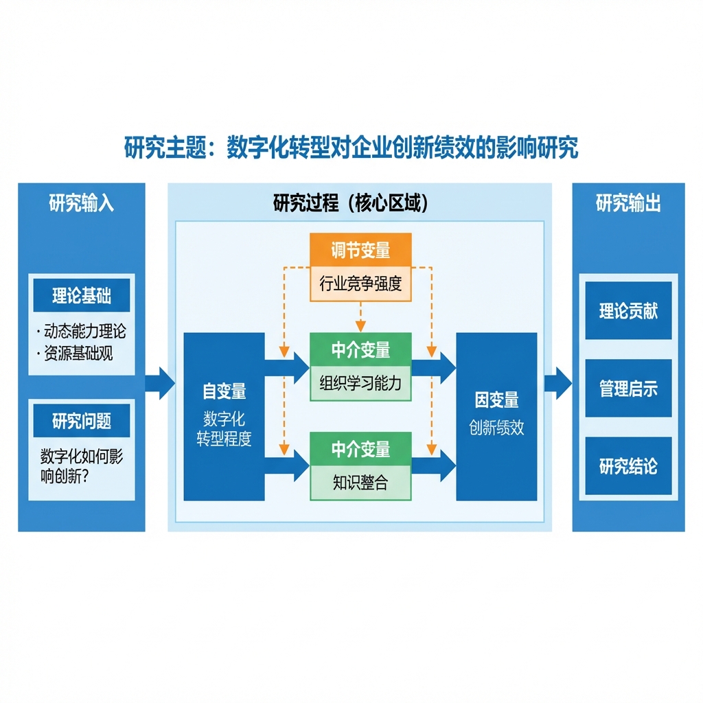
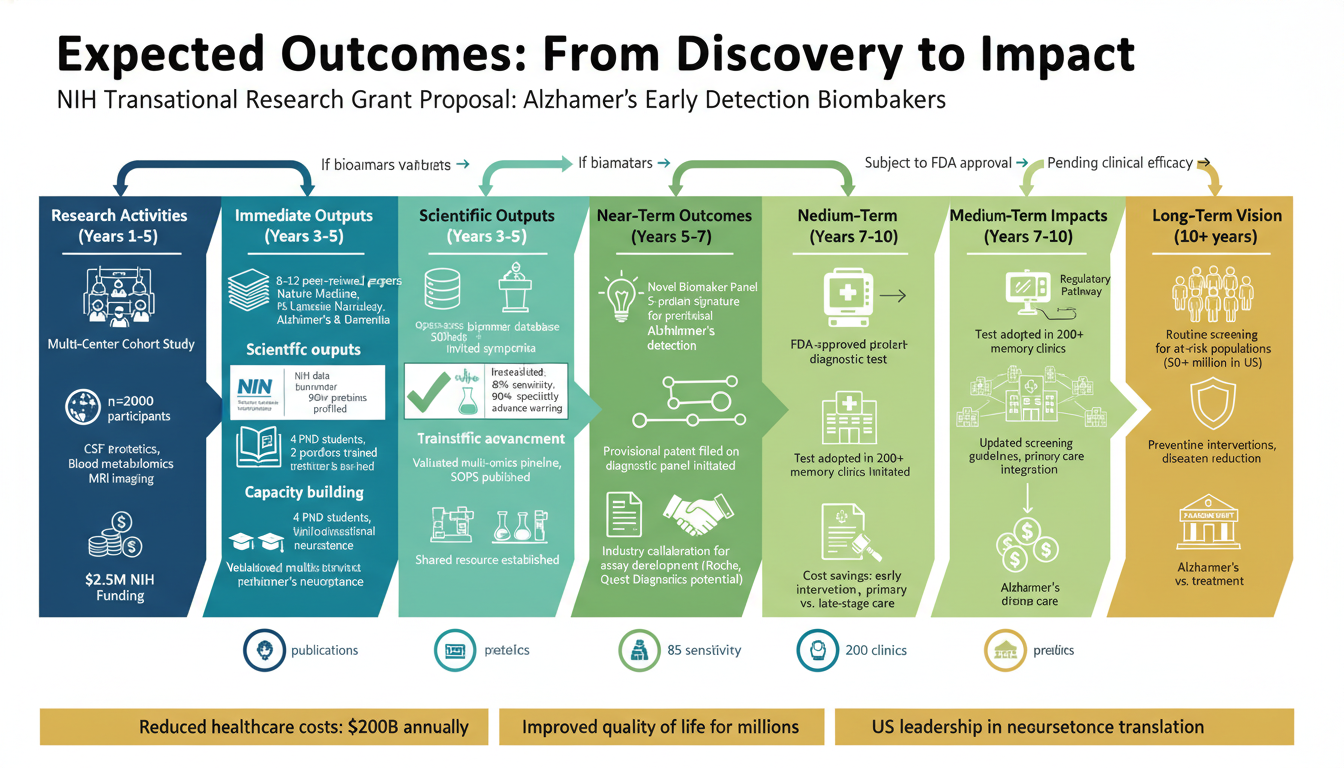
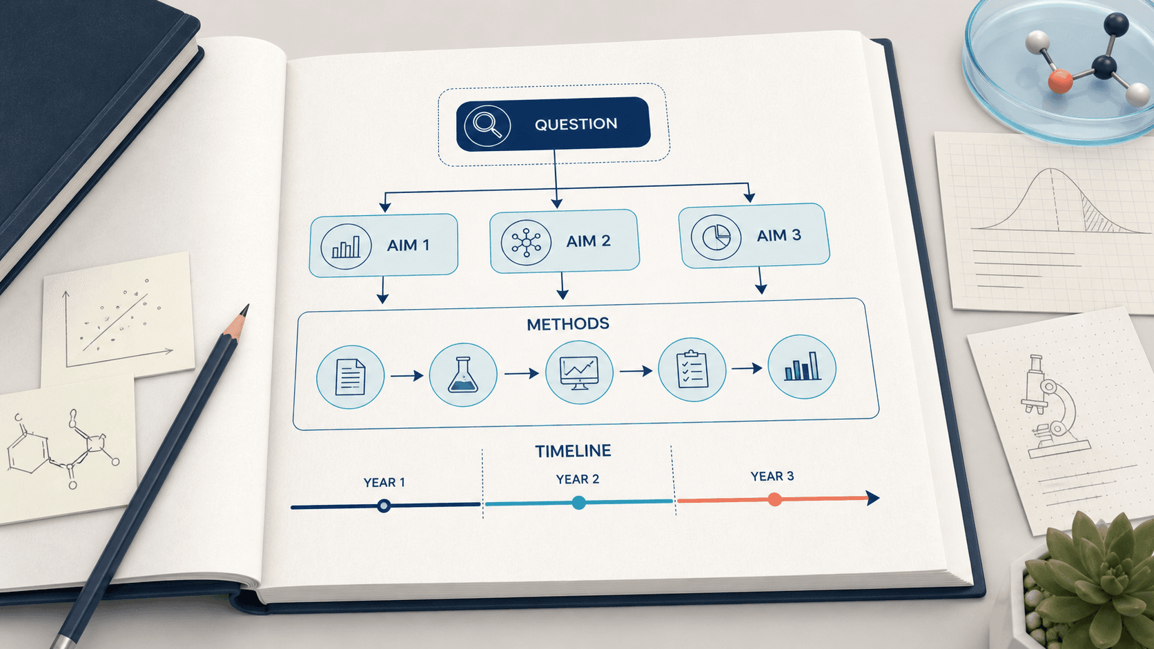
Most grant agencies asking for a "research strategy figure" or "research plan diagram" want the middle one — not a Gantt, not an experimental detail diagram. It must show the logical chain from central question → specific aims → key methods → expected outcomes.
If you submit a Gantt-style roadmap, reviewers conclude "this PI hasn't really thought through the science." If you submit an experimental detail flowchart, reviewers conclude "no big picture, no framework."
Successful and rejected proposals reveal a clear pattern. Reviewers scan for these in the first 30–60 seconds:
1. The central question is identifiable at a glance
The hypothesis or central question must be at the top or left edge of the diagram. Don't bury it in the middle. Reviewers won't search.
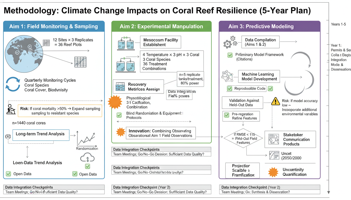
2. Specific aims split cleanly into 3–5 modules
Fewer than 3 looks shallow. More than 5 looks unfocused. Most R01-class proposals use 3 specific aims; junior/early-career grants use 3; large center grants can extend to 5–6 with main and supporting tracks.
3. The relationship between aims is clear
Are they parallel (three angles run simultaneously), sequential (Aim 1 must complete before Aim 2), or funnel-shaped (broad screen → validation → translation)? Wrong logic here makes reviewers question whether the project is mature.
4. Each aim shows key methods + verifiable outputs
Under each aim, name the methods (e.g., RNA-seq, single-cell ATAC, CRISPR screen, mass spec) and the deliverable (dataset, model, validated mechanism, prototype). "Investigate the mechanism of X" alone is not enough; "identify downstream targets of X via RNA-seq" is.
5. Innovation points are visually emphasized
A reviewer should be able to see the innovative element of the project, not just read about it in body text. Common methods: an accent color (orange or deep blue), a border, a small "innovation" tag.
6. Risks and contingencies are included
Mature roadmaps annotate "potential risk → mitigation strategy" near critical nodes. This is not strictly required but elevates the perception of the PI's planning depth.
Roadmaps are one of the harder cases for AI image generation, because the figure encodes logic structure, not just visuals. "Draw a research roadmap" returns a generic flowchart with no aims, no methods, no outputs.
"Extract RNA → reverse transcribe → qPCR → analysis" is a wet lab protocol, not an aim. An aim should be: "Determine the function of X in Y process and its regulation," with the methods listed below.
Roadmaps are not PowerPoint templates. Flat, restrained visuals look professional. 3D blocks, gradient fills, deep shadows signal "template," which signals "not deeply considered."
Typically at the end of the "research strategy" or "specific aims" narrative, as the visual summary of that section. Check successful samples in your discipline for placement convention.
For US, UK, EU, and most international agencies: English. For local-language agencies (e.g., Japanese 科研費 in Japanese, Korean NRF in Korean, Chinese NSFC in Chinese), use the corresponding local language. Reviewers reading native language will appreciate it; English labels add cognitive load.
Completely normal. Good roadmaps go through 5–10 revisions, each forcing you to rethink the proposal's logic. The value isn't just producing the figure — it's a thinking tool for sharpening the plan.
No. The AI gives you a structural draft. Final output requires: (1) verifying the scientific accuracy of every module, (2) fixing arrow logic, (3) emphasizing innovation, (4) unifying typography, (5) finishing in PowerPoint or Illustrator. AI compresses "0 to 80%" from two weeks to two hours; the last 20% is on you.
Junior/single-PI grants: vertical (central question at top → aims in middle → outcomes at bottom, matches reading flow). Multi-PI / center / consortium grants: horizontal (central question on the left → multiple WPs in the middle → outcomes on the right; fits more content).
It's not too late, but it's not optimal. The most reliable workflow is to draw the roadmap before writing the body text — drawing forces logical gaps to the surface, and gaps are easier to fix in a diagram than in finished prose.
If you're working on a grant proposal, treat the roadmap on SciDraw AI as a thinking tool first and a figure second. Get the logic right, then write.
Davie Chen is a researcher at the Faculty of Animation and Intermedia, University of Arts in Poznan, studying generative AI for scientific figure creation, patent illustration, and manuscript drafting. SciDraw AI is one of the research-to-product tools built from this work.