
Color is silent metadata. Before a reader parses a single axis label, the palette of your figure signals whether you are careful or careless, accessible or exclusionary, publication-ready or hastily assembled. Yet most researchers choose colors by gut instinct — or simply accept whatever defaults Matplotlib or Excel offers.
This reference guide corrects that. You will learn the three palette families every scientist needs, get copy-paste HEX tables for seven ready-to-use palettes, and walk away with concrete do/don't rules for figures you can submit with confidence.
What you'll learn:
- The difference between qualitative, sequential, and diverging palettes — and when each is correct
- Which palettes are safe for the ~8 % of readers with color vision deficiency
- Seven ready-to-use palettes with full HEX codes
- Practical rules for applying color to real scientific figures
- How to check and finalize your figures with SciDraw AI's figure checker
Why Color Choice Is a Scientific Decision
A poor palette is not merely ugly — it can actively mislead. Rainbow ("jet") colormaps create false boundaries where none exist in the data. Red–green contrasts disappear entirely for deuteranopic readers (the most common form of color blindness). Inconsistent qualitative colors across figure panels force readers to re-decode the legend every time they move between panels.
Journals such as Nature, Science, and PNAS increasingly ask authors to ensure figures are "accessible to colorblind readers," and several publishers reject figures that fail a basic grayscale-conversion test. Choosing the right palette from the start saves revision cycles.
The Three Palette Families
Qualitative Palettes
Use when: Encoding categorical data with no intrinsic order — cell types, experimental groups, species, treatment arms.
Key principle: All colors should appear equally prominent. No single hue should dominate or suggest greater importance.
Pitfall to avoid: Using a sequential ramp (light-to-dark) for categories implies ranking where none exists.
Sequential Palettes
Use when: Encoding a numeric variable that goes from low to high — gene expression level, temperature, concentration, p-value magnitude.
Key principle: The palette should be perceptually uniform: equal steps in the data should look like equal steps in the color. This rules out most hand-crafted gradients.
Pitfall to avoid: Using a two-ended diverging palette when zero is not a meaningful reference point.
Diverging Palettes
Use when: Encoding data where the midpoint is meaningful — fold-change (centered on 1 or log₂-fold = 0), correlation coefficients (centered on 0), anomaly maps (centered on the historical mean).
Key principle: The two ends should be equally saturated and the midpoint should be a neutral, light color (near white or light gray), not a third saturated hue.
Pitfall to avoid: A diverging palette where the neutral midpoint is an unrelated bright color — this creates a false third category.
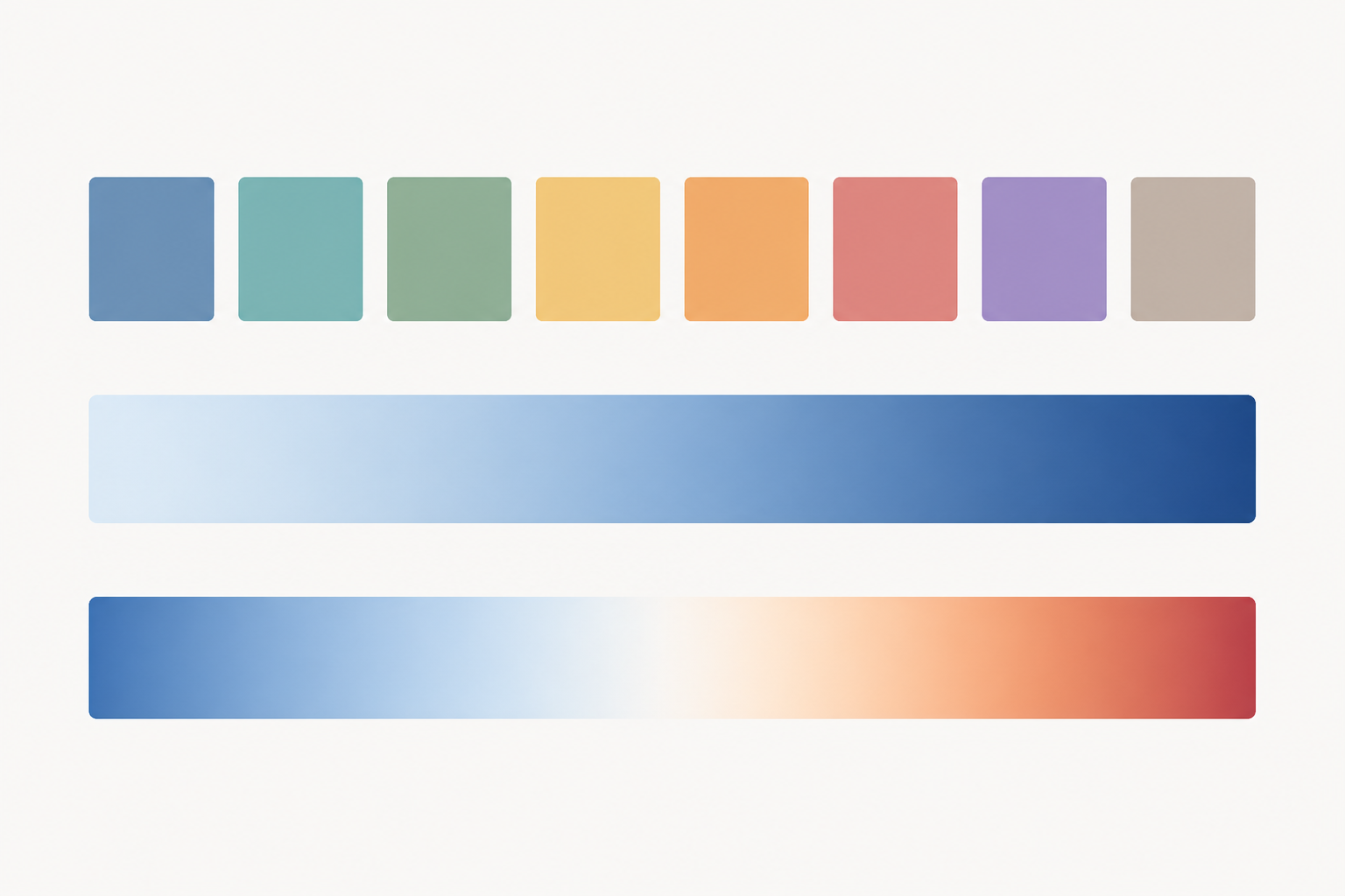 The three palette families — qualitative, sequential, and diverging — each encode a different kind of scientific data.
Colorblind Safety: The Non-Negotiable Requirement
Approximately 8 % of males and 0.5 % of females have some form of color vision deficiency. Deuteranopia and protanopia (red–green deficiency) are the most common. Tritanopia (blue–yellow) is rarer but still affects a meaningful fraction of readers.
The single fastest test: Convert your figure to grayscale. If all categories are still distinguishable, your figure passes the most basic accessibility check.
The definitive test: Run your image through Coblis (Color Blindness Simulator) or use the colorblind module in Python to simulate deuteranopia, protanopia, and tritanopia. Before submitting to any journal, paste your figure into SciDraw AI's figure checker to catch accessibility and formatting issues automatically.
Seven Ready-to-Use Palettes with HEX Codes
1. Okabe-Ito (Qualitative, 8 colors — Gold Standard for Colorblind Safety)
Designed by Masataka Okabe and Kei Ito specifically for colorblind accessibility. This is the recommended default for qualitative scientific figures in most modern style guides.
| Swatch | Name | HEX | RGB |
|---|---|---|---|
| ■ | Black | #000000 | 0, 0, 0 |
| ■ | Orange | #E69F00 | 230, 159, 0 |
| ■ | Sky Blue | #56B4E9 | 86, 180, 233 |
| ■ | Bluish Green | #009E73 | 0, 158, 115 |
| ■ | Yellow | #F0E442 | 240, 228, 66 |
| ■ | Blue | #0072B2 | 0, 114, 178 |
| ■ | Vermilion | #D55E00 | 213, 94, 0 |
| ■ | Reddish Purple | #CC79A7 | 204, 121, 167 |
Best for: Up to 8 categories; any figure targeting broad audiences or journals with accessibility requirements.
2. Paul Tol's Bright (Qualitative, 7 colors)
Developed by astronomer Paul Tol, this set prioritizes contrast on both white and light-gray backgrounds — common in journal figures.
| Swatch | Name | HEX |
|---|---|---|
| ■ | Blue | #4477AA |
| ■ | Cyan | #66CCEE |
| ■ | Green | #228833 |
| ■ | Yellow | #CCBB44 |
| ■ | Red | #EE6677 |
| ■ | Purple | #AA3377 |
| ■ | Grey | #BBBBBB |
Best for: Line plots and scatter plots with up to 7 groups.
3. Viridis (Sequential, perceptually uniform)
The most widely adopted sequential colormap in science, shipping as default in Matplotlib since 2015. Perceptually uniform, colorblind-safe, and prints well in grayscale.
| Stop | HEX | Description |
|---|---|---|
| 0 % | #440154 | Deep purple (low) |
| 25 % | #31688E | Blue |
| 50 % | #35B779 | Green |
| 75 % | #90D743 | Yellow-green |
| 100 % | #FDE725 | Bright yellow (high) |
Best for: Heatmaps, density plots, any continuous variable without a meaningful zero.
4. Plasma (Sequential, perceptually uniform)
A warmer alternative to Viridis. Particularly effective when printing in color is guaranteed.
| Stop | HEX |
|---|---|
| 0 % | #0D0887 |
| 25 % | #7E03A8 |
| 50 % | #CC4778 |
| 75 % | #F89540 |
| 100 % | #F0F921 |
Best for: Supplementary figures with rich color printing; microscopy intensity maps.
5. RdBu (Diverging)
A classic red–blue diverging palette from ColorBrewer, widely used for correlation matrices, expression fold-change, and climate anomaly maps.
| Stop | HEX | Description |
|---|---|---|
| −max | #B2182B | Strong red |
| −mid | #EF8A62 | Light red |
| 0 | #F7F7F7 | Near-white neutral |
| +mid | #67A9CF | Light blue |
| +max | #2166AC | Strong blue |
Best for: Correlation matrices, fold-change heatmaps, any data with a natural midpoint at zero.
6. PRGn (Diverging, colorblind-friendlier)
Purple–green diverging palette. Because it avoids red–green contrast, it performs significantly better for deuteranopic and protanopic readers than RdBu.
| Stop | HEX |
|---|---|
| −max | #762A83 |
| −mid | #C2A5CF |
| 0 | #F7F7F7 |
| +mid | #7FBF7B |
| +max | #1B7837 |
Best for: Any diverging use case where red–green accessibility is a concern.
7. Nature/Cell-inspired Muted Qualitative (5 colors)
This palette approximates the subdued, publication-quality style used by figures in Nature and Cell family journals. It avoids high saturation while maintaining clear category distinction.
| Swatch | HEX | Typical use |
|---|---|---|
| ■ | #4E79A7 | Group 1 / Control |
| ■ | #F28E2B | Group 2 / Treatment |
| ■ | #E15759 | Group 3 / Highlight |
| ■ | #76B7B2 | Group 4 |
| ■ | #59A14F | Group 5 |
Best for: Bar charts, box plots, and multi-line plots in manuscripts targeting high-impact journals.
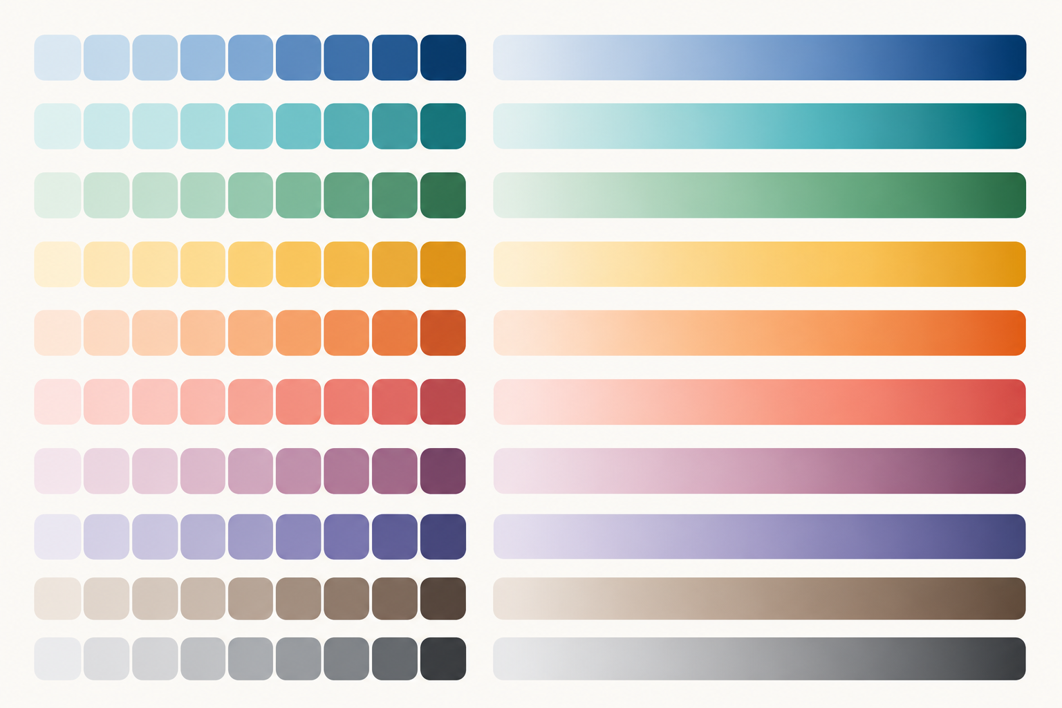 A tidy reference sheet of categorical chips and perceptually-uniform gradients makes it easy to reuse vetted palettes in SciDraw AI.
Palette Comparison: Which to Use When
| Palette | Type | Colors | Colorblind-Safe | Grayscale | Best Journal Context |
|---|---|---|---|---|---|
| Okabe-Ito | Qualitative | 8 | Excellent | Good | Any; accessibility-focused journals |
| Tol Bright | Qualitative | 7 | Good | Moderate | Line/scatter plots |
| Viridis | Sequential | Continuous | Excellent | Excellent | Heatmaps, density |
| Plasma | Sequential | Continuous | Excellent | Good | Color-printing guaranteed |
| RdBu | Diverging | Continuous | Moderate | Good | Correlation, fold-change |
| PRGn | Diverging | Continuous | Good | Good | Accessibility-critical diverging |
| Nature Muted | Qualitative | 5 | Good | Moderate | High-impact journal manuscripts |
Practical Do/Don't for Scientific Figures
DO
- Do use perceptually uniform sequential palettes (Viridis, Plasma, Cividis) for continuous data.
- Do test every figure in grayscale before submission — many reviewers print in black and white.
- Do use the same palette consistently across all panels of a multi-panel figure. When you build multi-panel layouts with SciDraw AI's scientific figure maker, lock palette settings at the project level to enforce consistency.
- Do choose diverging palettes only when the midpoint is scientifically meaningful.
- Do label your color axis (colorbar) with the exact variable and units.
- Do run finished figures through a dedicated quality check. SciDraw AI's figure checker flags common color and contrast issues automatically.
DON'T
- Don't use the jet/rainbow colormap for scientific data. It is not perceptually uniform, creates false contours, and fails every colorblind test.
- Don't encode more than 8 qualitative categories with color alone — add shape or pattern redundancy.
- Don't use red and green as the two ends of a diverging palette without checking accessibility.
- Don't apply a diverging palette to strictly positive or strictly negative data.
- Don't change palettes between figure panels showing the same variable.
- Don't rely on color as the only visual channel — always combine with shape, line style, or direct annotation where possible.
 A perceptually-uniform colormap (left) represents data faithfully, while the rainbow "jet" map (right) invents false boundaries.
Applying These Palettes in Common Tools
Python (Matplotlib / Seaborn)
import matplotlib.pyplot as plt
import matplotlib.colors as mcolors

# Okabe-Ito palette
okabe_ito = ['#000000','#E69F00','#56B4E9','#009E73',
R (ggplot2)
library(ggplot2)

# Okabe-Ito via the colorblind-friendly package
library(ggthemes)
scale_colour_colorblind()

# Or specify manually
okabe <- c("#E69F00","#56B4E9","#009E73","#F0E442","#0072B2","#D55E00","#CC79A7")
scale_colour_manual(values = okabe)
Adobe Illustrator / Inkscape
Import HEX codes directly into swatches. Create a named swatch group for each project to enforce palette consistency across panels. Then export your figure files and use SciDraw AI's graphical abstract maker to integrate them into polished, journal-ready layouts.
From Palette to Publication-Ready Figure
Choosing the right colors is step one. Publication readiness also requires:
- Correct font sizes (minimum 6 pt for labels in most journals; 8–10 pt recommended)
- Line weights that survive downscaling (≥0.5 pt)
- Figure dimensions that match journal specifications
- Resolution of at least 300 DPI for raster elements
SciDraw AI's scientific figure maker handles the dimensional and resolution requirements automatically, and SciDraw AI's graphical abstract maker helps you integrate your data figures into a visually coherent single-page summary. Run the finished file through the figure checker to catch anything you missed.
FAQ
Q: Should I always use Viridis for heatmaps?
Viridis is an excellent default, but it is not the only option. Inferno and Cividis are also perceptually uniform and colorblind-safe. Choose based on the visual context: Viridis reads as "cool to warm" for many audiences, which may or may not match your data's narrative. If your data represents intensity or count without a directional narrative, all three are appropriate.
Q: Can I use more than 8 colors in a qualitative palette?
You can, but you should not rely on color alone when you have more than 8 categories. Beyond 8 hues, human perception of categorical distinction degrades significantly. Add shape markers (circles, squares, triangles), line styles (solid, dashed, dotted), or direct labels to supplement color encoding.
Q: What is the minimum colorbar resolution I should include?
A colorbar should have at minimum 5 labeled tick marks at regular intervals across the full data range. Include the exact units in the colorbar label. For diverging palettes, always include and explicitly label the midpoint value.
Q: My journal asks for CMYK figures. Do these HEX codes still apply?
HEX codes are RGB. Before final submission, convert your figure to CMYK using the journal's ICC profile (usually Adobe RGB 1998 or sRGB IEC61966-2.1 as the source profile). Colors will shift slightly — check the CMYK proof carefully, especially for saturated yellows (like the bright end of Viridis), which can become muddy. Request a color proof from the production office if in doubt.
Q: Is there a single palette safe enough for all types of color blindness?
No single palette is perfect for all three main types (protanopia, deuteranopia, tritanopia) simultaneously, but Okabe-Ito comes closest for qualitative data. For sequential and diverging palettes, Cividis is specifically optimized for all forms of color vision deficiency. Use the Coblis simulator to verify your specific palette against all three conditions.
Q: How do I make sure my colors look correct across different monitors and projectors?
Calibrate your monitor to the sRGB color space, which is the standard assumption for screen-destined academic figures. For presentations projected in a large room, increase contrast and avoid very light colors (anything above ~85 % lightness will wash out on most projectors). Test your slides in the actual projection environment when possible.


