Color is one of the most powerful tools in scientific communication — and one of the most commonly misused. Roughly 8 % of men and 0.5 % of women of Northern European descent have some form of color vision deficiency (CVD). In a global research audience that can easily mean one reviewer, one committee member, or one editor in ten cannot distinguish your carefully chosen red from your green.
Choosing a colorblind-safe palette is not just an accessibility nicety; it is part of rigorous science communication. This guide gives you everything you need to make that choice correctly, starting with the gold-standard option most working scientists reach for: the Okabe-Ito palette.
What you will learn:
- The exact HEX (and RGB) codes for the full 8-color Okabe-Ito palette
- Why these colors were empirically designed to stay distinguishable under the three most common CVD types
- Practical rules for applying the palette in line graphs, bar charts, scatter plots, and multi-panel figures
- Alternative colorblind-safe palettes and when to prefer them
- Free tools to simulate and verify CVD safety before submission
What Is the Okabe-Ito Palette?
The palette was proposed by Masataka Okabe and Kei Ito in their 2008 guide "Color Universal Design (CUD)", published under the Color Universal Design Organization (CUDO) in Japan. Their goal was a small, practical set of colors that remain distinguishable under the three most prevalent forms of CVD:
- Deuteranopia / deuteranomaly — reduced sensitivity to green (most common in men)
- Protanopia / protanomaly — reduced sensitivity to red
- Tritanopia / tritanomaly — reduced sensitivity to blue (rare, ~0.003 %)
Rather than being derived from a mathematical formula, the palette was designed empirically: Okabe and Ito chose colors that differ in brightness and saturation and deliberately avoided the yellow-green range where CVD confusion is greatest, then verified the set against colorblind vision. In practice, the colors look muted compared to saturated defaults like Matplotlib or ggplot2 — intentionally so. It is best described as "empirically colorblind-safe," not mathematically guaranteed.
The Okabe-Ito 8-Color Palette — Exact HEX Codes
The following table lists all eight colors with their canonical HEX values, RGB triplets, and recommended use cases. These HEX codes match the values given in the original CUDO document and are reproduced identically across major scientific style guides, including Bang Wong's 2011 Nature Methods "Points of view: Color blindness", which popularized a 7-color subset (Wong popularized the palette; Okabe and Ito are the originators).
| # | Name | HEX | R | G | B | Best used for |
|---|---|---|---|---|---|---|
| 1 | Black | #000000 | 0 | 0 | 0 | Primary data series, reference lines |
| 2 | Orange | #E69F00 | 230 | 159 | 0 | Second series; pairs well with blue |
| 3 | Sky Blue | #56B4E9 | 86 | 180 | 233 | Third series; highly distinguishable |
| 4 | Bluish Green | #009E73 | 0 | 158 | 115 | Fourth series; also called teal |
| 5 | Yellow | #F0E442 | 240 | 228 | 66 | Highlight, fill; avoid thin lines |
| 6 | Blue | #0072B2 | 0 | 114 | 178 | Strong accent; pairs with orange |
| 7 | Vermilion | #D55E00 | 213 | 94 | 0 | Error bars, emphasis |
| 8 | Reddish Purple | #CC79A7 | 204 | 121 | 167 | Eight-category ceiling |
Tip: For figures with ≤ 4 categories, use colors 2 (Orange), 3 (Sky Blue), 6 (Blue), and 7 (Vermilion) first — this quartet has the highest pairwise contrast under all three CVD simulations.
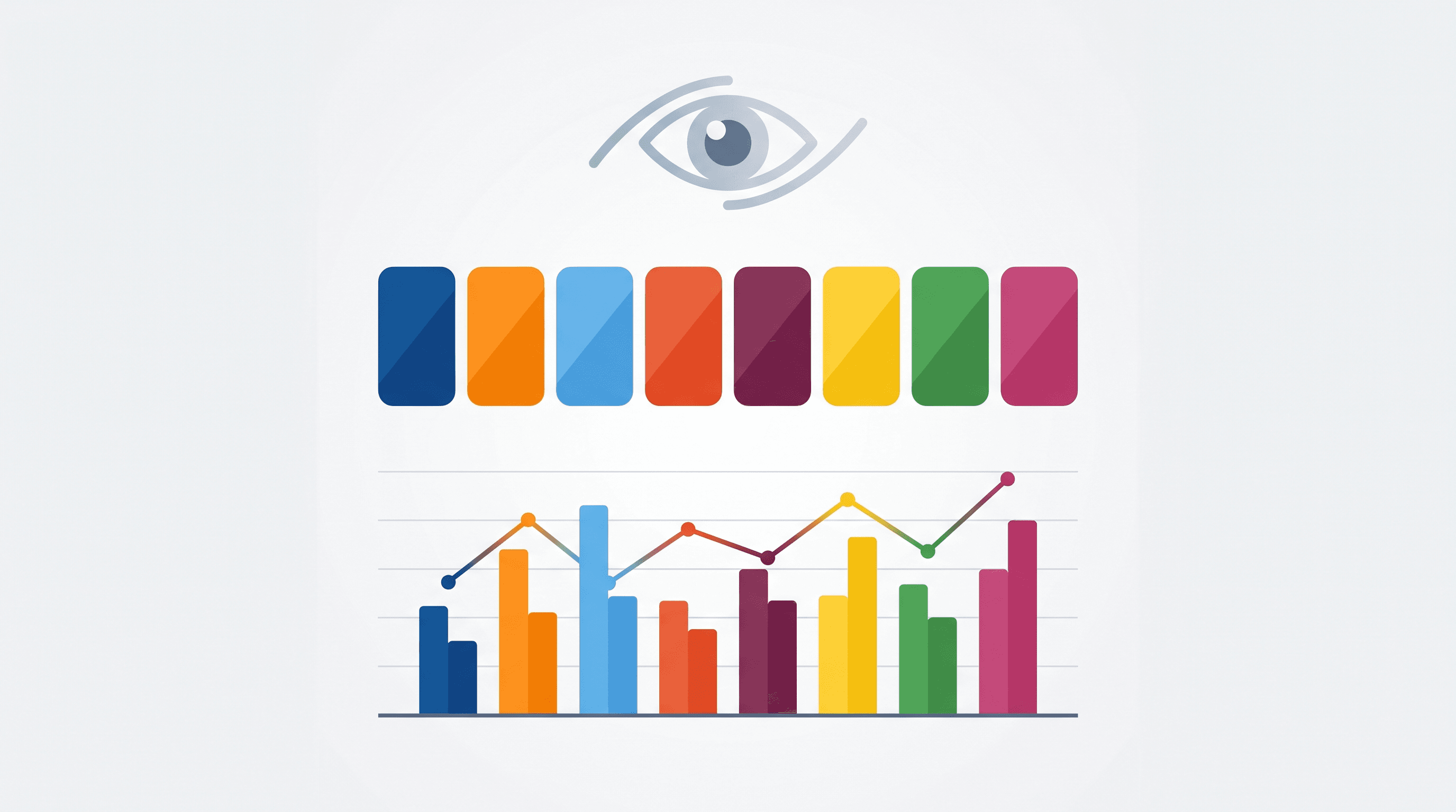
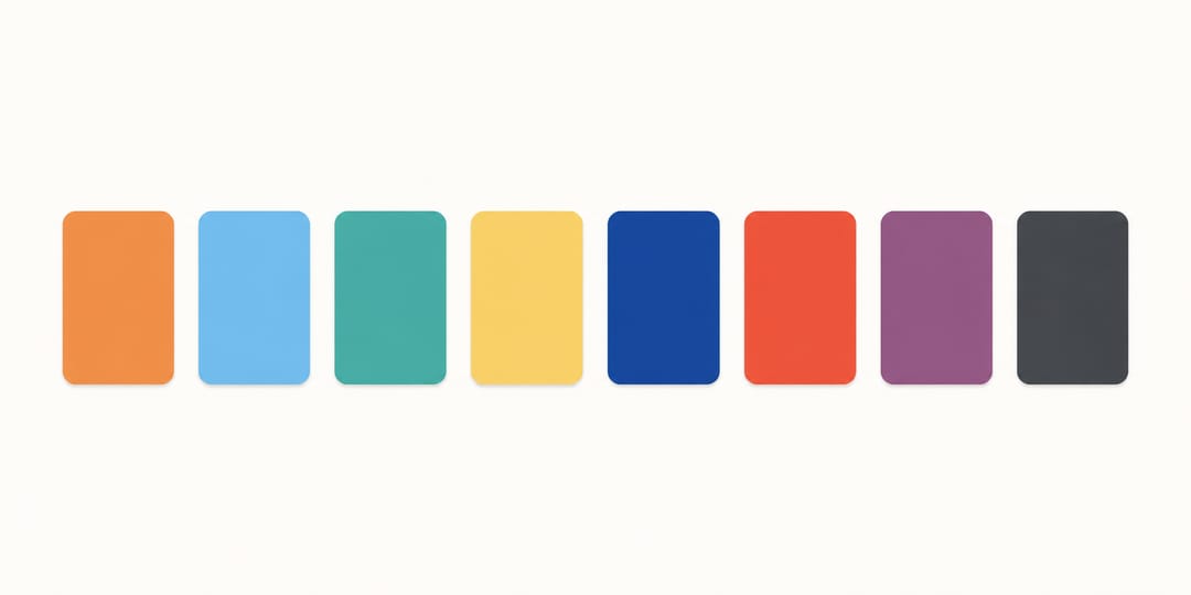 The eight Okabe-Ito colors form a harmonious, colorblind-safe reference strip you can reuse across every SciDraw AI figure.
Why These Specific Colors Work
Protanopia and Deuteranopia (Red-Green Deficiency)
In both protanopia and deuteranomaly, the red and green channels merge. Colors that differ only in red vs. green are confused. The Okabe-Ito palette avoids pure red and pure green entirely. Instead it uses:
- Orange (
#E69F00) — perceived as yellow-orange even in protanopia - Bluish Green / Teal (
#009E73) — contains enough blue channel to survive the red-green merge - Vermilion (
#D55E00) — shifted far enough toward orange that it stays distinct from teal
Tritanopia (Blue-Yellow Deficiency)
Tritanopia confuses blue with green and yellow with violet. The palette keeps its blue (#0072B2) dark and saturated enough that it separates from teal and yellow even when the short-wave channel is absent.
Luminance Contrast
Colorblind viewers often rely on luminance (brightness) differences when hue fails them. The Okabe-Ito colors span a wide luminance range — from near-zero (Black) through mid-range (Teal, Vermilion, Orange) to high (Yellow, Sky Blue) — giving a secondary separation channel even when color simulation collapses hues together.
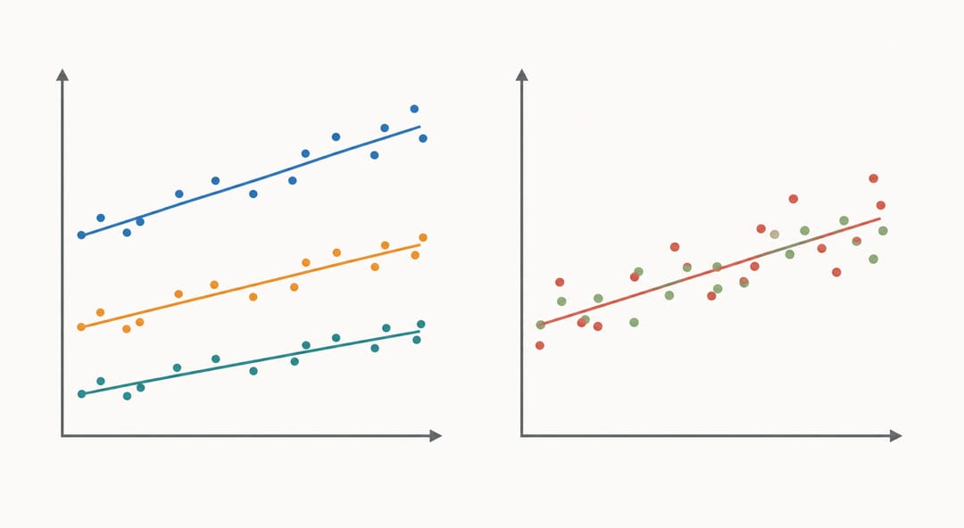 A well-separated colorblind-safe palette (left) stays readable where a clashing red-green palette (right) collapses for many viewers.
How to Apply the Palette in Practice
Line and Scatter Plots
Assign colors in order 2 → 3 → 6 → 7 → 4 → 5 → 8, reserving Black (#1) for a reference or null series. If you have more than 7 data series, consider splitting into subplots rather than adding a ninth color — no palette extends cleanly to 9+ categories under CVD constraints.
Use both color and shape (or line style) for dual encoding. A CVD viewer who prints in greyscale or views a low-quality PDF still reads the figure correctly.
Bar Charts and Filled Areas
Yellow (#F0E442) is weak on white backgrounds as a thin line but effective as a fill. Pair it with a dark border (#000000 or #5a5a5a) to ensure visibility.
Heatmaps and Continuous Scales
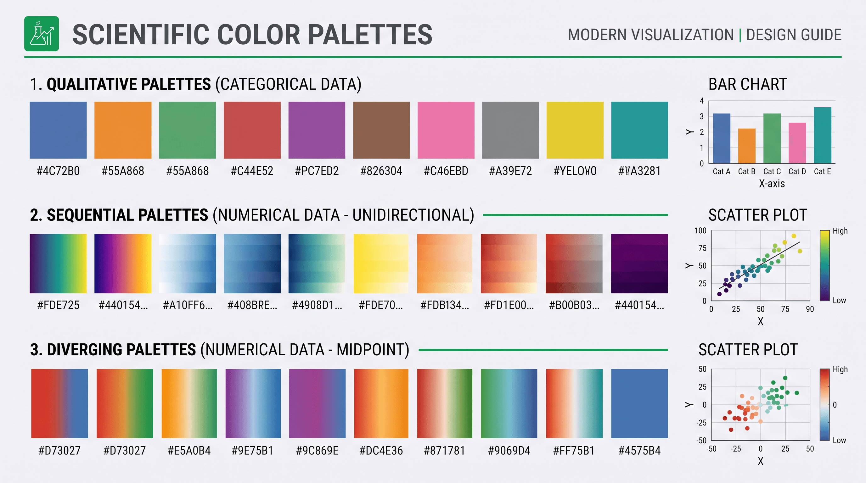
The Okabe-Ito set is a categorical palette — it is not designed for continuous data. For heatmaps:
- Sequential data: Use
viridis,cividis, ormako(all CVD-safe by design) - Diverging data: Use
RdBuorBrBGwith central white; avoidRdGn
Multi-Panel Figures
Maintain color consistency across all panels. If panel A shows Orange = Condition X, every other panel must keep that mapping. Inconsistency is the most common colorblind-accessibility failure in multi-panel figures — even when the individual panels are CVD-safe.
When you build multi-panel figures with SciDraw AI's scientific figure maker, you can specify the Okabe-Ito hex codes directly in your prompt to enforce consistency across panels automatically.
Other Colorblind-Safe Palettes
The Okabe-Ito palette is not the only option. The table below compares it with other commonly recommended sets.
| Palette | Colors | Type | CVD types covered | Notes |
|---|---|---|---|---|
| Okabe-Ito | 8 | Categorical | Protan, Deutan, Tritan | Recommended default for science |
| Wong (2011) | 7 | Categorical | Protan, Deutan | Subset of Okabe-Ito minus Black; published in Nature Methods |
| Tol Bright | 7 | Categorical | Protan, Deutan | Paul Tol's palette; good for presentations |
| Tol Muted | 10 | Categorical | Protan, Deutan | Up to 10 categories; slightly lower contrast |
| IBM Color Blind Safe | 5 | Categorical | Protan, Deutan | Clean, high-contrast; only 5 colors |
| viridis | Continuous | Sequential | All types | Best continuous palette; perceptually uniform |
| cividis | Continuous | Sequential | All types | Optimized specifically for deuteranopia |
When to choose Okabe-Ito over alternatives:
- You need exactly up to 8 categories in a single chart
- Your figures will appear in print (the palette is designed for both screen and CMYK print)
- You want a single palette to cover protan, deutan, and tritan simultaneously
When to consider Paul Tol's palettes instead:
- You need more than 8 categorical colors (Tol Muted reaches 10)
- You are making presentation slides where slightly brighter colors read better at a distance
Checking Your Figures for CVD Safety
Choosing a CVD-safe palette is step one. Checking the output is step two — because misapplication (wrong hex code, added gradient, opacity overlap) can silently break accessibility.
Simulation Tools
| Tool | Platform | Method | Notes |
|---|---|---|---|
| Coblis (color-blindness.com) | Web | Upload image | Quick; simulates all 8 CVD types |
| Sim Daltonism | macOS / iOS | Desktop app | Real-time screen overlay |
| Color Oracle | Win / Mac / Linux | Desktop app | Full-screen real-time simulation |
| Adobe Color | Web | Accessibility checker | Also checks contrast ratios |
| Chromatic Vision Simulator | iOS / Android | Mobile | Camera-based real-time simulation |
The Greyscale Test
Convert your figure to greyscale (desaturate completely). If every series remains distinguishable by luminance alone, your figure passes the most stringent accessibility standard. Many journals that accept color online still print in greyscale — this test catches dual failures at once.
Automated Figure Checking
SciDraw AI's figure checker can flag common palette issues in uploaded figures, including red-green combinations that are unsafe for protanopia/deuteranopia. Running a quick check before submission takes seconds and can prevent reviewer complaints.
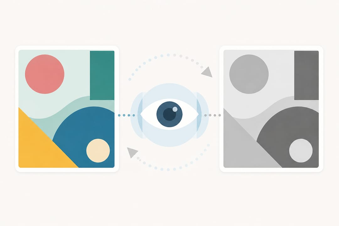 Simulating color vision deficiency and converting to greyscale reveals whether a figure stays readable for every audience.
Applying Okabe-Ito in Common Tools
R / ggplot2
# Install the colorblind-friendly palette package
# install.packages("ggthemes")
library(ggthemes)
scale_colour_colorblind()   # applies Okabe-Ito automatically

# Or define manually:
okabe_ito <- c("#E69F00", "#56B4E9", "#009E73", "#F0E442",
               "#0072B2", "#D55E00", "#CC79A7", "#000000")
scale_colour_manual(values = okabe_ito)
Python / Matplotlib
okabe_ito = [
    "#E69F00", "#56B4E9", "#009E73", "#F0E442",
    "#0072B2", "#D55E00", "#CC79A7", "#000000"
]
import matplotlib.pyplot as plt
plt.rcParams["axes.prop_cycle"] = plt.cycler(color=okabe_ito)
Prism (GraphPad)
In GraphPad Prism, double-click a data set color, select "Custom color", and enter the hex code. There is no palette import feature, but copying the HEX table above into a reference document makes manual entry fast.
Adobe Illustrator / Inkscape
Create a color swatch library from the HEX values. In Illustrator: Window → Swatches → New Color Group. This ensures you always pick from the safe set without memorizing codes.
Using AI Figure Tools with Okabe-Ito
AI-powered figure generators can enforce a specific color palette if you supply the hex codes in your generation prompt. With SciDraw AI you can describe your figure's content and specify:
"Use only Okabe-Ito colors: Orange #E69F00, Sky Blue #56B4E9, Blue #0072B2, Vermilion #D55E00"
The graphical abstract maker similarly accepts color constraints, which is useful when your institution or journal has adopted Okabe-Ito as a house standard.
Common Mistakes to Avoid
- Pairing teal and brown — Brown is not in the Okabe-Ito set; it can be confused with dark orange by deuteranopes. Stick to the defined set.
- Adding transparency / alpha — Overlapping semi-transparent fills create mixed colors that may not have been tested for CVD safety.
- Using yellow on a white or light-grey background as a line — Yellow (
#F0E442) is effectively invisible as a 1 px line. Reserve it for fills or increase stroke width significantly. - Ignoring print CMYK conversion — HEX values defined for RGB screens can shift during CMYK conversion. Provide both RGB and CMYK values to your journal production team if color accuracy is critical.
- Calling it "colorblind-proof" — No palette is perfect for every individual. Combined color + shape encoding is always safer than color alone.
FAQ
Q: Is the Okabe-Ito palette the same as the Wong palette from Nature Methods? A: Nearly. The Wong (2011) palette published in Nature Methods is a 7-color subset of Okabe-Ito — it omits Black. Both share the same six chromatic colors with identical hex codes. The terms are often used interchangeably.
Q: Can I use Okabe-Ito for a heatmap?
A: No — it is a categorical palette designed for discrete groups. For continuous heatmap data, use viridis or cividis instead, both of which are perceptually uniform and CVD-safe.
Q: My journal requires specific brand colors that are not CVD-safe. What do I do? A: Use the brand color for a single accent element (e.g., title bar or logo) and apply CVD-safe colors for all data series. Supplement with shape and pattern encoding so that color is not the sole differentiator.
Q: Does Okabe-Ito work for all 8 color vision deficiency types? A: It is tested and documented for the three most prevalent types: protanopia, deuteranopia, and tritanopia. Rare forms such as monochromacy (complete color blindness) require additional accommodations such as texture or pattern.
Q: How many categories can I safely show with Okabe-Ito? A: Up to 8, but legibility degrades above 5–6 in small figures. For 7–8 categories, increase symbol size and consider supplementary tables alongside the figure.
Q: Is there a free tool to automatically apply Okabe-Ito to existing figures? A: SciDraw AI's figure checker can analyze an uploaded figure and flag CVD issues. For full regeneration with Okabe-Ito applied, the scientific figure maker lets you specify exact palette constraints from the start.
Related tools
- Figure Accessibility Kit — contrast ratios, CVD simulation and the non-colour encodings (shape, pattern, direct labelling) that journals increasingly ask for
- Scientific Diagram Notation — the arrow, scale-bar and panel-label conventions that carry meaning when colour alone cannot
- Figure DPI Calculator — check that your figure still resolves at the journal's column width