Sankey Diagram Generator
Build a flow diagram from plain text
Describe how quantities flow between stages and AI draws a clean Sankey diagram with proportional bands and labeled nodes — perfect for energy balances, budgets, material flows, and research figures.
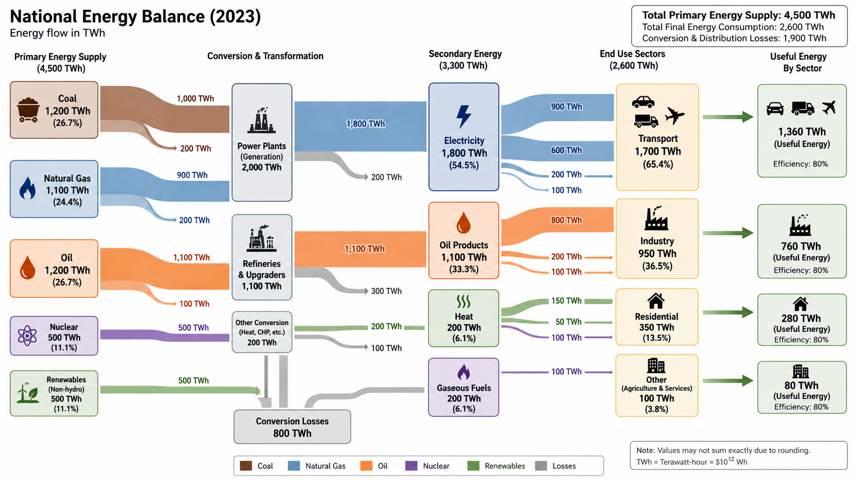
Sankey diagram examples
Click any example to load its prompt, or use it as a starting point for your own flow diagram.
What does this Sankey diagram generator do?
It turns a description of how quantities move between stages into a clean, labeled Sankey diagram — the flow chart where the width of every band is proportional to the amount flowing through it. You describe the sources, the stages, and where things split or are lost, and the AI draws proportional flow bands connecting labeled nodes from left to right, so you can see at a glance where the biggest flows and losses are without aligning ribbons by hand.
Why use a Sankey diagram generator
- Sankey diagrams are the clearest way to show energy, material, money, and process flows in one picture.
- Drawing proportional bands and routing them between nodes by hand is slow and error-prone.
- Proportional widths make dominant flows and losses obvious to any audience.
- Researchers and analysts need quick, presentable flow figures for papers, reports, and talks.
- Regenerating from text is far faster than re-laying-out ribbons every time the numbers change.
How to make a Sankey diagram
List your nodes (sources, intermediate stages, and final destinations) and the flows between them, with a rough size or unit for each — for example energy in TWh, budget in dollars, or students as a count. Describe where flows split or branch off as losses. Generate the diagram, then check that the band widths reflect the relative sizes and that each flow connects the right nodes. Refine the labels and quantities and regenerate until the picture matches your data.
Parts of a Sankey diagram
- Nodes — the sources, stages, and destinations between which things flow.
- Flow bands — ribbons whose width is proportional to the quantity.
- Sources — the starting nodes on the left.
- Sinks / losses — where flows end or branch off as waste.
- Labels & values — node names and the magnitude of each flow.
- Colour coding — a colour per source so flows are easy to trace.
Sankey Diagram Generator FAQ
What is a Sankey diagram?
A Sankey diagram is a flow diagram in which the width of each connecting band is proportional to the quantity it represents. It is used to visualise energy, material, money, and process flows, making it easy to see where the largest flows and losses occur.
What can I use a Sankey diagram for?
Common uses include energy balances, carbon and material flows, budget and resource allocation, water budgets, manufacturing process flows, and user or cohort pathways. Describe any flow with quantities and the generator will draw it.
Are the flow bands proportional to the values?
Yes. Provide rough quantities or units for each flow in your description and the diagram sizes the bands proportionally, so the relative magnitudes are visually accurate.
Can I show losses or branches?
Yes. Describe where a flow splits or is lost — for example conversion losses in an energy system or scrap in a manufacturing process — and those branches are drawn as separate proportional bands.
Is it suitable for reports and presentations?
Yes. It produces clean, labeled Sankey diagrams suitable for papers, reports, and slides. Always check the values and connections against your own data before publishing.
Is it free?
Each generation uses a small number of credits. New accounts get free credits, so you can make a Sankey diagram without any subscription.
Explore More Tools
Workflow Diagram Generator
Generate experimental flowcharts and research methodology diagrams
Try it free
Schematic Diagram Generator
Generate experimental setup and conceptual schematic diagrams
Try it free
Circuit Diagram Maker
Draw clean electrical circuit schematics with standard symbols from a text prompt.
Try it freeNeed other research diagrams?
Generate workflow diagrams, schematics, and process figures with SciDraw AI.