AI Figures for Papers, Graphical Abstracts, and Posters: A Grad Student Workflow
A complete visual workflow for grad students — how paper figures, graphical abstracts, and scientific posters differ, how to make each well, and how to share one asset set across all three with AI. Includes prompt templates and FAQ.
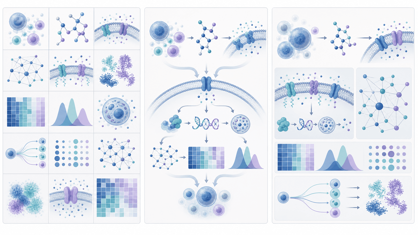
If you're in grad school, there's a good chance you'll need to make three kinds of figures this year: the figures that go inside your paper, the graphical abstract that goes with the submission, and the giant poster you bring to a conference. They all look like "research visuals," but once you actually make one of each, you realize the design logic behind them is completely different — different readers, different information density, different time-on-screen.
This article ties them together: first the actual differences between the three, then how to make each one well, and finally how to use AI tools to share assets across all three so you don't start from scratch every time. Prompt templates and an FAQ at the end.
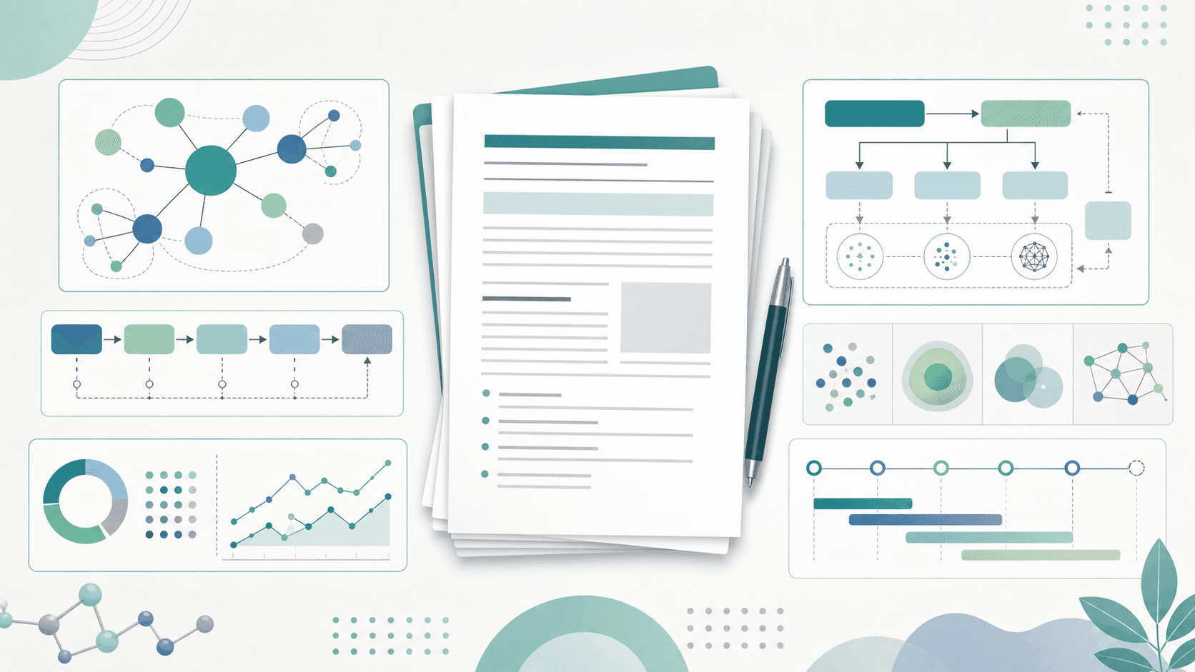
A common rookie move is to write a prompt like "make me a research figure." That's almost no information for an AI. The same word covers three completely different things:
More Posts
Create your scientific figures with AI
Thousands of researchers use SciDraw AI to make publication-ready figures for papers, grants, and journal submissions — in minutes, with no design skills.
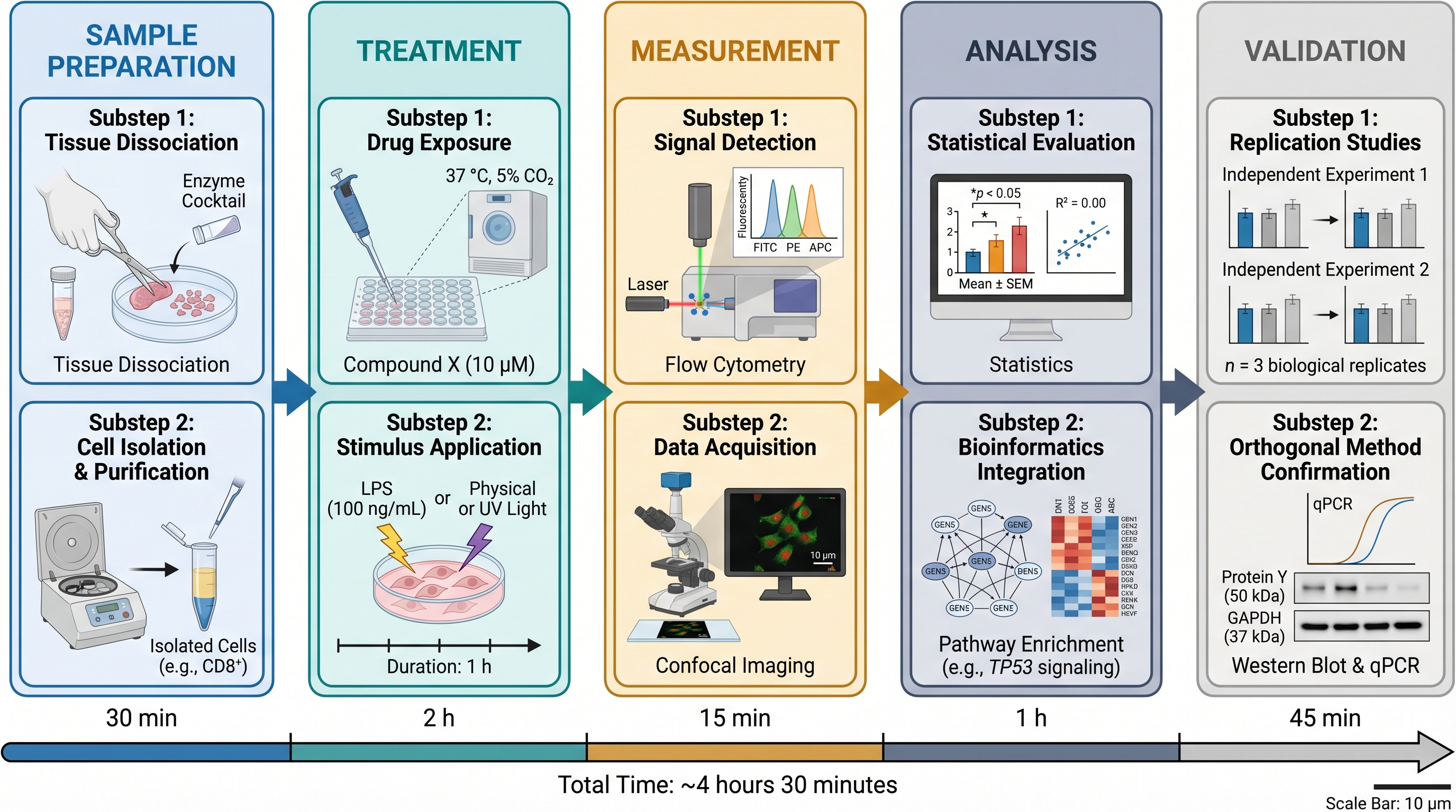
Paper figures are the densest of the three. The goal is to let a reviewer understand your experimental design or mechanistic claim in 30 seconds and survive repeated re-reading. There are three common types:
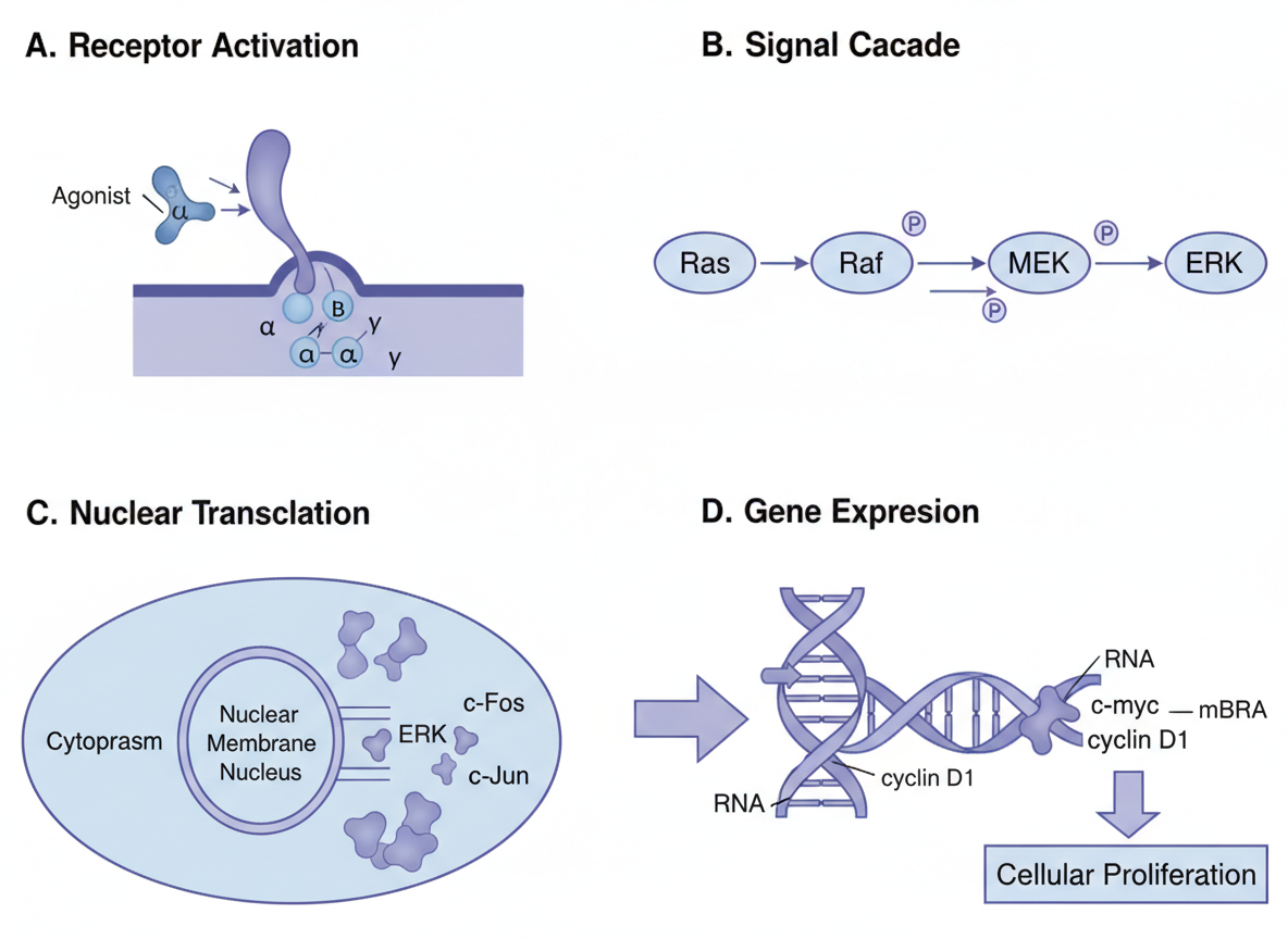
Mechanism diagrams: explaining a biological/chemical/physical process
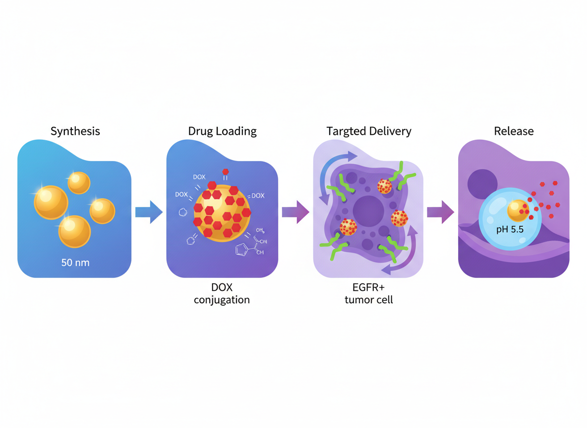
Experimental workflows: how samples are collected, processed, measured
Don't open the prompt box yet. Write down the one sentence the reviewer must remember after looking at the figure. This single line drives every design decision:
❌ "I did a cell experiment, draw it" (no center)
✅ "Drug X reduces inflammation by inhibiting the NF-κB pathway" (one clear claim)
If you can't write that sentence, you haven't decided what the figure is for, and no design polish will save it.
Paper figures usually follow one of four reading orders: left-to-right, top-to-bottom, center-outward, or circular. Mechanisms and workflows are typically left-to-right; causal/comparison figures are typically top-to-bottom; signaling networks are typically center-outward.
Write the reading order into your prompt. Otherwise the AI defaults to a centered pile of elements.
A frequent rookie error: jamming everything from a paper into a single figure. The result is messy arrows, tiny text, and unreadable output once shrunk to journal column width.
The fix is to split into 2–4 panels, each doing exactly one thing:
For instance, a mechanism figure can split into:
Panel A: study background and key entities
Panel B: core mechanism or experimental workflow
Panel C: key comparison result or conclusion model
A panelized prompt is much clearer to the AI, and it produces drafts you can actually use.
Labels in figures should be 1–3 words. Not "induces apoptosis through STAT3 pathway activation," but "STAT3 activation → apoptosis." Reviewers don't read full sentences inside figures.
Create a publication-ready scientific figure based on the description below.Subject: [one-sentence central message]Layout: 3 panels, left-to-right reading order.Panel A: [study background and key entities]Panel B: [mechanism or experimental workflow]Panel C: [key conclusion or comparison model]Style: clean vector style, white background, no decorative gradients, short labels (1–3 words), consistent arrow meaning.Output: editable, journal-figure-ready.
Replace the bracketed text with your own research, and you have a runnable prompt.
This is the key realization. Paper figures are made for reviewers reading deeply. Graphical abstracts are made for someone walking past in 5 seconds. The design logic is opposite:
Paper figure: high density, expects re-reading
Graphical abstract: one sentence + one obvious visual, must not require 30 seconds of effort
Roughly 90% of effective graphical abstracts use a problem → method → outcome layout, with one simple visual per block, capping total text at around 30 words.
Things to avoid:
❌ Including the full experimental workflow (that's the paper figure's job)
❌ Statistical plots like bar/box plots (those go inside the paper)
❌ Decorative backgrounds, 3D rendering, drop shadows
Different journals (Cell, Nature, Elsevier titles, ACS titles) have different size, format, and font requirements. Always read the author guidelines first. A common baseline is 1328 × 531 px, TIFF/PNG, minimum 8pt fonts.
Create a graphical abstract for a research paper, NOT a full figure.Three blocks, left to right: problem → method → outcome.Total text under 30 words. Each block: 3-6 words max.One accent color for the novel contribution.Avoid statistical plots, 3D renderings, decorative gradients.Output: 1328 × 531 px equivalent ratio, journal-ready, vector-clean.
A common trap is "layout thinking" — opening PowerPoint, building a giant canvas, and stuffing it with text, figures, and references. The result looks like a paper flattened against a wall.
The right approach is the opposite: what actually works on a poster is 1–2 hero visuals readable from 10 feet away. Everything else is supporting text.
AI is bad at producing the final poster output — sizes, logos, QR codes, author lists need precise layout work that PowerPoint, InDesign, or Illustrator handle better.
AI is good at producing the 2–3 hero visual assets: the headline image, the workflow diagram, the visual research model. Generate those, then drop them into your poster layout tool.
Create a hero visual for an academic conference poster.Subject: [one-sentence research topic]Style: bold, simple, recognizable from 3 meters away. Clean vector style.Maximum 5 visual elements, 1 accent color, large readable labels.Avoid: small text, multiple sub-panels, 3D rendering, photorealistic textures.Aspect ratio: square or 4:3, leave whitespace for title overlay.
This is the section that actually saves you time — don't write three separate briefs for the three figures. Build a small research asset library and let all three figures share it.
One central message sentence (used by graphical abstract)
Key entity list: molecule names, cell types, equipment, workflow stages (used by all three for labels)
Main mechanism or workflow (3–5 steps)
Key comparison or conclusion
Color rules: which color means what (must stay consistent across figures)
Write this brief once. All three figures use it.
Step 2: Make the paper figure first (highest density)
Start with the most complex one. Draw the mechanism in full and lock in the color and symbol rules.
Step 3: Simplify the figure into a graphical abstract
Don't redraw. Pull the three most essential elements (problem, method, outcome) from the figure, drop the details, rearrange into a horizontal three-block layout.
Step 4: Pull a poster hero from the figure
The poster headline is usually the most striking section of the figure (mechanism core or key result), enlarged, simplified, with bigger labels.
This way the same visual language carries through your paper, your graphical abstract, and your poster — readers can instantly tell they belong to the same project.
I once watched a PhD student use blue-green for the paper figure, red-yellow for the graphical abstract, and purple for the poster. None of his peers connected the three to the same project. Visual consistency isn't an aesthetic concern — it's a recognition concern.
Don't expect AI to produce a submission-ready final on the first pass. Its real value is shrinking the "blank canvas to first draft" gap from a week to half a day.
In practice:
Brief stage: feed your abstract or research plan to AI; let it extract the central message, key entities, and module structure
First draft stage: use a structured prompt to generate an editable draft, then manually adjust arrows, labels, alignment
Graphical abstract stage: take the existing figure and let AI simplify it into a three-block format
Poster hero stage: have AI produce just the hero asset; layout in PowerPoint or Illustrator
Polish stage: once the figure is 80% done, finish the last 20% (precise font sizes, institutional logos, alignment) by hand
No. AI gives you a draft. Label precision, alignment, font sizes, journal-specific formatting all need manual adjustment. But it gets you from blank to 80% done.
For international journal submissions and international conferences: English. For local-language journals, textbooks, or popular science: use the local language. Decide at the start; switching mid-project wastes hours.
You can, but results are mediocre. A better approach is to first ask the AI to extract "central message / key entities / three-block structure" from the abstract, then run a structured prompt. Pasting the abstract typically produces a too-dense image.
Illustrator is more precise but slow when starting from scratch. AI is good for the first structural draft. Use them together: AI for "first structure," Illustrator for "final polish." Either tool alone is suboptimal.
Yes. Every visual asset for one project should share a color and symbol vocabulary (e.g., the same protein always rendered in the same color, inhibition arrows always the same style). This isn't aesthetics — it's recognition.
If you're preparing a paper for submission, planning the paper figure, graphical abstract, and poster as one asset set on SciDraw AI saves more time than building each from scratch.
Davie Chen is a researcher at the Faculty of Animation and Intermedia, University of Arts in Poznan, studying generative AI for scientific figure creation, patent illustration, and manuscript drafting. SciDraw AI is one of the research-to-product tools built from this work.