Figures are among the most important elements of any research paper. They communicate complex findings more efficiently than text, help reviewers understand your methodology, and often determine a reader's first impression of your work. Yet creating effective figures remains one of the most time-consuming and underappreciated parts of the publication process.
This guide walks through the complete process of creating figures for research papers -- from initial planning through final submission. Whether you are preparing your first manuscript or your fiftieth, these principles and practical steps will help you produce figures that strengthen your research communication.
Why Figures Matter in Research Papers
The impact of well-designed figures extends far beyond aesthetics. Research on how scientists read papers reveals that figures and their captions are among the first elements reviewers examine. A study by Howe and Purves in 2005 found that the majority of readers scan figures before reading the full text.
The Measurable Impact of Good Figures
| Factor | Effect of High-Quality Figures |
|---|---|
| Reviewer perception | More favorable initial impression |
| Comprehension speed | Readers grasp methods 2-3x faster |
| Citation rates | Papers with clear figures cited more frequently |
| Social media sharing | Figures drive most academic social sharing |
| Rejection risk | Poor figures are a common reason for desk rejection |
| Revision requests | Figure-related revisions delay publication by weeks |
Investing time in your figures is not a cosmetic exercise -- it directly affects whether your paper gets published, read, and cited.
Types of Figures in Research Papers
Understanding the different types of figures helps you choose the right format for your data and story. Each type serves a distinct purpose and follows different design conventions.
| Figure Type | Purpose | Common In | Key Characteristics |
|---|---|---|---|
| Workflow/Pipeline | Show experimental or analytical process | All fields | Sequential flow, numbered steps |
| Mechanism/Model | Explain how something works | Biology, chemistry, physics | Arrows, interactions, spatial relationships |
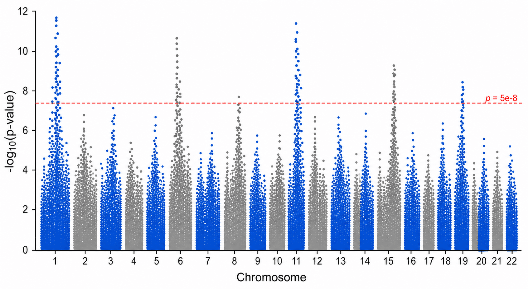
| Data Visualization | Present quantitative results | All fields | Charts, graphs, heatmaps |
| Graphical Abstract | Summarize entire paper | Journal requirement | Single image, key findings |
| Schematic Diagram | Illustrate system architecture | Engineering, CS | Components, connections, labels |
| Microscopy/Imaging | Show experimental observations | Biology, materials science | Scale bars, annotations |
| Comparison Figure | Show before/after or control/treatment | Clinical, experimental | Side-by-side panels, consistent formatting |
| Supplementary Figure | Provide additional evidence | All fields | Often lower production quality |
For a deeper exploration of each figure type with examples, see our scientific figure types guide.
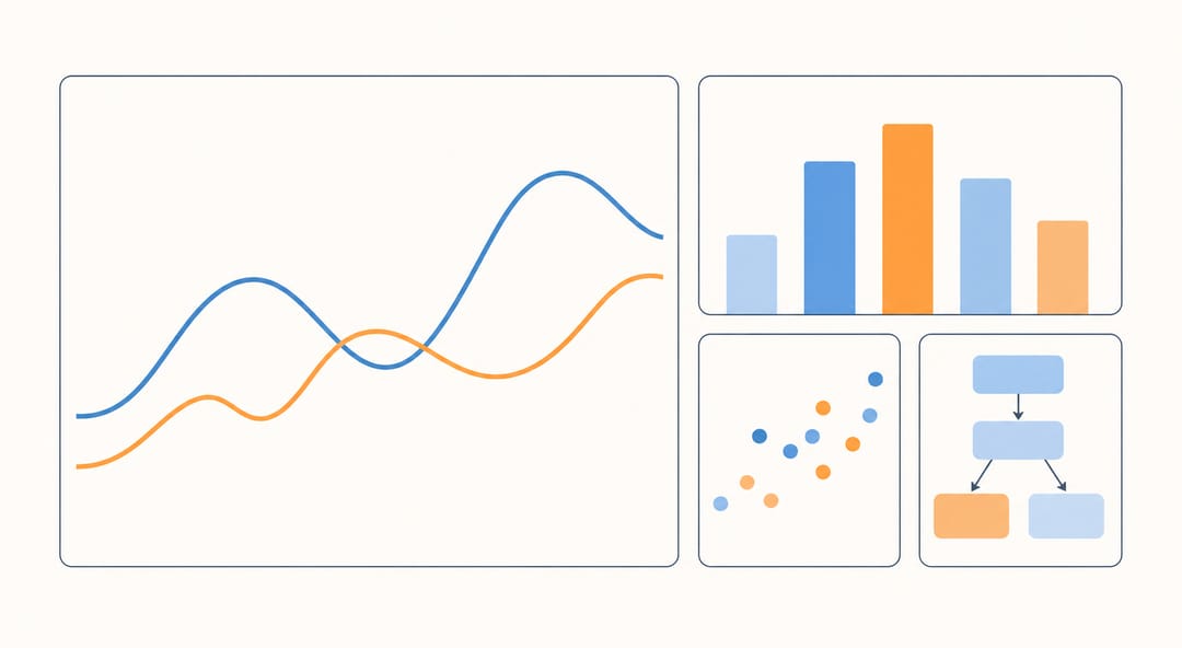 Different figure types suit different data -- choosing the right one is the first design decision.
Step 1: Planning Your Figure
The most common mistake researchers make is opening a design tool before planning what the figure needs to communicate. Every effective figure starts with a clear plan.
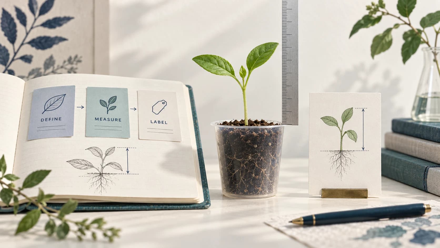
Define the Story
Each figure should tell one story. Ask yourself:
- What is the single main point this figure communicates?
- Could a reader understand this point from the figure and caption alone, without reading the main text?
- Is this the most efficient way to communicate this information, or would a table or text description work better?
If you cannot articulate the figure's message in one sentence, you likely need to split it into multiple figures or simplify your approach.
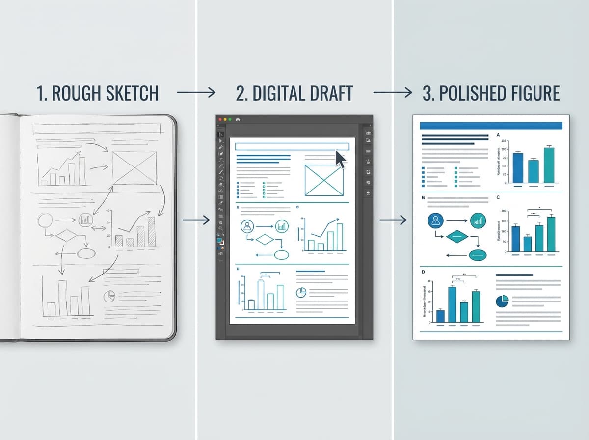
Sketch Before You Design
Before investing time in any software tool, sketch your figure on paper or a whiteboard. This takes 5 minutes and can save hours of rework. Your sketch should include:
- Approximate layout and panel arrangement
- Which data or visual elements go in each section
- Annotation placement and label text
- Arrow directions and flow indicators
- Scale bar locations (for imaging data)
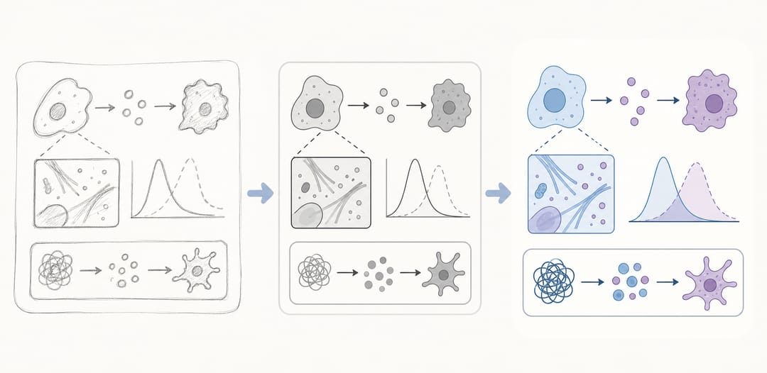 Sketching first turns a rough idea into a clean, publication-ready figure with less rework.
Determine Panel Structure
Many journal figures use multi-panel layouts (Figure 1A, 1B, 1C, etc.). When planning panels:
- Group related information within the same figure
- Arrange panels in the order they are discussed in the text
- Use consistent sizing for panels that will be compared
- Plan for the final printed/displayed width (single column: ~85mm, double column: ~170mm)
Step 2: Choosing the Right Figure Type
Your data and message determine the best figure type. Here is a decision framework:
If you are showing a process or workflow: Use a flowchart or pipeline diagram. Sequential steps connected by arrows, with brief labels at each stage. Keep the flow direction consistent (left-to-right or top-to-bottom).
If you are explaining a mechanism: Use a schematic or model diagram. Show the key components, their spatial relationships, and the interactions between them. Color-coding helps distinguish different elements or pathways.
If you are presenting quantitative data: Choose the chart type that best matches your data structure:
- Comparisons between groups: bar charts or dot plots
- Trends over time: line charts
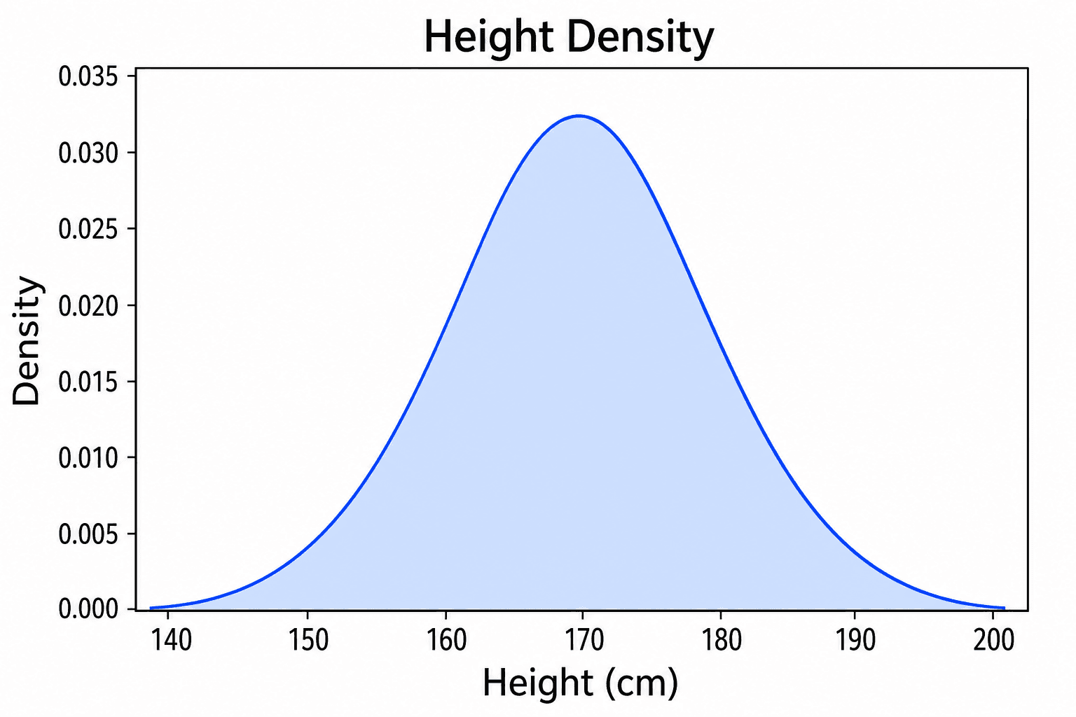
- Distributions: histograms, box plots, or violin plots
- Correlations: scatter plots
- Proportions: stacked bars (avoid pie charts in scientific publications)
- High-dimensional data: heatmaps or PCA plots
If you are showing experimental observations: Use microscopy images, photographs, or other direct observations with appropriate scale bars, annotations, and consistent brightness/contrast across comparable panels.
If you are summarizing your paper: Create a graphical abstract using our graphical abstract maker guide for journal-specific requirements.
Step 3: Creating the Figure
With your plan in hand, choose the appropriate tool and create the figure. Different figure types often benefit from different tools.
Tool Selection by Figure Type
| Figure Type | Recommended Tools | Notes |
|---|---|---|
| Workflow diagrams | SciDraw AI, draw.io, Illustrator | AI generation fastest for initial drafts |
| Mechanism diagrams | SciDraw AI, BioRender, Illustrator | Depends on field and complexity |
| Data visualizations | Python (matplotlib, seaborn), R (ggplot2), GraphPad Prism | Code-based tools ensure reproducibility |
| Graphical abstracts | SciDraw AI, Canva, Illustrator | See graphical abstract guide |
| Schematics | draw.io, Inkscape, Illustrator | Precision tools for technical diagrams |
| Multi-panel composites | Inkscape, Illustrator, PowerPoint | Assembly tools for combining panels |
Using AI Tools for Figure Creation
AI-powered tools like SciDraw AI can dramatically accelerate the figure creation process. Rather than manually drawing each element, you describe the figure you need and the AI generates an initial version that you can refine. This approach is particularly effective for:
- Workflow and pipeline diagrams
- Mechanism and model illustrations
- Schematic representations
- Conceptual figures
- Graphical abstracts
The AI handles the visual design while you focus on the scientific content and accuracy. For researchers without formal design training, this levels the playing field considerably.
Creating Data Visualizations
For data figures, code-based tools provide the best combination of quality and reproducibility.
Python with matplotlib/seaborn:
# Example: publication-quality figure settings
import matplotlib.pyplot as plt
import matplotlib as mpl

mpl.rcParams['figure.dpi'] = 300
mpl.rcParams['font.family'] = 'Arial'
mpl.rcParams['font.size'] = 8
mpl.rcParams['axes.linewidth'] = 0.8
mpl.rcParams['lines.linewidth'] = 1.0
R with ggplot2:
# Example: publication theme
theme_publication <- theme_minimal() +
  theme(
    text = element_text(family = "Arial", size = 8),
    axis.line = element_line(size = 0.3),
    panel.grid.minor = element_blank()
  )
Key settings for publication-quality data figures:
- Font: Arial or Helvetica (universally accepted by journals)
- Font size: 6-8pt for axis labels, 8-10pt for axis titles
- Line width: 0.5-1.0pt for data lines, 0.3-0.5pt for axes
- Export at 300 DPI minimum (600 DPI for line art)
Step 4: Meeting Journal Requirements
Every journal has specific figure requirements. Submitting figures that do not meet these requirements is one of the most common causes of production delays and revision requests.
Universal Requirements
These requirements apply to virtually all scientific journals:
| Parameter | Standard Requirement |
|---|---|
| Resolution (photos/images) | 300 DPI minimum |
| Resolution (line art) | 600-1200 DPI |
| Resolution (combination) | 600 DPI |
| Color mode | RGB for online, CMYK for print |
| File formats | TIFF, EPS, PDF (preferred); PNG, JPEG (often accepted) |
| Font | Arial, Helvetica, or Times New Roman embedded |
| Minimum font size | 6pt after scaling to final size |
| Single column width | 80-90mm (journal-dependent) |
| Double column width | 160-180mm (journal-dependent) |
| Maximum file size | 10-50MB per figure (journal-dependent) |
Journal-Specific Requirements
Major publishers have detailed figure guides:
Nature/Science journals require TIFF or EPS at 300+ DPI, with specific width constraints. RGB color for online publication, CMYK available for print. See our detailed Nature and Science figure requirements guide for exact specifications.
Elsevier journals accept TIFF, EPS, PDF, and high-resolution JPEG. Minimum 300 DPI for all figure types. Graphical abstracts required for many Elsevier journals with specific dimension requirements.
ACS (American Chemical Society) prefers TIFF at 600 DPI for line art. Specific color requirements for Table of Contents (TOC) graphics. Column width figures at 3.25 inches, full-width at 7 inches.
Wiley journals accept TIFF, EPS, and PDF. Minimum 300 DPI for halftone, 600 DPI for line art. Provide both color and grayscale versions if the journal has a print edition.
For a complete reference on converting between formats and meeting specific journal requirements, see our journal figure conversion guide.
Checking Your Figures Before Submission
Before submitting, verify every figure against the journal's requirements. Common checkpoints:
- Resolution: Open the file in an image viewer and check the DPI in file properties
- Dimensions: Verify the width matches single-column or double-column requirements
- Font size: Zoom to 100% and confirm all text is readable
- Color: Check that colors are distinguishable in both color and grayscale
- File format: Save in the journal's preferred format
- File size: Confirm the file does not exceed the journal's upload limit
Our scientific figure checker guide provides a comprehensive pre-submission checklist. You can also use the figure checker tool to verify your figures automatically.
Step 5: Multi-Panel Figure Layout
Multi-panel figures (Figure 1A, 1B, 1C) are standard in research papers. Creating effective multi-panel layouts requires attention to alignment, spacing, and visual hierarchy.
Panel Labeling
- Use uppercase bold letters: A, B, C (most journals prefer this)
- Place labels in the top-left corner of each panel
- Use a consistent font and size across all panels (typically 10-12pt bold Arial)
- Some journals require parentheses: (A), (B), (C) -- check guidelines
Alignment and Spacing
- Align panel edges precisely using grid or alignment tools
- Maintain consistent spacing between panels (typically 2-5mm)
- Ensure all panels within a row have the same height
- Ensure all panels within a column have the same width
Common Multi-Panel Layouts
2x2 Grid: Four equal panels, works for comparisons with two variables.
1+2 Layout: One large panel (left) with two stacked panels (right). Good when one panel shows the main result and others show supporting data.
Horizontal Strip: 3-5 panels in a single row. Works for sequential steps or time series.
Asymmetric Grid: Mixed panel sizes. Use when panels have very different aspect ratios (e.g., a wide flowchart above a set of bar charts).
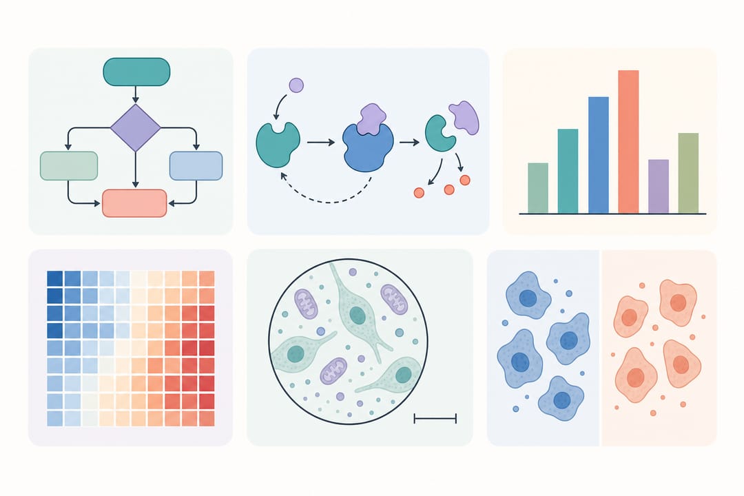 A well-aligned multi-panel layout groups related results into a single coherent figure.
Assembly Tools
For combining multiple panels into a single figure:
- Adobe Illustrator: Industry standard, provides precise alignment and artboard management
- Inkscape: Free alternative with good alignment tools
- PowerPoint: Accessible option for simple layouts; export at high resolution
- Python (matplotlib): Use
subplotorgridspecfor programmatic layouts - SciDraw AI: Generate individual panels and combine them using the scientific figure maker
Common Figure Rejection Reasons
Understanding why figures get rejected helps you avoid these pitfalls. Based on common reviewer feedback and journal production team reports, these are the most frequent issues.
Resolution Too Low
Problem: Figures appear pixelated or blurry when printed or viewed at full size.
Fix: Always work at the final output resolution from the start. If your figure will be printed at 85mm wide, create it at 85mm x your-height at 300+ DPI. Upscaling a low-resolution image does not restore quality.
Font Size Too Small
Problem: After scaling to column width, text becomes unreadable (below 6pt).
Fix: Design your figure at the final printed size, not at an arbitrary large size. If you design at 200% and the journal scales down to 50%, your 12pt text becomes 6pt. Always check readability at the final output dimensions.
Inconsistent Formatting
Problem: Panels within the same figure use different fonts, colors, or line weights.
Fix: Establish a style guide for your figure set before you begin. Define the font, font sizes, line weights, and color palette, then apply them consistently across all panels and all figures in the manuscript.
Missing Scale Bars
Problem: Microscopy or imaging figures lack scale bars, making it impossible to judge dimensions.
Fix: Always include scale bars on imaging data. Place the scale bar in a consistent location (typically bottom-right), use a contrasting color against the image background, and include the measurement in the figure caption.
Color Accessibility Issues
Problem: Figures use red-green color schemes that are indistinguishable to the approximately 8% of males and 0.5% of females with color vision deficiency.
Fix: Use colorblind-friendly palettes (e.g., blue-orange, blue-red, or viridis). Test your figures with a colorblindness simulator. Consider using both color and pattern/shape to encode information.
Excessive Complexity
Problem: Too much information crammed into a single figure, making it overwhelming and difficult to interpret.
Fix: Follow the one-story-per-figure rule. If a figure requires more than 30 seconds to understand its main point, it is too complex. Split it into multiple figures or move some panels to supplementary materials.
JPEG Compression Artifacts
Problem: Saving figures as JPEG introduces visible compression artifacts, especially around text and line art.
Fix: Use TIFF or PNG for figures containing text, lines, or sharp edges. Reserve JPEG only for photographic images where slight compression is acceptable. If you must use JPEG, set quality to 95% or higher.
Copyright Violations
Problem: Figures include elements (icons, illustrations, images) used without proper licensing.
Fix: Track the source and license of every visual element in your figures. Use Creative Commons or public domain resources. If adapting a figure from another publication, obtain permission and cite the original.
Figure Formatting Checklist
Use this checklist before submitting any figure:
- Figure tells one clear story
- Resolution meets journal requirements (300 DPI photos, 600 DPI line art)
- Dimensions match journal column width specifications
- All text is readable at final printed size (minimum 6pt)
- Font is consistent across all panels (Arial or Helvetica recommended)
- Colors are distinguishable in both color and grayscale
- Colors are accessible to colorblind readers
- Panel labels are bold uppercase letters, consistently positioned
- Scale bars included on all microscopy/imaging panels
- Axis labels include units
- Legend is included or all elements are labeled directly
- File format matches journal requirements
- File size is under the journal's upload limit
- No copyrighted material used without permission
- Figure caption is written and matches the figure content
Start Making Figures with SciDraw AI
Creating publication-quality figures does not require professional design skills. SciDraw AI's AI-powered platform helps you:
- Generate scientific illustrations from text descriptions -- describe your figure and receive a publication-ready result
- Choose from scientific templates optimized for different figure types and journals
- Export in publication formats including high-resolution PNG, SVG, and more
- Work across any research field -- from molecular biology to electrical engineering
- Save time -- create figures in minutes instead of hours
Visit SciDraw AI Drawing to start creating your figures today.
Related Guides
- Nature and Science Figure Requirements -- exact specifications for top-tier journals
- Journal Figure Conversion Guide -- convert between formats and meet submission requirements
- Scientific Figure Types Guide -- detailed breakdown of every figure type with examples
- Scientific Figure Checker for Journal Submission -- pre-submission validation checklist
- Scientific Figure Maker Tool -- free online figure creation platform