
許多團隊在工作中使用錯誤的圖表類型。結果通常是一樣的:一張視覺上「漂亮」的圖片,卻無法傳達關鍵訊息。
本指南將協助您為科學傳播選擇正確的圖表格式。針對每種類型,您將獲得:
- 何時使用
- 應包含的內容
- 一個即插即用的提示詞 (Prompt)
- 一個生成的範例
1) Graphical Abstract (圖文摘要)
當您需要對整個研究故事(問題、方法和結果)進行單螢幕總結時使用。
最適用於:
- 期刊投稿
- 論文登入頁面
- 研究亮點的社交分享
提示詞模板
Create a graphical abstract for [study topic].
Three connected panels: problem context, core method, key outcome.
Use concise English labels, directional arrows, and high information density.
Clean white background, publication-ready scientific style.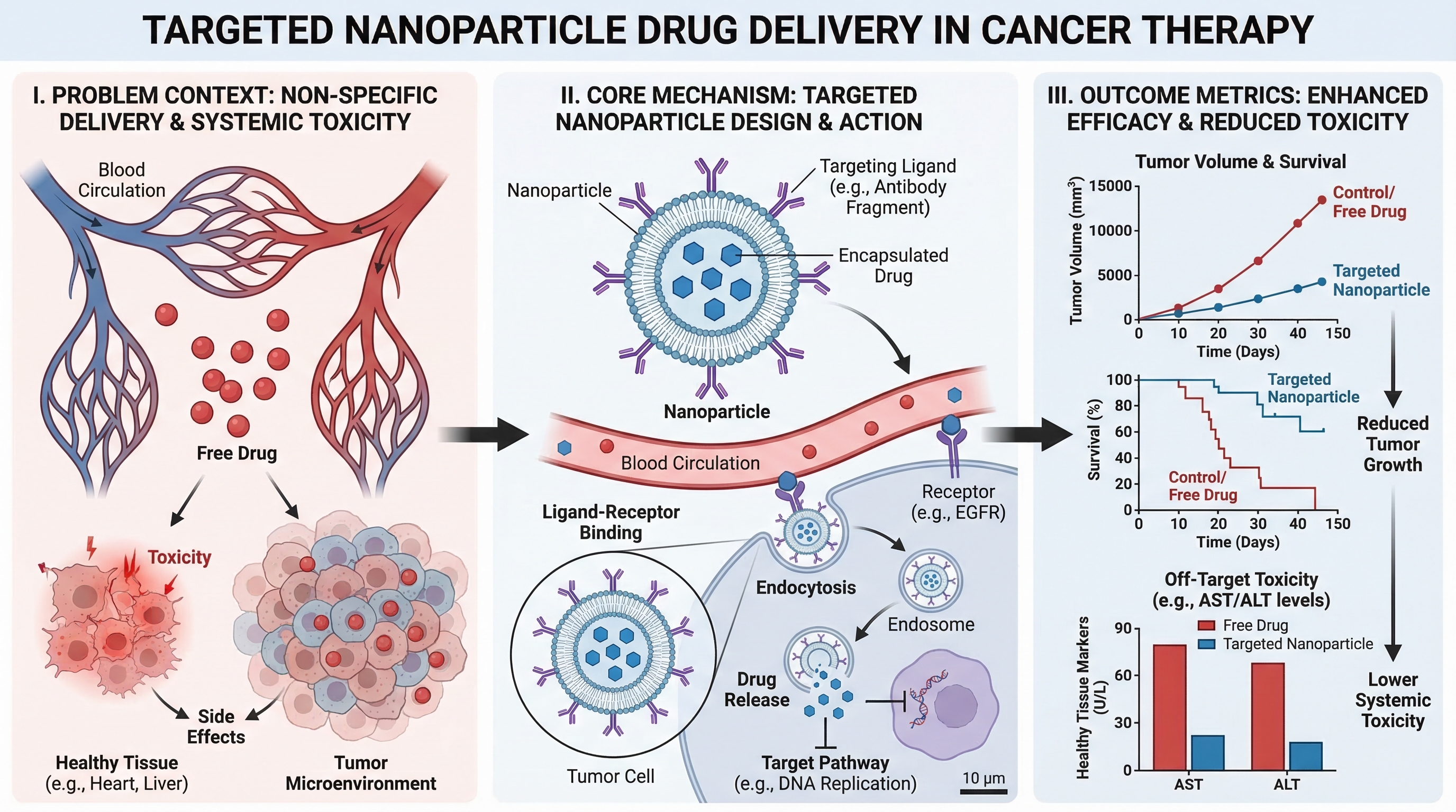
2) Mechanism Diagram (機制圖)
當您需要逐步解釋分子、細胞或系統層級的「運作方式」時使用。
最適用於:
- 論文中的機制章節
- 研究經費申請的原理圖
- 藥物作用解釋
提示詞模板
Create a mechanism diagram for [process].
Show numbered causal steps from trigger to downstream effect.
Include key actors, arrows, inhibition/activation markers, and concise labels.
White background, textbook-level scientific clarity.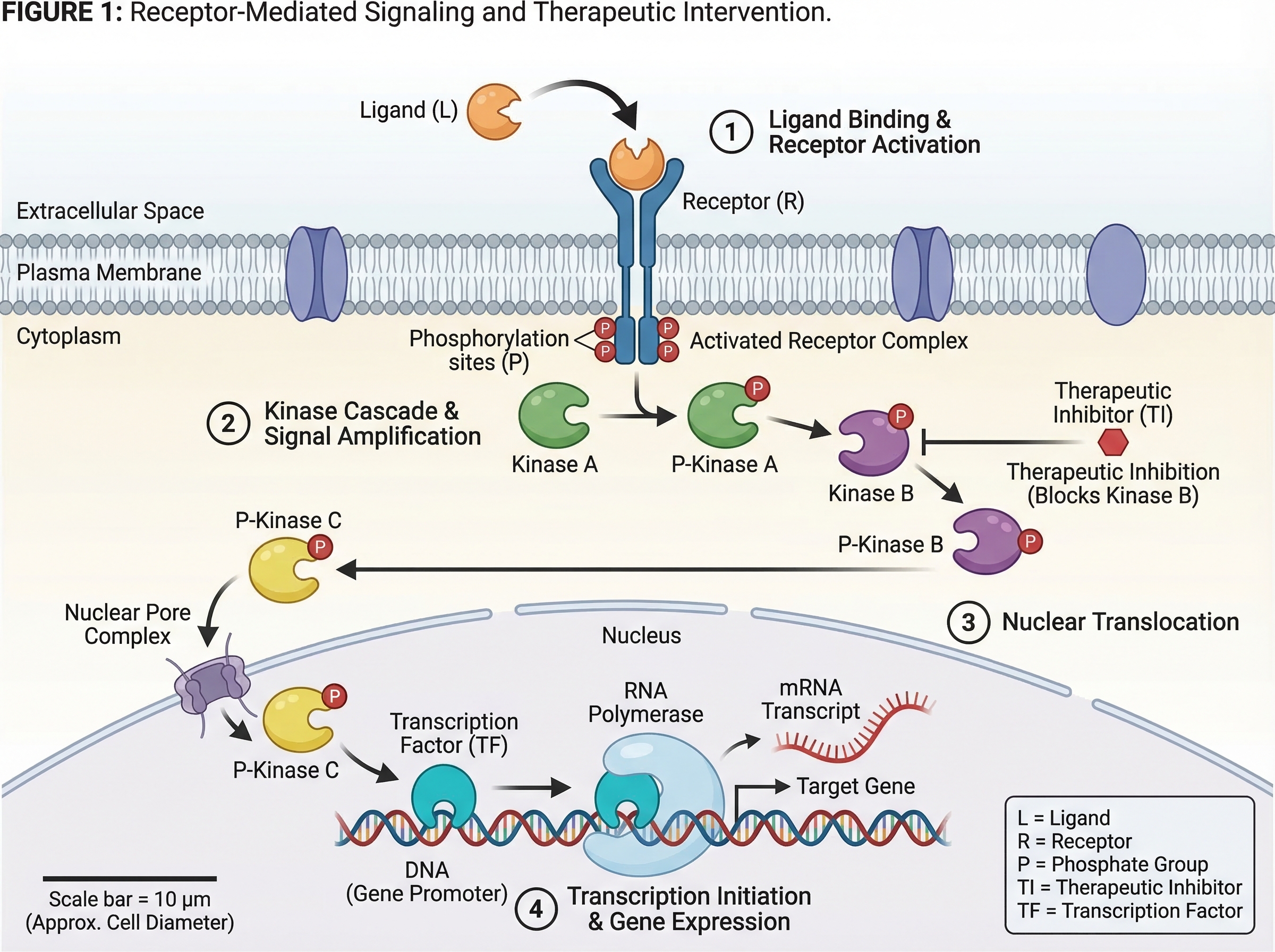
3) Pathway Diagram (通路圖)
當您需要跨多個生物或技術路徑的分支關係和交互作用 (crosstalk) 時使用。
最適用於:
- 信號通路總結
- 系統生物學解釋
- 多因素因果模型
提示詞模板
Create a pathway diagram for [topic].
Map upstream inputs, branch nodes, cross-talk links, and final outputs.
Use color-coded branches, legend, and concise English labels.
High readability, publication-ready style.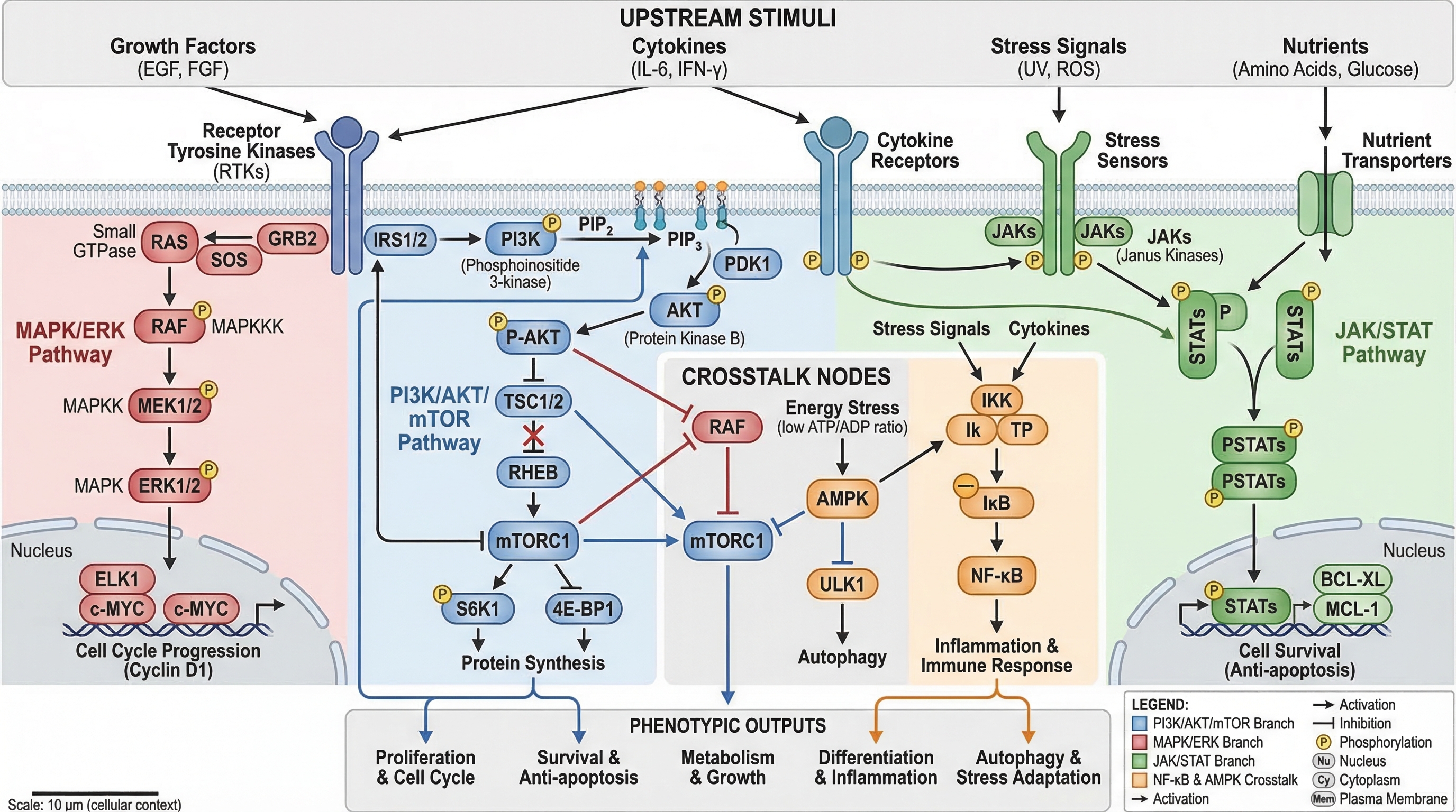
4) Workflow Diagram (工作流程圖)
當您需要操作順序時使用:首先發生什麼,接著發生什麼,以及在什麼條件下發生。
最適用於:
- 方法章節
- 標準作業程序 (SOP) 文件
- 可重複性與培訓
提示詞模板
Create a workflow diagram for [process].
Show end-to-end steps from input to output, with decision nodes and checkpoints.
Include artifacts produced at each stage and concise labels.
Clean white background, process-centric layout.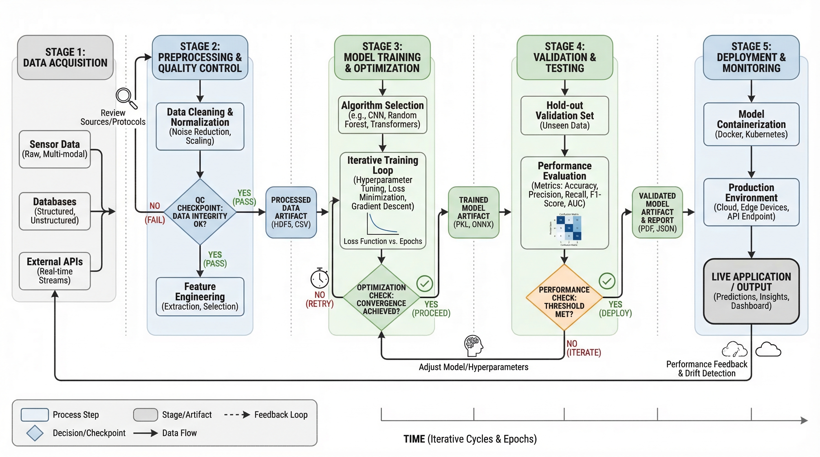
5) Architecture Diagram (架構圖)
當您需要展示系統結構和組件交互作用,而非按時間順序的步驟時使用。
最適用於:
- 平台文件
- AI/ML 系統溝通
- 提案與技術設計審查
提示詞模板
Create a system architecture diagram for [platform].
Use layered structure (data, service, model, application).
Show key modules, interfaces, and data/control flows.
Concise labels, modern technical style, white background.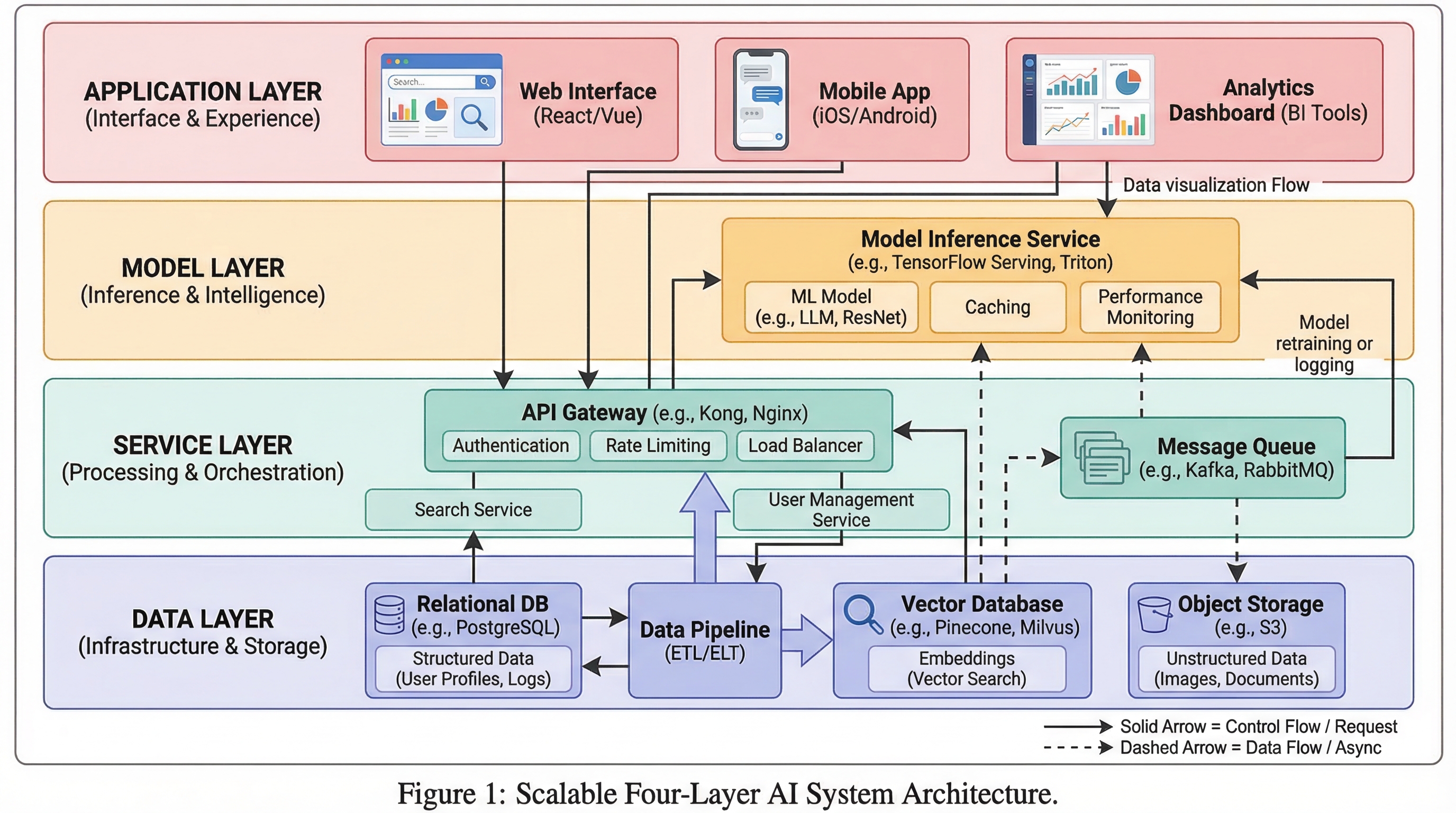
6) Comparison Figure (對比圖)
當您的核心訊息是差異時使用:舊與新、基準與改進、方法 A 與方法 B。
最適用於:
- 消融實驗/結果解釋
- 面向審稿人的清晰度
- 決策支持投影片
提示詞模板
Create a comparison figure for [A] vs [B].
Two-column aligned layout with matched dimensions.
Include key metrics, strengths/limitations, and callout arrows.
Clean white background, objective scientific presentation style.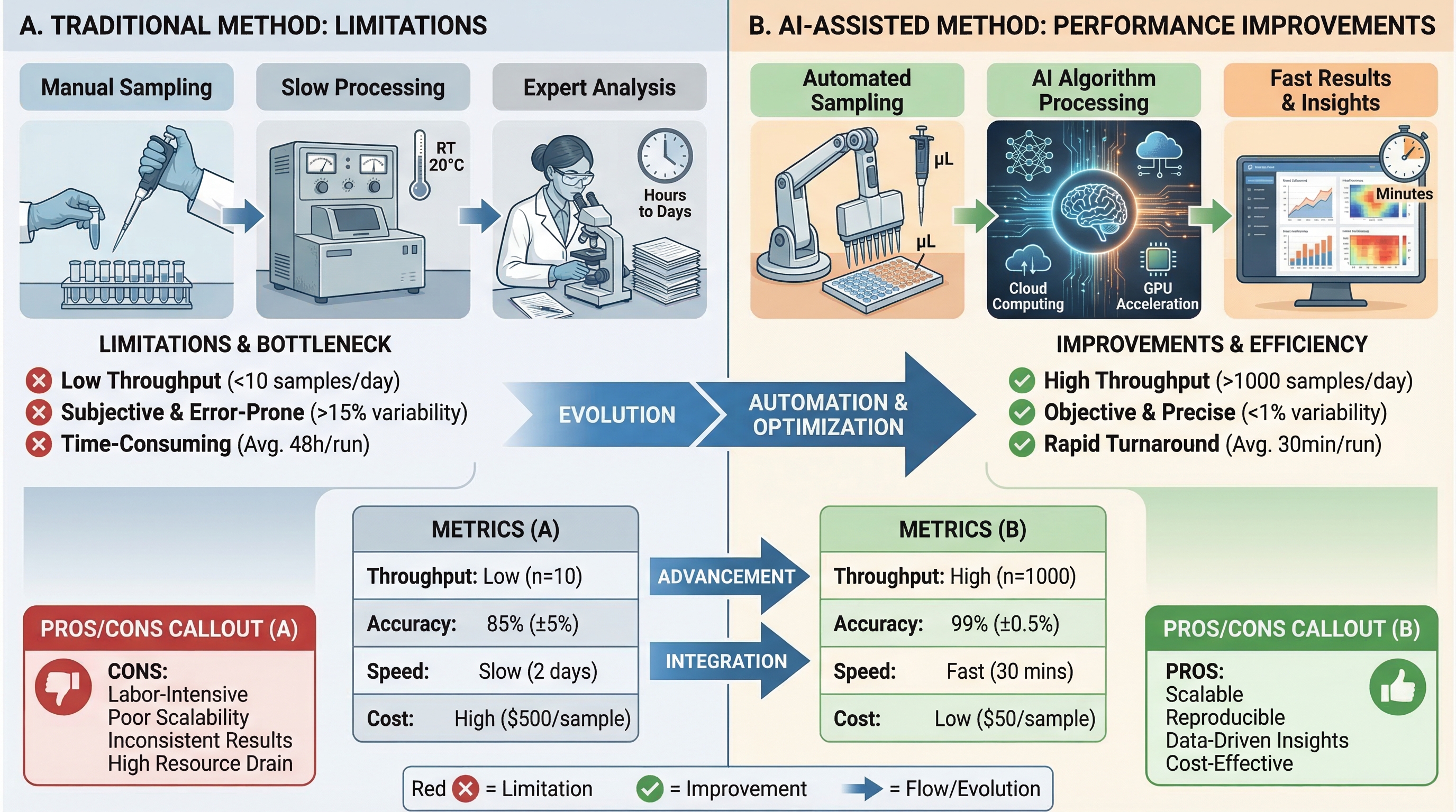
7) Infographic (資訊圖表)
當您需要為非專業讀者提供高層級的綜合資訊,或進行快速決策溝通時使用。
最適用於:
- 執行摘要
- 研討會海報片段
- 跨部門團隊更新
提示詞模板
Create a scientific infographic for [topic].
Include key metric cards, trend summary, category breakdown, and takeaways.
Use icon-supported sections, concise English labels, and strong visual hierarchy.
Readable at presentation distance, white background.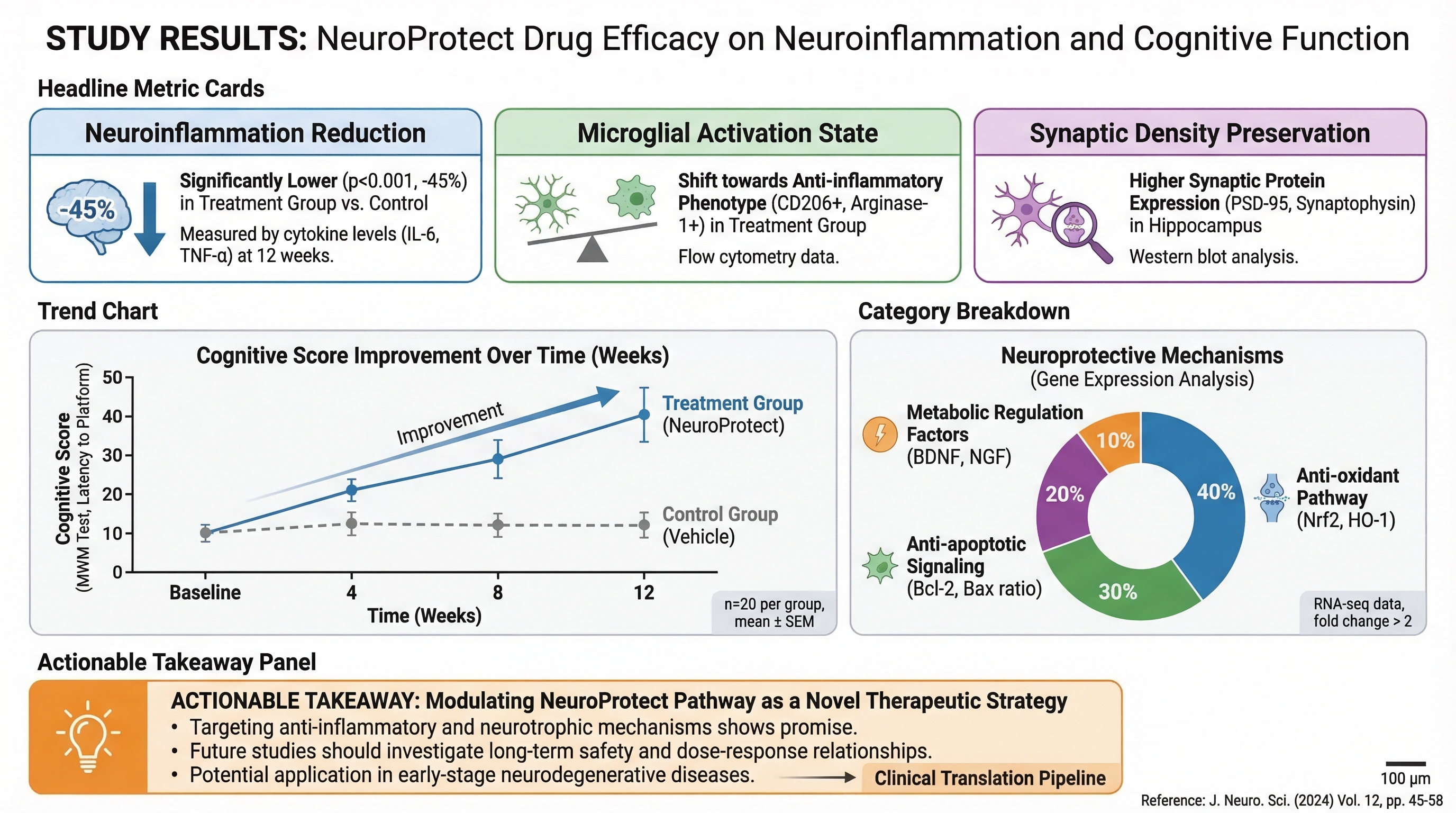
快速選擇規則
如果您的主要問題是:
- 「整個故事是什麼?」 → Graphical Abstract (圖文摘要)
- 「它是如何運作的?」 → Mechanism (機制圖)
- 「分支如何交互作用?」 → Pathway (通路圖)
- 「流程順序是什麼?」 → Workflow (工作流程圖)
- 「系統是如何構建的?」 → Architecture (架構圖)
- 「什麼更好/有何不同?」 → Comparison (對比圖)
- 「人們應該快速記住什麼?」 → Infographic (資訊圖表)
先選擇正確的類型,再優化風格。單憑這一點,對圖表清晰度的提升就超過任何顏色調整。

")

