
多くのチームが、目的に対して不適切な図のタイプを選択しています。その結果、見た目は「きれい」でも、肝心のメッセージが伝わらない画像になってしまうことがよくあります。
このガイドは、科学コミュニケーションにおいて適切な図の形式を選択するのに役立ちます。各タイプについて、以下を解説します:
- いつ使用すべきか
- 何を含めるべきか
- すぐに使えるプロンプト
- 生成された例
1) Graphical Abstract(グラフィカルアブストラクト)
研究全体のストーリー(問題、手法、結果)を1画面で要約する必要がある場合に使用します。
最適な用途:
- ジャーナルへの投稿
- 論文のランディングページ
- 研究ハイライトのSNS共有
プロンプトテンプレート
Create a graphical abstract for [study topic].
Three connected panels: problem context, core method, key outcome.
Use concise English labels, directional arrows, and high information density.
Clean white background, publication-ready scientific style.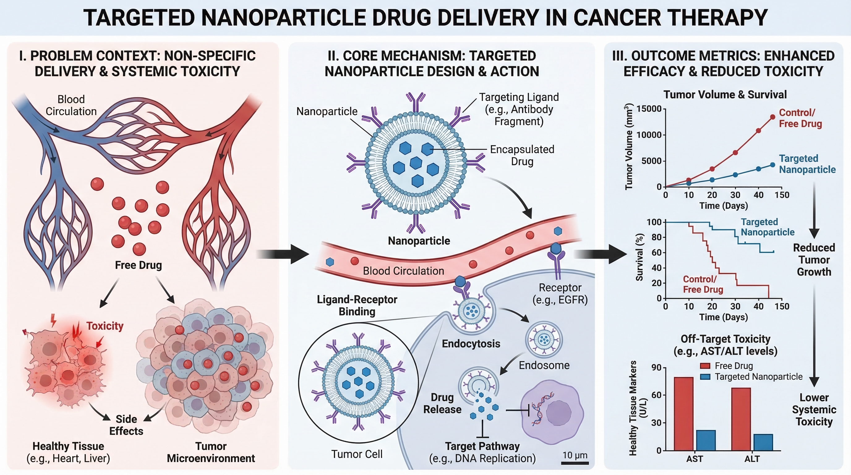
2) Mechanism Diagram(メカニズム図)
分子、細胞、またはシステムレベルで、何かが「どのように」機能するかを段階的に説明する必要がある場合に使用します。
最適な用途:
- 論文のメカニズムセクション
- 助成金申請書の根拠図
- 薬理作用の説明
プロンプトテンプレート
Create a mechanism diagram for [process].
Show numbered causal steps from trigger to downstream effect.
Include key actors, arrows, inhibition/activation markers, and concise labels.
White background, textbook-level scientific clarity.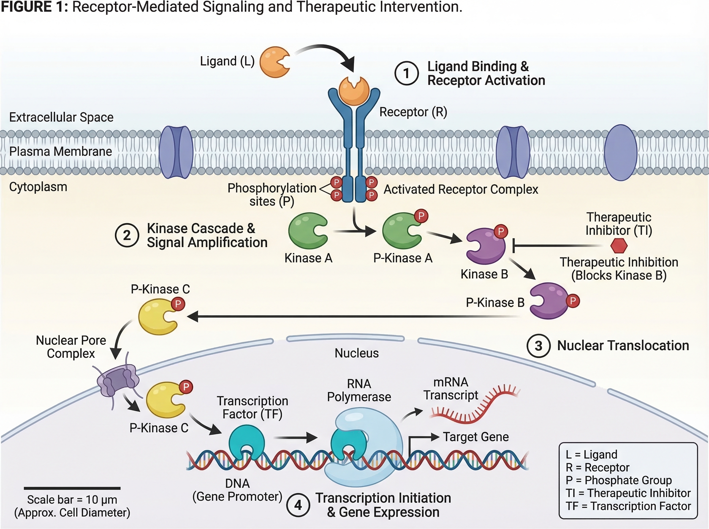
3) Pathway Diagram(パスウェイ図)
複数の生物学的または技術的なパスウェイにわたる分岐関係やクロストークを示す必要がある場合に使用します。
最適な用途:
- シグナル伝達経路の要約
- システム生物学の解釈
- 多因子因果モデル
プロンプトテンプレート
Create a pathway diagram for [topic].
Map upstream inputs, branch nodes, cross-talk links, and final outputs.
Use color-coded branches, legend, and concise English labels.
High readability, publication-ready style.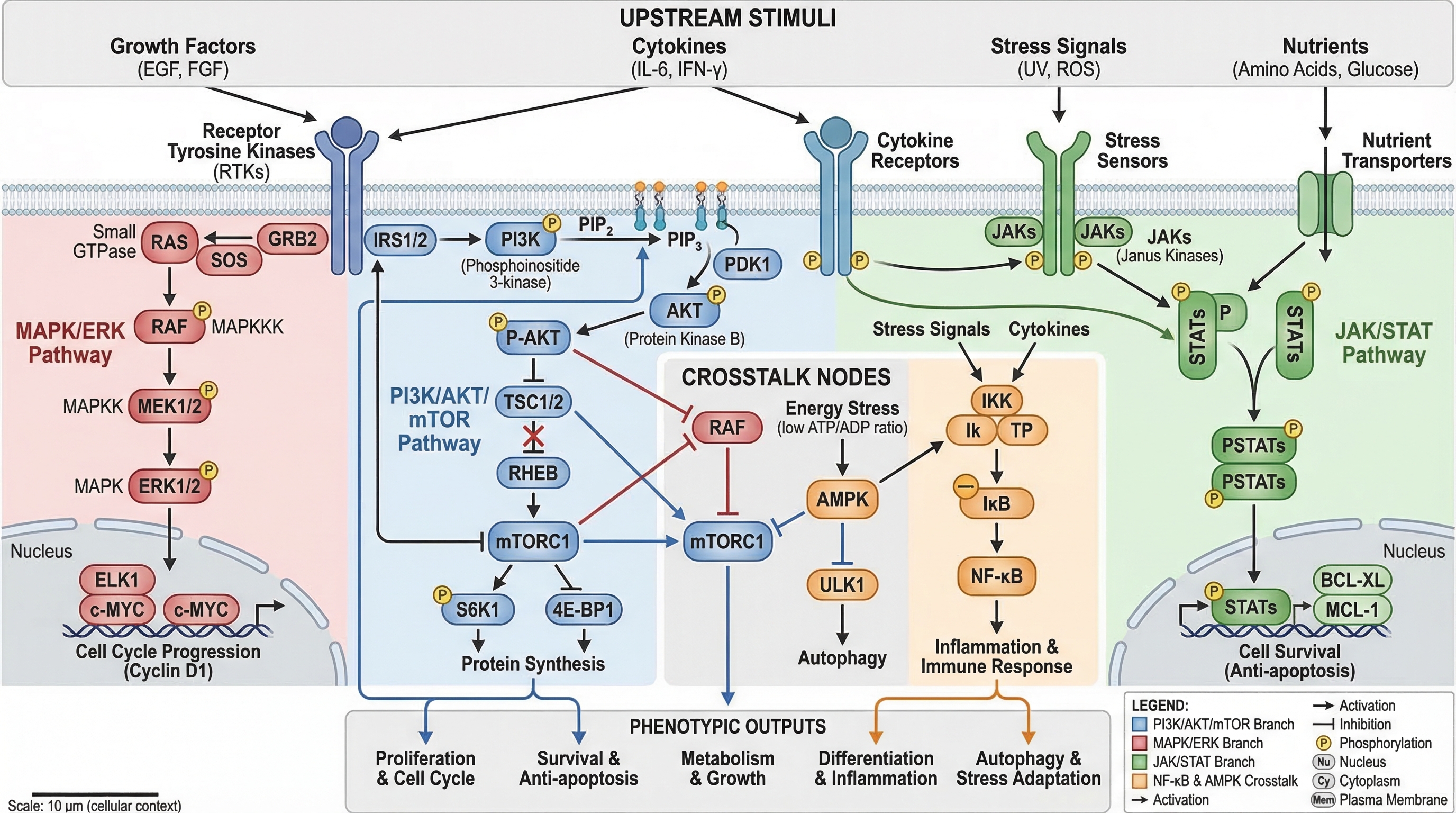
4) Workflow Diagram(ワークフロー図)
運用の順序(何が最初に起こり、次に何が起こり、どのような条件下で起こるか)を示す必要がある場合に使用します。
最適な用途:
- 手法(Methods)セクション
- SOP(標準作業手順書)のドキュメント
- 再現性とトレーニング
プロンプトテンプレート
Create a workflow diagram for [process].
Show end-to-end steps from input to output, with decision nodes and checkpoints.
Include artifacts produced at each stage and concise labels.
Clean white background, process-centric layout.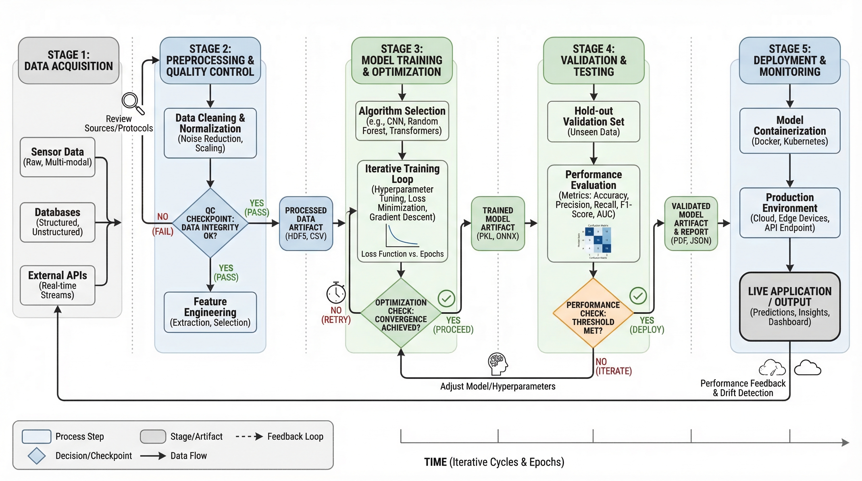
5) Architecture Diagram(アーキテクチャ図)
時系列のステップではなく、システムの構造やコンポーネント間の相互作用を示す必要がある場合に使用します。
最適な用途:
- プラットフォームのドキュメント
- AI/MLシステムのコミュニケーション
- プロポーザルや技術設計のレビュー
プロンプトテンプレート
Create a system architecture diagram for [platform].
Use layered structure (data, service, model, application).
Show key modules, interfaces, and data/control flows.
Concise labels, modern technical style, white background.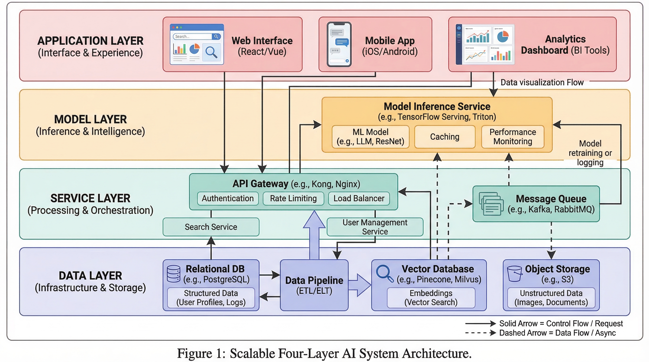
6) Comparison Figure(比較図)
コアメッセージが「違い」(旧 vs 新、ベースライン vs 改善、手法A vs 手法B)である場合に使用します。
最適な用途:
- アブレーション(除去)実験や結果の説明
- 査読者向けの明快な説明
- 意思決定支援スライド
プロンプトテンプレート
Create a comparison figure for [A] vs [B].
Two-column aligned layout with matched dimensions.
Include key metrics, strengths/limitations, and callout arrows.
Clean white background, objective scientific presentation style.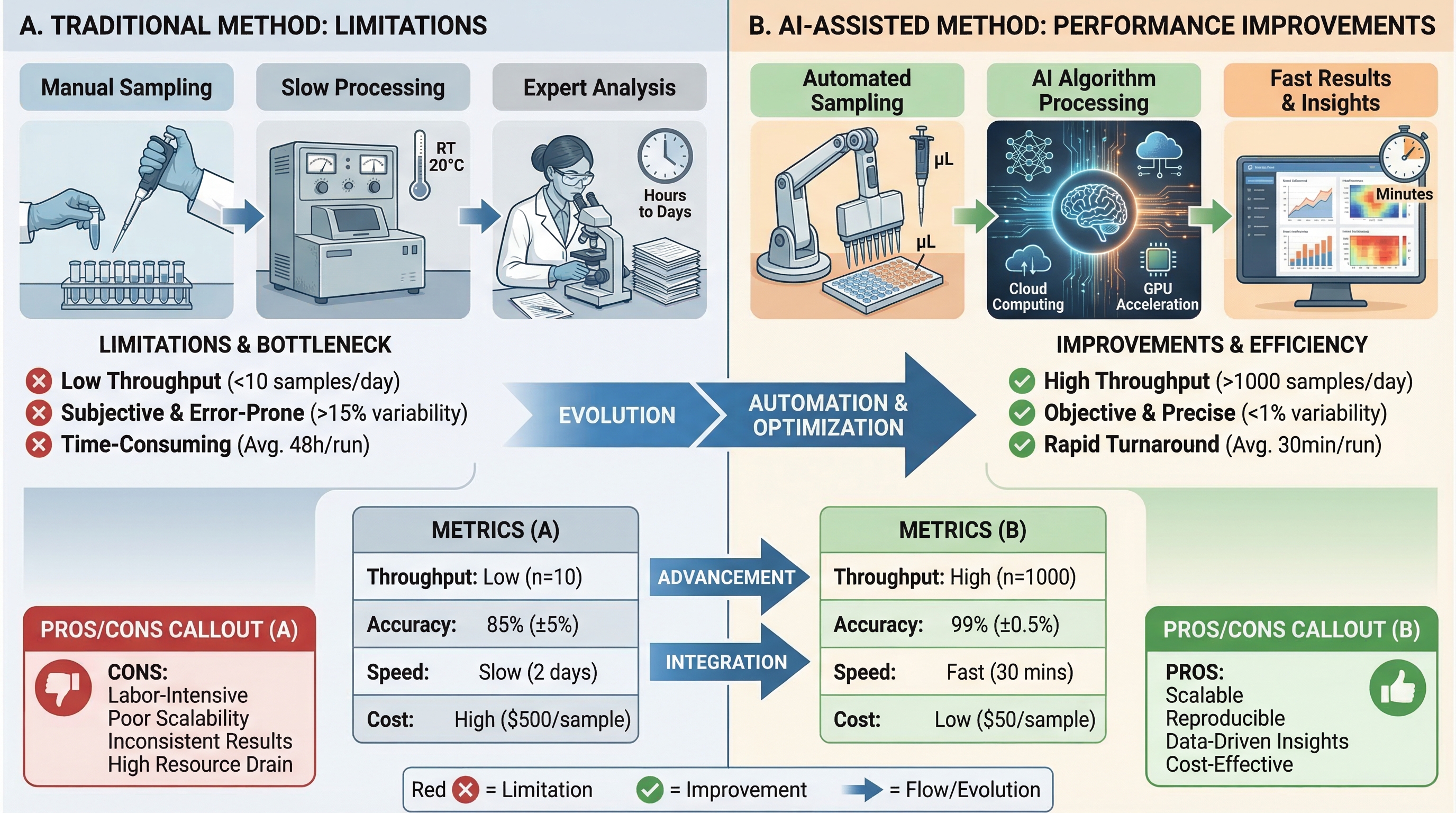
7) Infographic(インフォグラフィック)
専門外の読者への高度な要約や、迅速な意思決定のためのコミュニケーションが必要な場合に使用します。
最適な用途:
- エグゼクティブサマリー
- 学会ポスターの一部
- 部門横断的なチームへのアップデート
プロンプトテンプレート
Create a scientific infographic for [topic].
Include key metric cards, trend summary, category breakdown, and takeaways.
Use icon-supported sections, concise English labels, and strong visual hierarchy.
Readable at presentation distance, white background.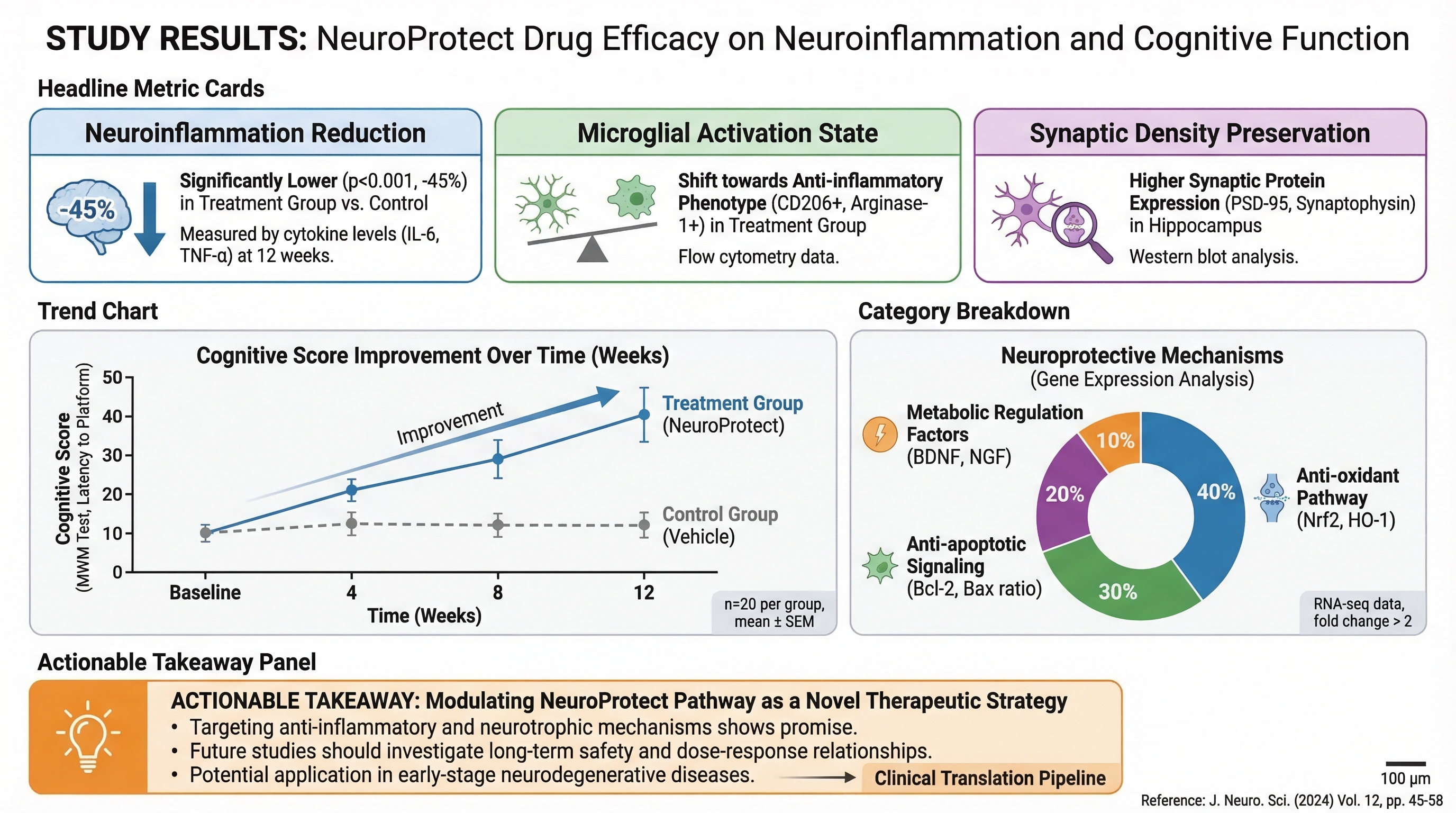
クイック選択ルール
主な目的が以下の場合:
- 「ストーリー全体は?」 → Graphical Abstract
- 「どのように機能するか?」 → Mechanism
- 「分岐はどのように相互作用するか?」 → Pathway
- 「プロセスの順序は?」 → Workflow
- 「システムはどのように構築されているか?」 → Architecture
- 「何が優れているか/違うのか?」 → Comparison
- 「すぐに覚えてもらうべきことは?」 → Infographic
まず適切なタイプを選択し、それからスタイルを最適化してください。これだけで、どんな色の調整よりも図の明快さが向上します。
関連ツール
- ワークフロー図ジェネレーター — AIでワークフロー図を作成
- メカニズム図ジェネレーター — AIでメカニズム・パスウェイ図を作成
- 模式図ジェネレーター — AIで実験模式図を作成
- AIアーキテクチャ図ジェネレーター — AIでシステム構成図を作成
- 細胞イラストジェネレーター — AIで細胞生物学イラストを作成
- 材料科学図ジェネレーター — AIで材料科学図を作成
- 臨床イラストジェネレーター — AIで医学・臨床イラストを作成
- グラフィカルアブストラクト作成ツール — AIでビジュアルアブストラクトを作成


