💡 SciDraw AI Mechanism Figure Generator: the "mechanism examples by research topic" section includes a "scientific hypothesis diagram (grant proposal)" template. Replace the sample text with your own hypothesis and get a first draft. Generate a hypothesis diagram →
The rationale section is nearly done, and the sentence that begins "We therefore hypothesize that" has been rewritten several times. Your PI reads it and says: put a figure here. You place the pilot data, the three aims, the models and the readouts on one slide. The result looks partly like a mechanism figure and partly like a roadmap, and the hypothesis itself is hard to find.
A scientific hypothesis diagram does one job: it turns that one sentence into a causal chain a reader can follow. Proposals to the National Natural Science Foundation of China (NSFC) often include one, where it is called a 科学假说图, and the same structure works for any proposal that states a central hypothesis. Where the figure goes and how much space it may take depend on the funder's current proposal instructions.
How it differs from three similar figures
A hypothesis diagram shows what you think is happening. Some links are already supported by the literature or your preliminary data. Others are what the project will test.
| Figure | Question it answers | What it leaves out |
|---|---|---|
| Scientific hypothesis diagram | What do I think causes what? | Groups, methods, readouts |
| Mechanism figure | What is already known? | Untested speculation |
| Research roadmap | How will the project be done? | Causal relations between molecules |
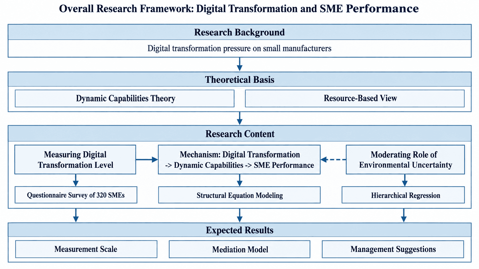
| Research framework | How do the aims relate? | Timing, experimental detail |
A quick test: if the figure contains "Western blot" or "control group", it is a roadmap and belongs in the research roadmap maker. If it contains "Aim 1, Aim 2, Aim 3", it is a research framework. Other figure types are covered in the research grant illustration guide.
A structure that works
- One main line. Draw only the causal chain of the core hypothesis, left to right, or top to bottom on a portrait page.
- No more than 8 nodes. Each node is a noun phrase: a molecule, a process, a phenotype.
- Line style carries the evidence level. Solid arrows for links with existing evidence. Dashed arrows with a question mark for links the project will test. A flat-head arrow (⊣) for inhibition.
- A one-line legend at the bottom.
- Nothing about execution. No experimental groups, controls, methods, readouts or timeline.
Keep it landscape, flat, on a white background, with two or three colors and no crossing arrows. Proposals may be printed in grayscale, so solid and dashed lines must stay distinguishable without color.
Common mistakes
- Putting the roadmap inside the hypothesis. Notes such as "validate in knockout mice" turn "I think" into "I will do".
- Drawing known and untested links the same way. All solid, and the reader cannot see what the project contributes. All dashed, and the chain looks unsupported.
- Too many nodes. Keep the objects named in the hypothesis sentence, plus one or two necessary intermediates.
- Full sentences on arrows. Use single words such as "activates" or "inhibits".
- A mismatch with the text. The text says "inhibits" and the figure shows a normal arrow.
- Too many colors. One main color and one accent for the links to be tested is enough.
Three prompts to copy and edit
Replace the text in square brackets with your own and delete the brackets.
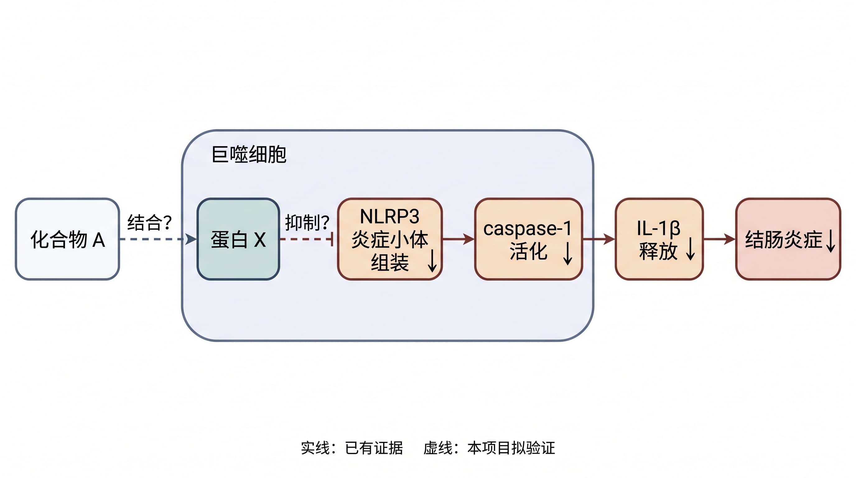
(a) Molecular mechanism: compound → target → pathway → phenotype
Scientific hypothesis diagram for a grant proposal, landscape 16:9, white background, flat vector style, no 3D, no shadows.

Layout: one straight line from left to right, five evenly spaced rounded rectangles of equal size.
Nodes in order: [Compound A] → [Protein X] → [Pathway Y activation] → [Cellular process Z] → [Phenotype: reduced tissue fibrosis]

Links:
1. [Compound A] to [Protein X]: dashed flat-head arrow (inhibition), with "?" beside it.
2. [Protein X] to [Pathway Y activation]: solid arrow, labelled "[activates]".
3. [Pathway Y activation] to [Cellular process Z]: solid arrow, labelled "[promotes]".
4. [Cellular process Z] to [Phenotype]: dashed arrow with "?".

Legend, one line at the bottom: "Solid: existing evidence. Dashed: to be tested in this project. ⊣: inhibition."
Dark blue as the main color; orange only for the dashed links. No crossing arrows.
Do not show experimental groups, controls, methods or readouts.
Use only the text I provide. Do not add molecules or modules I did not mention.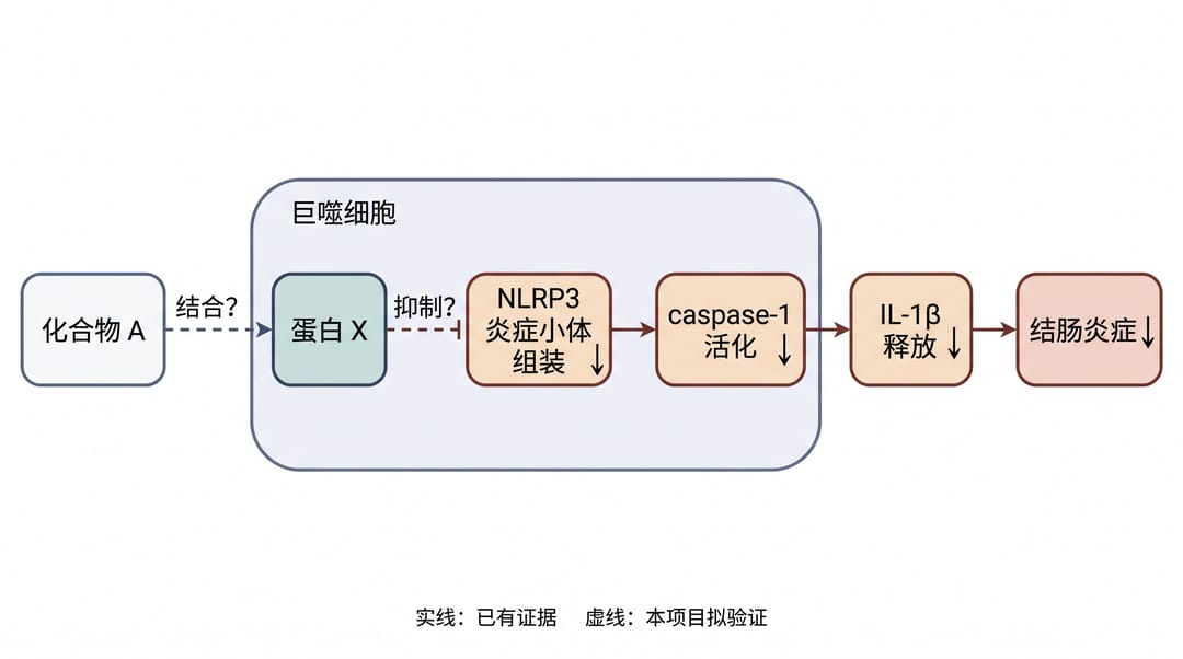
The example is labelled in Chinese and uses placeholder names (Compound A, Protein X). It shows the structure only, not a real mechanism.
(b) Clinical or translational: exposure → intermediate biology → outcome
Scientific hypothesis diagram for a grant proposal, landscape 16:9, white background, flat vector style, no 3D, no shadows.

Layout: three columns from left to right, each with a small heading.
Left, Exposure / intervention: [Exposure E]
Middle, Intermediate biology (upper node pointing to lower): [Biological change M1], [Biological change M2]
Right, Clinical outcome: [Outcome O]

Links:
1. [Exposure E] to [Outcome O]: solid arrow passing above the middle column, labelled "[association observed]".
2. [Exposure E] to [M1]: dashed arrow with "?".
3. [M1] to [M2]: solid arrow, labelled "[promotes]".
4. [M2] to [Outcome O]: dashed arrow with "?".

Legend, one line at the bottom: "Solid: existing evidence. Dashed: to be tested in this project."
Gray-blue as the main color; green only for the dashed links. No crossing arrows.
Do not show sample size, groups, follow-up time or readouts.
Use only the text I provide. Do not add molecules or modules I did not mention.
(c) Materials and engineering: process → microscopic mechanism → property
Scientific hypothesis diagram for a grant proposal, landscape 16:9, white background, flat vector style, no 3D, no shadows.

Layout: one straight line from left to right, four evenly spaced rounded rectangles of equal size.
Nodes in order: [Adding trace element M] → [Grain refinement] → [Grain boundaries impede dislocation motion] → [Higher yield strength]

Links:
1. [Adding trace element M] to [Grain refinement]: dashed arrow with "?".
2. [Grain refinement] to [Grain boundaries impede dislocation motion]: solid arrow.
3. [Grain boundaries impede dislocation motion] to [Higher yield strength]: solid arrow.

Legend, one line at the bottom: "Solid: existing evidence. Dashed: to be tested in this project."
Dark gray as the main color; blue only for the dashed link. No formulas or values.
Do not show preparation steps, characterization techniques or test conditions.
Use only the text I provide. Do not add molecules or modules I did not mention.
The grain-refinement example is textbook material, used only to show the format. All three prompts can be pasted into the mechanism figure generator.
What to check after generating
An AI-generated figure is a draft, and only the applicant can judge whether it is drawn correctly:
- Arrow directions. Read the figure along the arrows. The sentence you get should match the hypothesis paragraph and your own data.
- Activation versus inhibition. Confirm every flat-head and normal arrow.
- Solid versus dashed. Each solid link needs a citation or preliminary result in the text.
- Invented elements. An extra receptor, organelle or caption can still appear. Remove it.
In SciDraw AI you can revise the result with a text instruction, such as "change the second arrow to a flat-head arrow". New accounts get 10 free credits at sign-up plus 5 per day, and one 2K diagram costs 5 credits.
FAQ
Q1: Can the hypothesis diagram and the mechanism figure be one figure?
A: Yes, if the line styles are clear and the legend explains them. When the known background is complex, use two figures.
Q2: Where does it go in the proposal?
A: Usually right after the paragraph that states the hypothesis. The section and any page limits depend on the funder's current proposal instructions.
Q3: Can I draw one without preliminary data?
A: Yes, but every solid link needs support from the literature. Links without support must be dashed.
Q4: Which export format is easiest to edit later?
A: PNG is enough for a Word document. To change wording or line styles yourself, export SVG (10–15 credits) or PPTX (10 credits).
Summary
Write the hypothesis as one sentence, split it into a chain of no more than 8 nodes, and mark which links have evidence and which the project will test. Then copy the matching prompt and check every arrow against your proposal.
👉 Generate a hypothesis diagram draft
For teaching-reform proposals, see the teaching-reform proposal figures guide.