When a thesis in management, public policy, public health or environmental science asks why does the obvious fix make things worse, or why does this policy work for a year and then stop, the answer usually lives in a feedback structure. The standard way to show one is a causal loop diagram (CLD).
The figure looks simple — a few variables, a few curved arrows — but the three errors reviewers catch most often are fatal to the argument: variables written as actions, polarity missing or reversed, and loops that never close. This guide walks through the steps in the order you actually draw them.
What you'll learn:
- How to write variables (and why "improve efficiency" isn't one)
- A one-sentence test for + and − polarity
- How to tell a reinforcing loop from a balancing loop
- Where delays go and why they decide the story
- CLD vs stock-and-flow, and when you need each
- A full worked example and how to write it up
Step 1: Variables are nouns that can go up or down
This is the most common reason a draft comes back. Every variable in a CLD must be a quantity that can increase or decrease, which means it has to be a noun or noun phrase.
| Don't write | Write instead | Why |
|---|---|---|
| Increase training | Training investment | The first is an action — "an increase in increase training" is meaningless |
| Work overtime | Overtime hours | You need something comparable across time |
| Employee dissatisfaction | Employee satisfaction | Variables carry no built-in direction; polarity carries it |
| Implement performance reviews | Review intensity | The policy is an external input; its intensity is the variable |
Building a negative into the name ("dissatisfaction", "resource shortage") wrecks polarity later, because a single arrow then has to express both "dissatisfaction rises" and "satisfaction falls". Keep every variable neutral and positively framed.
A readable diagram holds roughly 8 to 15 variables. Past that, nobody can trace a loop. The fix is not smaller text — it is splitting the diagram, one loop story per figure.
Step 2: Polarity answers one question
Every causal arrow gets a + or a −. There is only one test:
All else equal, when A increases, does B become higher than it otherwise would be (+), or lower than it otherwise would be (−)?
The phrase "than it otherwise would be" matters. You are judging the direction of change, not the resulting level. For example:
- Overtime hours → Work completed: +
- Fatigue → Error rate: +
- Error rate → Rework: +
- Work completed → Work remaining: −
One caution worth stating plainly: an arrow is a causal claim you are making, not a correlation in your data. A significant coefficient does not license an arrow. The justification comes from theory, a stated mechanism, or prior findings — and it belongs in your text. Without it, the diagram is a well-drawn guess.
Step 3: Count the negatives to get R or B
Once a loop closes, walk it once and count the minus signs:
- Even number of negatives (including zero) → reinforcing loop, label R: deviations get amplified — a virtuous or vicious circle
- Odd number of negatives → balancing loop, label B: deviations get pulled back — the system seeks a goal
Give every loop a number and a name: R1 Rework spiral, B1 Work harder. The name is not decoration. Your text discusses loops by name, and a loop without one cannot be discussed.
Step 4: Mark delays only where they change behavior
A delay is drawn as a double bar across the arrow. It does not mean "this takes some time" — it means the gap between cause and effect is long enough to change how the system behaves.
Typical places: overtime to accumulated fatigue, hiring to staff actually arriving, investment to capacity coming online, emissions to ecological response. Delays are the direct reason so many policies look effective for a quarter and fail over a year, so mark them where they belong — and nowhere else. A double bar on every arrow says nothing.
CLD vs stock-and-flow
The two get conflated, but the division of labor is clean:
- A causal loop diagram shows structure and direction: which variables influence which, and whether the feedback amplifies or balances. It carries no quantities and cannot be simulated.
- A stock-and-flow diagram distinguishes stocks (rectangles — inventory, population, funds) from flows (valves — hiring rate, emission rate), carries equations and parameters, and can be simulated in Vensim, Stella and similar tools.
A common thesis structure is: use a CLD to state the mechanism, then build a stock-and-flow model of the core loop for quantitative work. If your study is a mechanism analysis and you are not simulating, a CLD on its own is a complete contribution. Do not bolt on a model you cannot actually run.
Worked example: schedule pressure on a project
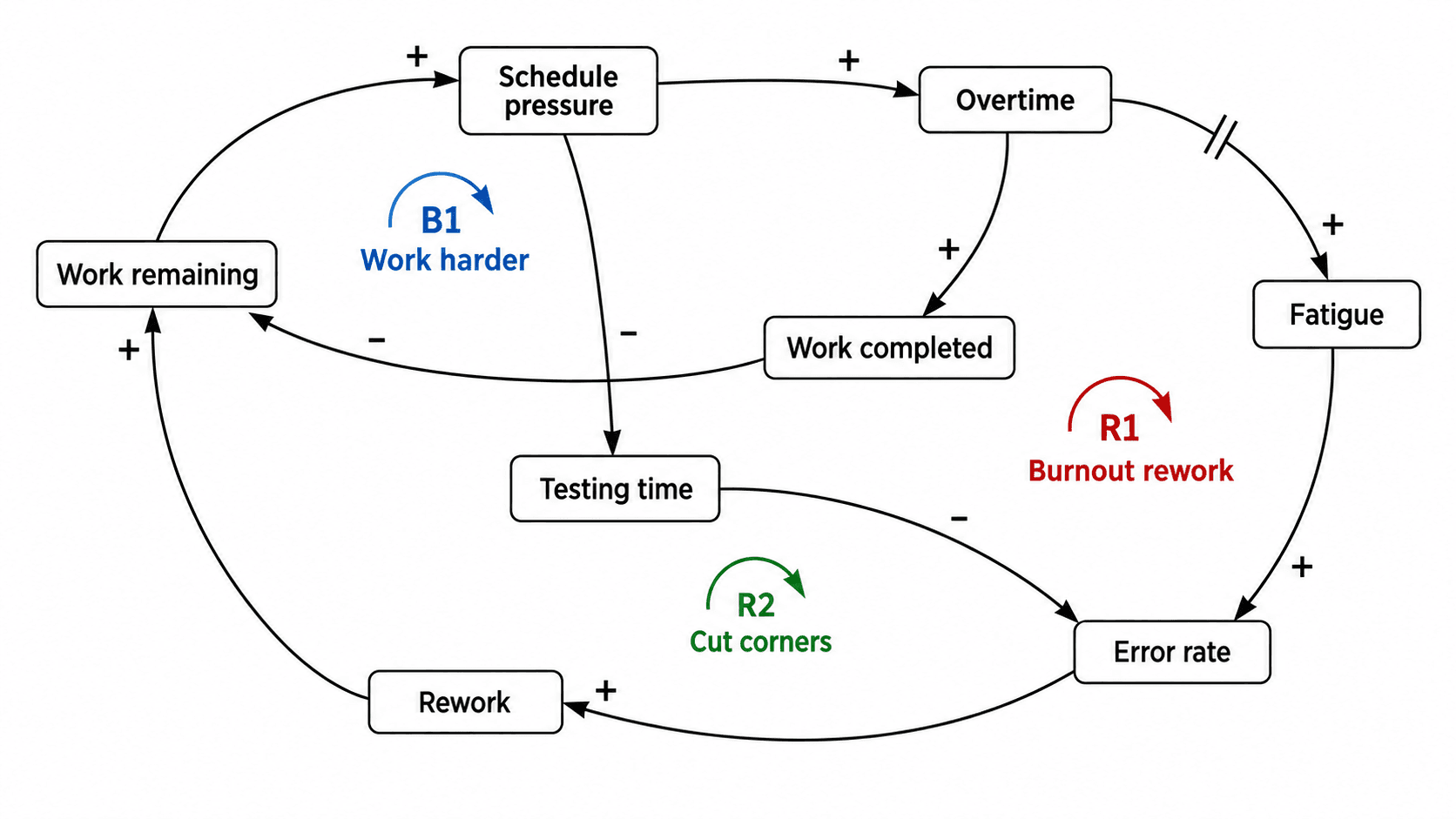
Write the causal links as a list before you draw anything:
- Work remaining → Schedule pressure (+)
- Schedule pressure → Overtime (+)
- Overtime → Work completed (+)
- Work completed → Work remaining (−)
- These form B1 Work harder (one negative, balancing)
- Overtime → Fatigue (+, with a delay)
- Fatigue → Error rate (+)
- Error rate → Rework (+)
- Rework → Work remaining (+)
- These form R1 Burnout rework (zero negatives, reinforcing)
- Schedule pressure → Testing time (−)
- Testing time → Error rate (−)
- These form R2 Cut corners (two negatives, reinforcing)
The story: when the schedule tightens, the team absorbs it with overtime (B1) — which works, briefly. But overtime produces fatigue and fatigue produces rework (R1), while squeezing testing raises the error rate directly (R2). Two reinforcing loops eventually overwhelm the balancing one, and the project gets slower the harder it is pushed.
Write it up in exactly that order: state each loop's mechanism, say which loop dominates in which phase, then name the leverage point. Here the leverage point is testing time, not overtime — which is precisely the sort of conclusion the figure earns you.
Generating a first draft from text
Laying out curved arrows without crossings is the slow part, and one comment — "reverse that link" — means redoing it. Faster: write the causal links as a list, generate a draft, refine.
The causal loop diagram generator separates domains into task modes, switchable above the input box:
- Policy and public systems — urban transport, health capacity, public service feedback
- Organizations and management — projects, human resources, organizational behavior
- Environment and resources — ecology, fisheries, water and other natural-resource systems
The input format is the list above: Variable A → Variable B (+), plus loop names, R/B labels and where the delays sit. The generator draws only the links you give it — it will not add one to make the diagram look complete, which is the behavior a thesis figure requires. It also does not simulate, estimate parameters, or infer causality from data. Those remain your work.
If what you need is a program's inputs and outcomes rather than a feedback structure, a logic model is the right figure instead. For the diagrams other disciplines need, browse thesis figures by discipline.
Frequently asked questions
Do I need both a causal loop diagram and a stock-and-flow model? No. If your study analyzes mechanisms and discusses policy, a CLD is sufficient on its own. You need a stock-and-flow model only when you are running quantitative simulations, which requires distinguishing stocks from flows and specifying equations and parameters.
How do I count negatives without making a mistake? Walk the loop once, all the way back to your starting variable, noting the polarity of every link on the way, and count only the minus signs. Even (including zero) is reinforcing; odd is balancing. Then sanity-check it: does this loop feel self-amplifying or self-correcting?
How many variables belong in one diagram? Eight to fifteen. Beyond that readers cannot trace loops. For a complex system, split it into several figures, each telling one loop's story, plus an overview figure showing how they connect.
Can I draw a causal loop diagram without data? Yes. A CLD expresses structural assumptions drawn from theory, interviews, prior research or field experience, and does not require quantitative data. The reverse also holds: having data does not let you turn a correlation into a causal arrow. Justify every link in your text.