How to Make an Experimental Workflow Diagram for a Paper
A step-by-step guide to designing a clear experimental workflow diagram for a research paper — what to include, a reusable layout, common mistakes, and a checklist.
A reviewer can usually tell within seconds whether they understand your study design. Not from the Methods section — from the workflow figure. A good experimental workflow diagram answers three questions at a glance: what you did, in what order, and to which samples. When that figure is missing or muddled, the reviewer has to reconstruct your design from dense prose, and every reconstruction is a chance to misunderstand.
This guide explains how to make an experimental workflow diagram that carries its weight in a paper. It is written for research articles and theses, not slide decks, so the emphasis is on clarity, honesty, and reproducibility rather than decoration.
A workflow diagram (sometimes called a methods figure, study design figure, or experimental schematic) is a visual summary of your procedure. It is not a decorative version of your Methods section — it is a map that lets a reader hold the whole experiment in their head before reading the details.
The best workflow figures do one specific job: they make the structure of the experiment obvious. How many groups? What treatment did each receive? At what timepoints were measurements taken? Where did samples split or merge? A reader should be able to answer those questions from the figure alone.
Groups and sample sizes — treatment vs. control, and the n for each arm.
Interventions or conditions — what was applied, and to whom.
Timeline — key timepoints, in order, with real units (days, weeks, passages) when they matter.
Measurements and readouts — what was collected at each stage.
Branch points — where a cohort splits into subgroups or where parallel tracks run.
Leave out anything that belongs in the Methods text: buffer recipes, catalog numbers, instrument settings, and exhaustive parameter lists. If a detail does not change how a reader interprets the structure of the experiment, it does not belong in the workflow figure.
Most experimental workflows fit one of two shapes. Choose the one that matches how your reader will think about the study.
Linear (left-to-right): best for a single pipeline — collection → processing → analysis → output. Use it when there is one main path and the story is "we did A, then B, then C." Time flows in one direction; keep the arrows consistent so the eye never has to reverse.
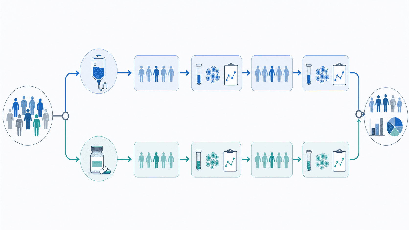
Branched (top-down or fork): best for comparative designs — a starting cohort that splits into treatment and control arms, each with its own timeline and readouts. Use it whenever the comparison is the point of the study. Keep parallel arms visually parallel: same box size, same vertical position for the same timepoint, so the reader can compare arms row by row.
Whichever shape you choose, respect a few layout rules:
One reading direction. Left-to-right or top-to-bottom, never both. Every arrow should point the same general way.
Align equivalent stages. If two arms are measured on day 14, put both "day 14" boxes at the same height.
Group with whitespace and color, not boxes-within-boxes. Nested rectangles read as clutter fast.
Label arrows when they carry meaning. "48 h" or "sorted by flow cytometry" on an arrow is worth more than a caption sentence.
Step 1 — Write the one-sentence summary. Before drawing anything, write the experiment as a single sentence: "Mice were randomized to drug or vehicle, dosed for two weeks, and tumor volume was measured every three days." That sentence is your figure's skeleton.
Step 2 — List the stages and branch points. Turn the sentence into an ordered list of stages, marking where the cohort splits. This becomes your node list.
Step 3 — Pick the shape. Linear if there is one path; branched if the comparison is the point.
Step 4 — Draft it fast, then refine. Get the structure down before polishing. Check that sample sizes, timepoints, and group labels match your Methods section exactly — a workflow figure that disagrees with the text invites a reviewer query.
Step 5 — Test it on someone. Show it to a labmate who did not run the experiment. If they can describe your design back to you from the figure alone, it works. If they ask "wait, which group got the drug?", the labels need work.
If you want a fast first draft, describe your design in plain language to the SciDraw AI Workflow Diagram Generator and edit the layout it produces. It will not make the scientific decisions for you, but it gets you past the blank canvas.
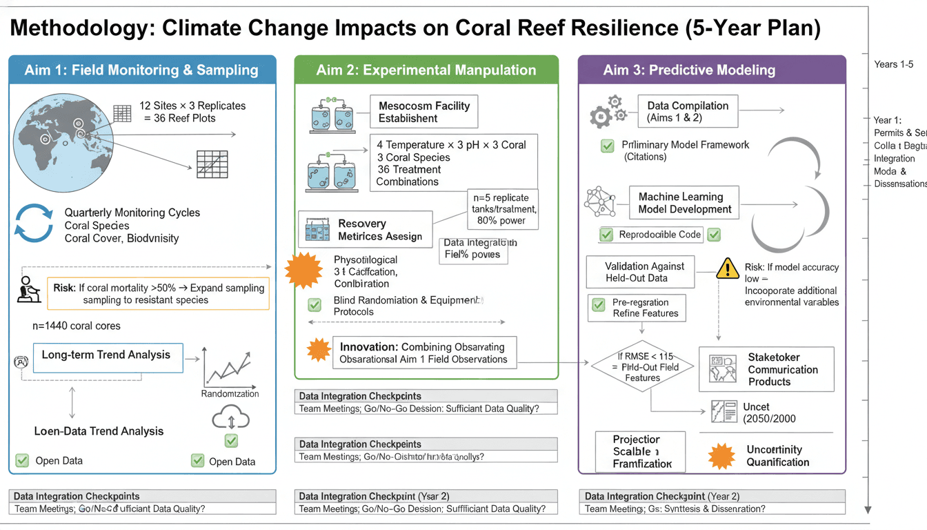
Restating the Methods. If the figure has as many words as the paragraph it summarizes, it is not a summary. Cut to the structure.
Inconsistent arrows. Arrows that point in different directions force the reader to re-orient at every step. Pick one flow direction and hold it.
Missing sample sizes. A design figure without n per arm hides exactly the information reviewers check first.
Mismatched labels. "Group A" in the figure and "high-dose cohort" in the text is a small inconsistency that erodes trust. Use one vocabulary everywhere.
Decorative icons that mislead. A cute mouse icon is fine; a syringe icon on the control arm is a factual error. Every visual element should be true.
Before you submit, confirm the figure answers each of these from itself, with no help from the caption:
Can a reader tell how many groups there are and the n for each?
Is the order of steps unambiguous?
Are timepoints labeled with real units where they matter?
Do all labels match the Methods text word for word?
Would a colleague who did not run the study describe the design correctly?
A workflow figure that passes this checklist does more than illustrate your Methods — it makes your study easier to trust, easier to review, and easier to reproduce.
Davie Chen is a researcher at the Faculty of Animation and Intermedia, University of Arts in Poznan, studying generative AI for scientific figure creation, patent illustration, and manuscript drafting. SciDraw AI is one of the research-to-product tools built from this work.