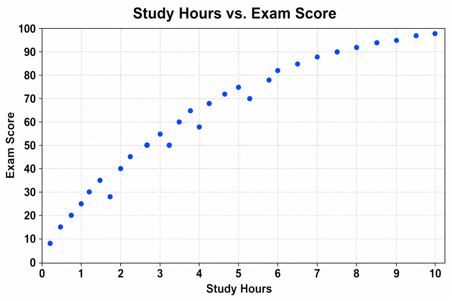
Kostenloser Streudiagramm-Maker
Kostenloser Streudiagramm-Maker aus Versuchs- und Forschungsdaten erzeugen
Erstellen Sie Einfaches Streudiagramm mit Streudiagramm-Maker aus CSV oder Excel. Python-Darstellung, SciVis-Bearbeitung und Export sind enthalten.
Beispiele und Datensätze für Streudiagramm-Maker
Öffnen Sie ein Beispiel, prüfen Sie die Grafik, laden Sie die CSV herunter oder übernehmen Sie dieselben Daten in den Generator.
Was zeigt Streudiagramm-Maker?
Streudiagramm-Maker überführt strukturierte Forschungsdaten in die statistische Darstellung, für die dieser Diagrammtyp gedacht ist. Geeignet ist er unter anderem für Einfaches Streudiagramm und Streudiagramm mit Trendlinie; Python erzeugt die reproduzierbare Erstfassung, SciVis übernimmt die visuelle Nachbearbeitung.
Datenanforderungen für Streudiagramm-Maker
- Beispielhafte Felder: sample_id, x_value, y_value, group, bubble_size, label.
- Eine Zeile steht für eine Beobachtung, Kategorie, einen Zeitpunkt oder ein gültiges Paar.
- Messwerte werden numerisch gespeichert; Einheiten gehören in den Spaltennamen.
- Leere Zellen gelten als fehlend; Summenzeilen und Notizen sollten vor dem Upload entfernt werden.
Forschungsbeispiele für Streudiagramm-Maker
- Einfaches Streudiagramm
- Streudiagramm mit Trendlinie
- Gruppiertes Streudiagramm
- Korrelations-Streudiagramm
- Blasendiagramm
- XY-Streudiagramm (zwei Reihen)
Warum Streudiagramm-Maker für Forschungsdaten nutzen?
- Prüfen Sie die Feldzuordnung zunächst mit dem enthaltenen Beispiel Einfaches Streudiagramm.
- Übertragen Sie die visuelle Struktur von Streudiagramm mit Trendlinie auf einen vergleichbaren Datensatz.
- Nutzen Sie die Python-Darstellung, ohne Plot-Code selbst zu schreiben oder zu debuggen.
- Lassen Sie die erzeugten Werte unverändert und verfeinern Sie Beschriftung, Farben und Export in SciVis.
So verwenden Sie Kostenloser Streudiagramm-Maker
Wählen Sie ein Beispiel oder laden Sie eine CSV-, TSV-, TXT-, XLSX- oder XLS-Datei hoch. Prüfen Sie die erkannten Spalten, erzeugen Sie das Diagramm und bearbeiten Sie es in SciVis. Bei Excel wird das erste Tabellenblatt verwendet.
Merkmale einer gut lesbaren Darstellung mit Streudiagramm-Maker
- Achsen, Gruppen oder Knoten werden konsistent aus sample_id, x_value, y_value, group, bubble_size, label abgeleitet.
- Der Titel nennt Ergebnis oder Vergleich, den Streudiagramm-Maker zeigt.
- Beschriftungen, Einheiten, Legenden und methodisch nötige Referenzlinien bleiben gut lesbar.
- Zurückhaltende Farben und ausreichende Auflösung eignen sich für Paper, Poster und Folien.
Streudiagramm-Maker oder Blasendiagramm-Ersteller?
Ein Streudiagramm zeigt zwei quantitative Variablen und optional eine Regressionslinie. Ein Blasendiagramm ist nur nötig, wenn eine dritte quantitative Variable die Punktfläche steuert.
Häufige Fragen zu Kostenloser Streudiagramm-Maker
Welche Spalten benötigt Streudiagramm-Maker?
Die beigefügte CSV zeigt die empfohlene Struktur. Typische Felder sind sample_id, x_value, y_value, group, bubble_size, label; gleichbedeutende Spaltennamen sind ebenfalls möglich.
Wann ist Streudiagramm-Maker besser geeignet als Blasendiagramm-Ersteller?
Verwenden Sie Streudiagramm-Maker für die statistische Beziehung, die dieser Diagrammtyp gezielt abbildet. Für den alternativen Vergleich eignet sich Blasendiagramm-Ersteller.
Kann ich eine mit Kostenloser Streudiagramm-Maker erstellte Grafik weiter bearbeiten?
Ja. Öffnen Sie die mit Kostenloser Streudiagramm-Maker erzeugte Grafik in SciVis und ändern Sie Beschriftungen, Farben, Anmerkungen, Layout und weitere visuelle Einstellungen.
Kann ich Abbildungen aus Kostenloser Streudiagramm-Maker in einer Publikation verwenden?
Ja. Kostenloser Streudiagramm-Maker ist auf klare wissenschaftliche Abbildungen ausgelegt. Prüfen Sie vor der Einreichung dennoch alle Werte und die Vorgaben der Zeitschrift.
Kann Kostenloser Streudiagramm-Maker hochauflösende Grafiken ausgeben?
Ja. Nach der Bearbeitung einer Kostenloser Streudiagramm-Maker-Abbildung in SciVis können Sie sie passend für Artikel, Poster, Folien und Berichte exportieren.
Brauche ich Programmierkenntnisse für Kostenloser Streudiagramm-Maker?
Nein. Der geführte Upload in Kostenloser Streudiagramm-Maker erzeugt den ersten Entwurf; die Feinabstimmung erfolgt mit den visuellen Werkzeugen in SciVis.
So visualisieren Sie Ihre Forschungsdaten mit Kostenloser Streudiagramm-Maker
Erfahren Sie mehr über Diagrammauswahl, erforderliche Datenstruktur, Interpretation und wissenschaftliche Workflows, bevor Sie Ihre finale Abbildung für das Paper erstellen.
Weitere Tools entdecken
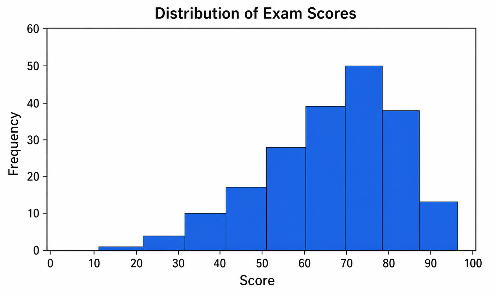
Histogramm-Maker
Nutzen Sie Histogramm-Maker für CSV- oder Excel-Daten und verfeinern Sie die mit Python erstellte Grafik in SciVis.
Kostenlos testen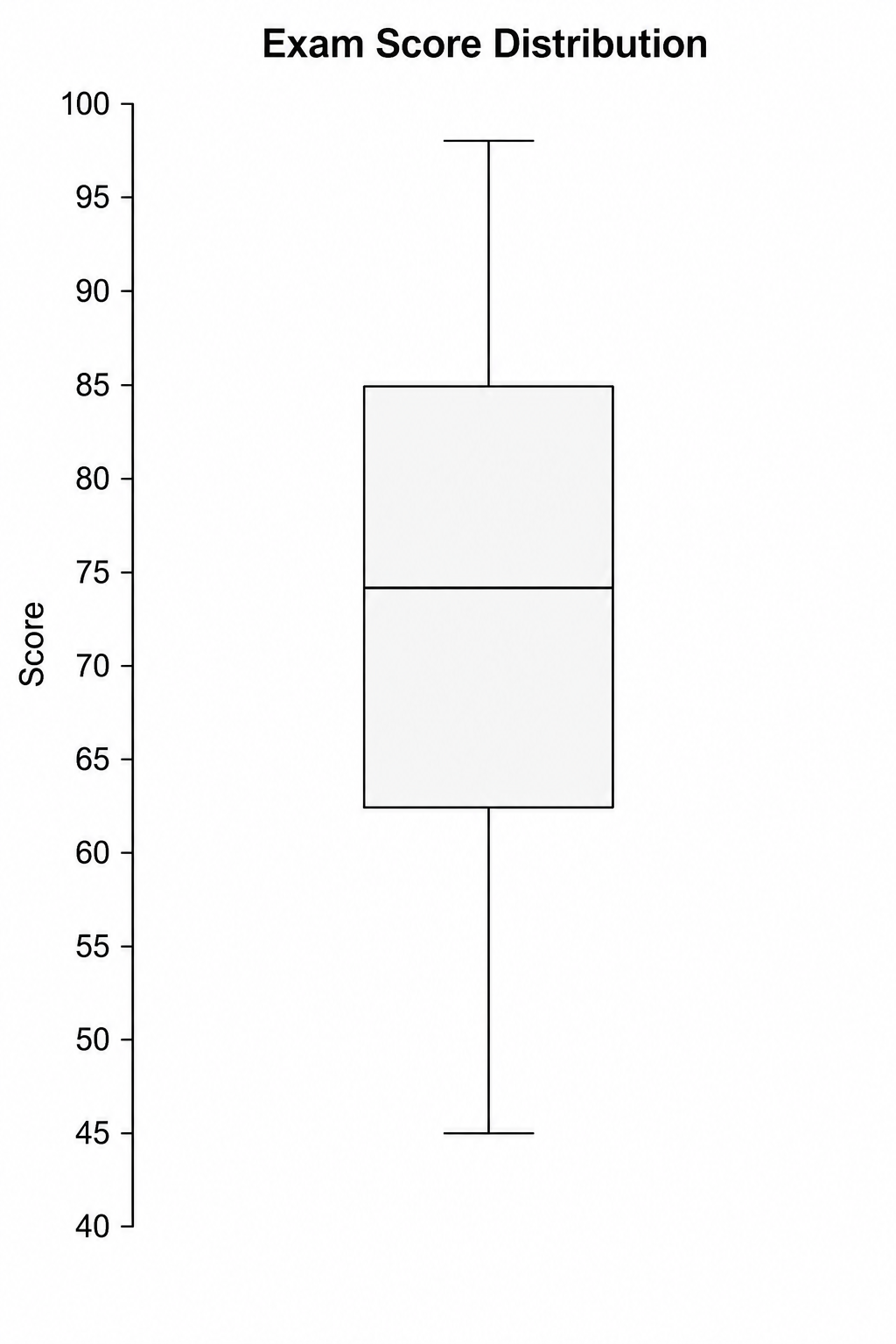
Boxplot-Maker
Nutzen Sie Boxplot-Maker für CSV- oder Excel-Daten und verfeinern Sie die mit Python erstellte Grafik in SciVis.
Kostenlos testen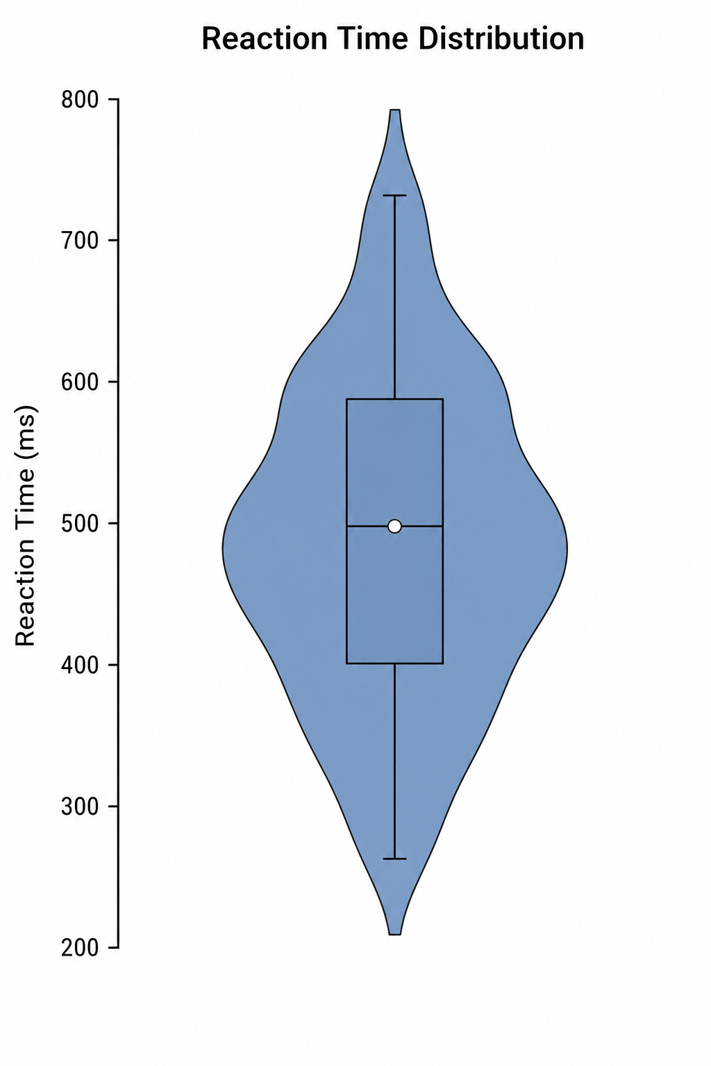
Violindiagramm-Maker
Nutzen Sie Violindiagramm-Maker für CSV- oder Excel-Daten und verfeinern Sie die mit Python erstellte Grafik in SciVis.
Kostenlos testenEine Abbildung mit Kostenloser Streudiagramm-Maker erstellen
Beginnen Sie mit Beispieldaten oder einer unterstützten Datendatei und stellen Sie die Abbildung in SciVis fertig.