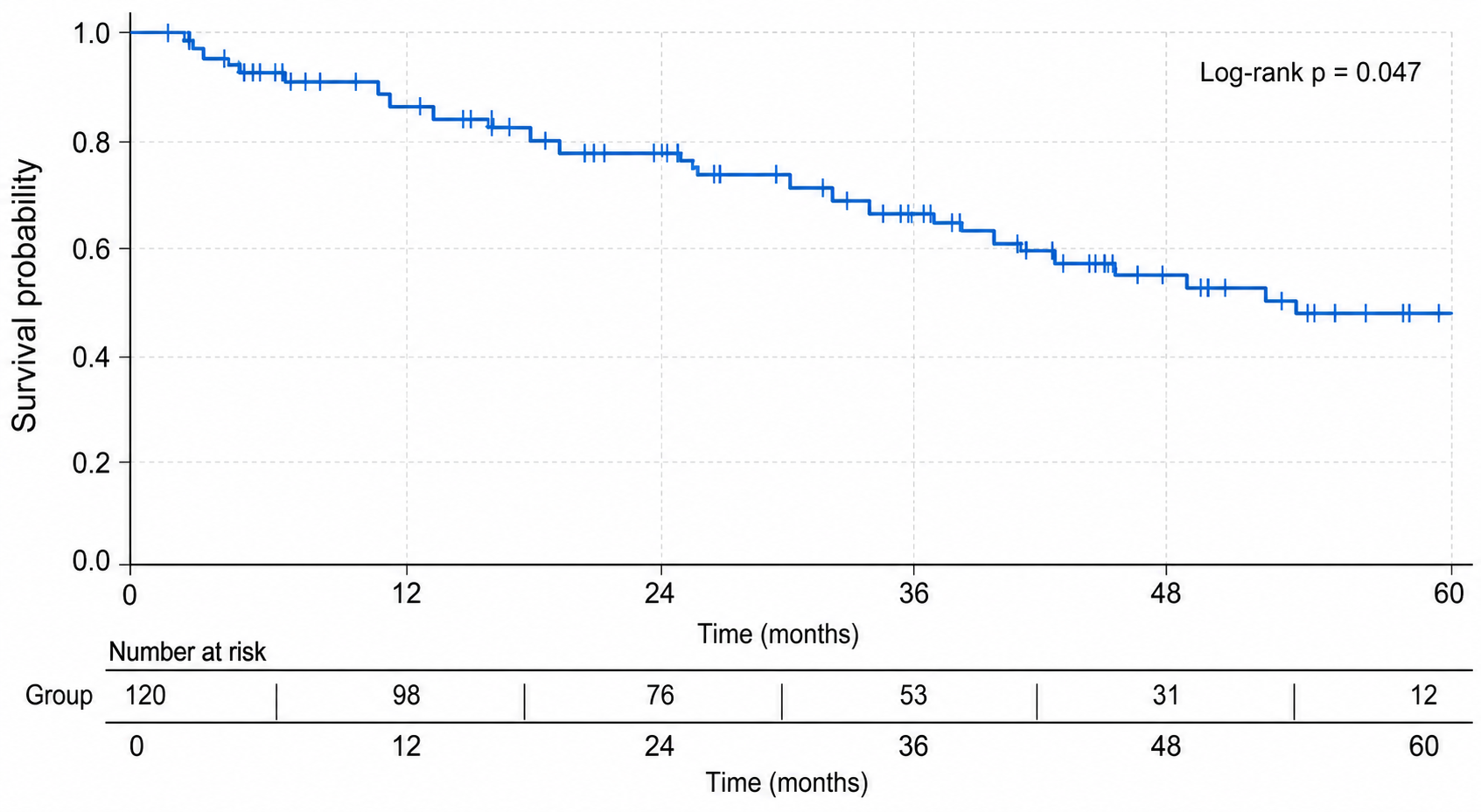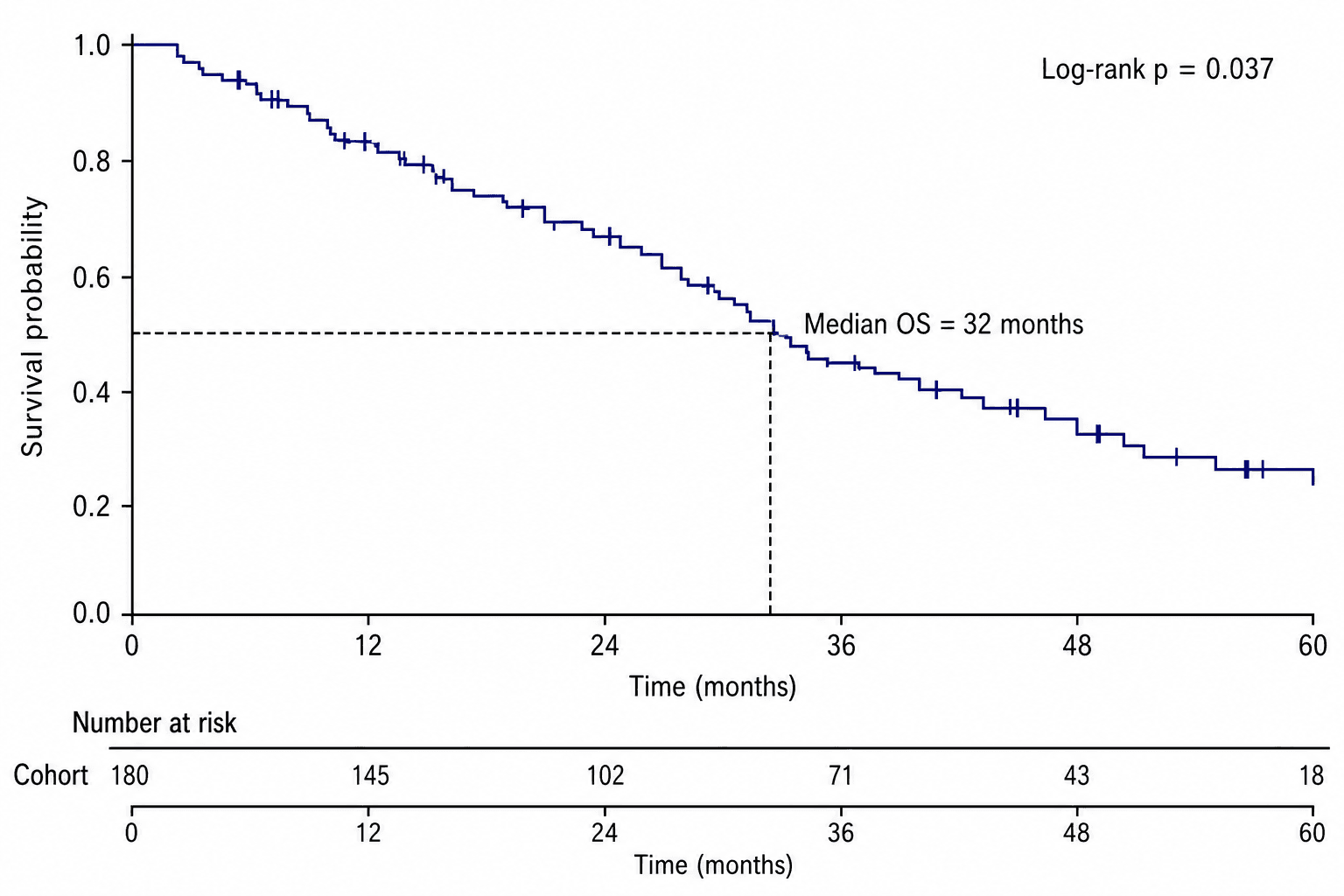
A Kaplan-Meier plot estimates the probability of remaining event-free over time. SciDraw creates the first survival chart from your table, including step curves and censoring marks, and then sends the result to SciVis for detailed visual editing.

What data does a Kaplan-Meier plot need?
Upload one CSV, TSV, TXT, XLSX, or XLS file. Excel uses the first worksheet. The standard long-format table has one patient or subject per row:
| Column | Purpose | Example |
|---|---|---|
patient_id | Unique subject identifier | P001 |
time_months | Follow-up or event time | 49.9 |
event | Event status, commonly 1 = event and 0 = censored | 1 |
group | Treatment arm or cohort | Treatment |
Confirm the event coding before upload. Reversing event and censor values changes the curve and invalidates the interpretation.
Step 1: Choose an example or upload survival data
Open the Kaplan-Meier plot generator. The six examples cover overall survival, treatment comparison, progression-free survival, censoring marks, multiple groups, and an at-risk table. Use them to check the expected column structure before loading your own data.
Only one file is needed for the common workflow because time, status, and group can all live in the same table. Join separate clinical tables before upload when necessary.
Step 2: Generate the survival curves
Map the time, event, and group columns, then generate the figure. A correct first version should use:
- a step-down curve rather than a smoothed line;
- survival probability from 0 to 1, or 0% to 100%;
- censoring marks at censored observations;
- distinct curves for each study group;
- a time unit that matches the source data.
If your analysis includes confidence intervals, median survival, a log-rank p-value, or a hazard ratio, verify those statistics against the survival model used in your analysis.

Step 3: Continue editing in SciVis
Select Continue editing in SciVis after generation. In the editor you can change curve colors, line weights, labels, annotations, legend placement, and the layout of the plot and at-risk table. You can also refine the visible time range without changing the source table.
Keep curve labels and risk-table rows in the same order and color. If the number at risk becomes very small, avoid emphasizing the unstable tail of the curve.
Adding an at-risk table
An at-risk table helps readers judge how much information remains at each time point. Align every count directly below its x-axis tick and use one row per group. Choose intervals that suit the follow-up period, such as every 6 or 12 months.
The table should come from the same cleaned survival data as the curve. Do not type counts into the graphic without verifying them against the analysis output.
Common Kaplan-Meier mistakes
- Incorrect event coding: Confirm whether 0 or 1 represents an event.
- Smooth curves: Kaplan-Meier estimates change in steps at event times.
- Missing censoring marks: Censoring is part of the data, not decoration.
- No at-risk context: Add a risk table when the figure is used for clinical reporting.
- Unlabeled time units: State days, months, or years on the x-axis.
- Overinterpreting the tail: Curves based on very few remaining subjects are unstable.
- Confusing descriptive and adjusted estimates: A Kaplan-Meier curve is unadjusted; adjusted effects normally come from a separate model.
Frequently asked questions
Can I create a Kaplan-Meier plot without R?
Yes. Upload time-to-event data to the Kaplan-Meier plot generator, generate the chart, and continue editing it in SciVis.
Is one file enough?
Usually yes. A single long-format table can contain subject ID, follow-up time, event status, and group. The uploader accepts one file at a time.
Which file formats are supported?
CSV, TSV, TXT, XLSX, and XLS are supported. For Excel workbooks, the first worksheet is imported.
Can I edit censoring marks and the risk table later?
Yes. The generated result opens in SciVis, where you can refine visual properties and layout. Always verify statistical values against your analysis.
Create your survival plot
Try a prepared dataset or upload your own survival table in the Kaplan-Meier plot generator. Generate the first curve, verify the event coding and counts, then finish the figure in SciVis.