Générateur de courbe de Kaplan-Meier
Transformez vos résultats d'analyse de survie en figure prête à publier
Décrivez vos données de survie — groupes, durée de suivi et p-value du log-rank issue de votre analyse — et l'IA trace une courbe de Kaplan-Meier claire avec courbes de survie en marches descendantes, marques de censure, table du nombre de sujets à risque et p-value annotée, prête pour vos manuscrits et vos exposés.
Exemples de courbe de Kaplan-Meier
Cliquez sur un exemple pour charger son prompt, ou servez-vous-en comme point de départ pour votre propre courbe de survie.
Que fait ce générateur de courbe de Kaplan-Meier ?
Il transforme la description de vos résultats d'analyse de survie en une courbe de Kaplan-Meier claire et prête à publier — la fonction en escalier qui place la probabilité de survie (de 0 à 1 ou en pourcentage) en ordonnée face au temps en abscisse. Vous décrivez vos groupes, votre durée de suivi, la censure et les statistiques issues de votre propre analyse, et l'IA trace les courbes en marches descendantes, les marques de censure, la table du nombre de sujets à risque et l'annotation de la p-value du log-rank, de sorte que les différences de survie se lisent clairement, sans code de tracé ni mise en page manuelle. SciDraw AI trace et embellit la courbe à partir des valeurs que vous fournissez ; il ne réalise pas les calculs statistiques de survie à votre place.
Pourquoi utiliser un générateur de courbe de Kaplan-Meier
- La courbe de Kaplan-Meier est la façon standard de présenter des données de survie ou de temps jusqu'à l'événement en une seule figure.
- Coder une courbe KM soignée avec marques de censure et table du nombre à risque sous R ou Python demande du temps et plusieurs itérations.
- Une courbe en marches claire, avec légende et p-value annotée, rend les différences entre groupes évidentes pour tout lecteur.
- Les chercheurs ont besoin de figures de survie propres et présentables, rapidement, pour leurs articles, posters et exposés.
- Régénérer à partir d'une description est plus rapide que de relancer un script chaque fois que les étiquettes, les couleurs ou la mise en page changent.
Comment faire une courbe de Kaplan-Meier
Décrivez votre étude (par exemple survie globale, traitement vs contrôle), indiquez les groupes à afficher et sur quelle durée de suivi, et précisez l'échelle de l'axe des ordonnées — probabilité de survie de 0 à 1 ou en pourcentage. Ajoutez les éléments souhaités : marques de censure, bandes de confiance ombrées, table du nombre de sujets à risque, ainsi que la p-value du log-rank et la survie médiane issues de votre analyse. Générez la figure, puis vérifiez que les courbes ne font que descendre, que les groupes et les étiquettes sont corrects, et affinez jusqu'à ce qu'elle corresponde à vos données.
Les éléments d'une courbe de Kaplan-Meier
- Axe des ordonnées — probabilité de survie, de 0 à 1 ou en pourcentage.
- Axe des abscisses — temps écoulé depuis le début du suivi (jours, mois ou années).
- Courbes en marches — la survie par groupe, ne descendant jamais que vers le bas au fil du temps.
- Marques de censure — marques aux points où les observations ont été censurées.
- Table du nombre à risque — effectifs restants par groupe sous l'axe des abscisses.
- Annotations — la p-value du log-rank, la survie médiane et une légende des groupes.
FAQ du générateur de courbe de Kaplan-Meier
Qu'est-ce qu'une courbe de Kaplan-Meier ?
Une courbe de Kaplan-Meier est une fonction en escalier qui montre la probabilité de survie estimée d'un ou plusieurs groupes au fil du temps. L'axe des ordonnées va de 0 à 1 (ou de 0 % à 100 %) et l'axe des abscisses correspond au temps de suivi ; chaque courbe ne descend que par marches à mesure que les événements surviennent, et les observations censurées sont généralement indiquées par des marques.
De quelles données ai-je besoin pour une courbe de survie ?
Pour votre propre analyse, il faut pour chaque sujet une durée de suivi, un indicateur d'événement/censure et un groupe. Pour tracer la figure ici, vous décrivez les groupes, la forme des courbes au fil du temps, les marques de censure et les statistiques — comme la p-value du log-rank et la survie médiane — issues de votre analyse.
Réalise-t-il les calculs statistiques de survie à ma place ?
Non. SciDraw AI trace et embellit la courbe de Kaplan-Meier à partir des valeurs que vous fournissez. Réalisez l'estimation de Kaplan-Meier et le test du log-rank dans votre propre logiciel statistique, puis décrivez les résultats pour que la figure les reflète fidèlement.
Peut-il ajouter une table du nombre à risque et la p-value du log-rank ?
Oui. Vous pouvez demander une table du nombre de sujets à risque alignée sous l'axe des abscisses et faire annoter la p-value du log-rank dans le graphique. Fournissez les effectifs à risque et la p-value issus de votre analyse, et ils seront tracés dans la figure.
Puis-je montrer la censure et plusieurs groupes ?
Oui. Vous pouvez afficher les observations censurées par des marques et tracer plusieurs groupes sous forme de courbes en marches colorées distinctes avec une légende, éventuellement avec des bandes de confiance ombrées — utile pour la survie globale (OS), la survie sans progression (PFS) et les comparaisons stratifiées.
Puis-je exporter une figure modifiable ?
SciDraw AI peut exporter vers des formats vectoriels pour que vous puissiez ensuite ajuster les étiquettes, les couleurs, les styles de ligne et la légende. Vérifiez toujours les courbes, les marques de censure et les statistiques annotées par rapport à votre analyse sous-jacente avant soumission.
Découvrir plus d'outils
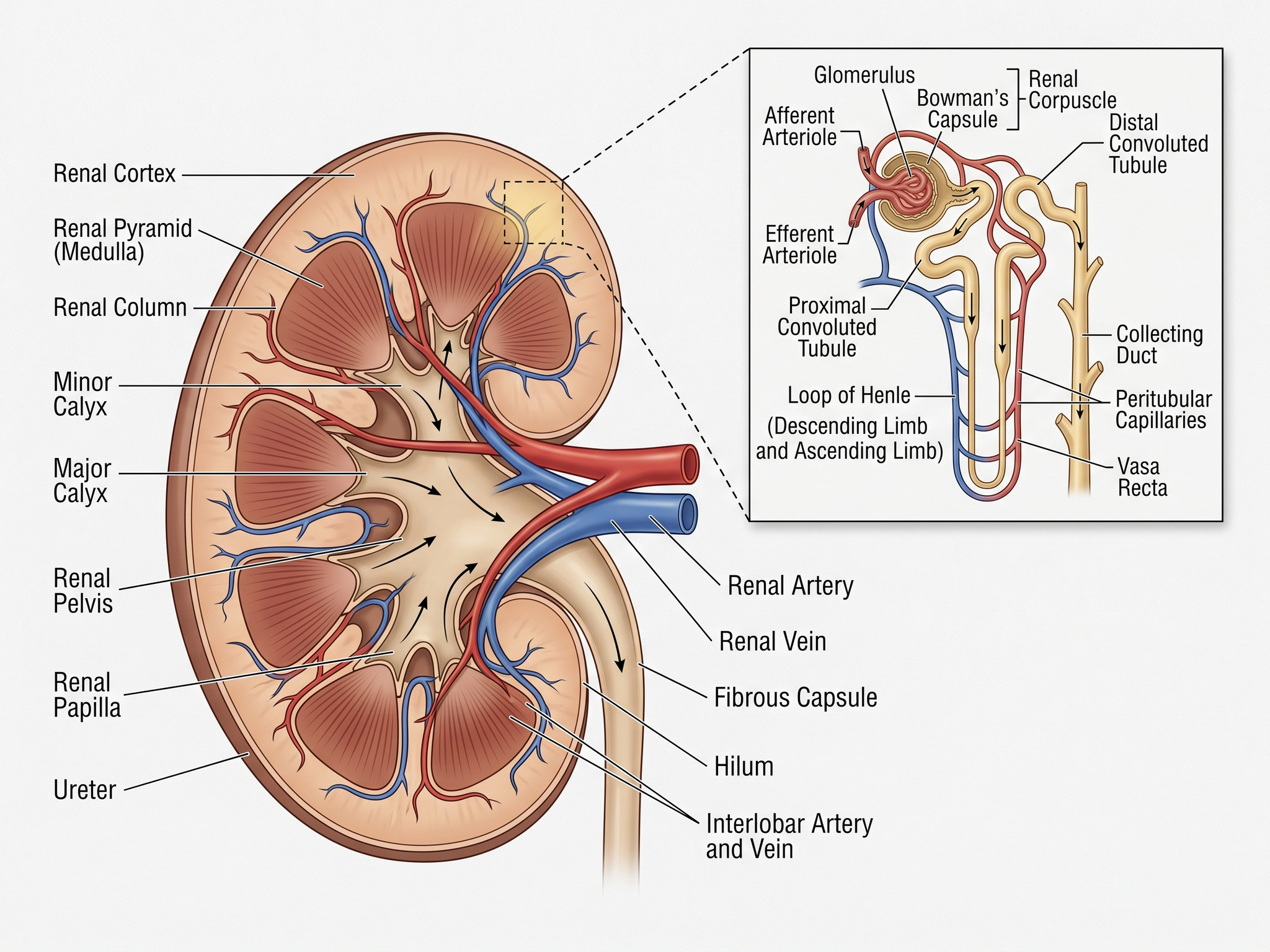
Créateur d'illustrations médicales
Créez des schémas anatomiques, cliniques et pédagogiques
Essayer gratuitement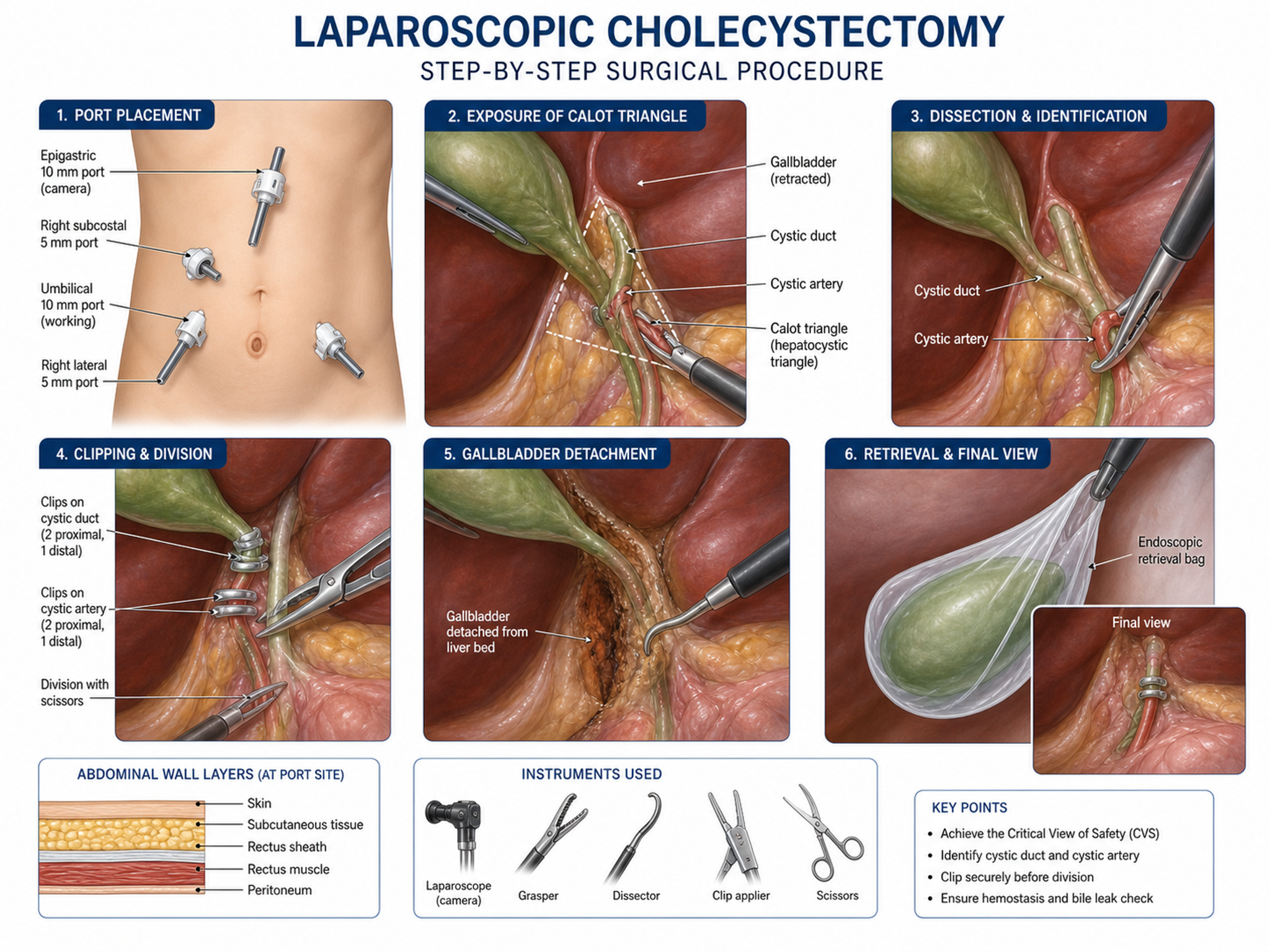
Générateur d'illustrations cliniques
Créez des schémas anatomiques et des illustrations de procédures chirurgicales
Essayer gratuitement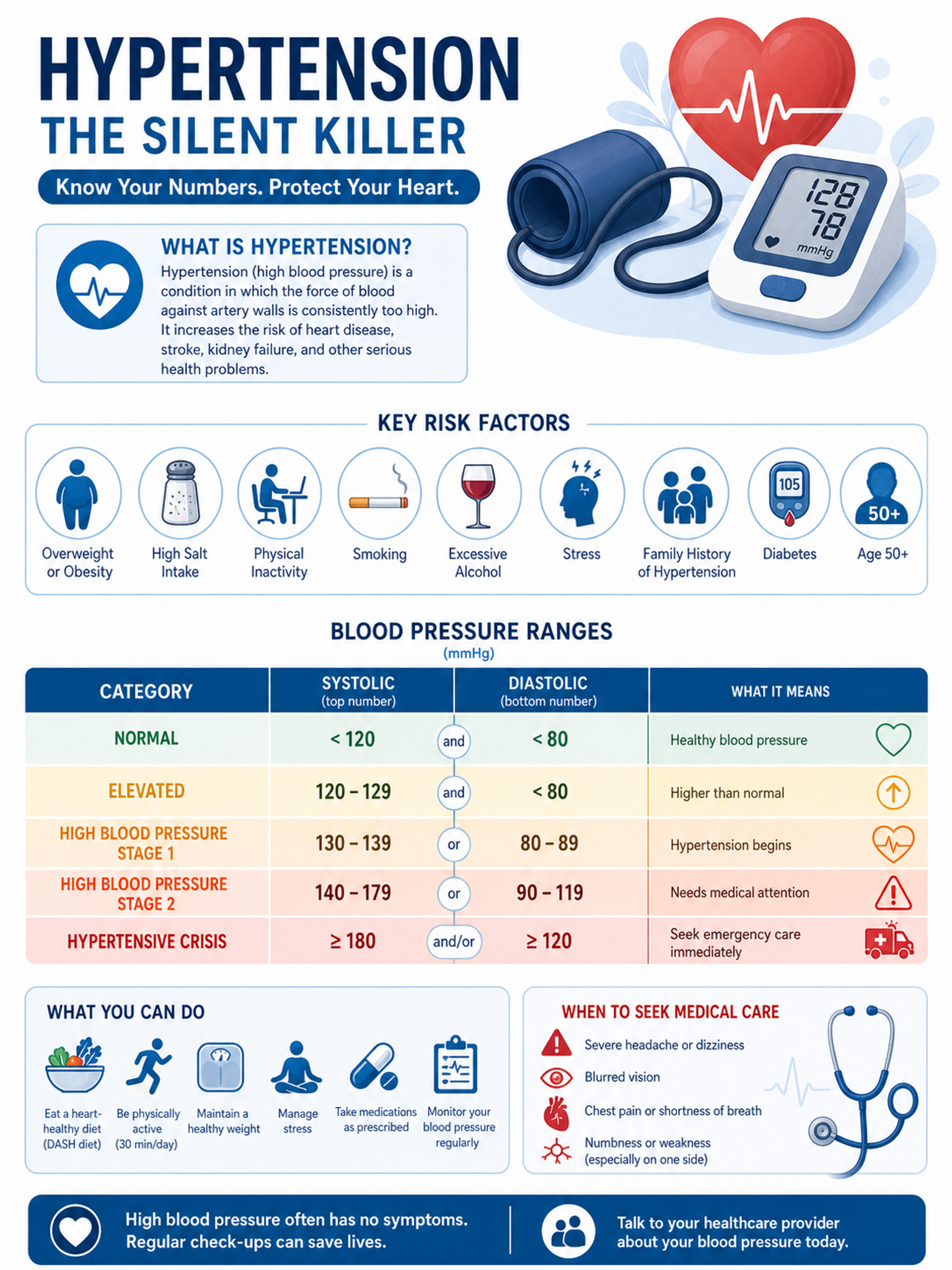
Infographies médicales
Créez des infographies médicales et des visuels d'éducation du patient
Essayer gratuitementBesoin d'autres figures de recherche ?
Générez des forest plots, des volcano plots, des diagrammes de voies et d'autres figures de recherche avec SciDraw AI.
