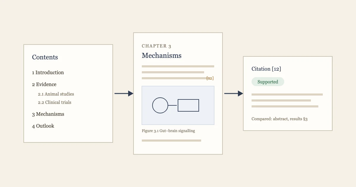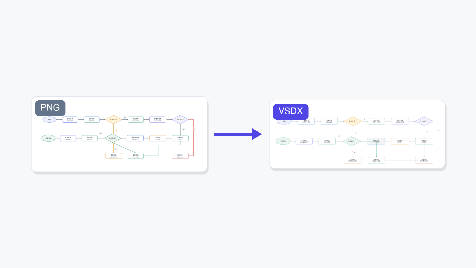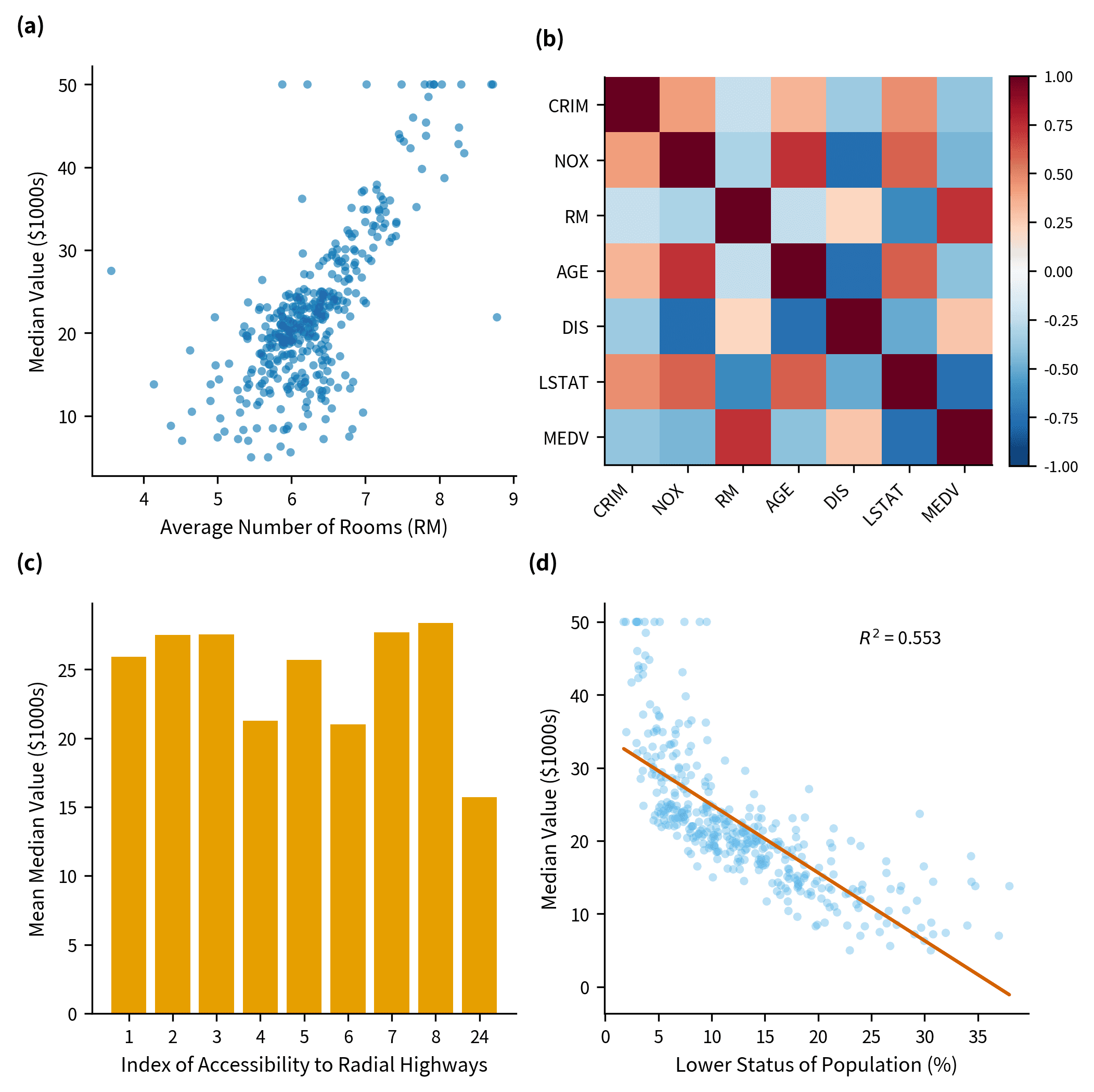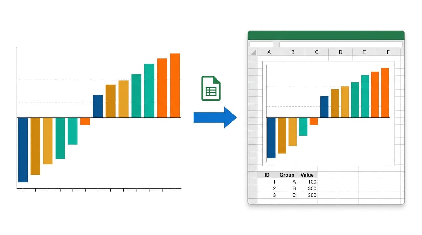
A static PNG is often not enough. Reviewers ask for the numbers behind a figure. Journals require source data files with submission. Collaborators want to tweak a color or fix a label without emailing you back and forth. And many labs simply live in Excel.
That's why SciDraw AI's data visualization tool can now export any supported chart as a real, editable Excel workbook (.xlsx) — not a screenshot pasted into a spreadsheet, but a native Excel chart wired to its data.
What's inside the exported .xlsx
Every export contains three worksheets:
- Chart — a native Excel chart object. Click any bar, line, or point and edit it exactly as if you had built the chart in Excel yourself: change colors, fonts, axis ranges, legend position, or chart type.
- Chart Data — the exact data the chart plots, after any sorting, filtering, grouping, or derived calculations (for example, -log10 p-values in a volcano plot). Edit a cell and the chart updates instantly.
- Source Data — your complete original dataset, untouched, including rows the chart excluded. This is the sheet journals mean when they ask for a "source data file."
Because the chart references cell ranges rather than embedded values, the workbook behaves like any hand-built Excel file. No plugins, no add-ins, no SciDraw account needed to open or edit it.
How to convert a chart to Excel
- Upload your data (CSV or Excel) to the scientific data visualization tool and generate a chart.
- When you're happy with the figure, click Convert in the top-right corner of the result.
- Choose Convert to Excel (.xlsx). The conversion costs 10 credits and takes about 10–40 seconds.
- The file downloads automatically, and an Excel (.xlsx) entry is added to that chart's download menu — re-downloading it later is free.
Which chart types can be exported
Excel's native chart engine supports bar, line, area, scatter, and radar families, so every SciDraw AI chart that maps onto them converts cleanly:
- Bar family: bar charts, grouped and stacked bars, histograms, bar charts with error bars, and oncology waterfall plots
- Line family: line charts, time series, growth curves, standard curves, density curves, ECDF, ogives, ROC curves, precision-recall curves, calibration curves, and stacked area charts
- Scatter family: scatter plots, volcano plots, regression plots with trendlines, dose-response curves, Q-Q plots, Bland-Altman plots, MA plots, PCA plots, Cleveland dot plots, paired dot plots, and Michaelis-Menten enzyme kinetics
- Radar charts
Chart types that Excel itself cannot represent as native charts — heatmaps, violin plots, box plots, UpSet plots, Sankey diagrams — are clearly marked as not exportable in the app, so you never receive a file that only pretends to be editable.
Example: an oncology waterfall plot your whole team can edit
A waterfall plot shows each patient's best percentage change in tumor size as one bar, sorted from progression to response, usually with dashed RECIST reference lines at +20% and -30%.
Export it to Excel and you get one series per tumor type (so the legend and colors survive), the threshold lines as their own dashed series, patients in the plotted order on Chart Data, and the complete patient-level dataset — including patients without a measurable response — on Source Data. A clinical collaborator can recolor a tumor type, correct a single response value, or extend the dataset with the next cohort, all without leaving Excel.
Why native charts beat embedded images
Plenty of "chart to Excel" tools drop a picture of your chart into a worksheet. That file looks right until someone tries to change it. A native chart keeps the figure and its numbers connected:
- Edit data → the chart redraws
- Restyle in Excel's own chart editor, no design skills required
- Copy the chart into PowerPoint or Word as a live, editable object
- Satisfy journal source-data requirements with a single file
FAQ
Does it work in Google Sheets and LibreOffice? Yes. The workbook uses the standard Office Open XML chart format, which Google Sheets, LibreOffice Calc, and Apple Numbers can all open and edit.
How much does a conversion cost? 10 credits per chart, charged only when the conversion succeeds. Downloading the same workbook again is free.
Is my sorted/filtered view preserved? Yes. The export reproduces the transformations your chart actually used — sort order, excluded rows, derived columns — on the Chart Data sheet, while Source Data always keeps the full original upload.
Why can't I export my heatmap or violin plot? Excel has no native chart type for them. Rather than embedding a static image and calling it editable, SciDraw AI marks these types as not exportable. You can still download them as PNG, PDF, EPS, or TIFF.
Can I use the exported file for journal submission? Yes — the Source Data sheet is designed for exactly that. Many journals (including Nature portfolio titles) require the numerical data behind each figure; one workbook covers both the figure and its data.
Try it now
Upload your data to the SciDraw AI data visualization tool, generate a publication-ready chart, and convert it to an editable Excel workbook in under a minute. Your figure, your numbers, and your collaborators' edits — finally in the same file.