Free Bland-Altman Plot Generator
Create a labeled method-agreement plot from plain text
Describe your two measurement methods, the bias, and the limits of agreement you want shown, and AI draws a clean, professional Bland-Altman plot — ready for method-comparison studies, lab reports, and research papers.
Bland-Altman plot examples
Click any example to load its prompt, or use it as a starting point for your own Bland-Altman plot.
What is a Bland-Altman plot?
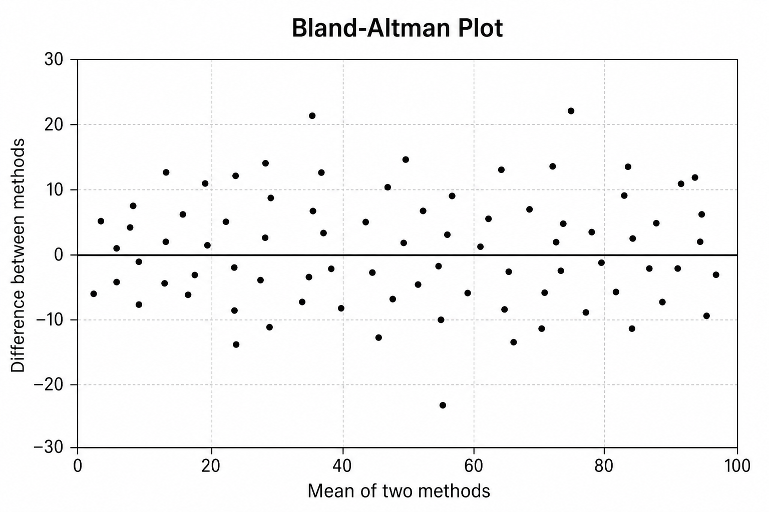
A Bland-Altman plot (also called a difference plot or method-agreement plot) is a graph used to compare two measurement methods by plotting the difference between each pair of readings against their mean, so you can see how well the two methods agree. This Bland-Altman plot generator turns a plain-text description into a clean, labeled figure — you describe your two methods, the bias, and the limits of agreement, and the AI produces a properly proportioned plot with the mean on the x-axis, the difference on the y-axis, a bias line, and ±1.96 SD limits of agreement, all without spreadsheets or coding.
Why use a Bland-Altman plot generator
- Bland-Altman plots are the standard way to assess agreement between two measurement methods or devices in medicine and research.
- Building a publication-quality agreement plot in R, Python, or SPSS takes formatting work that distracts from the analysis.
- Students learning method comparison understand bias and limits of agreement far better from a clearly labeled Bland-Altman plot.
- Clinicians and researchers need quick, presentable agreement plots for validation studies, lab reports, and papers.
- Changing the bias, limits, or labels and regenerating is much faster than editing plotting code by hand.
How to make a Bland-Altman plot
Name the two measurement methods you are comparing and describe the agreement you want shown. Then add the features you need: the mean of the two methods on the x-axis, the difference on the y-axis, a mean bias line, upper and lower limits of agreement at ±1.96 SD, optional confidence intervals, and axis titles with units. Generate the Bland-Altman plot, check the bias line, the limits, and the point scatter, and refine the description if anything is unclear.
Parts of a Bland-Altman plot
- X-axis — the mean of the two measurements for each pair, used as the best estimate of the true value.
- Y-axis — the difference between the two measurements for each pair (method A minus method B).
- Mean bias line — a horizontal line at the average difference, showing systematic bias between the methods.
- Upper limit of agreement — a dashed line at the mean difference plus 1.96 SD.
- Lower limit of agreement — a dashed line at the mean difference minus 1.96 SD.
- Scattered points & optional CIs — one point per pair, with optional confidence intervals shaded around the bias and limits.
Bland-Altman Plot Generator FAQ
What is a Bland-Altman plot?
A Bland-Altman plot is a graph that compares two measurement methods by plotting the difference between each pair of readings on the y-axis against the mean of the pair on the x-axis. A horizontal bias line shows the average difference, and dashed limits of agreement show the range within which most differences fall. It is the standard way to judge how well two methods or devices agree.
How do I make a Bland-Altman plot online?
Type a short description of what you want, such as a Bland-Altman plot comparing a new device against a reference method, and name the bias and limits you want shown. SciDraw AI then draws a clean, labeled agreement plot with the mean on the x-axis, the difference on the y-axis, a bias line, and limits of agreement. You can adjust the wording and regenerate until the Bland-Altman plot matches what you need.
How is a Bland-Altman plot read?
Each point shows one paired measurement: the mean of the two methods on the x-axis and their difference on the y-axis. The central line is the mean difference, or bias. The two outer dashed lines are the limits of agreement, set at the mean difference plus and minus 1.96 SD, and about 95% of differences should fall between them. A bias near zero and narrow limits indicate good agreement.
Bland-Altman plot vs. correlation or scatter plot — what's the difference?
A correlation or scatter plot of two methods can look strong even when the methods disagree, because correlation measures association, not agreement. A Bland-Altman plot instead shows the actual differences between methods and whether they stay within acceptable limits, making it far better for deciding whether one method can replace another.
Is the Bland-Altman plot generator free?
Yes, you can start for free. Create an account and you receive free credits to generate Bland-Altman plots right away, with paid plans available if you need to make many method-comparison plots and agreement charts on a regular basis.
Is it suitable for research and method-comparison studies?
Yes. Bland-Altman plots are well suited to validation and method-comparison studies, clinical research, and lab reports, as well as slides and study guides. Generate the plot to communicate your bias and limits of agreement, and always verify the numbers against your own data before publishing.
Explore More Tools

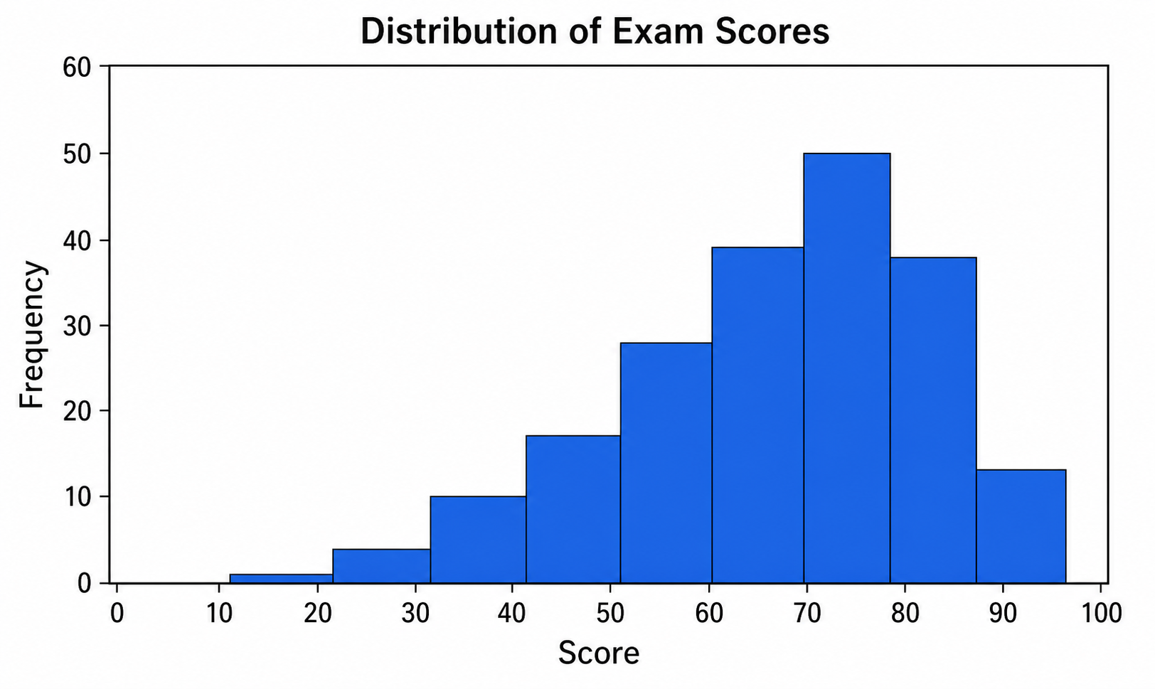
Histogram Maker
Turn data and bins into a clean, labeled frequency histogram with an optional normal curve.
Try it free
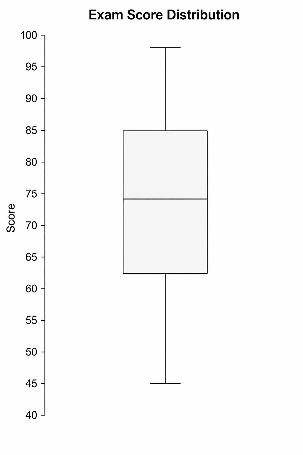
Box Plot Maker
Generate clean, labeled box-and-whisker plots with quartiles, whiskers, and outliers from a plain-text description.
Try it free
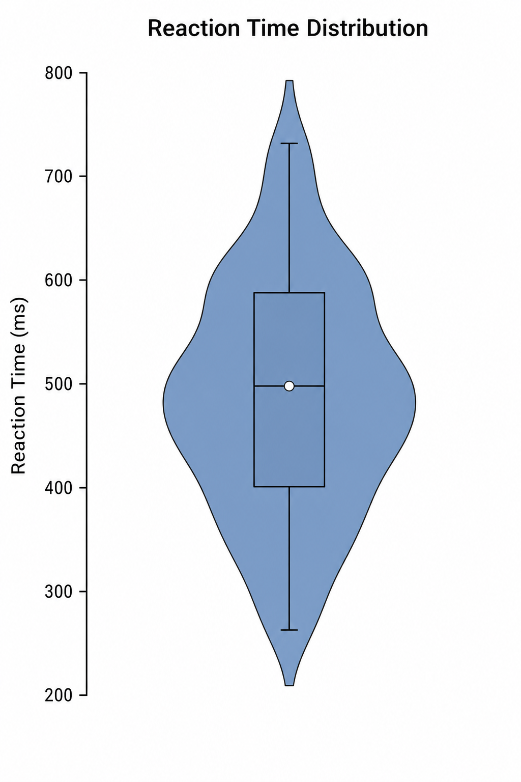
Violin Plot Maker
Create labeled violin plots with inner box plots and density shapes from a plain-text description.
Try it freeNeed other statistical or research graphs?
Pair your Bland-Altman plot with scatter plots, correlation matrices, and ROC curves. Describe what you need and get a clean, labeled figure in seconds. Start free with SciDraw AI.