Free ROC Curve Generator
Create Free ROC Curve Generator from experimental or research data
Make Single ROC Curve from CSV or Excel with ROC Curve Generator. Includes Python rendering, SciVis editing, and publication-ready export.
Create your scientific chart
Drag a data file here, or click to upload
CSV, TSV, TXT, Excel · Max 5MB
Preview
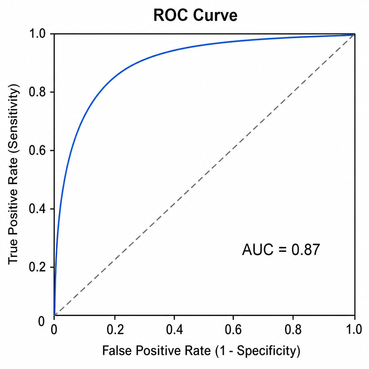 Example
This preview uses the selected sample dataset. Generate it with Python, or upload your own data to create a new chart.
ROC Curve Generator examples with downloadable data
Open an example to inspect the chart, download its CSV, or load the same data into the generator above.
What does ROC Curve Generator show?
ROC Curve Generator turns structured research data into the statistical form this chart is designed to show. Use it for Single ROC Curve, Multi-Model Comparison, and related analyses; Python creates the first reproducible chart and SciVis handles visual refinement.
Data requirements for ROC Curve Generator
- Representative fields: model, threshold, false_positive_rate, true_positive_rate, lower_95, upper_95.
- Keep one observation, category, time point, or valid pair per row.
- Store measured values as numbers and put units in the column header.
- Treat blanks as missing values and remove totals or notes before upload.
Research examples for ROC Curve Generator
- Single ROC Curve
- Multi-Model Comparison
- Perfect vs. Random
- Optimal Threshold Point
- ROC with Confidence Band
- Diagnostic Biomarker ROC
Why use ROC Curve Generator for research data?
- Validate the data mapping with the included Single ROC Curve example before replacing its values.
- Apply the same visual grammar to Multi-Model Comparison or a comparable dataset.
- Use Python-backed rendering without having to write or debug plotting code.
- Keep the generated values intact while refining labels, colors, and export in SciVis.
How to use Free ROC Curve Generator
Choose an example or upload one CSV, TSV, TXT, XLSX, or XLS file, check the detected columns, generate the chart, and continue editing it in SciVis. For Excel files, the first worksheet is imported.
What a clear ROC Curve Generator should include
- Axes, groups, or nodes mapped consistently from model, threshold, false_positive_rate, true_positive_rate, lower_95, upper_95.
- A title that states the outcome or comparison shown by the ROC Curve Generator.
- Readable labels, units, legends, and reference lines where the method requires them.
- A restrained color system and sufficient resolution for papers, posters, or slides.
ROC Curve Generator or Precision-Recall Curve Generator?
Use ROC curves to compare sensitivity and specificity across thresholds. For strongly imbalanced classes where positive-case precision matters, use the precision–recall curve tool.
Free ROC Curve Generator FAQ
Which columns does ROC Curve Generator need?
The included CSV shows the expected structure. Representative fields are model, threshold, false_positive_rate, true_positive_rate, lower_95, upper_95; equivalent column names are accepted when their values have the same roles.
When should I use ROC Curve Generator instead of Precision-Recall Curve Generator?
Use ROC Curve Generator when you want the relationship it is specifically designed to encode. Choose Precision-Recall Curve Generator when its alternative comparison better matches the research question.
Can I edit a figure after creating it with Free ROC Curve Generator?
Yes. Open the figure generated with Free ROC Curve Generator in SciVis to change labels, colors, annotations, layout, and other visual settings.
Can I use figures from Free ROC Curve Generator in a research paper?
Yes. Free ROC Curve Generator is designed to produce clean, publication-ready scientific figures. Always verify values and journal requirements before submission.
Can Free ROC Curve Generator export high-resolution figures?
Yes. After editing a Free ROC Curve Generator figure in SciVis, you can export it in formats suitable for papers, posters, slides, and reports.
Do I need coding experience to use Free ROC Curve Generator?
No. Free ROC Curve Generator creates the first version through a guided upload workflow, while SciVis provides visual controls for refinements.
Learn how to use Free ROC Curve Generator with research data
Review chart selection, required data columns, interpretation, and related scientific visualization workflows before preparing your final figure.
Explore More Tools
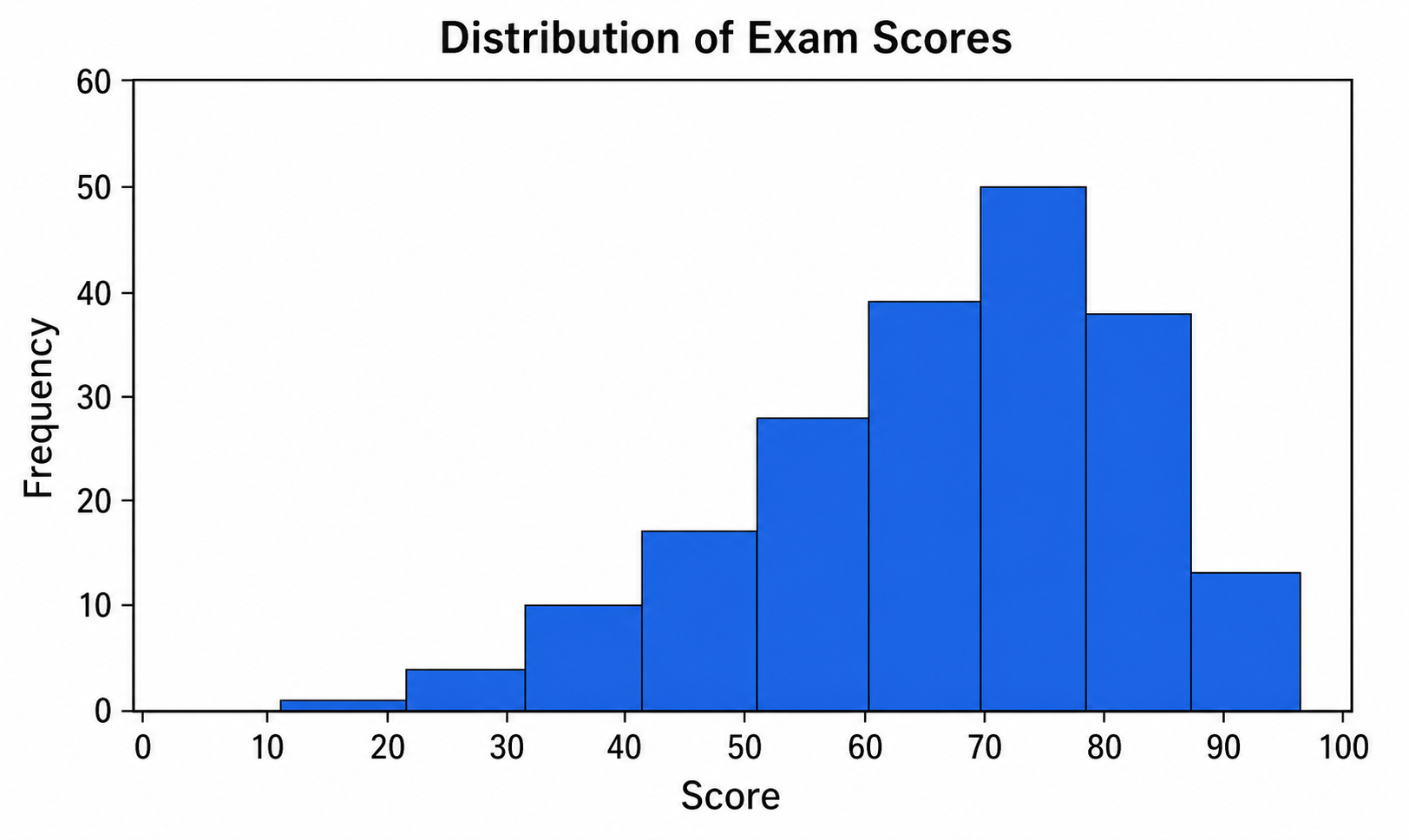
Histogram Maker
Use Histogram Maker with CSV or Excel data. Python renders the chart; refine labels, styling, and export in SciVis.
Try it free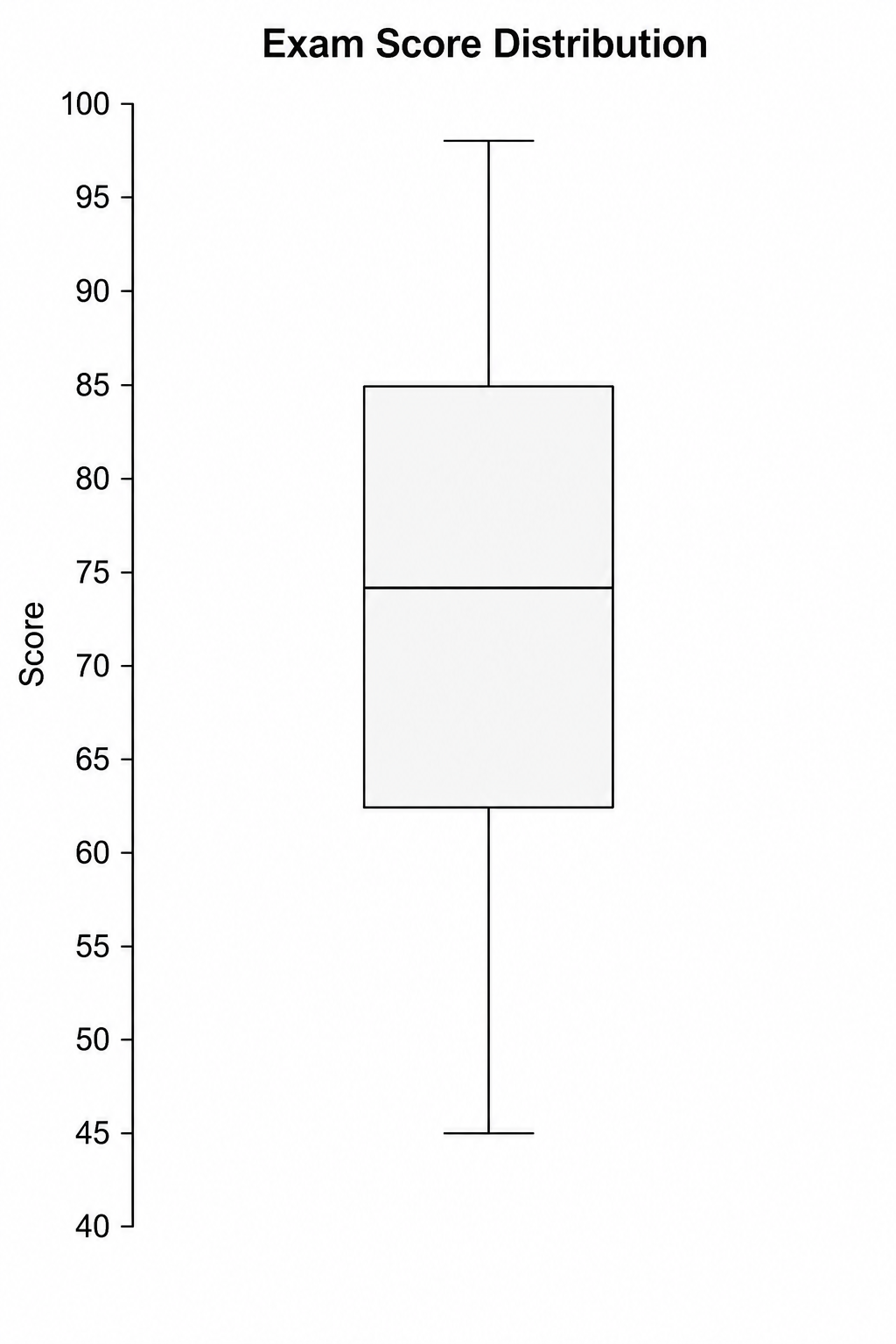
Box Plot Maker
Use Box Plot Maker with CSV or Excel data. Python renders the chart; refine labels, styling, and export in SciVis.
Try it free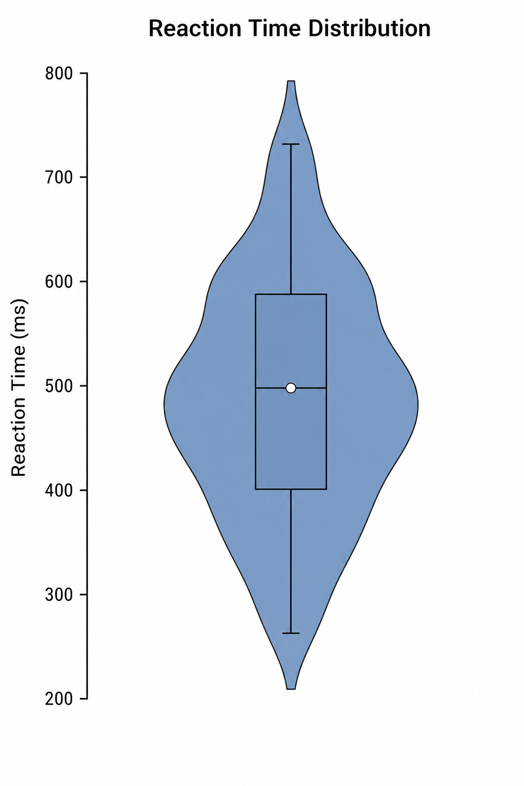
Violin Plot Maker
Use Violin Plot Maker with CSV or Excel data. Python renders the chart; refine labels, styling, and export in SciVis.
Try it freeCreate a figure with Free ROC Curve Generator
Start with sample data or upload one supported data file, then finish the figure in SciVis.