The most useful page in a case report is rarely the narrative. It is the ecomap — one circle for the client, a ring of circles for everything around them, one line per relationship. Who is holding this family up, which relationship is draining them, which resource has never been used: three paragraphs of prose, or one figure you read in ten seconds.
The ecomap comes from Ann Hartman's social work practice in the 1970s and has since been borrowed by nursing, education and family therapy. It looks easy — draw circles, connect them. But the ecomaps that come back marked up fail in the same few ways: inconsistent line types, no legend, genogram symbols mixed in, and worst of all, real names.
What you'll learn:
- What belongs on an ecomap and what does not
- The four line conventions, and why the legend is required
- How an ecomap differs from a genogram
- Interview questions, anonymization rules, and two worked examples
What an ecomap shows
Three elements. Anything else is noise.
The center. The focal person or family sits in a circle in the middle — an individual, or a household with the co-resident members named inside. Whichever unit of assessment you choose, do not switch halfway through a report.
The surrounding systems. Every part of the environment the center actually deals with gets a labeled circle in a ring: extended family, school, work, housing, income and benefits, health and mental health services, child welfare or courts, faith community, neighbors. Only draw systems with real contact — support that should exist but doesn't belongs in your written analysis, not on the map.
The relationship lines. One line between the center and each system, one line per relationship. Three parallel lines do not mean "it's complicated" — complexity is carried by line type and arrowheads.
The line conventions, and why the legend is required
Almost all of an ecomap's information lives in the line type, so apply the conventions strictly:
| Line | Meaning |
|---|---|
| Solid | Strong, stable, supportive |
| Dashed | Tenuous, weak, intermittent |
| Jagged | Stressful or conflicted |
| Arrowheads | Direction of energy or resources: one-way = giving, two-way = mutual |
Two things go wrong constantly. Jagged does not mean "bad person." A relationship can be both the main source of income and a source of stress; draw it jagged and use an arrow to show resources really are flowing in. And arrowheads show flow, not affection — a client who cares full-time for an ill spouse gets an arrow from client to spouse, however warmly they describe it.
The legend is a requirement, not decoration. Textbooks disagree on the fine points — some use a double line for "very strong," others vary line weight — and no marker will guess which convention you adopted. Put a small legend in a corner listing every line type you used. An ecomap with no legend is a chart with no axis labels.
Ecomap vs genogram
- A genogram maps family structure across generations — marriage and divorce, birth order, deaths, who lives in the household — using standardized symbols (square for male, circle for female). It answers who this family is made of.
- An ecomap maps the family's relationships with its environment — school, clinic, employer, community, benefits. It answers what is happening between this family and the world around it.
They complement each other, and case reports often carry both: the genogram for composition, the ecomap for resources. Never mix the symbol sets, though. Drop gender squares into an ecomap and the reader can no longer tell whether you are describing structure or relationships.
Getting the information out of an interview
An ecomap is a product of the interview, not of your desk afterwards. The efficient method is to draw it with the client in the room so they can correct and add to it. People routinely name systems while looking at their own circles that no question on your guide would surface.
For each system, ask four things:
- Contact — "How often are you in touch?" Decides whether the circle exists.
- Strength — "Would you call that close, or a bit distant?" Decides solid or dashed.
- Stress — "Does dealing with them wear you out or worry you?" Decides jagged or not.
- Direction — "Is it mostly them helping you, you looking after them, or both?" Decides the arrowheads.
Close with one sweep question: "Who haven't we mentioned?" Keep the figure factual — "employer (jagged, energy outward)" on the map, your interpretation in the text.
Anonymization and ethics
The moment the figure leaves the agency file — coursework, a thesis, a published case report — it has to be anonymized, and the bar is higher than most students assume.
- No real names, including relatives, teachers, social workers and physicians. Use role labels: "the client," "the client's eldest daughter," "the ward nurse."
- Remove re-identifying combinations: agency names, school names, street names, exact dates. Each looks harmless alone; together they often identify a household.
- Blur, don't fabricate. Widening an age to a range is fine; changing the family structure distorts the analysis you draw conclusions from. Say in the text what you altered.
- Check your permissions. Real cases in a thesis normally require informed consent and ethics approval. If you are only practising the technique, use a fictional case and label it as one.
Worked example: a social work case
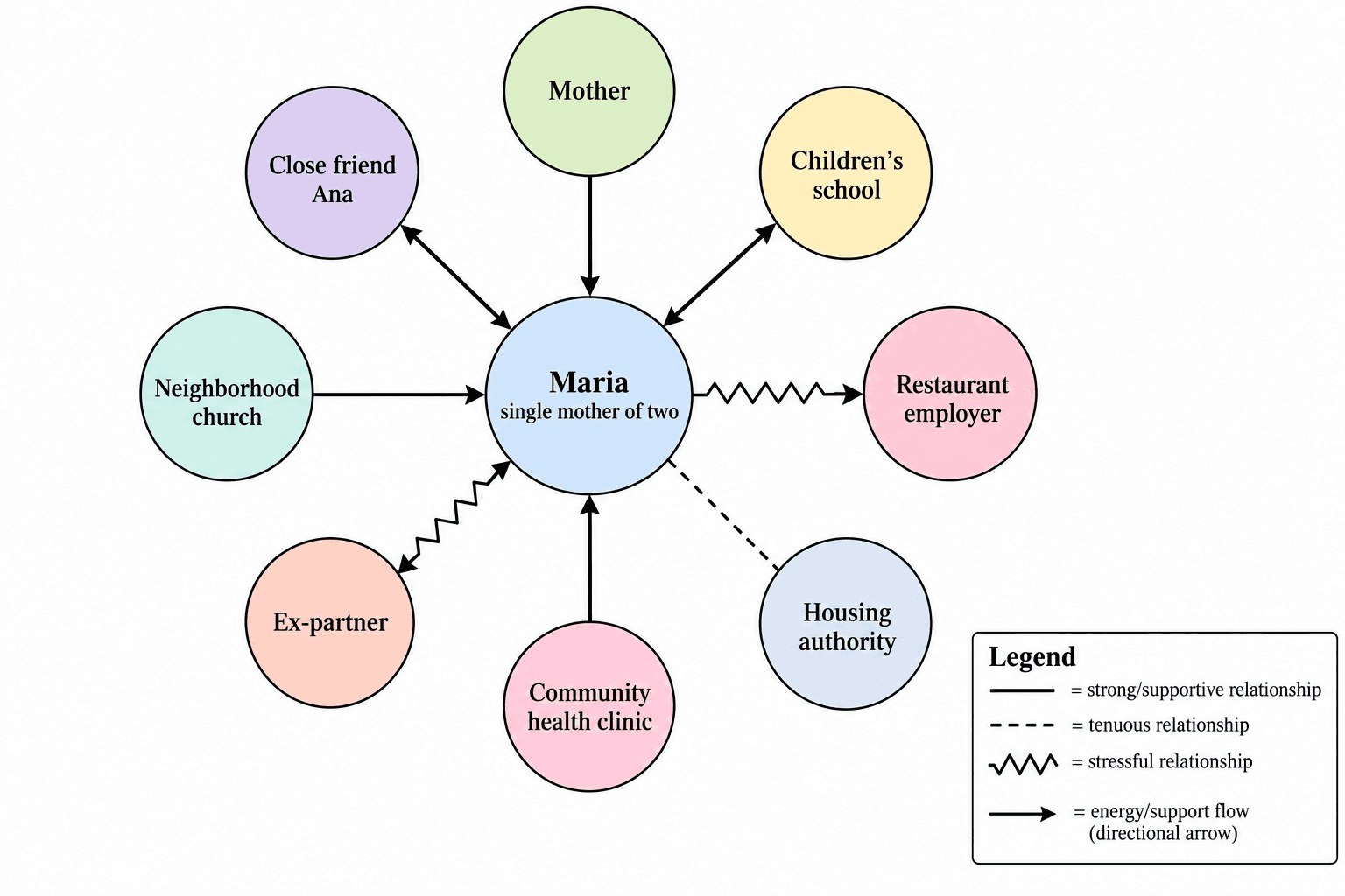
Fictional background. The client is a single mother of two school-age children facing housing instability after a rent increase. The center circle holds all three.
- Client's mother — solid, arrow toward the client (childcare, some money)
- Children's school — solid, two-way
- Restaurant employer — jagged, arrow outward (shift changes, long hours)
- Housing authority — dashed (applied, no response)
- Community health clinic — solid, arrow toward the client
- Ex-partner — jagged, two-way (contact arrangements)
- Neighborhood church, one close friend — solid
Reading it: nearly all working support is informal. Of the formal systems only the clinic is open; housing is dashed, the employer is draining. The service direction writes itself — turn the dashed line solid, and address the drain.
Worked example: nursing discharge planning
Fictional background. A man in his eighties going home after hip fracture surgery. The patient is the center.
- Daughter in the same city — solid, arrow toward the patient (daily visits)
- Son living abroad — dashed (video calls only)
- Family physician, orthopedic clinic — solid, two-way
- Home health nurse, pharmacy — solid, arrow toward the patient
- Senior day center — dashed (registered, never attended)
- Apartment building, no elevator — jagged, arrow toward the patient
Reading it: the clinical side is almost entirely solid, so continuity is not the problem. The risk sits in two places — the jagged line to the housing environment, and one solid caregiver carrying all the daily care. Discharge discussion belongs on home modification and caregiver load, not another appointment.
Reading the finished map, and writing it up
Look for four things, in this order:
- Isolation — few circles, most lines dashed. Thin social support.
- Overloaded systems — one system carrying several solid lines, every arrow pointing inward. Stable today, fragile tomorrow.
- Missing supports — a system that should be there for this population and simply isn't (a school-age child with no school line). The gap is itself a finding.
- Drains — jagged lines, especially those with arrows pointing outward.
In the write-up, the figure is evidence, not illustration. Move in three steps: describe the pattern factually ("three of eight systems are dashed"), say what it means, then connect it to your goals or care plan. Do not narrate every line. To show change, draw the map before and after intervention with the systems in the same positions, so the reader sees which dashed line went solid.
Drafting one with SciDraw AI
The painful part of drawing an ecomap by hand is the revision: add one system after a follow-up interview and every circle moves. Writing the interview up as a paragraph and generating a draft is faster.
The ecomap maker separates common uses into modes, switchable above the input box:
- Social work case assessment — organized around the case-assessment system list: kin, housing, income support, health and mental health, child welfare, neighbors
- Nursing family assessment — organized for family health assessment and discharge planning: household, primary care, clinics, home care, pharmacy
- Student support network — for education and student affairs research: family, roommates, advisor, organizations, campus services
Describe each system as name (strength, stress, direction) — "community health clinic (strong, support toward the client)" — and the line types come out right. It draws only what you give it and will not add a support that "should" be there, which is what a case report needs. The legend comes with it.
Two caveats. Anonymize before you type, using role labels instead of names. And the figure is a visualization of your assessment record — not the assessment, and no clinical or practice judgment.
If what you need is relationships between concepts rather than between a person and systems — a thematic network from interview data — use the thematic relationship map instead. For what else your field expects, browse thesis figures by discipline. The ecomap maker is free to try, and exports stay editable in PowerPoint.
Frequently asked questions
Can I combine an ecomap and a genogram in one figure? Better not to. A genogram uses standardized symbols for generational structure; an ecomap uses line types for environmental relationships. Combined, a reader cannot tell which you are describing. Present them as two figures, each with a sentence of interpretation.
How many systems should an ecomap have? Usually six to ten. Fewer than five typically means the interview did not go deep enough; more than twelve and the lines tangle. Merge minor systems and keep only what the assessment turns on.
Does an ecomap have to be in color? No. The information is carried by line type and arrowheads, so it reads perfectly in black and white — which matters for printed appendices. Use color only to group systems, and put that in the legend too.
Can I use a real case for a class assignment? That depends on your program and agency. Real cases generally require informed consent; a thesis or published case report usually also requires ethics committee approval, plus thorough anonymization of names, agencies, places and re-identifying detail combinations. When you are only practising the technique, a fictional case is safer.