Hexbin Plot Generator
Create Hexbin Plot Generator from experimental or research data
Turn thousands of paired observations into a clear hexbin density plot with a count color scale for dense relationships and model validation.
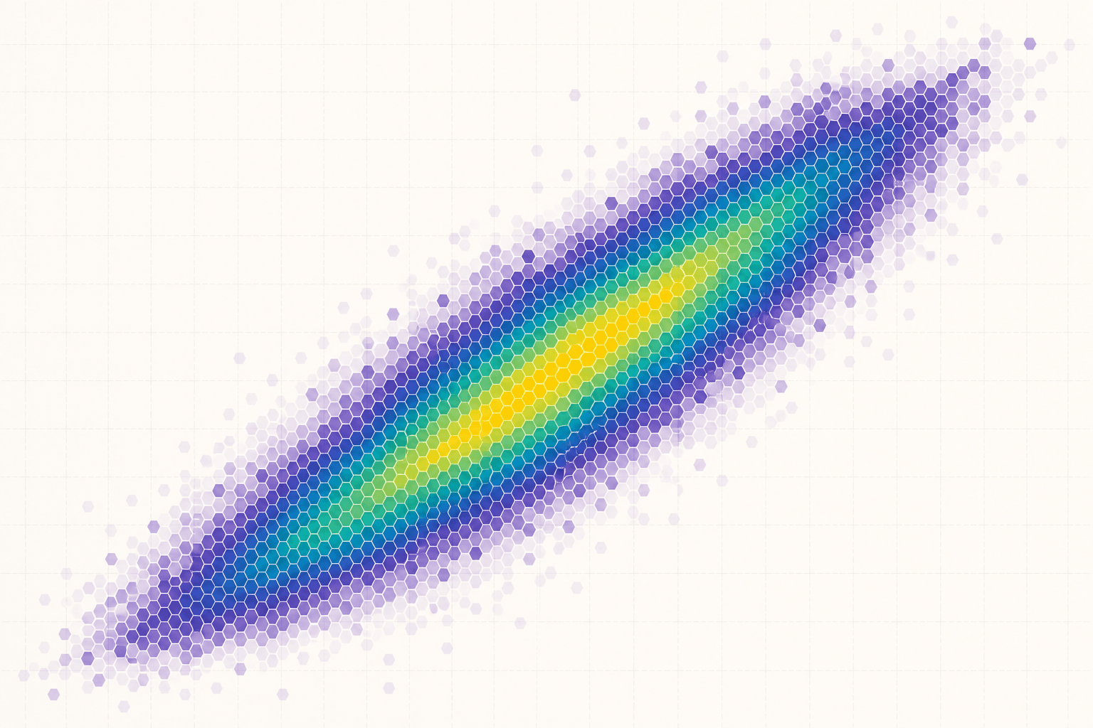
Hexbin Plot Generator examples
Explore six ready-to-use datasets and visual styles for real research scenarios.
What does Hexbin Plot Generator show?
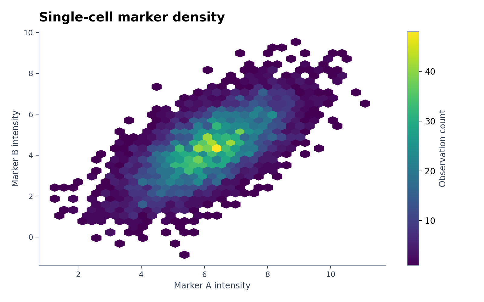
Hexbin Plot Generator divides a dense x–y plane into hexagonal cells and colors each cell by observation count or an aggregated value. It reveals concentration, gaps, nonlinear structure, and outliers when a scatter plot would collapse into an opaque cloud.
Data requirements for Hexbin Plot Generator
- Provide one row per observation with numeric x and y columns.
- Add an optional numeric value column when color should summarize a mean, median, or total instead of count.
- Remove invalid and infinite values before upload.
- Retain units and note any log transformation applied to either axis.
Research examples for Hexbin Plot Generator
- Hexbin Density Plot for Single-Cell Data
- Predicted vs Observed Hexbin Plot
- Hexagonal Binning for Sensor Correlation
- Hexbin Scatter Plot for Particle Morphology
- Temperature–Humidity Hexbin Density Plot
- High-Density Geochemical Hexbin Visualization
Why use a hexbin plot for dense data?
- Avoid marker overlap in datasets with thousands of observations.
- Show local density without hiding the overall x–y relationship.
- Compare dense regions using equal-area cells.
- Produce a compact figure for sequencing, sensor, imaging, or population data.
How to use Hexbin Plot Generator
Choose an example or upload one CSV, TSV, TXT, XLSX, or XLS file, check the detected columns, generate the chart, and continue editing it in SciVis. For Excel files, the first worksheet is imported.
What a clear hexbin plot should include
- Labeled axes and documented transformations.
- A color bar labeled as count, density, mean, or another aggregate.
- A bin size fine enough to reveal structure but not noise.
- A perceptually ordered color scale with visible empty regions.
Hexbin plot or scatter plot?
Use a scatter plot when individual observations and outliers must remain identifiable. Use a hexbin plot when overplotting makes local density impossible to judge. Report the binning or aggregation rule because the picture changes with resolution.
Hexbin Plot Generator FAQ
Which columns does Hexbin Plot Generator need?
Provide numeric x and y columns. An optional numeric value may be aggregated within each hexagon; otherwise the color represents the number of observations.
How should I choose the number of hexagons?
Start with a moderate grid, then verify that major patterns persist across slightly coarser and finer settings. Avoid selecting a resolution only because it makes a preferred pattern look stronger.
Can I edit a figure after creating it with Hexbin Plot Generator?
Yes. Open the figure generated with Hexbin Plot Generator in SciVis to change labels, colors, annotations, layout, and other visual settings.
Can I use figures from Hexbin Plot Generator in a research paper?
Yes. Hexbin Plot Generator is designed to produce clean, publication-ready scientific figures. Always verify values and journal requirements before submission.
Can Hexbin Plot Generator export high-resolution figures?
Yes. After editing a Hexbin Plot Generator figure in SciVis, you can export it in formats suitable for papers, posters, slides, and reports.
Do I need coding experience to use Hexbin Plot Generator?
No. Hexbin Plot Generator creates the first version through a guided upload workflow, while SciVis provides visual controls for refinements.
Learn how to use Hexbin Plot Generator with research data
Review chart selection, required data columns, interpretation, and related scientific visualization workflows before preparing your final figure.
Explore More Tools
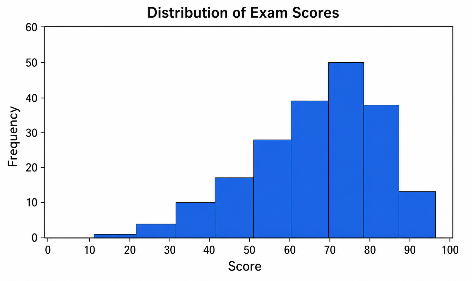
Histogram Maker
Use Histogram Maker with CSV or Excel data. Python renders the chart; refine labels, styling, and export in SciVis.
Try it free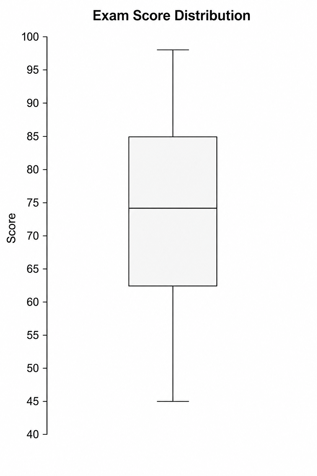
Box Plot Maker
Use Box Plot Maker with CSV or Excel data. Python renders the chart; refine labels, styling, and export in SciVis.
Try it free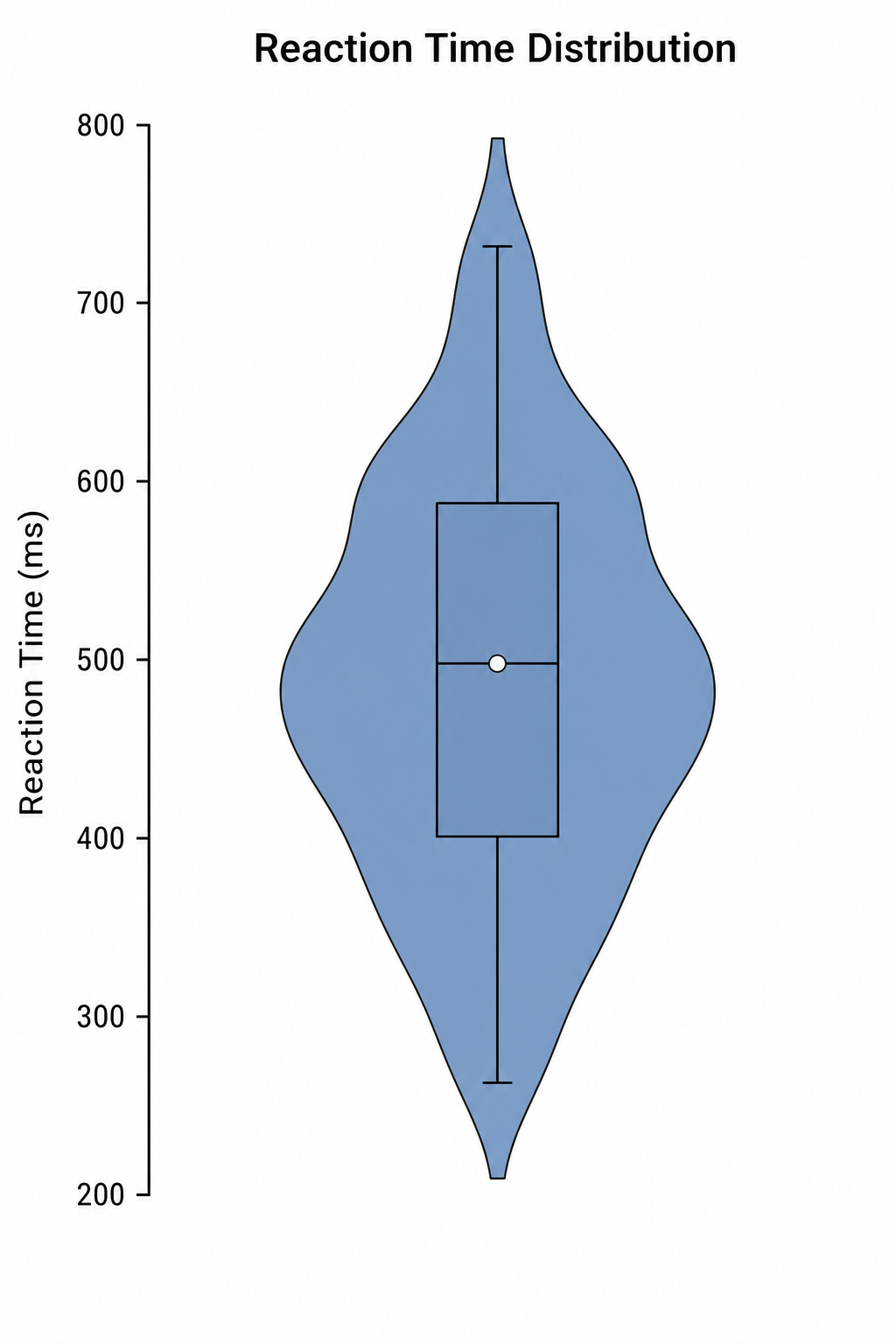
Violin Plot Maker
Use Violin Plot Maker with CSV or Excel data. Python renders the chart; refine labels, styling, and export in SciVis.
Try it freeCreate a figure with Hexbin Plot Generator
Start with sample data or upload one supported data file, then finish the figure in SciVis.