Heatmap Generator
Turn CSV data into a publication-ready heatmap
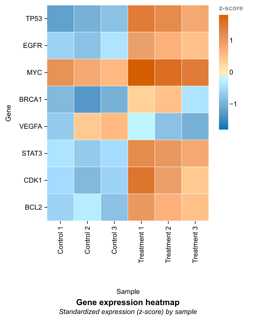
Heatmap Generator turns structured research data into the statistical form this chart is designed to show. Use it for Gene Expression Heatmap, Cell Viability Screening Plate, and related analyses; Python creates the first reproducible chart and SciVis handles visual refinement.
Heatmap Generator examples with downloadable data
Open an example to inspect the chart, download its CSV, or load the same data into the generator above.
What does this heatmap generator do?
Heatmap Generator turns structured research data into the statistical form this chart is designed to show. Use it for Gene Expression Heatmap, Cell Viability Screening Plate, and related analyses; Python creates the first reproducible chart and SciVis handles visual refinement.
Why researchers use heatmaps
- Compare many measurements across samples or conditions in one compact figure.
- Reveal high and low regions, blocks, gradients, and outlying cells at a glance.
- Use a diverging scale for values around a meaningful midpoint such as zero.
- Turn a raw matrix into a labeled figure suitable for a paper, poster, or presentation.
- Move the generated result into SciVis for annotations, colors, layout changes, and export.
How to make a heatmap from CSV data
Prepare tidy data with one column for the horizontal category, one for the vertical category, and one numeric value for cell color. Upload the file or load an example, check the preview, and generate the first heatmap. Download the result immediately, or choose Edit in SciVis to adjust the chart in the full visualization workspace.
What a scientific heatmap should include
- Clearly named row and column variables.
- A color scale that matches sequential or diverging data.
- A labeled legend with units, score type, or correlation range.
- Readable category labels without unnecessary decoration.
- A meaningful midpoint for fold changes, z-scores, or correlations.
- Enough resolution and export options for the intended journal or slide.
Heatmap Generator FAQ
What data format should I use for a heatmap?
Tidy data works best: one column for the x-axis category, one for the y-axis category, and one numeric column for color. The tool accepts CSV, TSV, TXT, XLSX, and XLS files.
Can I create a gene expression heatmap?
Yes. Use genes as rows, samples as columns, and expression, fold-change, or z-score as the color value. The included gene-expression CSV is a ready-to-use example.
Heatmap Generator or Correlation Matrix Generator?
Use the general heatmap for measured values such as gene expression, screening plates, or feature matrices. Use the correlation matrix tool when every cell is a pairwise correlation coefficient.
Can I edit the heatmap after generating it?
Yes. The tool page creates the first chart. Select Edit in SciVis to continue changing colors, labels, layout, annotations, and other chart details in the full SciVis workspace.
Which export formats are available?
The generated preview can be downloaded as PNG. In SciVis, the chart workflow also supports publication-oriented outputs such as PDF, TIFF, and EPS when available for the result.
Does the example image use the downloadable example data?
Yes. Each example chart on this page is rendered from the CSV offered with that example, so you can reproduce the same chart structure before substituting your own measurements.
Explore More Tools

Histogram Maker
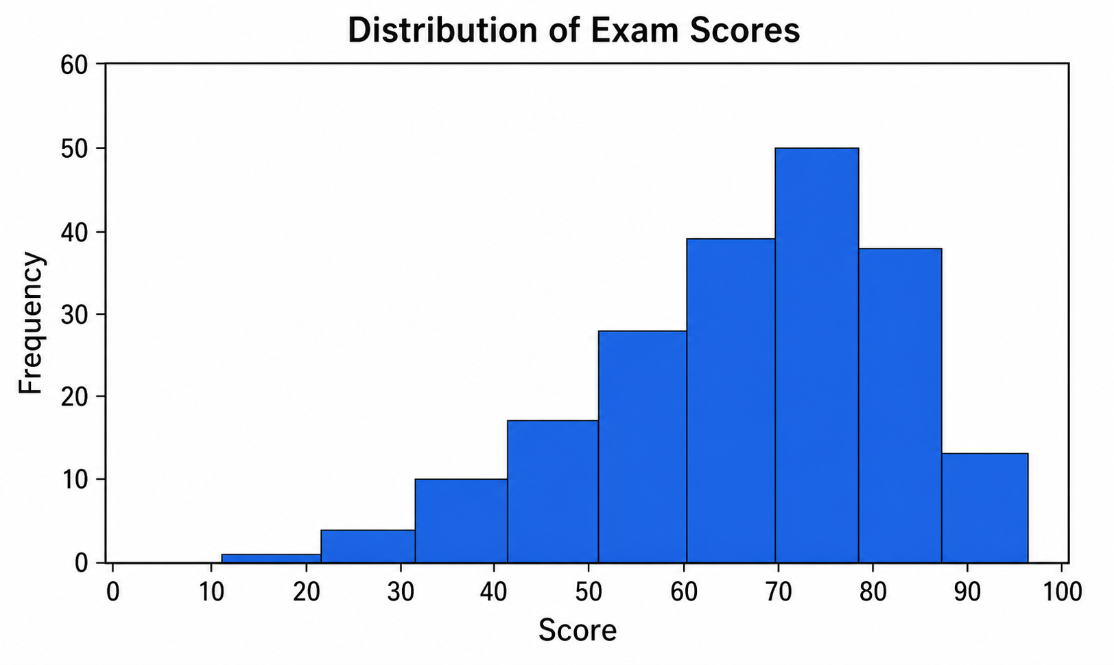
Use Histogram Maker with CSV or Excel data. Python renders the chart; refine labels, styling, and export in SciVis.
Try it free
Box Plot Maker
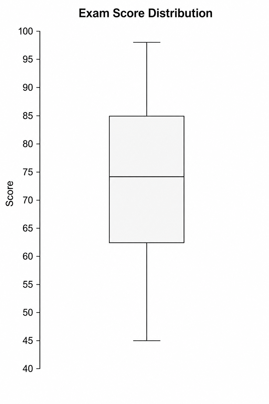
Use Box Plot Maker with CSV or Excel data. Python renders the chart; refine labels, styling, and export in SciVis.
Try it free
Violin Plot Maker
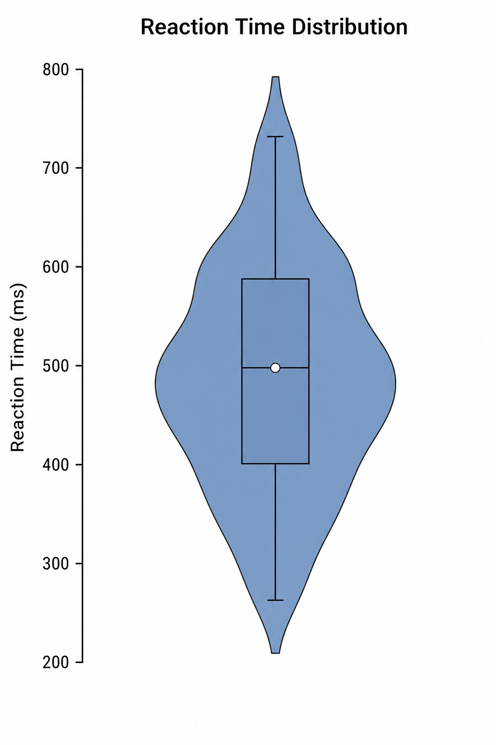
Use Violin Plot Maker with CSV or Excel data. Python renders the chart; refine labels, styling, and export in SciVis.
Try it freeNeed to refine your heatmap?
Open SciVis to adjust labels, colors, annotations, layout, and publication export after the first chart is generated.