Free Correlation Matrix Generator
Create a labeled correlation heatmap from plain text
Describe your variables, the correlations you want shown, and the style you prefer, and AI draws a clean, professional correlation matrix — ready for statistics homework, data analysis, and research papers.
Correlation matrix examples
Click any example to load its prompt, or use it as a starting point for your own correlation matrix.
What is a correlation matrix?
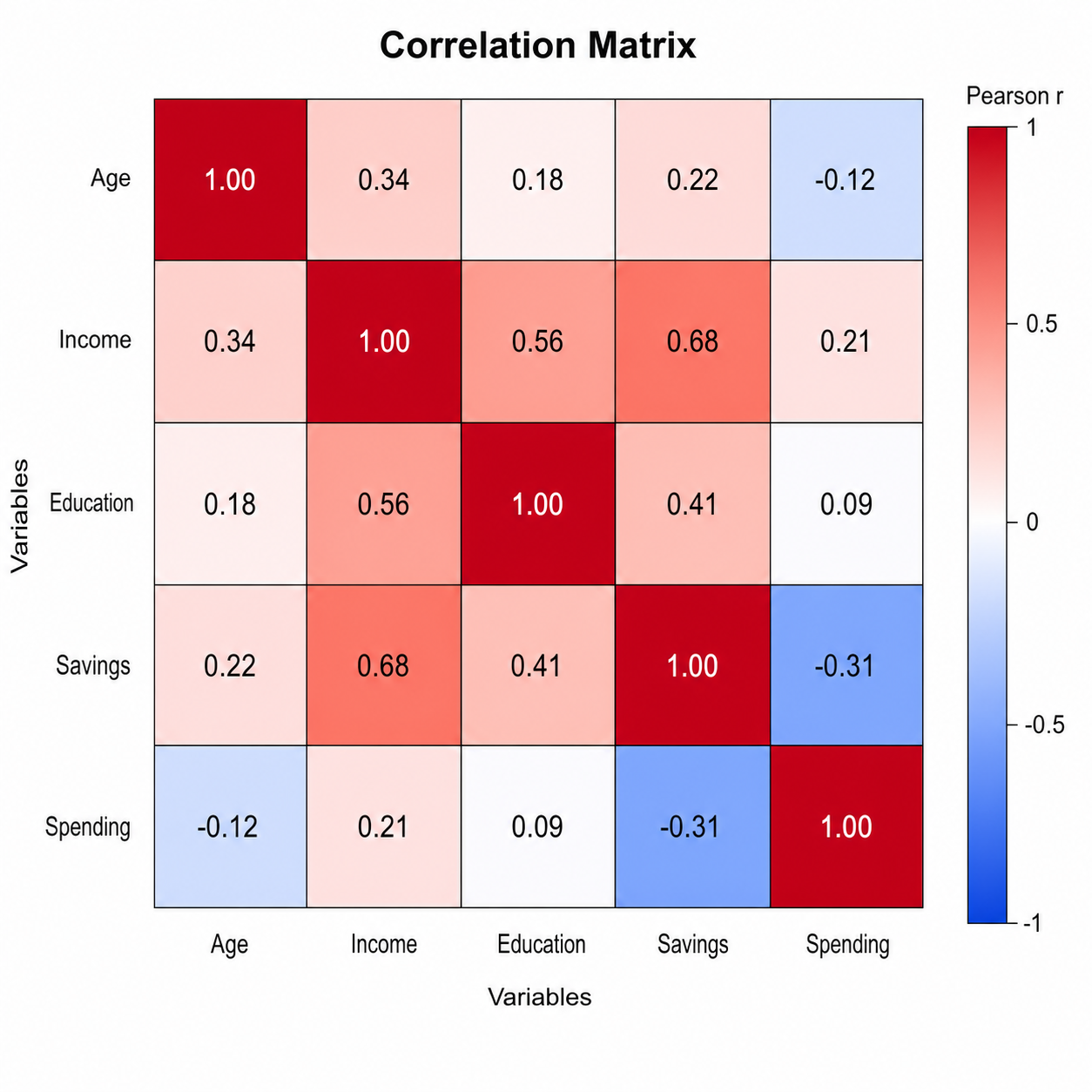
A correlation matrix (also called a correlation heatmap or corrplot) is a square table that shows the correlation coefficient between every pair of variables in a dataset, so you can see at a glance which variables move together and which do not. This correlation matrix generator turns a plain-text description into a clean, labeled correlation matrix — you describe your variables, the correlations you want shown, and the style you prefer, and the AI produces a properly proportioned figure with axis labels, color-coded cells, a diverging legend, and optional coefficients, all without spreadsheets or coding.
Why use a correlation matrix generator
- Correlation matrices are the standard way to reveal relationships, redundancy, and clusters among many variables at once in statistics, science, and business.
- Building a publication-quality correlation heatmap in Excel, R, or Python takes formatting work that distracts from the analysis.
- Students learning correlation understand it far better from a clearly labeled, color-coded correlation matrix than from a wall of numbers.
- Instructors and researchers need quick, presentable correlation plots for slides, lab reports, and papers.
- Changing the variables, masking, or color scale and regenerating is much faster than editing heatmap code by hand.
How to make a correlation matrix
List the variables you want compared and describe the correlation pattern you expect between them. Then add any visual features you need: printed coefficients in each cell, a diverging −1 to +1 color scale, a lower-triangle or upper-triangle mask, hierarchical clustering with a dendrogram, or significance stars for meaningful cells. Generate the correlation matrix, check the labels, colors, and values, and refine the description if anything is unclear.
Parts of a correlation matrix
- Variable labels — the same set of variable names along both the rows and the columns of the matrix.
- Colored cells — one cell per variable pair, shaded by the size and sign of its correlation coefficient.
- Diverging color scale & legend — a key running from −1 (strong negative) through 0 to +1 (strong positive).
- Diagonal of 1s — the main diagonal where each variable is correlated with itself, always equal to 1.
- Printed coefficients — optional numbers in each cell giving the exact correlation value.
- Significance markers — optional stars or symbols flagging which correlations are statistically significant.
Correlation Matrix Generator FAQ
What is a correlation matrix?
A correlation matrix is a square table that displays the correlation coefficient between every pair of variables in a dataset. Also called a correlation heatmap or corrplot, it is used to spot which variables move together, find redundant variables, and reveal clusters of related measures at a glance.
What does the color scale and coefficient mean?
Each cell shows a correlation coefficient between −1 and +1. A value near +1 (typically dark blue or red) means a strong positive relationship — the variables rise together; a value near −1 means a strong negative relationship — one rises as the other falls; and a value near 0 (usually white or neutral) means little or no linear relationship. The diverging color scale simply maps that −1 to +1 range onto color.
How do I make a correlation matrix online?
List the variables you want compared and describe the correlation pattern, plus any masking, color scale, or significance markers you want. This online correlation matrix maker then generates a clean, labeled correlation heatmap for you, with no spreadsheets, formulas, or coding required.
What is the difference between a correlation matrix and a heatmap?
A correlation matrix is a specific kind of heatmap whose cells are correlation coefficients between variables, always symmetric with a diagonal of 1s. A general heatmap can color any grid of values — raw measurements, counts, or intensities. So every correlation matrix is drawn as a heatmap, but not every heatmap is a correlation matrix.
Is it free?
Each generation uses a small number of credits. New accounts receive free credits, so you can make a correlation matrix without any subscription.
Is this suitable for class, research, or reports?
Yes. The correlation matrix generator produces clean, labeled figures suitable for classroom assignments, lab reports, posters, and research papers. Remember that correlation does not imply causation, and always verify that the coefficients match your own data before using the figure in a formal report.
Explore More Tools

Histogram Maker
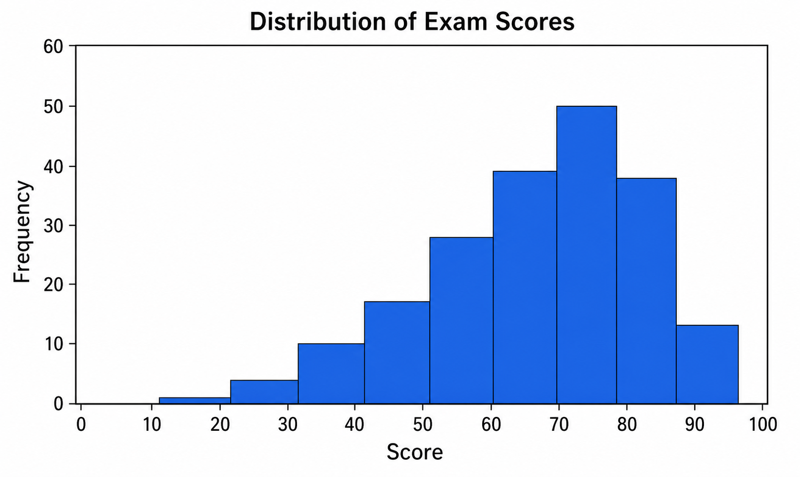
Turn data and bins into a clean, labeled frequency histogram with an optional normal curve.
Try it free
Box Plot Maker
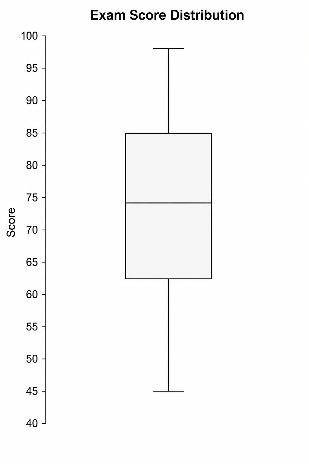
Generate clean, labeled box-and-whisker plots with quartiles, whiskers, and outliers from a plain-text description.
Try it free
Violin Plot Maker
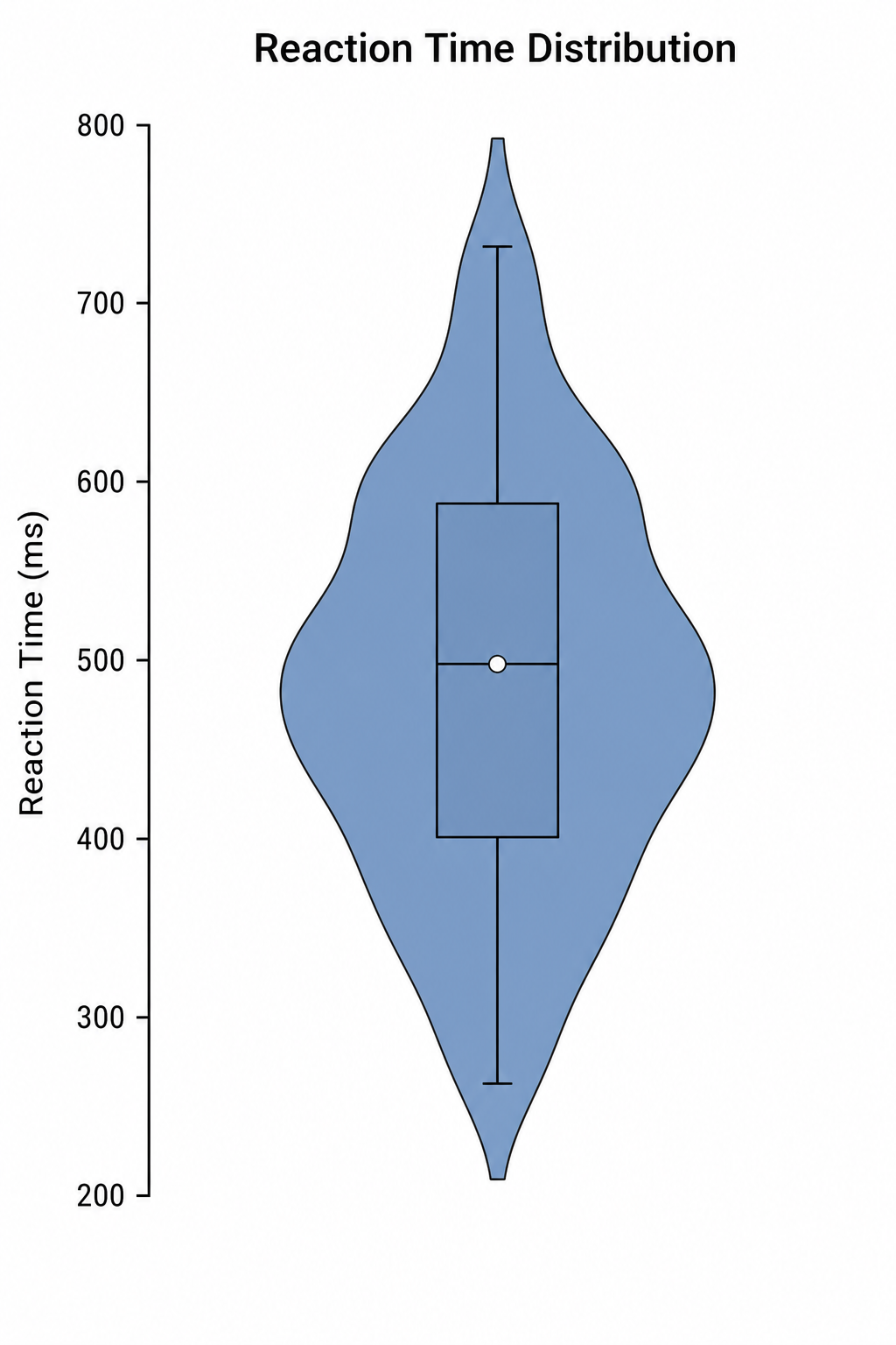
Create labeled violin plots with inner box plots and density shapes from a plain-text description.
Try it freeNeed other statistical or scientific graphs?
Generate scatter plots, histograms, box plots, and more scientific figures with SciDraw AI.