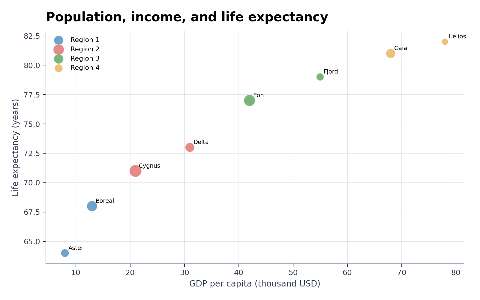
Bubble Chart Maker
Create Bubble Chart Maker from experimental or research data
Create a bubble chart from CSV or Excel data and map three variables to x position, y position, and bubble area for scientific comparison.

Bubble Chart Maker examples
Explore six ready-to-use datasets and visual styles for real research scenarios.
What does Bubble Chart Maker show?
Bubble Chart Maker displays the relationship between two numeric variables while using bubble area for a third quantity. Optional color groups and labels can identify experimental conditions, countries, compounds, samples, or other research units without hiding the x–y pattern.
Data requirements for Bubble Chart Maker
- Include one row per observation with numeric x, y, and size columns.
- Add an optional group column for color and a label column for selected points.
- Use non-negative size values and document whether area represents count, concentration, population, or another quantity.
- Remove totals and repeated headers; keep units in the column names.
Research examples for Bubble Chart Maker
- Bubble Chart Example: Population, GDP and Life Expectancy
- Excel-Style Bubble Chart from CSV
- Pathway Enrichment Bubble Plot
- AI Model Comparison Bubble Chart
- Gene Expression Bubble Plot
- Risk–Return Bubble Chart
Why use a bubble chart for research data?
- Compare two measurements while preserving a third quantitative dimension.
- Reveal large observations that would be indistinguishable in a standard scatter plot.
- Use color to separate treatment arms, sample classes, or regions.
- Keep the underlying x, y, and size values available for verification and later editing.
How to use Bubble Chart Maker
Choose an example or upload one CSV, TSV, TXT, XLSX, or XLS file, check the detected columns, generate the chart, and continue editing it in SciVis. For Excel files, the first worksheet is imported.
What a clear bubble chart should include
- Labeled x and y axes with units.
- A size legend that explains what bubble area represents.
- Area-based—not radius-based—visual scaling.
- Limited labels and sufficient transparency where bubbles overlap.
Bubble chart or scatter plot?
Use a bubble chart only when a meaningful third numeric variable should control marker area. Use a scatter plot when the scientific question concerns the relationship between x and y alone; unnecessary bubble sizing makes comparisons harder.
Bubble Chart Maker FAQ
Which columns does Bubble Chart Maker need?
Provide numeric x, y, and size columns. Group and label columns are optional. Each row should represent one observation, sample, or entity.
Should bubble size represent radius or area?
Use bubble area for the numeric value. Scaling the radius directly exaggerates large values because viewers perceive the resulting area.
Can I edit a figure after creating it with Bubble Chart Maker?
Yes. Open the figure generated with Bubble Chart Maker in SciVis to change labels, colors, annotations, layout, and other visual settings.
Can I use figures from Bubble Chart Maker in a research paper?
Yes. Bubble Chart Maker is designed to produce clean, publication-ready scientific figures. Always verify values and journal requirements before submission.
Can Bubble Chart Maker export high-resolution figures?
Yes. After editing a Bubble Chart Maker figure in SciVis, you can export it in formats suitable for papers, posters, slides, and reports.
Do I need coding experience to use Bubble Chart Maker?
No. Bubble Chart Maker creates the first version through a guided upload workflow, while SciVis provides visual controls for refinements.
Learn how to use Bubble Chart Maker with research data
Review chart selection, required data columns, interpretation, and related scientific visualization workflows before preparing your final figure.
Explore More Tools
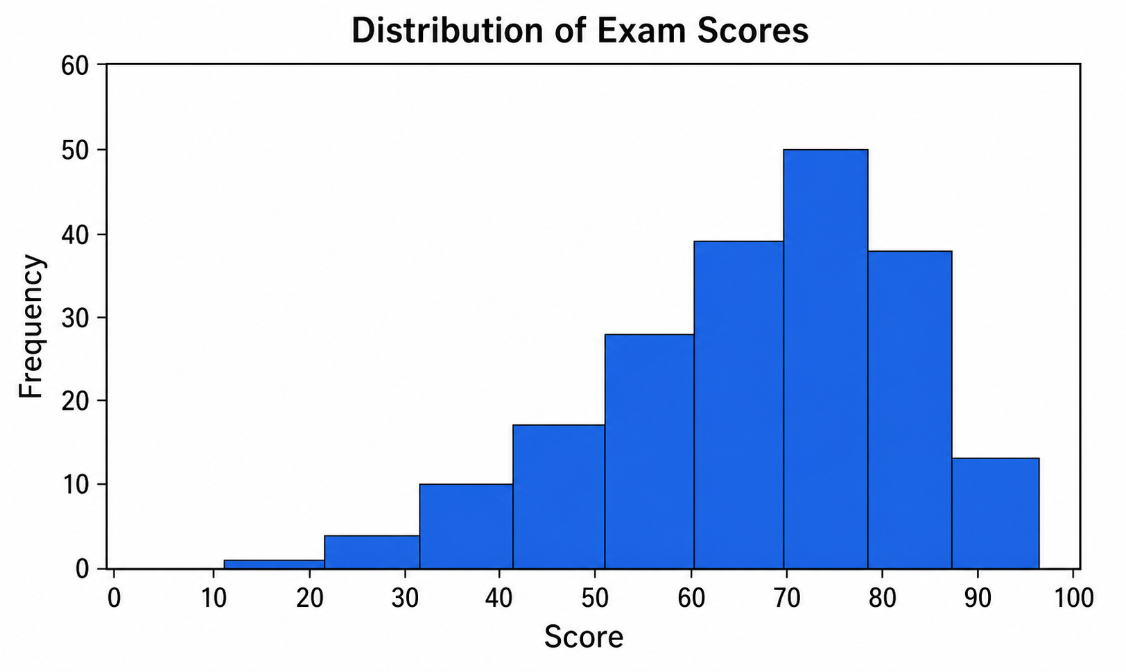
Histogram Maker
Use Histogram Maker with CSV or Excel data. Python renders the chart; refine labels, styling, and export in SciVis.
Try it free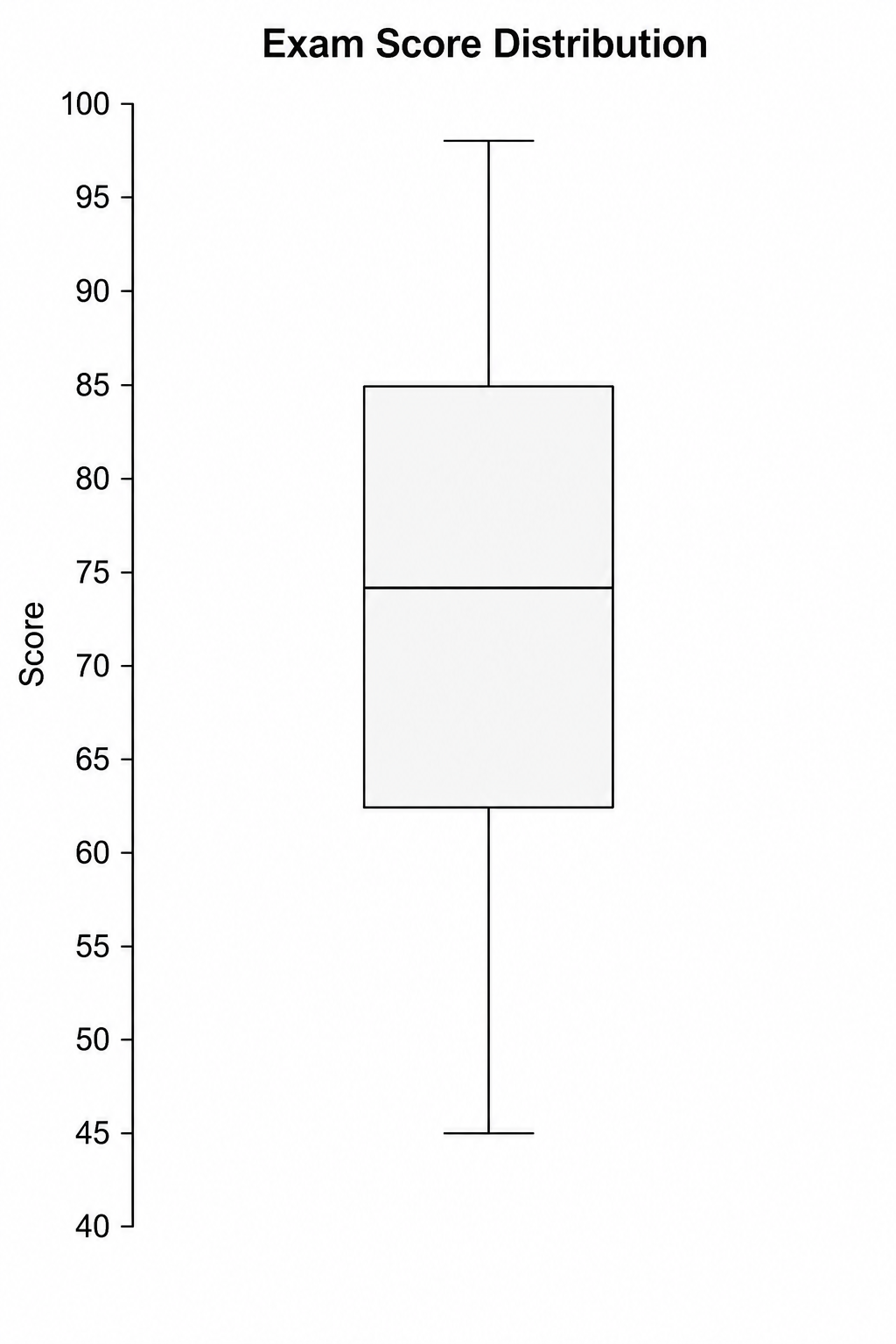
Box Plot Maker
Use Box Plot Maker with CSV or Excel data. Python renders the chart; refine labels, styling, and export in SciVis.
Try it free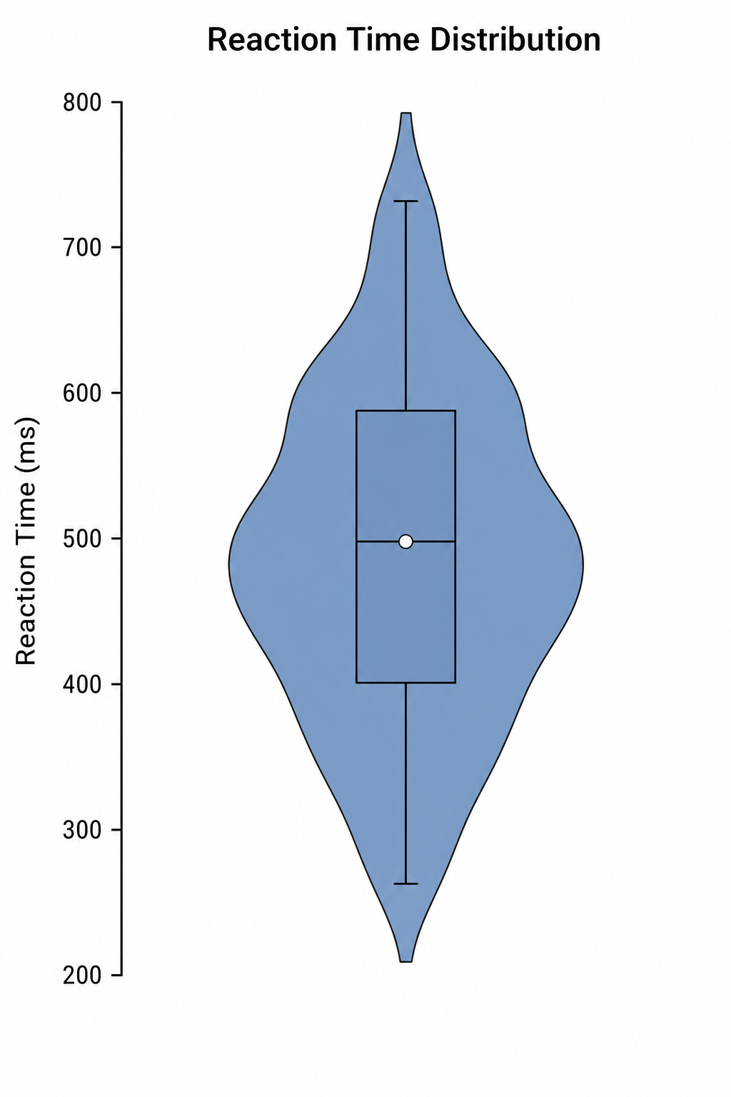
Violin Plot Maker
Use Violin Plot Maker with CSV or Excel data. Python renders the chart; refine labels, styling, and export in SciVis.
Try it freeCreate a figure with Bubble Chart Maker
Start with sample data or upload one supported data file, then finish the figure in SciVis.