Free Radar Chart Maker
Create a labeled spider chart from plain text
Describe your variables, one or more data series, and the scale you want shown, and AI draws a clean, professional radar chart — ready for skill comparisons, KPI dashboards, and research presentations.
Radar chart examples
Click any example to load its prompt, or use it as a starting point for your own radar chart.
What is a radar chart?
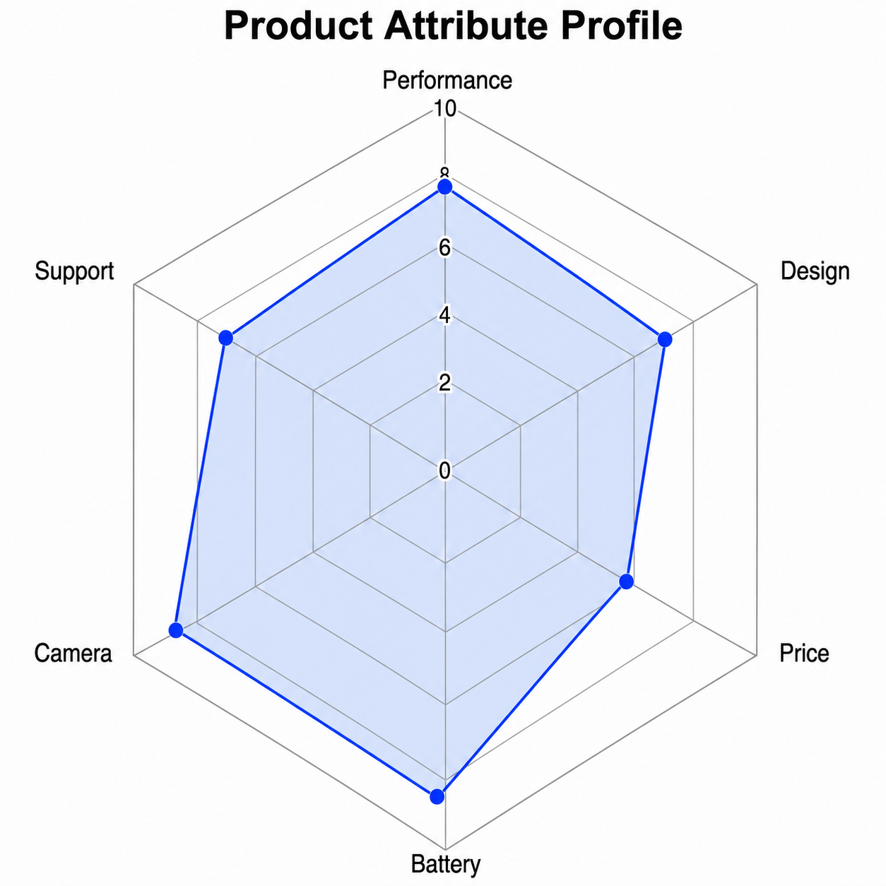
A radar chart (also called a spider chart, web chart, star plot, or polar chart) plots several variables on axes that radiate from a common center, connecting each series' values into a polygon so you can compare multivariate profiles at a glance. This radar chart maker turns a plain-text description into a clean, labeled spider chart — you describe your variables, data series, and scale, and the AI produces a properly proportioned figure with radial axes, a scale grid, and a legend, all without spreadsheets or coding.
Why use a radar chart maker
- Radar charts are the standard way to compare multivariate profiles — skills, KPIs, product features — across many dimensions at once.
- Building a clean spider chart in Excel, R, or Python takes formatting work that distracts from the comparison itself.
- Students and analysts grasp strengths and weaknesses far faster from a clearly labeled radar chart than from a table of numbers.
- Instructors and researchers need quick, presentable web charts for slides, dashboards, and reports.
- Changing the variables, series, or scale and regenerating is much faster than editing chart code by hand.
How to make a radar chart
List the variables that become the radial axes and the scale each one uses, then describe the data series you want plotted as polygons. Add any visual features you need: a legend for multiple series, a dashed target polygon for KPIs, axis labels with units, and a fill color or outline for each series. Generate the radar chart, check the axes, scale, and polygon shapes, and refine the description if anything is unclear.
Parts of a radar chart
- Radial axes — one spoke per variable, all radiating from the shared center point.
- Concentric scale grid — the rings (or polygons) marking the numeric scale used on every axis.
- Data polygon(s) — each series drawn as a closed shape connecting its values on the axes.
- Axis labels — the name of the variable at the outer end of each spoke.
- Legend — color or fill coding that distinguishes the different data series.
- Title — a short caption describing what the radar chart shows.
Radar Chart Maker FAQ
What is a radar chart?
A radar chart is a graph that plots several variables on axes radiating from a common center, connecting each series' values into a polygon. Also called a spider chart, web chart, or star plot, it is used to compare the multivariate profiles of items across many dimensions at once.
Is a radar chart the same as a spider chart?
Yes — radar chart and spider chart are two names for the same chart type, along with web chart, star plot, and star chart. They all describe a plot where variables sit on axes radiating from a center and each data series forms a polygon. The name varies by field, but the chart is identical.
How do I make a radar chart online?
Describe the variables that become your axes, the scale each uses, and the data series you want plotted as polygons. This online radar chart maker then generates a clean, labeled spider chart for you, with no spreadsheets, formulas, or coding required.
How many variables or axes should a radar chart have?
Three is the minimum, and most readable radar charts use between four and eight axes. Beyond about ten variables the polygon becomes cramped and hard to read, so consider grouping dimensions or splitting into multiple charts. Keep the scale consistent across all axes so the shapes can be compared fairly.
Is it free?
Each generation uses a small number of credits. New accounts receive free credits, so you can make a radar chart without any subscription.
Is this suitable for class, presentations, or reports?
Yes. The radar chart generator produces clean, labeled figures suitable for classroom assignments, presentations, dashboards, and research papers. Always verify that the axes, scale, and polygons match your actual data before using the figure in a formal report.
Explore More Tools

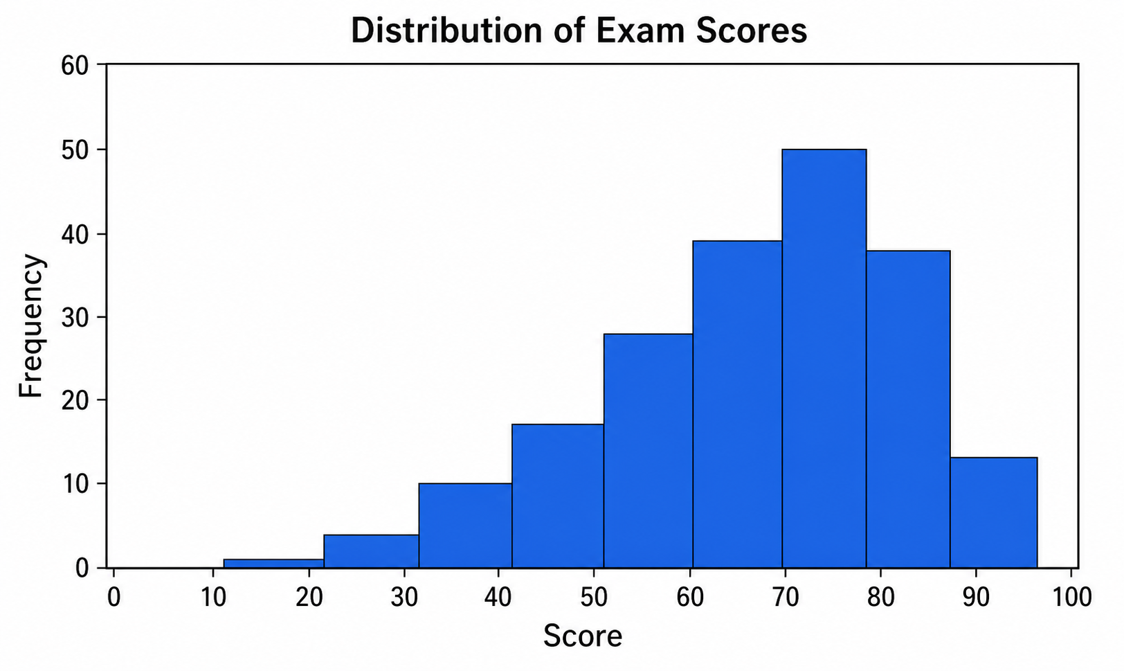
Histogram Maker
Turn data and bins into a clean, labeled frequency histogram with an optional normal curve.
Try it free
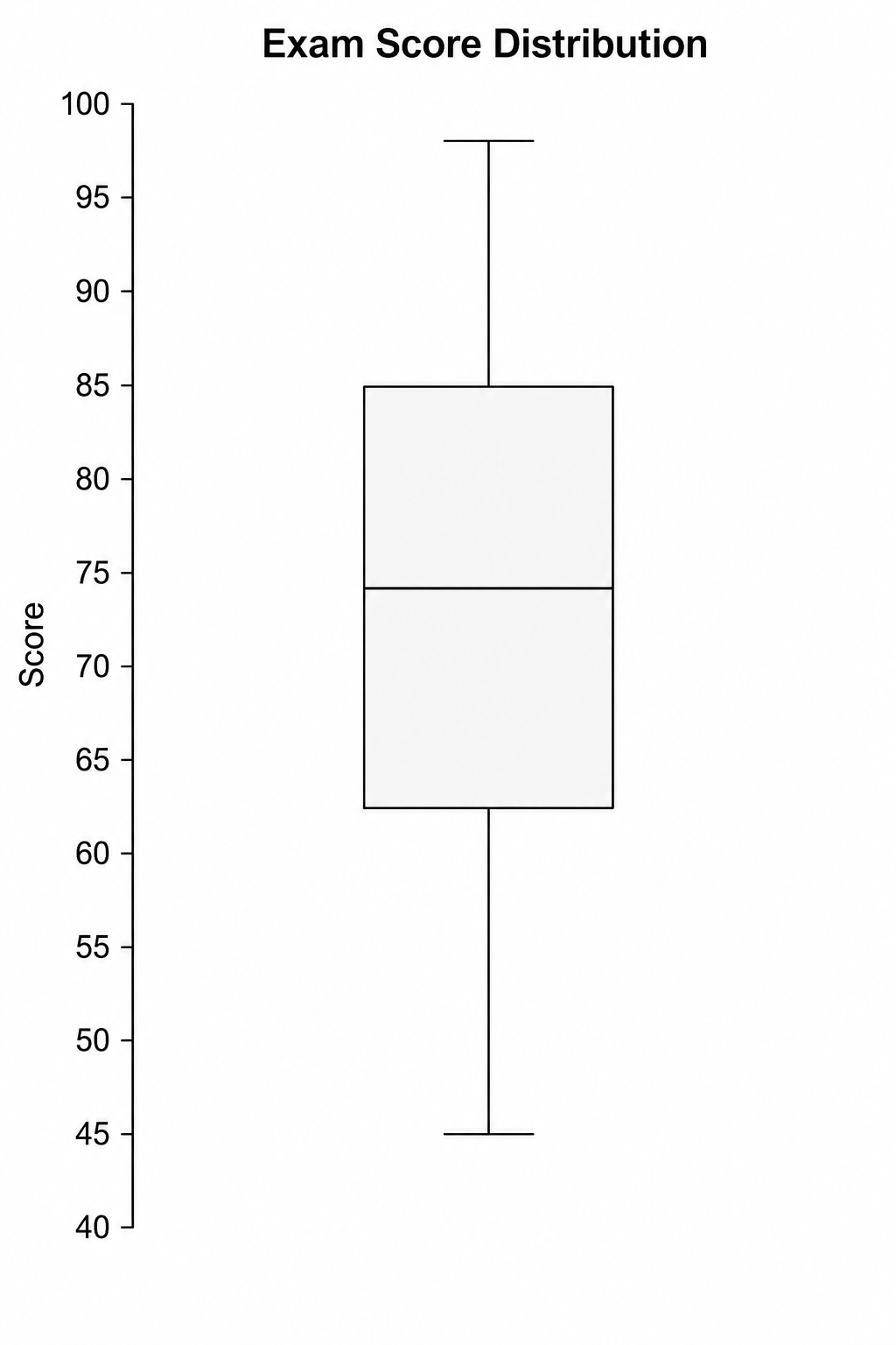
Box Plot Maker
Generate clean, labeled box-and-whisker plots with quartiles, whiskers, and outliers from a plain-text description.
Try it free
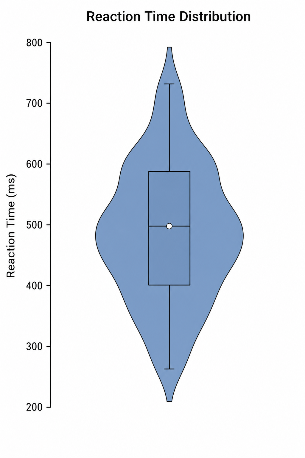
Violin Plot Maker
Create labeled violin plots with inner box plots and density shapes from a plain-text description.
Try it freeNeed other statistical or scientific graphs?
Generate scatter plots, dot plots, correlation matrices, and more scientific figures with SciDraw AI.