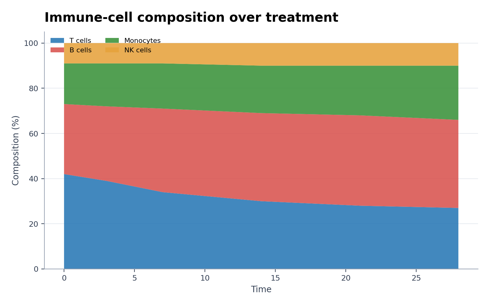
Creador de gráficos de áreas apiladas
Crea Creador de gráficos de áreas apiladas con datos experimentales o de investigación
Crea gráficos de áreas apiladas listos para publicar desde CSV o Excel y muestra total y composición a lo largo del tiempo, también normalizados al 100 %.
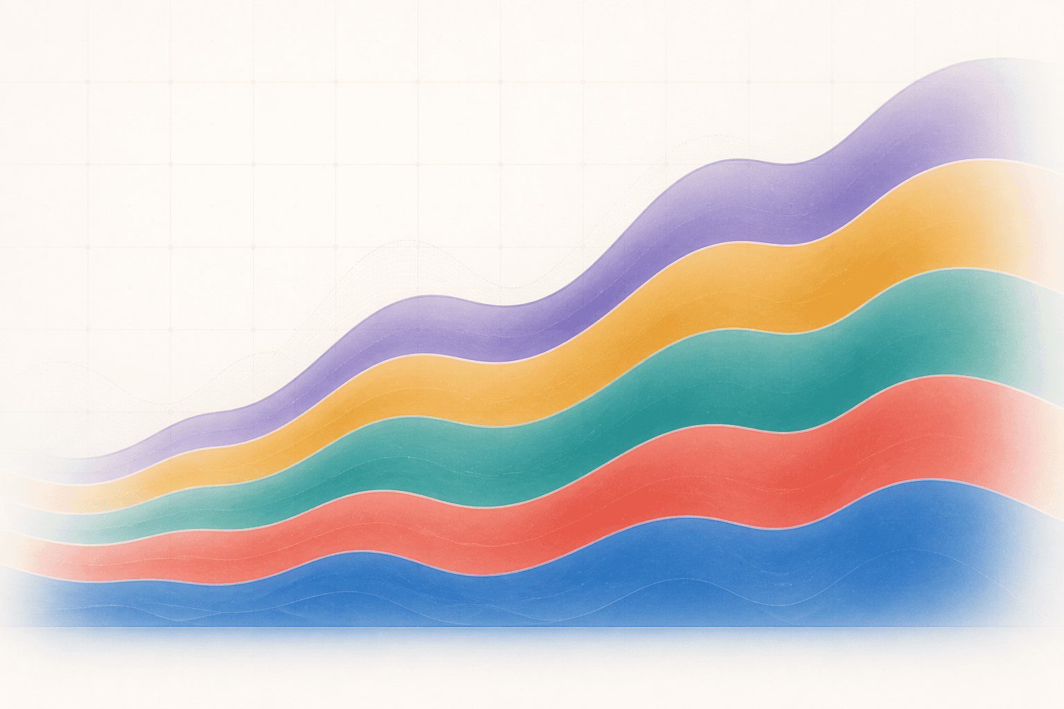
Ejemplos de Creador de gráficos de áreas apiladas
Seis conjuntos de datos listos para usar y estilos basados en situaciones reales de investigación.
¿Qué muestra el generador de gráficos de áreas apiladas?
El gráfico de áreas apiladas muestra cómo contribuyen diversas categorías a un total a lo largo de una variable ordenada, generalmente el tiempo. Puede mostrar totales absolutos o normalizar cada punto temporal al 100% para visualizar la composición relativa.
Requisitos de datos para el gráfico de áreas apiladas
- Proporcionar columnas para el tiempo (u otra variable x ordenada), la categoría y el valor numérico.
- Incluir cada combinación de categoría-tiempo o documentar cómo se tratan los valores faltantes.
- Utilizar valores no negativos para un apilamiento convencional.
- Elegir entre valores absolutos o porcentajes antes de graficar y evitar mezclar ambas escalas.
Ejemplos de uso en investigación
- Áreas apiladas al 100 % de composición celular
- Áreas apiladas estilo Excel desde CSV
- Evolución de la combinación energética
- Abundancia relativa del microbioma
- Composición del presupuesto de investigación
- Cambio apilado de cobertura terrestre
¿Por qué utilizar un gráfico de áreas apiladas?
- Mostrar el total y la evolución de sus componentes en una sola figura.
- Monitorear la composición de comunidades, fuentes de energía, categorías presupuestarias o clases de muestras a lo largo del tiempo.
- Destacar los contribuyentes dominantes y las transiciones principales.
- Crear una vista continua cuando el eje x está ordenado y densamente muestreado.
Cómo usar Creador de gráficos de áreas apiladas
Elige un ejemplo o sube un archivo CSV, TSV, TXT, XLSX o XLS. Revisa las columnas detectadas, genera el gráfico y edítalo en SciVis. En Excel se importa la primera hoja.
Elementos clave de un gráfico de áreas apiladas claro
- Un eje x ordenado con unidades o fechas explícitas.
- Una leyenda que coincida con un orden de apilamiento estable.
- Un eje y etiquetado claramente como valor absoluto o porcentaje de composición.
- Una paleta de colores que permita distinguir fácilmente las capas adyacentes.
¿Gráfico de áreas apiladas o gráfico de líneas?
Utilice áreas apiladas cuando la relación parte-todo sea fundamental y los valores sean aditivos. Utilice líneas independientes cuando sea necesario comparar con precisión la tendencia de cada serie; solo la capa inferior del gráfico apilado comparte una línea de base común.
Preguntas frecuentes sobre Creador de gráficos de áreas apiladas
¿Qué columnas requiere el generador de gráficos de áreas apiladas?
Requiere una columna ordenada de x o tiempo, una columna de categoría y una columna de valor numérico. Las tablas anchas con una columna por categoría deben reestructurarse o identificarse claramente primero.
¿Cuándo se debe utilizar un gráfico de áreas apiladas al 100%?
Utilice el apilamiento al 100% para comparar la composición relativa cuando cada punto temporal deba sumar la misma totalidad. Utilice el apilamiento absoluto cuando los cambios en la magnitud total sean científicamente relevantes.
¿Puedo editar una figura después de crearla con Creador de gráficos de áreas apiladas?
Sí. Abre en SciVis la figura generada con Creador de gráficos de áreas apiladas para cambiar etiquetas, colores, anotaciones, composición y otros ajustes visuales.
¿Puedo usar las figuras de Creador de gráficos de áreas apiladas en un artículo?
Sí. Creador de gráficos de áreas apiladas está pensado para figuras científicas claras y aptas para publicar. Comprueba siempre los valores y las normas de la revista antes de enviar.
¿Creador de gráficos de áreas apiladas permite exportar en alta resolución?
Sí. Después de editar una figura Creador de gráficos de áreas apiladas en SciVis puedes exportarla para artículos, pósteres, diapositivas e informes.
¿Necesito saber programar para usar Creador de gráficos de áreas apiladas?
No. El flujo guiado de Creador de gráficos de áreas apiladas crea la primera versión y los controles visuales de SciVis permiten afinarla.
Cómo utilizar Creador de gráficos de áreas apiladas con datos de investigación
Revise la selección de gráficos, las columnas de datos requeridas, la interpretación y los flujos de trabajo de visualización científica antes de preparar su figura final.
Explorar más herramientas
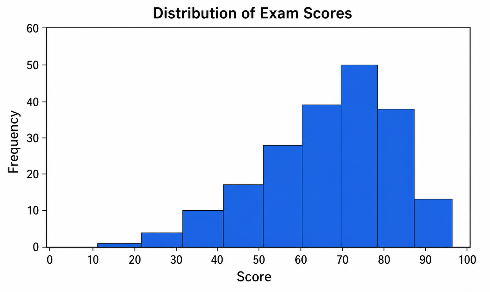
Creador de histogramas
Usa Creador de histogramas con datos CSV o Excel y ajusta en SciVis el gráfico generado por Python.
Pruébalo gratis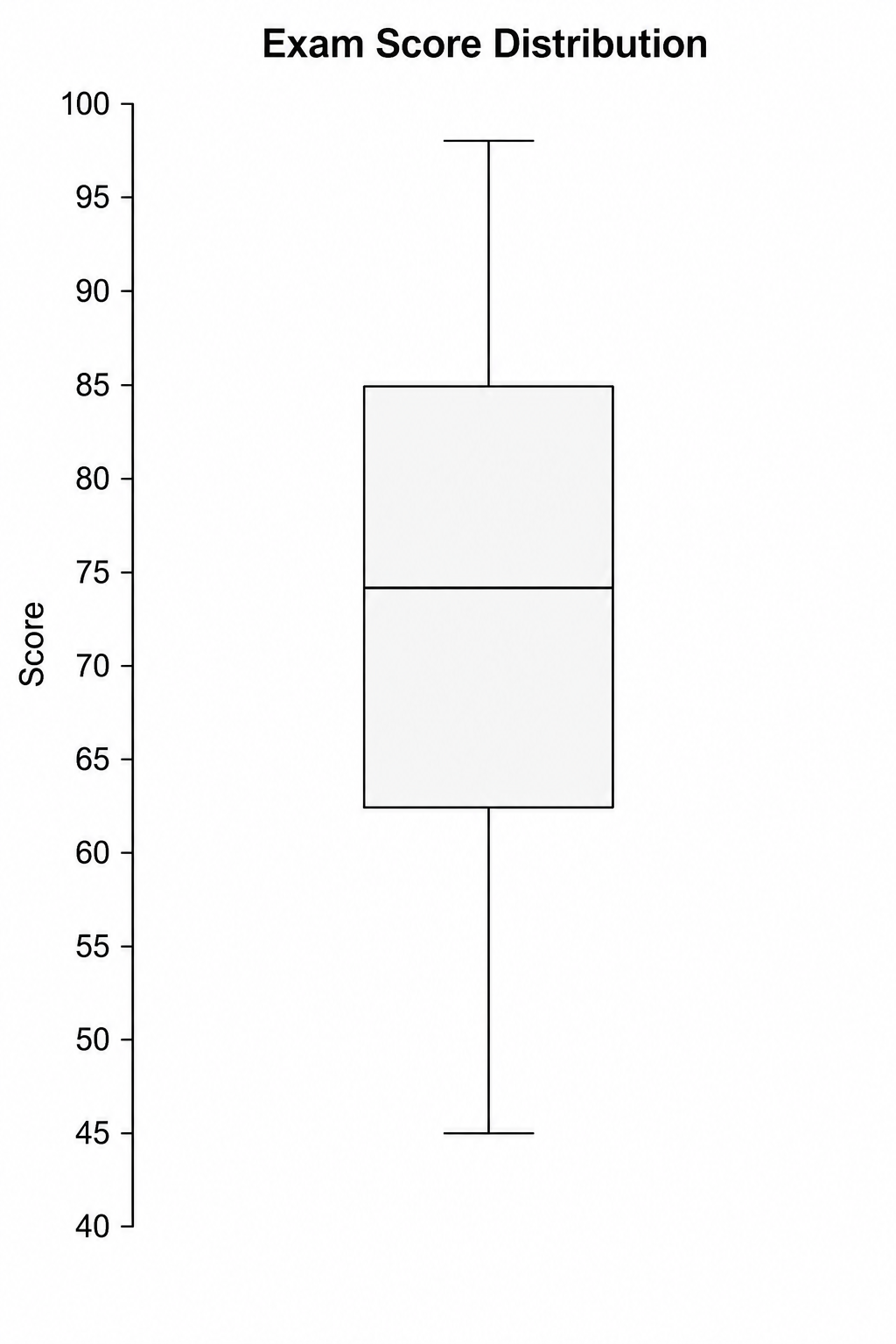
Creador de diagramas de caja
Usa Creador de diagramas de caja con datos CSV o Excel y ajusta en SciVis el gráfico generado por Python.
Pruébalo gratis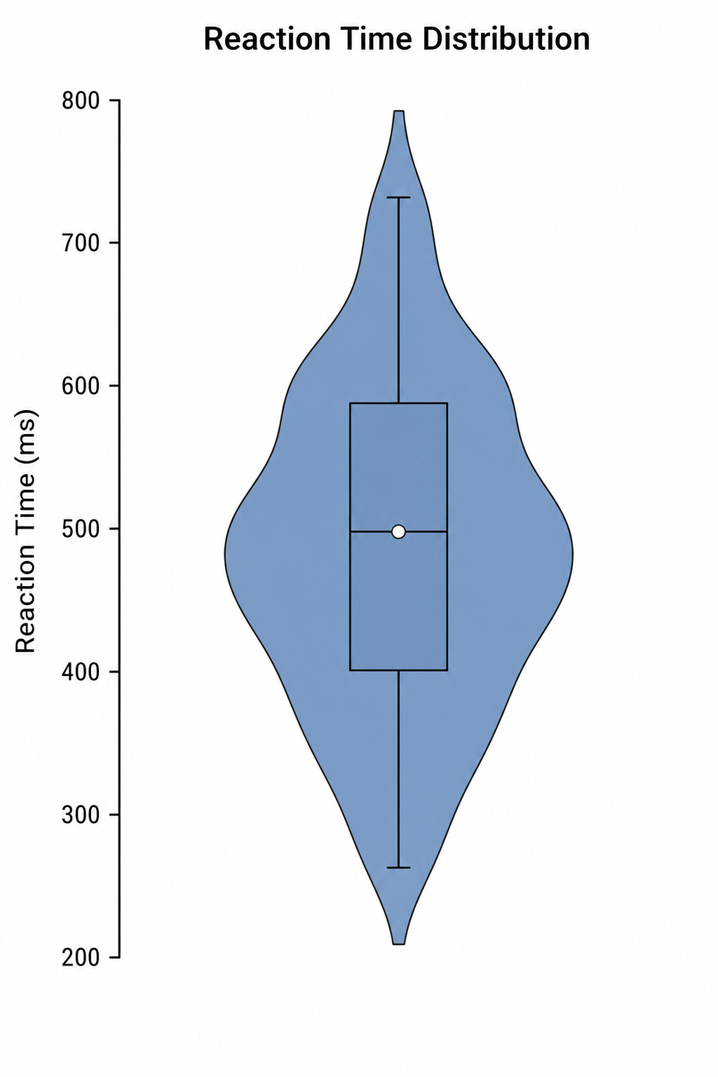
Creador de diagramas de violín
Usa Creador de diagramas de violín con datos CSV o Excel y ajusta en SciVis el gráfico generado por Python.
Pruébalo gratisCrea una figura con Creador de gráficos de áreas apiladas
Empieza con datos de ejemplo o un archivo compatible y termina la figura en SciVis.