Generatore di ridgeline plot
Crea Generatore di ridgeline plot da dati sperimentali o di ricerca
Crea ridgeline plot o joyplot da valori raggruppati per confrontare più distribuzioni senza programmare.
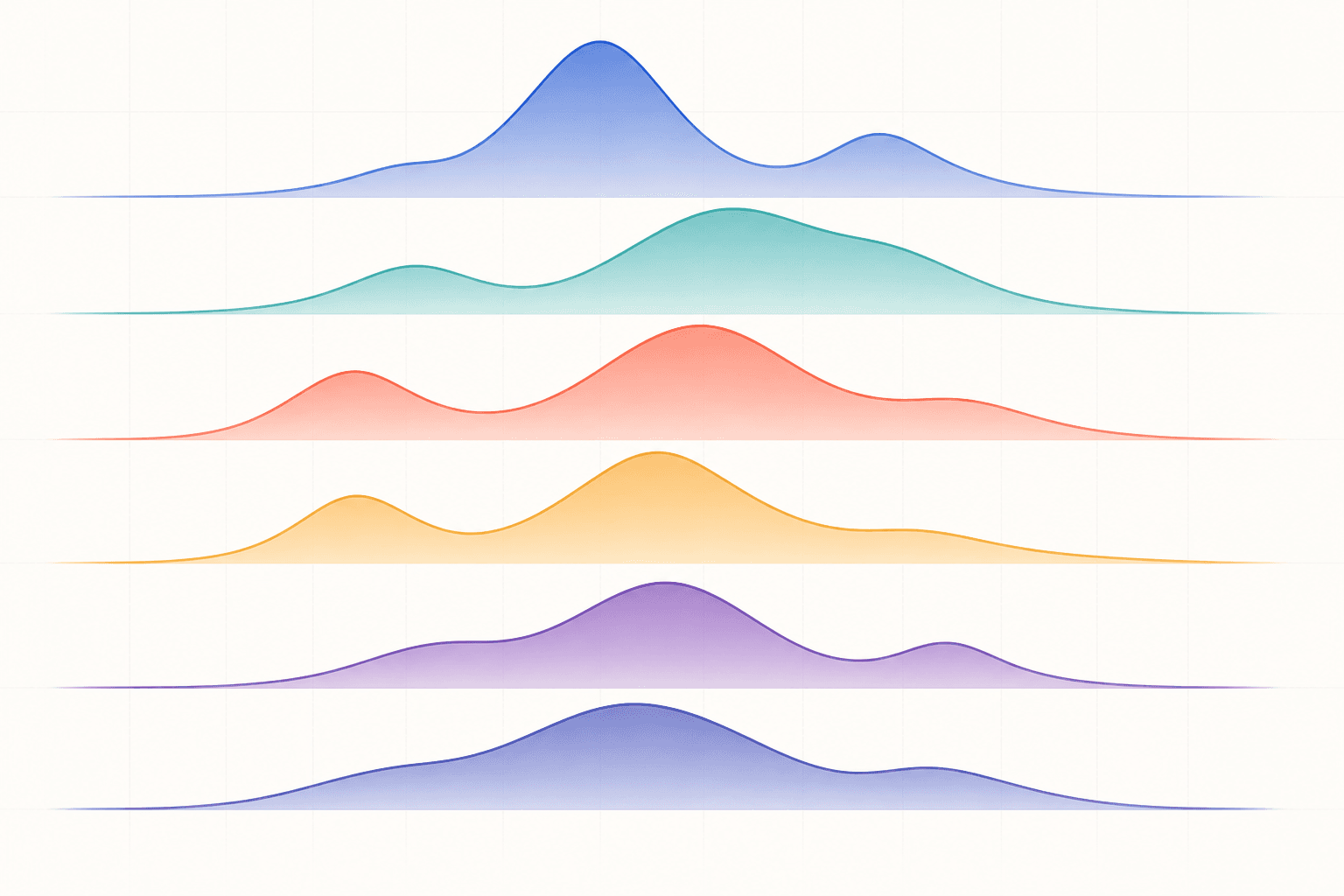
Esempi di Generatore di ridgeline plot
Sei set di dati pronti all’uso e stili basati su reali scenari di ricerca.
Cosa mostra il Ridgeline Plot Maker?
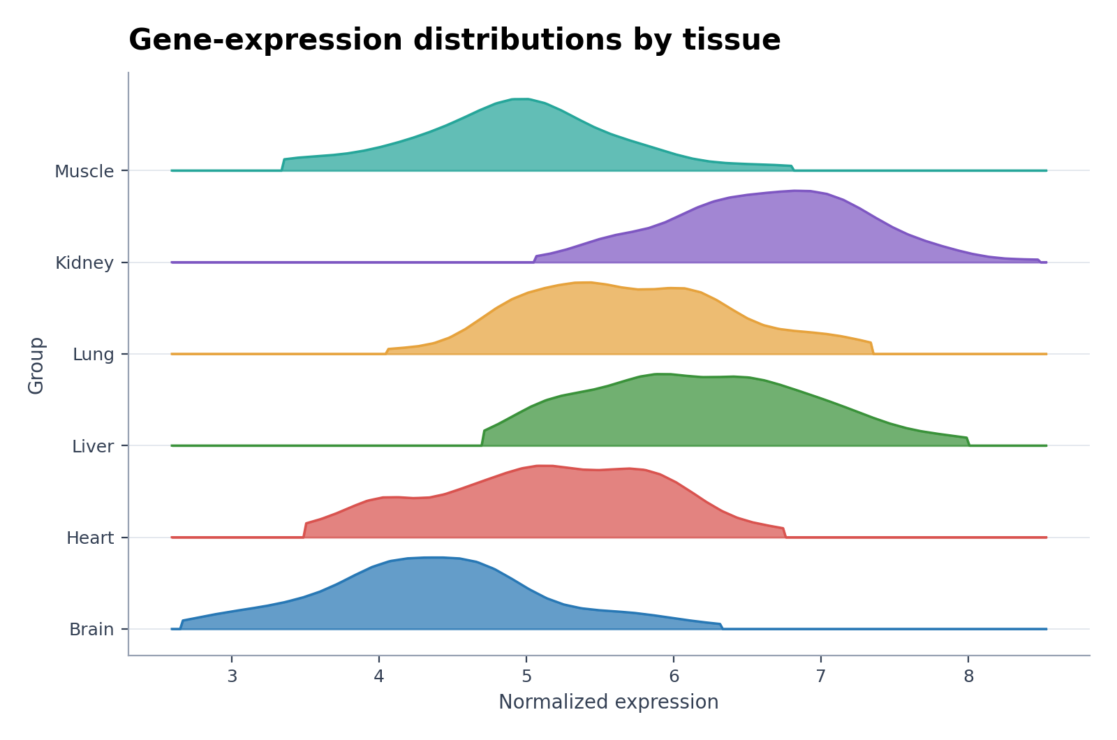
Il Ridgeline Plot Maker (noto anche come joyplot) sovrappone parzialmente curve di densità per consentire il confronto di numerosi gruppi, punti temporali o condizioni in un'unica figura compatta. Evidenzia le variazioni nella forma della distribuzione anziché limitarsi alla sola media.
Requisiti dei dati per il Ridgeline Plot Maker
- Fornisci una riga per osservazione con un valore numerico e una colonna categoriale di gruppo.
- Aggiungi una colonna opzionale di ordinamento o temporale se la sequenza verticale ha un significato scientifico.
- Assicurati di avere un numero sufficiente di osservazioni per gruppo per una stima di densità affidabile.
- Documenta le trasformazioni applicate e mantieni tutti i gruppi su una scala confrontabile.
Esempi di applicazione nella ricerca per il Ridgeline Plot Maker
- Ridgeline dell’espressione genica
- Densità per gruppo di trattamento
- Dimensioni delle particelle per lotto
- Joyplot delle temperature mensili
- Ridgeline stile Python da CSV
- Abbondanza proteica per condizione
Perché usare un ridgeline plot?
- Confronta le variazioni di distribuzione tra molti gruppi ordinati.
- Rivela multimodalità, asimmetria (skewness), dispersione e andamento delle code di distribuzione.
- Ottimizza lo spazio verticale in modo più efficiente rispetto a pannelli di densità separati.
- Mostra pattern temporali, curve dose-risposta, differenze tra tessuti, popolazioni o condizioni sperimentali.
Come usare Generatore di ridgeline plot
Scegli un esempio o carica un file CSV, TSV, TXT, XLSX o XLS. Controlla le colonne rilevate, genera il grafico e modificalo in SciVis. Per Excel viene importato il primo foglio.
Elementi essenziali di un ridgeline plot efficace
- Una scala numerica condivisa e definizioni dei gruppi leggibili.
- La larghezza di banda (bandwidth) della densità o il metodo di smoothing documentati.
- Una separazione verticale sufficiente a distinguere le curve adiacenti.
- Una tavolozza di colori o profili sobria che preservi l'ordine visivo.
Ridgeline plot o violin plot?
Usa un ridgeline plot per confrontare molte distribuzioni ordinate che condividono la stessa scala. Scegli i violin plot quando un numero limitato di gruppi richiede un confronto diretto affiancato, la sovrapposizione dei punti singoli (stripchart) o la visualizzazione interna di mediana e quartili.
Domande frequenti su Generatore di ridgeline plot
Quali colonne sono necessarie per il Ridgeline Plot Maker?
Fornisci una colonna di valori numerici e una colonna categoriale per i gruppi. Un campo opzionale di ordinamento o temporale può controllare la sequenza verticale delle curve.
Le curve di un ridgeline plot possono sovrapporsi?
Sì, una moderata sovrapposizione è parte integrante del design del grafico, ma una sovrapposizione eccessiva nasconde le linee di base e le code. Mantieni leggibili le etichette dei gruppi ed evita che la sovrapposizione suggerisca la presenza di valori inferiori a zero quando ciò è fisicamente impossibile.
Posso modificare una figura dopo averla creata con Generatore di ridgeline plot?
Sì. Apri in SciVis la figura generata con Generatore di ridgeline plot per cambiare etichette, colori, annotazioni, impaginazione e altre impostazioni visive.
Posso usare le figure di Generatore di ridgeline plot in un articolo?
Sì. Generatore di ridgeline plot è pensato per figure scientifiche chiare e adatte alla pubblicazione. Prima dell’invio verifica sempre valori e norme della rivista.
Generatore di ridgeline plot consente l’esportazione ad alta risoluzione?
Sì. Dopo aver modificato una figura Generatore di ridgeline plot in SciVis puoi esportarla per articoli, poster, diapositive e relazioni.
Serve saper programmare per usare Generatore di ridgeline plot?
No. Il caricamento guidato di Generatore di ridgeline plot crea la prima versione e i controlli visivi di SciVis permettono di rifinirla.
Come usare Generatore di ridgeline plot con i dati della tua ricerca
Verifica la selezione del grafico, le colonne di dati richieste, l'interpretazione e i flussi di lavoro di visualizzazione scientifica prima di generare la figura finale per la pubblicazione.
Scopri altri strumenti
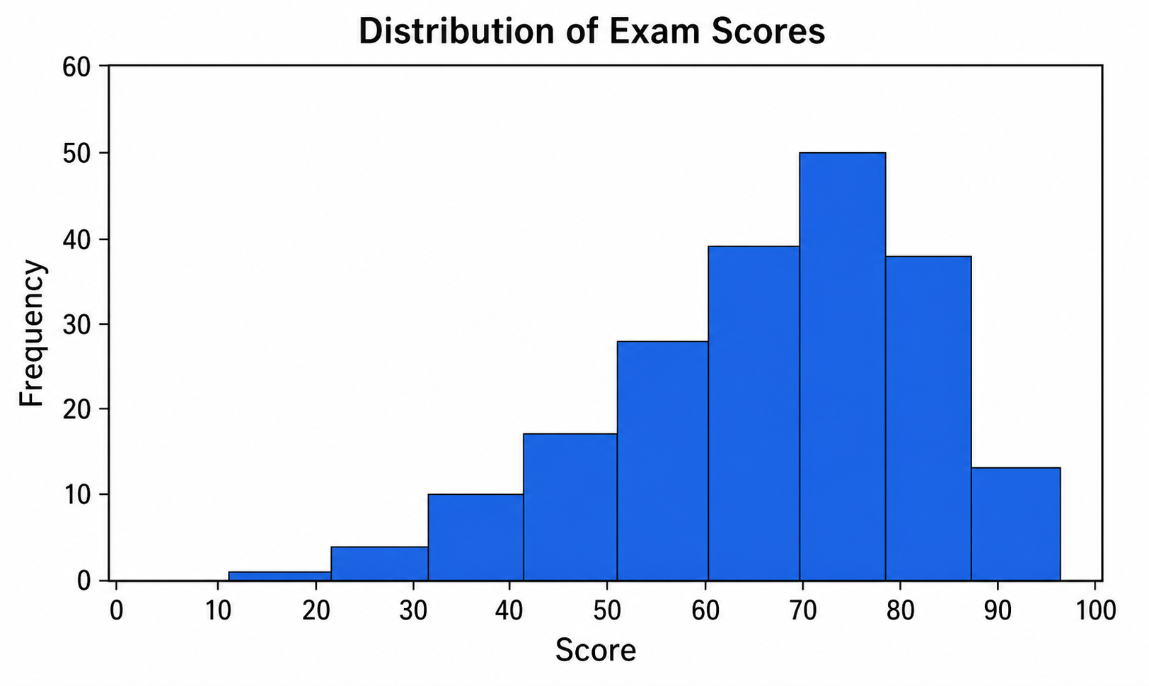
Creatore di istogrammi
Usa Creatore di istogrammi con dati CSV o Excel e rifinisci in SciVis il grafico generato da Python.
Provalo gratis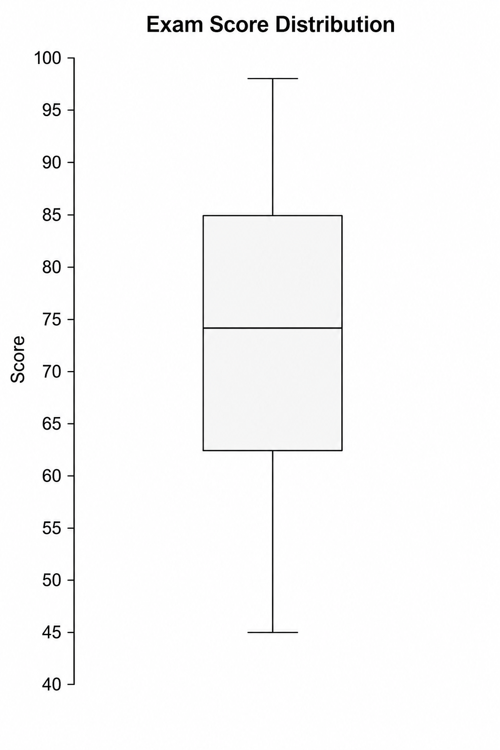
Creatore di box plot
Usa Creatore di box plot con dati CSV o Excel e rifinisci in SciVis il grafico generato da Python.
Provalo gratis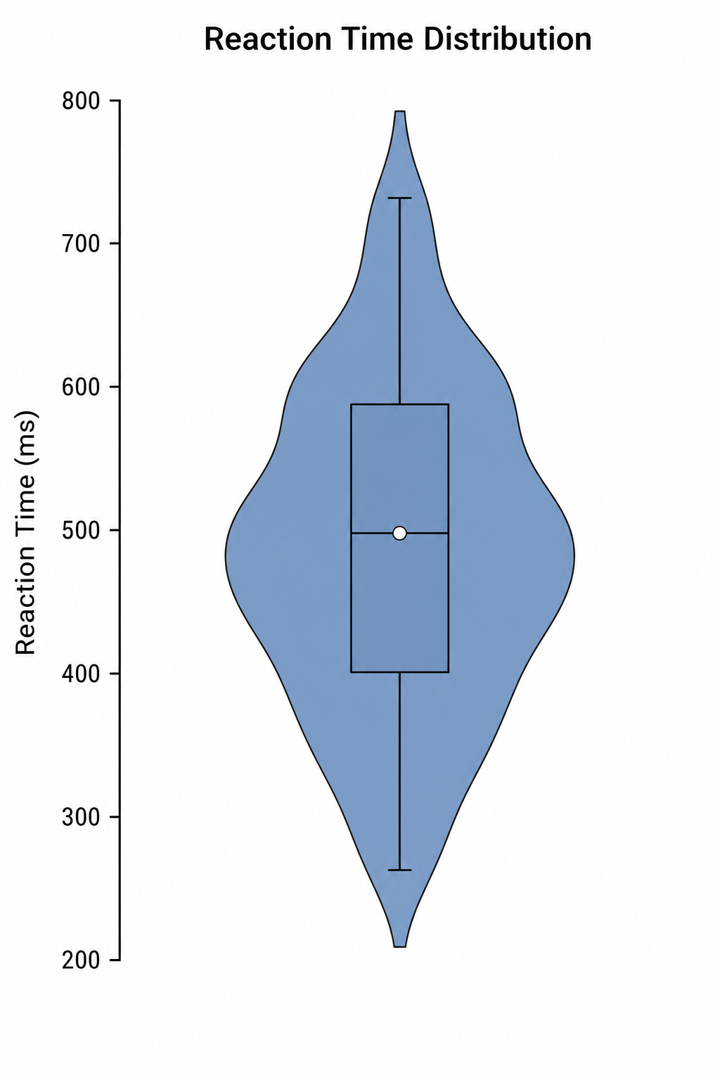
Creatore di violin plot
Usa Creatore di violin plot con dati CSV o Excel e rifinisci in SciVis il grafico generato da Python.
Provalo gratisCrea una figura con Generatore di ridgeline plot
Parti da dati di esempio o da un file compatibile e completa la figura in SciVis.