Générateur de graphiques de régression
Créer Générateur de graphiques de régression à partir de données expérimentales ou de recherche
Créez Courbe d’étalonnage linéaire avec Générateur de graphiques de régression depuis CSV ou Excel. Rendu Python, édition SciVis et export sont inclus.
Créer un graphique scientifique
Glissez un fichier de données ici, ou cliquez pour téléverser
CSV, TSV, TXT, Excel · Max 5 Mo
Aperçu
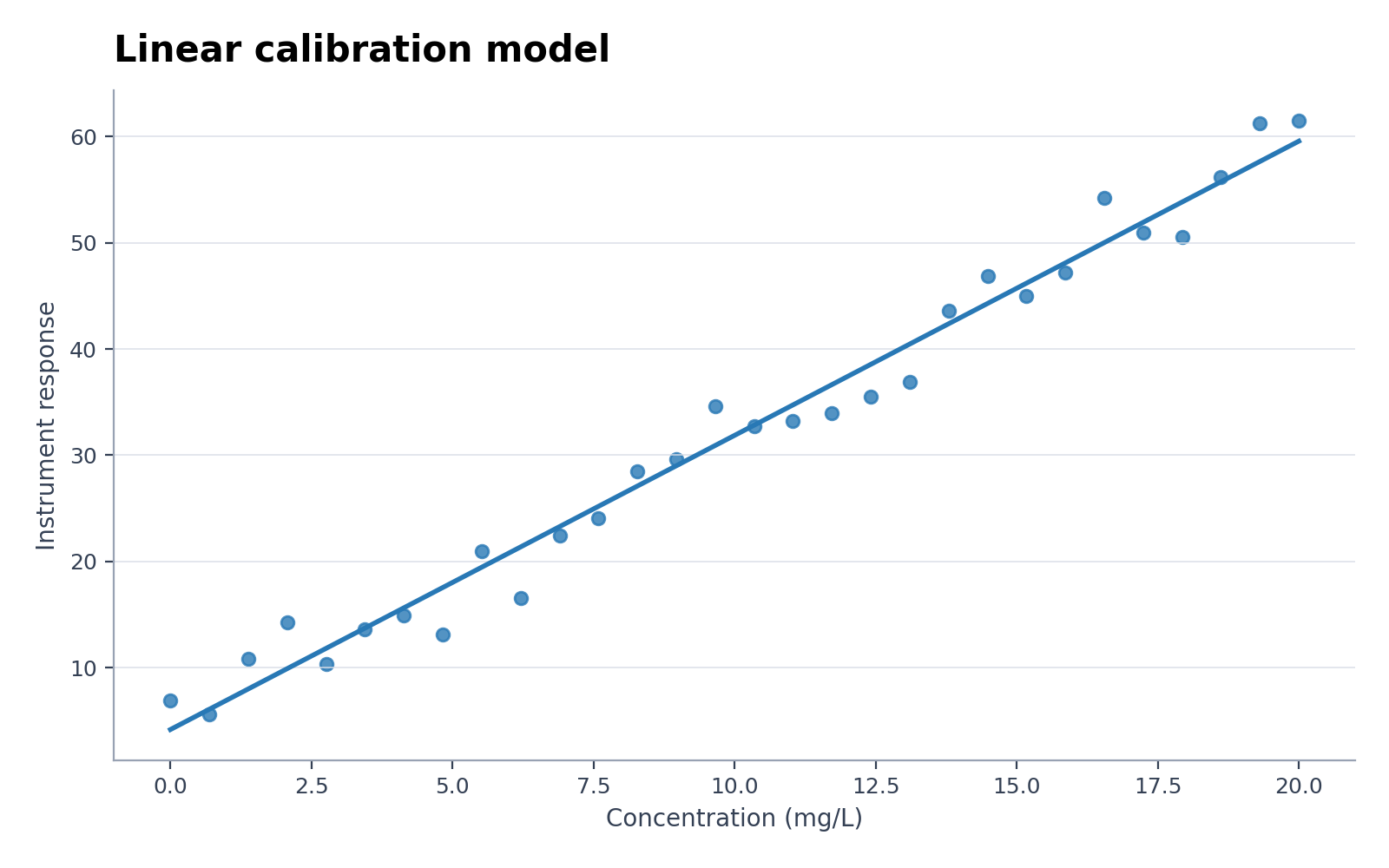 Exemple
Cet aperçu utilise le jeu de données choisi. Recréez-le avec Python ou importez vos propres données pour produire un nouveau graphique.
Exemples de Générateur de graphiques de régression avec données à télécharger
Ouvrez un exemple pour examiner le graphique, télécharger son CSV ou charger les mêmes données dans le générateur ci-dessus.
Que montre Générateur de graphiques de régression ?
Générateur de graphiques de régression transforme des données de recherche structurées selon la relation statistique propre à ce graphique. Il convient notamment à Courbe d’étalonnage linéaire et Pentes de régression par groupe ; Python crée une première version reproductible, puis SciVis assure la finition visuelle.
Données requises pour Générateur de graphiques de régression
- Champs représentatifs : x, group, y.
- Chaque ligne correspond à une observation, une catégorie, un temps ou une paire valide.
- Les mesures restent numériques et les unités figurent dans le nom des colonnes.
- Les cellules vides sont traitées comme manquantes ; retirez totaux et notes avant import.
Exemples de recherche pour Générateur de graphiques de régression
- Courbe d’étalonnage linéaire
- Pentes de régression par groupe
- Modèle de saturation non linéaire
- Validation observé-prédit
- Régression robuste avec valeurs atypiques
- Association clinique stratifiée d’un biomarqueur
Pourquoi utiliser Générateur de graphiques de régression avec des données de recherche ?
- Vérifiez d’abord le mappage des champs avec l’exemple Courbe d’étalonnage linéaire fourni.
- Réutilisez la structure visuelle de Pentes de régression par groupe pour un jeu de données comparable.
- Profitez du rendu Python sans écrire ni déboguer vous-même le code du graphique.
- Conservez les valeurs produites et affinez libellés, couleurs et export dans SciVis.
Comment utiliser Générateur de graphiques de régression
Choisissez un exemple ou importez un fichier CSV, TSV, TXT, XLSX ou XLS. Vérifiez les colonnes détectées, générez le graphique, puis modifiez-le dans SciVis. Pour Excel, la première feuille est importée.
Éléments d’un Générateur de graphiques de régression lisible
- Axes, groupes ou nœuds sont mappés de façon cohérente depuis x, group, y.
- Le titre précise le résultat ou la comparaison présentée par Générateur de graphiques de régression.
- Libellés, unités, légendes et lignes de référence nécessaires restent lisibles.
- Une palette sobre et une résolution suffisante conviennent aux articles, posters et diapositives.
Générateur de graphiques de régression ou Créateur de nuage de points ?
Choisissez Générateur de graphiques de régression lorsque les colonnes et la question suivent sa structure statistique. Si l’autre comparaison est centrale, préférez Créateur de nuage de points afin d’éviter un encodage visuel trompeur.
Questions fréquentes sur Générateur de graphiques de régression
Quelles colonnes faut-il pour Générateur de graphiques de régression ?
Le CSV fourni montre la structure conseillée. Les champs représentatifs sont x, group, y ; des noms équivalents conviennent s’ils jouent le même rôle.
Quand choisir Générateur de graphiques de régression plutôt que Créateur de nuage de points ?
Utilisez Générateur de graphiques de régression pour la relation statistique qu’il est conçu à représenter. Choisissez Créateur de nuage de points si son autre comparaison répond mieux à la question.
Puis-je modifier une figure après sa création avec Générateur de graphiques de régression ?
Oui. Ouvrez la figure créée avec Générateur de graphiques de régression dans SciVis pour changer libellés, couleurs, annotations, mise en page et autres réglages visuels.
Puis-je utiliser une figure Générateur de graphiques de régression dans un article scientifique ?
Oui. Générateur de graphiques de régression vise des figures scientifiques claires et prêtes à publier. Vérifiez néanmoins les valeurs et les consignes de la revue avant soumission.
Générateur de graphiques de régression permet-il un export haute résolution ?
Oui. Après retouche d’une figure Générateur de graphiques de régression dans SciVis, exportez-la pour un article, une affiche, des diapositives ou un rapport.
Faut-il savoir programmer pour utiliser Générateur de graphiques de régression ?
Non. Le parcours guidé de Générateur de graphiques de régression crée la première version ; les réglages fins se font visuellement dans SciVis.
Comment représenter vos données de recherche avec Générateur de graphiques de régression
Découvrez comment choisir le bon graphique, structurer vos colonnes de données, interpréter les résultats et optimiser vos figures scientifiques avant publication.
Découvrir plus d'outils
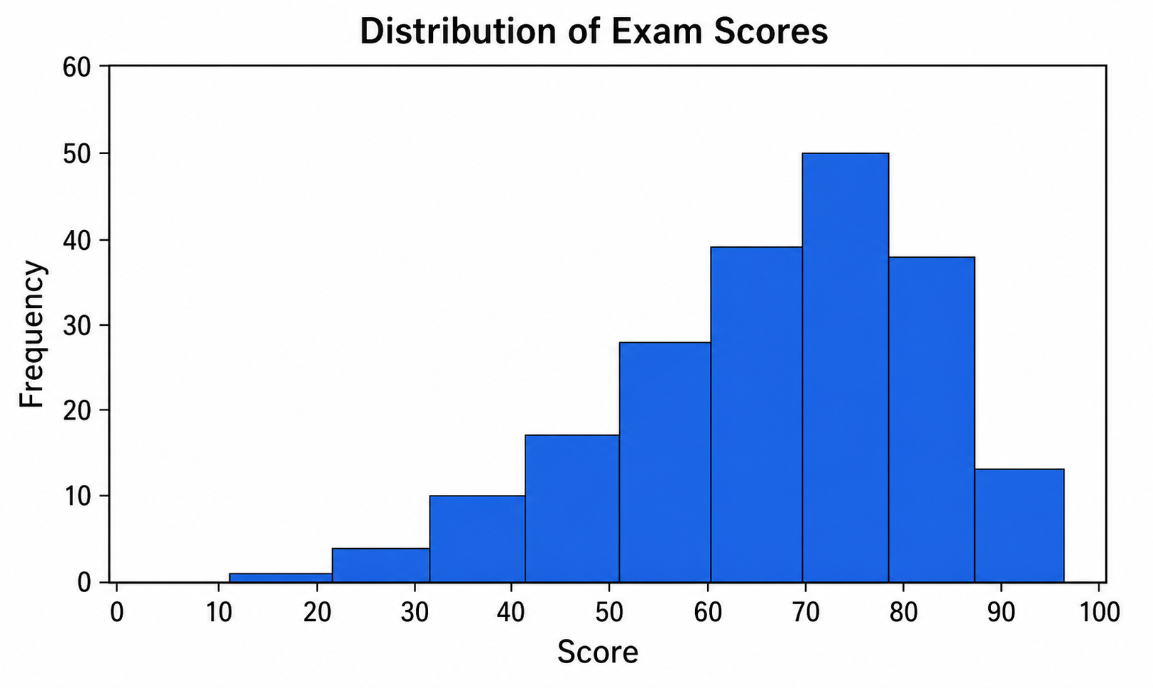
Créateur d'histogramme
Utilisez Créateur d'histogramme avec des données CSV ou Excel, puis affinez dans SciVis le graphique produit par Python.
Essayer gratuitement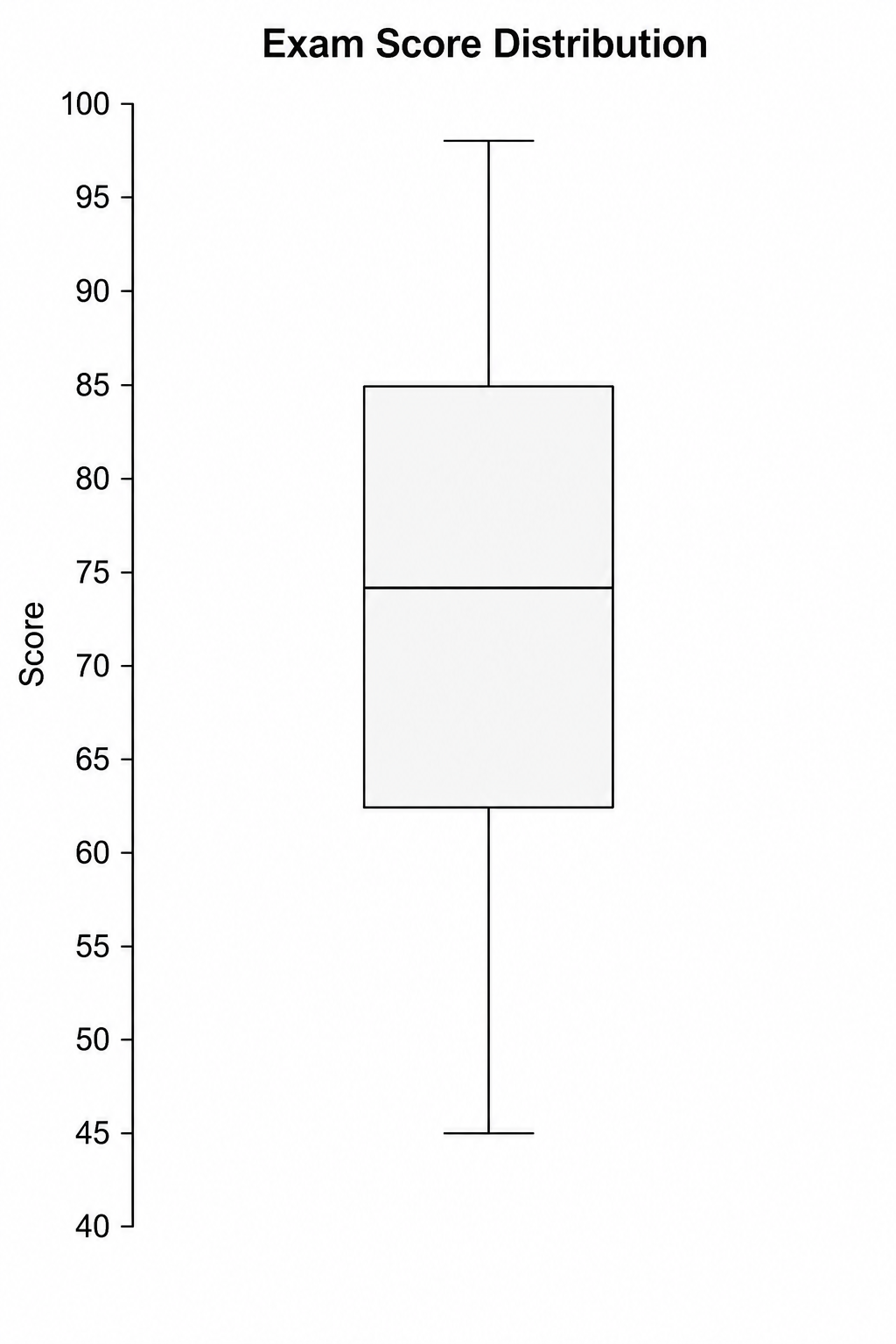
Créateur de boîte à moustaches
Utilisez Créateur de boîte à moustaches avec des données CSV ou Excel, puis affinez dans SciVis le graphique produit par Python.
Essayer gratuitement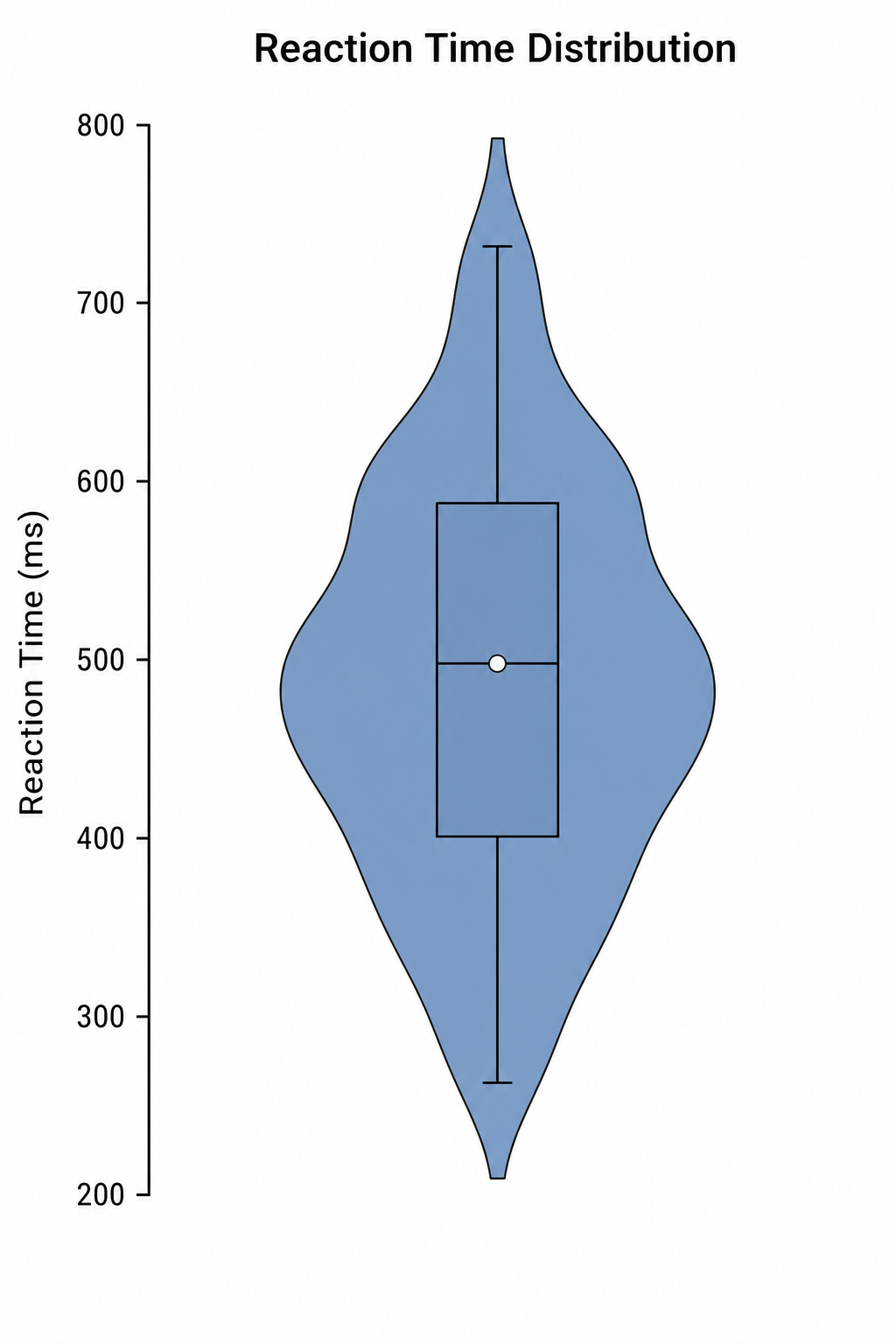
Créateur de graphique en violon
Utilisez Créateur de graphique en violon avec des données CSV ou Excel, puis affinez dans SciVis le graphique produit par Python.
Essayer gratuitementCréer une figure avec Générateur de graphiques de régression
Partez d’un exemple ou d’un fichier compatible, puis finalisez la figure dans SciVis.