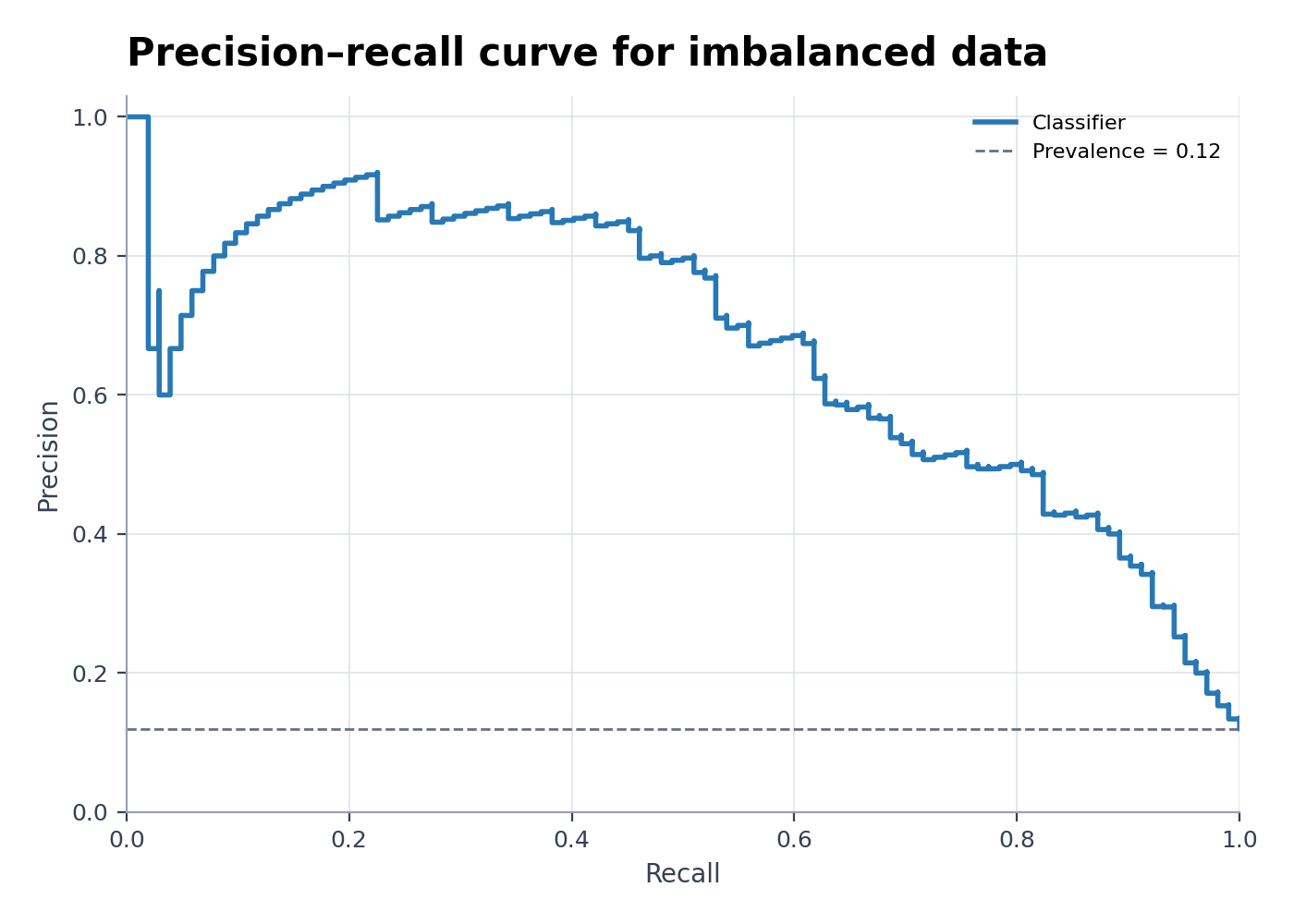
Precision-Recall Curve Generator
Create Precision-Recall Curve Generator from experimental or research data
Generate a precision-recall curve from observed labels and predicted probabilities, with prevalence baseline, thresholds, and average precision when available.
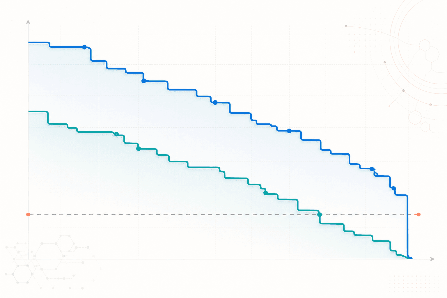
Precision-Recall Curve Generator examples
Explore six ready-to-use datasets and visual styles for real research scenarios.
What does Precision–Recall Curve Generator show?
Precision–Recall Curve Generator shows the trade-off between positive predictive value and sensitivity as a classification threshold changes. It is especially useful when positive cases are rare and false positives matter.
Data requirements for Precision–Recall Curve Generator
- Provide one observed binary label and one continuous score or predicted probability per case.
- Add an optional model, fold, cohort, or subgroup column for comparisons.
- Keep the positive-class definition consistent across all series.
- Use predictions from held-out or properly cross-validated data rather than training predictions.
Research examples for Precision–Recall Curve Generator
- Precision-Recall Curve for Imbalanced Classification
- PR AUC Curve for Disease Screening
- Multiclass Precision-Recall Curve
- ROC vs Precision-Recall Model Comparison
- Object Detection Precision-Recall Curve
- Precision-Recall Curve with Average Precision
Why use a precision–recall curve?
- Evaluate classifiers when the positive class is uncommon.
- See the cost of gaining recall in additional false-positive predictions.
- Compare models at thresholds relevant to the application.
- Report average precision or area measures alongside the full curve rather than alone.
How to use Precision-Recall Curve Generator
Choose an example or upload one CSV, TSV, TXT, XLSX, or XLS file, check the detected columns, generate the chart, and continue editing it in SciVis. For Excel files, the first worksheet is imported.
What a clear precision–recall curve should include
- Recall on the x-axis and precision on the y-axis.
- A label stating which outcome is the positive class.
- A no-skill baseline tied to positive-class prevalence.
- Separate curves and uncertainty estimates for models or validation folds when available.
Precision–recall curve or ROC curve?
Use precision–recall when positive cases are rare or false positives directly affect usefulness. ROC curves summarize sensitivity and specificity and can appear optimistic under severe class imbalance. Reporting both is often appropriate.
Precision-Recall Curve Generator FAQ
Which columns does Precision–Recall Curve Generator need?
Provide an observed binary label and a continuous prediction score. A model or cohort column is optional when comparing several curves.
Can I build a precision–recall curve from predicted class labels?
A single hard class label gives only one operating point. Use probabilities, decision scores, or results calculated across thresholds to draw a full curve.
Can I edit a figure after creating it with Precision-Recall Curve Generator?
Yes. Open the figure generated with Precision-Recall Curve Generator in SciVis to change labels, colors, annotations, layout, and other visual settings.
Can I use figures from Precision-Recall Curve Generator in a research paper?
Yes. Precision-Recall Curve Generator is designed to produce clean, publication-ready scientific figures. Always verify values and journal requirements before submission.
Can Precision-Recall Curve Generator export high-resolution figures?
Yes. After editing a Precision-Recall Curve Generator figure in SciVis, you can export it in formats suitable for papers, posters, slides, and reports.
Do I need coding experience to use Precision-Recall Curve Generator?
No. Precision-Recall Curve Generator creates the first version through a guided upload workflow, while SciVis provides visual controls for refinements.
Learn how to use Precision-Recall Curve Generator with research data
Review chart selection, required data columns, interpretation, and related scientific visualization workflows before preparing your final figure.
Explore More Tools
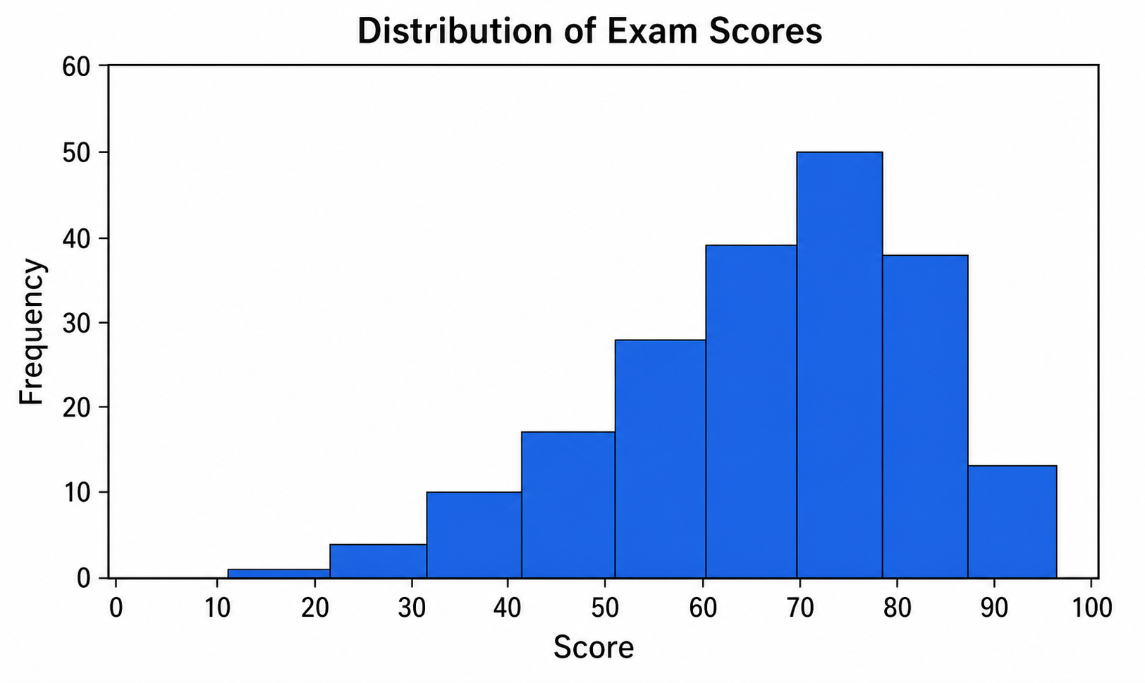
Histogram Maker
Use Histogram Maker with CSV or Excel data. Python renders the chart; refine labels, styling, and export in SciVis.
Try it free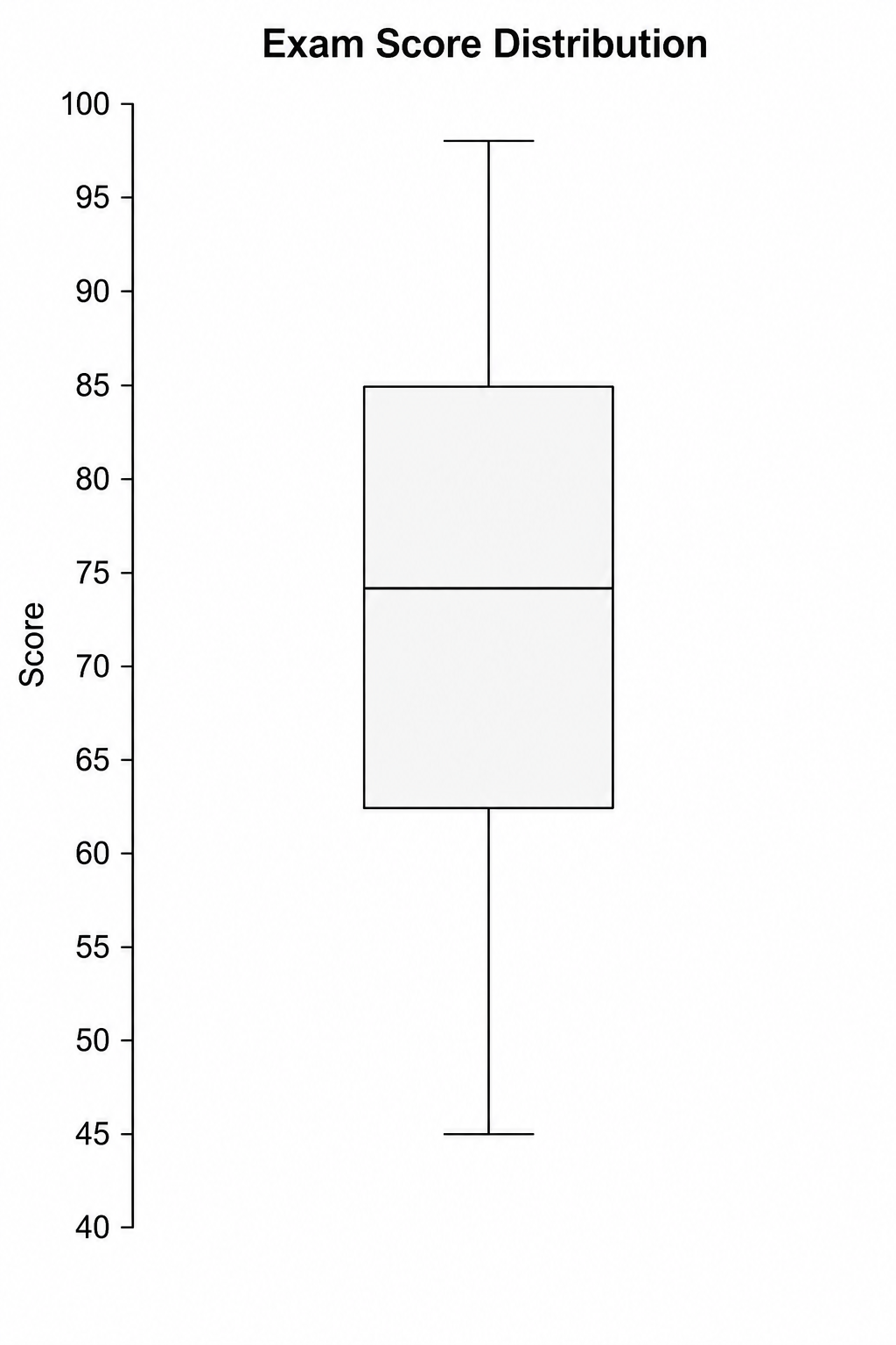
Box Plot Maker
Use Box Plot Maker with CSV or Excel data. Python renders the chart; refine labels, styling, and export in SciVis.
Try it free
Violin Plot Maker
Use Violin Plot Maker with CSV or Excel data. Python renders the chart; refine labels, styling, and export in SciVis.
Try it freeCreate a figure with Precision-Recall Curve Generator
Start with sample data or upload one supported data file, then finish the figure in SciVis.