Creatore gratuito di grafici PCA
Crea uno score plot, un biplot o uno scree plot PCA da semplice testo
Descrivi la tua analisi delle componenti principali — i gruppi, la percentuale di varianza su PC1 e PC2 e qualsiasi ellisse o vettore di loading — e l'IA disegna un grafico PCA pulito, in stile pubblicazione, pronto per report di genomica, metabolomica e machine learning.
Esempi di grafici PCA
Clicca un esempio per caricarne il prompt, oppure usalo come punto di partenza per il tuo grafico PCA.
Che cos'è un grafico PCA?
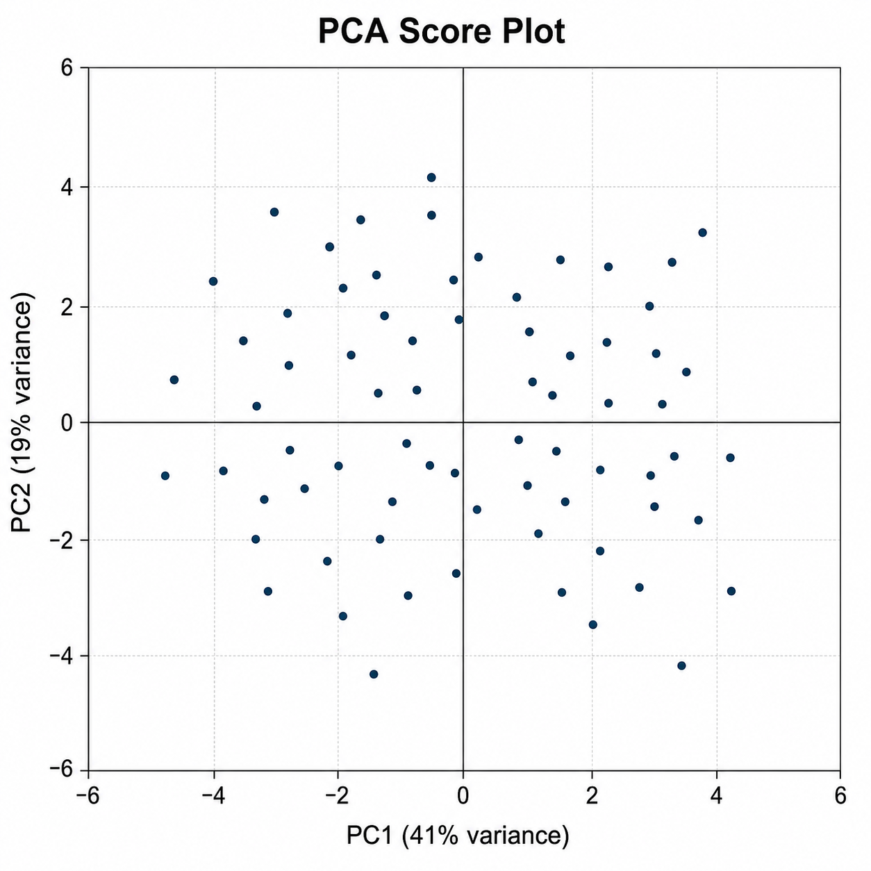
Un grafico PCA visualizza il risultato dell'analisi delle componenti principali, una tecnica che riduce molte variabili correlate in poche componenti principali non correlate. La forma più comune è lo score plot: una dispersione di campioni su PC1 rispetto a PC2, dove ogni asse è etichettato con la percentuale di varianza totale che cattura, e i punti sono colorati per gruppo per rivelare clustering, separazione o batch effect. Questo creatore di grafici PCA trasforma una descrizione testuale in una figura pulita ed etichettata — descrivi i tuoi gruppi, la varianza spiegata da ciascuna componente e qualsiasi ellisse di confidenza o vettore di loading, e l'IA produce un grafico PCA ben proporzionato con assi titolati e una legenda, senza R, Python o fogli di calcolo.
Perché usare un creatore di grafici PCA
- Ottieni uno score plot PCA pulito in pochi secondi senza scrivere codice di plotting in R o Python.
- Mostra chiaramente clustering, separazione tra gruppi e batch effect con gruppi colorati ed ellissi.
- Passa da uno score plot a un biplot, uno scree plot o un grafico dei loadings dalla stessa descrizione.
- Produci figure in stile pubblicazione per report di genomica, metabolomica e machine learning.
- Comunica i risultati della riduzione della dimensionalità a lettori che non vedono mai la matrice dei dati grezzi.
Come fare un grafico PCA
Descrivi la figura in linguaggio semplice: nomina i tuoi gruppi, indica la percentuale di varianza per PC1 e PC2 e specifica se vuoi uno score plot, un biplot, uno scree plot o un grafico dei loadings. Menziona extra come ellissi di confidenza al 95%, una legenda o frecce di loading etichettate. SciDraw AI disegna quindi un grafico PCA pulito con etichette di asse a percentuale di varianza e colori di gruppo ordinati, e puoi affinare il prompt e rigenerare finché la disposizione non appare esattamente corretta.
Cosa puoi disegnare
- Assi PC1 e PC2, ciascuno etichettato con la percentuale di varianza spiegata
- Punti dei campioni colorati per gruppo o condizione, con una legenda corrispondente
- Ellissi di confidenza al 95% che riassumono la dispersione di ciascun gruppo
- Vettori di loading disegnati come frecce etichettate per un biplot
- Uno scree plot della varianza spiegata da ciascuna componente successiva
- L'origine in (0, 0) dove le componenti sono centrate
Domande frequenti sui grafici PCA
Che cos'è un grafico PCA?
Un grafico PCA visualizza l'analisi delle componenti principali, che comprime molte variabili correlate in poche componenti principali. La forma usuale è uno score plot: una dispersione di campioni su PC1 rispetto a PC2 con ogni asse etichettato dalla percentuale di varianza che spiega e i punti colorati per gruppo. Si usa per rivelare clustering, separazione tra gruppi e batch effect in genomica, metabolomica e machine learning.
Cosa significano PC1, PC2 e la % di varianza?
PC1 (componente principale 1) è la direzione nei tuoi dati che cattura la maggior parte della varianza; PC2 è la direzione successiva, ortogonale a PC1, che cattura la maggior parte della varianza rimanente. La percentuale su ciascun asse è la quota di varianza totale che quella componente spiega, quindi un asse etichettato «PC1 (42%)» significa che quella componente rappresenta il 42% della dispersione nei dati. Percentuali più alte sulle prime due componenti significano che il grafico 2D rappresenta i dati originali in modo più fedele.
Qual è la differenza tra uno score plot, un biplot e uno scree plot?
Uno score plot mostra i campioni posizionati su PC1 rispetto a PC2 e si usa per vedere clustering e separazione tra gruppi. Un biplot aggiunge i vettori di loading delle variabili come frecce sopra lo score plot, mostrando quali variabili guidano la separazione. Uno scree plot è un grafico separato della percentuale di varianza spiegata da ciascuna componente successiva, usato per decidere quante componenti tenere. Un grafico dei loadings, a sua volta, mostra il contributo di ciascuna variabile a PC1 e PC2.
Come faccio un grafico PCA online?
Scrivi una breve descrizione della figura che vuoi, ad esempio uno score plot PCA su PC1 (42%) vs PC2 (18%) colorato per tre gruppi con ellissi di confidenza al 95%, e nomina eventuali frecce di loading o uno scree plot se ti servono. SciDraw AI disegna quindi un grafico PCA pulito ed etichettato. Puoi modificare il testo e rigenerare finché lo score plot, il biplot o lo scree plot non corrisponde a ciò che ti serve.
Il creatore di grafici PCA è gratuito?
Sì, puoi iniziare gratis. Crea un account e ricevi crediti gratuiti per generare grafici PCA subito, con piani a pagamento disponibili se hai bisogno di creare molte figure regolarmente.
È adatto per la ricerca o la pubblicazione?
Le figure sono in stile pubblicazione e ottime per slide, poster, bozze e didattica, ma sono diagrammi illustrativi generati dalla tua descrizione, non calcolati dai tuoi dati. Per una figura di risultati in un articolo, esegui l'analisi delle componenti principali effettiva sul tuo dataset (in R, Python o nel tuo pacchetto statistico) così che le posizioni dei punti, le percentuali di varianza e le ellissi riflettano valori reali, e usa questo strumento per abbozzare o spiegare la disposizione.
Scopri altri strumenti
Creatore di istogrammi
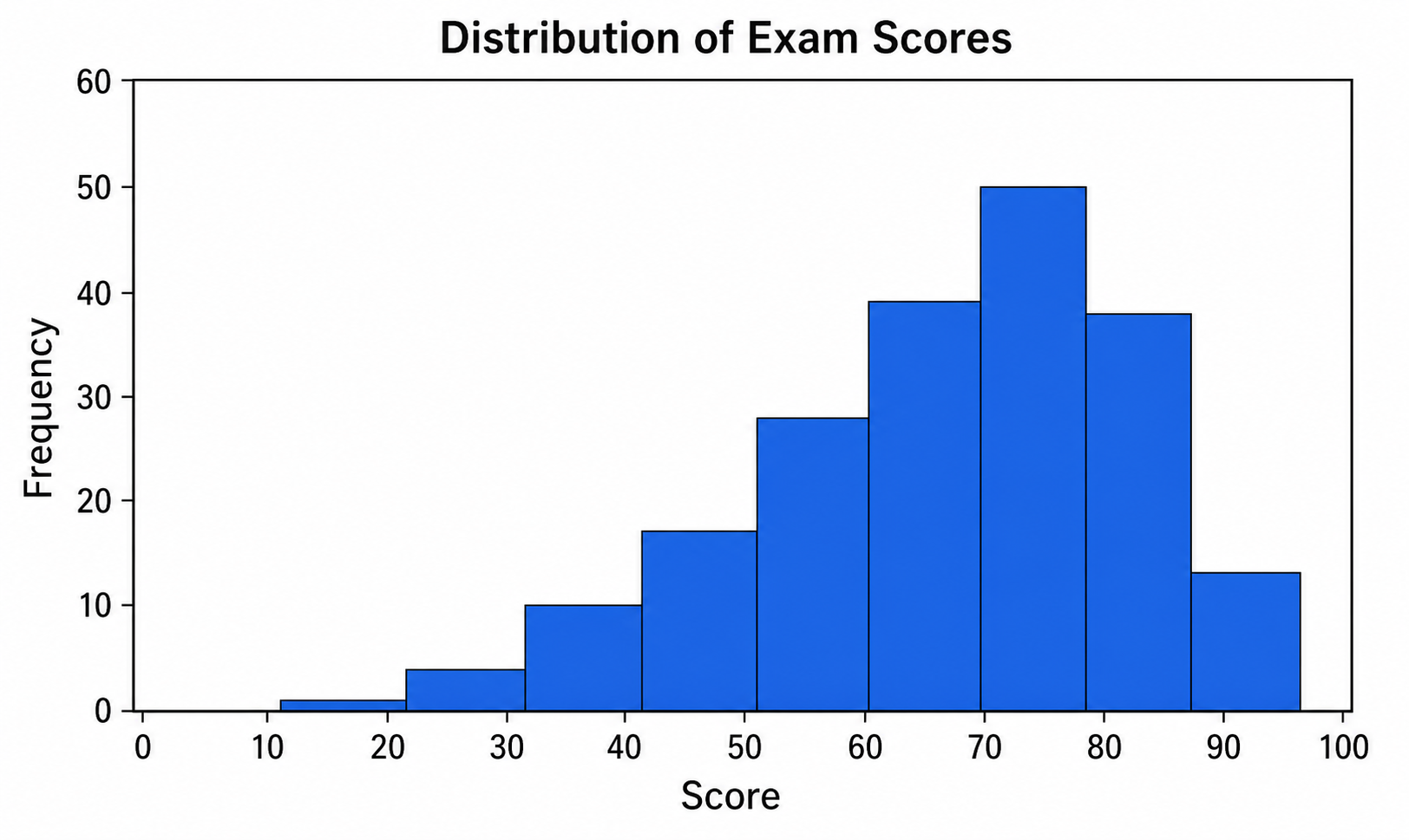
Trasforma dati e classi in un istogramma di frequenza pulito ed etichettato con una curva normale opzionale.
Provalo gratis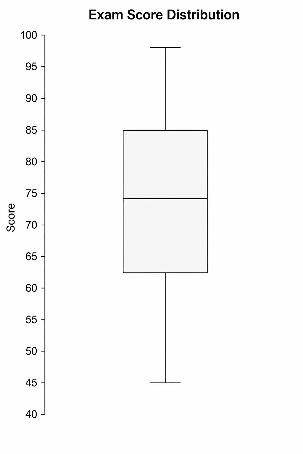
Creatore di box plot
Genera box plot a scatola e baffi puliti ed etichettati con quartili, baffi e valori anomali da una descrizione testuale.
Provalo gratis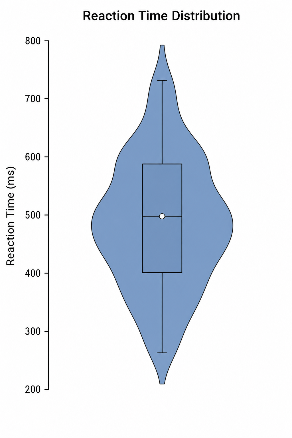
Creatore di violin plot
Crea violin plot etichettati con box plot interni e forme di densità da una descrizione testuale.
Provalo gratisDisegna ora il tuo grafico PCA
Descrivi la tua analisi delle componenti principali — gruppi, assi a percentuale di varianza, ellissi o vettori di loading — e ottieni un grafico PCA pulito in pochi secondi. Inizia gratis con SciDraw AI.