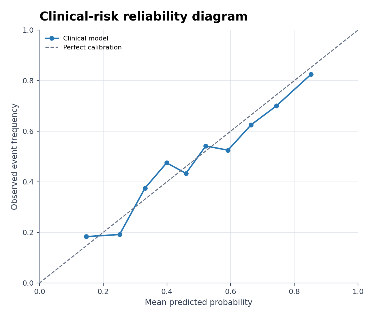
Generatore di grafici di calibrazione
Crea Generatore di grafici di calibrazione da dati sperimentali o di ricerca
Crea un grafico di calibrazione del modello o diagramma di affidabilità da risultati osservati e probabilità previste.
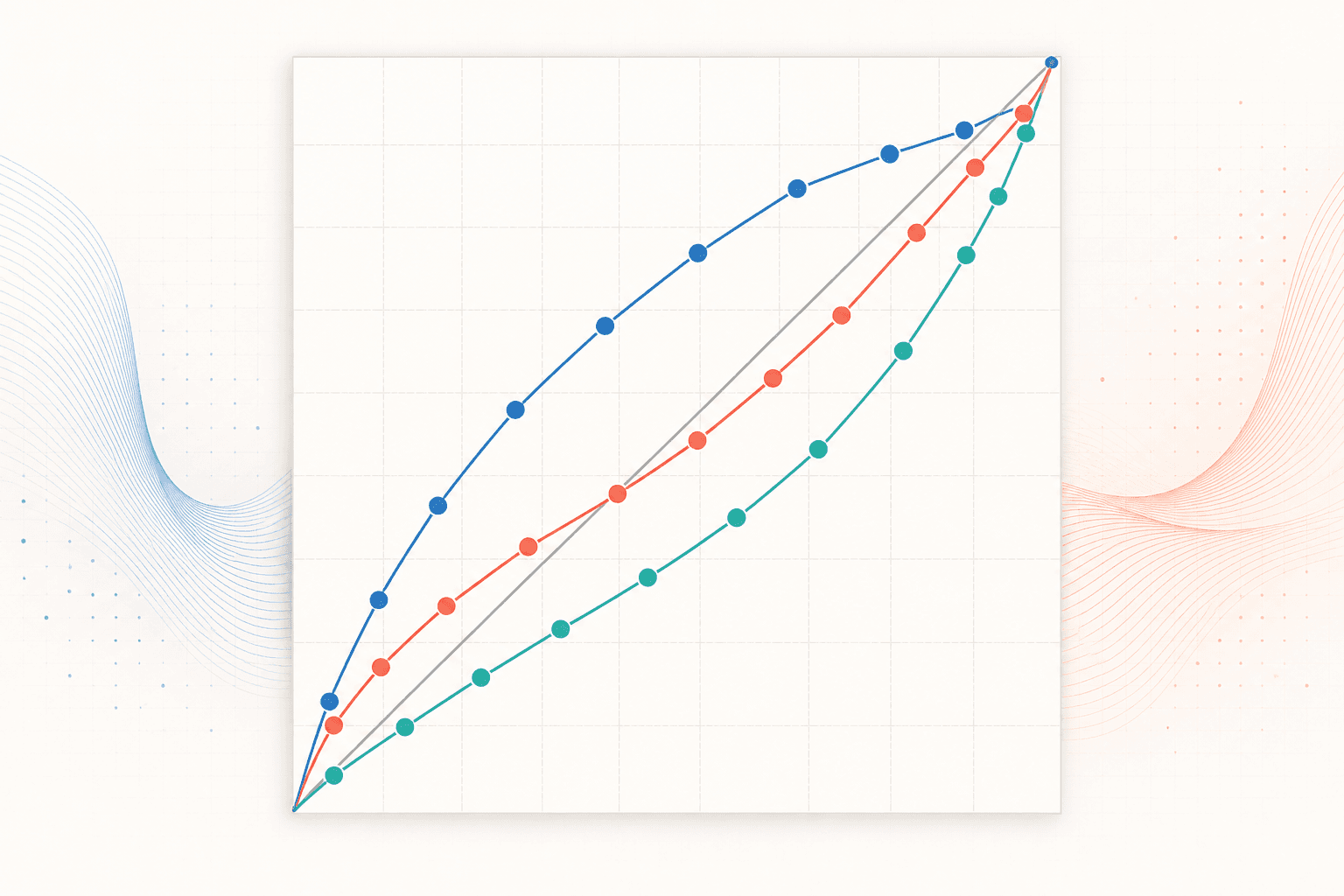
Esempi di Generatore di grafici di calibrazione
Sei set di dati pronti all’uso e stili basati su reali scenari di ricerca.
Cosa mostra il Model Calibration Plot Generator?
Il Model Calibration Plot Generator (grafico di calibrazione) confronta le probabilità predette da un modello con i tassi di eventi effettivamente osservati. Un modello ben calibrato segue la linea di identità (diagonale a 45°); scostamenti sistematici rivelano sovrastima o sottostima, anche in presenza di ottime metriche di discriminazione.
Requisiti dei dati per il Model Calibration Plot Generator
- Fornisci una probabilità predetta (compresa tra 0 e 1) e un esito binario osservato per ciascun caso.
- Aggiungi una colonna opzionale per modello, coorte, fold o sottogruppo per effettuare confronti.
- Utilizza un set di test o validazione indipendente, separato dai dati di addestramento.
- Se carichi dati già suddivisi in bin, includi la probabilità predetta media, la proporzione osservata e la numerosità campionaria del bin.
Esempi di applicazione nella ricerca per il Model Calibration Plot Generator
- Diagramma di affidabilità del rischio clinico
- Calibrazione di un classificatore binario
- Curva con punteggio di Brier
- Calibrazione di un modello ML
- Confronto della calibrazione dei modelli
- Calibrazione della probabilità di guasto
Perché esaminare la calibrazione di un modello?
- Verifica se un rischio stimato del 20% corrisponda effettivamente a circa 20 eventi su 100 casi comparabili.
- Rileva modelli che ordinano correttamente i casi ma forniscono probabilità assolute inaffidabili.
- Confronta coorti di validazione interna, temporale ed esterna.
- Comunica l'incertezza e le regioni a bassa densità di probabilità prima dell'uso clinico o operativo.
Come usare Generatore di grafici di calibrazione
Scegli un esempio o carica un file CSV, TSV, TXT, XLSX o XLS. Controlla le colonne rilevate, genera il grafico e modificalo in SciVis. Per Excel viene importato il primo foglio.
Elementi essenziali di un grafico di calibrazione efficace
- Probabilità predetta sull'asse x e frequenza osservata sull'asse y.
- La linea di riferimento a 45 gradi per la calibrazione ideale.
- Conteggi dei bin, un rug plot o un altro indicatore della densità delle probabilità.
- Intervalli di confidenza o dettagli di smoothing (lisciamento) quando statisticamente giustificati.
Grafico di calibrazione o curva ROC?
Un grafico di calibrazione valuta se i valori di probabilità espressi dal modello sono numericamente affidabili. Una curva ROC valuta la capacità di ordinamento (ranking) del modello rispetto a diverse soglie. Un modello può presentare un AUC elevato pur essendo mal calibrato: i due grafici rispondono a quesiti scientifici differenti.
Domande frequenti su Generatore di grafici di calibrazione
Quali colonne sono necessarie per il Model Calibration Plot Generator?
Usa le colonne predicted_probability e observed_outcome per i dati a livello di riga. Per dati aggregati, fornisci la probabilità predetta media, il tasso di eventi osservati e il numero di osservazioni per ciascun bin.
Il grafico di calibrazione ricalibra il mio modello?
No. Il tool si limita a visualizzare le predizioni e gli esiti forniti. Qualsiasi metodo di ricalibrazione deve essere stimato e validato separatamente; potrai poi tracciare le nuove probabilità aggiornate come un ulteriore modello o coorte.
Posso modificare una figura dopo averla creata con Generatore di grafici di calibrazione?
Sì. Apri in SciVis la figura generata con Generatore di grafici di calibrazione per cambiare etichette, colori, annotazioni, impaginazione e altre impostazioni visive.
Posso usare le figure di Generatore di grafici di calibrazione in un articolo?
Sì. Generatore di grafici di calibrazione è pensato per figure scientifiche chiare e adatte alla pubblicazione. Prima dell’invio verifica sempre valori e norme della rivista.
Generatore di grafici di calibrazione consente l’esportazione ad alta risoluzione?
Sì. Dopo aver modificato una figura Generatore di grafici di calibrazione in SciVis puoi esportarla per articoli, poster, diapositive e relazioni.
Serve saper programmare per usare Generatore di grafici di calibrazione?
No. Il caricamento guidato di Generatore di grafici di calibrazione crea la prima versione e i controlli visivi di SciVis permettono di rifinirla.
Come usare Generatore di grafici di calibrazione con i dati della tua ricerca
Verifica la selezione del grafico, le colonne di dati richieste, l'interpretazione e i flussi di lavoro di visualizzazione scientifica prima di generare la figura finale per la pubblicazione.
Scopri altri strumenti
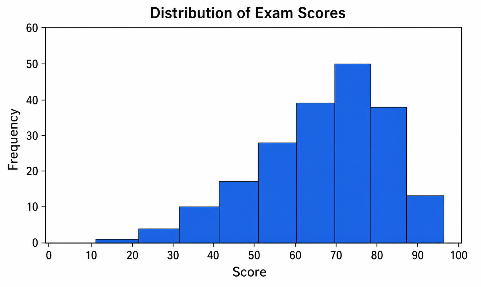
Creatore di istogrammi
Usa Creatore di istogrammi con dati CSV o Excel e rifinisci in SciVis il grafico generato da Python.
Provalo gratis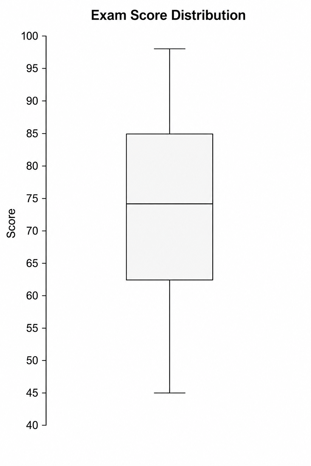
Creatore di box plot
Usa Creatore di box plot con dati CSV o Excel e rifinisci in SciVis il grafico generato da Python.
Provalo gratis
Creatore di violin plot
Usa Creatore di violin plot con dati CSV o Excel e rifinisci in SciVis il grafico generato da Python.
Provalo gratisCrea una figura con Generatore di grafici di calibrazione
Parti da dati di esempio o da un file compatibile e completa la figura in SciVis.