误差棒图生成器
用实验或科研数据生成 误差棒图生成器
使用误差棒图生成器处理 CSV 或 Excel 数据,适用于细胞活力均值与标准差、细胞因子时间过程均值与标准误等场景。Python 生成首版图表,可在 SciVis 中继续调整标注、样式与导出。
创建科研图表
将数据文件拖拽到此处,或点击上传
CSV, TSV, TXT, Excel · 最大 5MB
预览
 示例
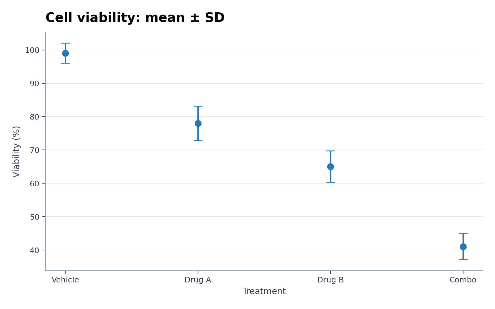
示例当前预览使用所选示例数据。可用 Python 重新生成,或上传自己的数据创建新图表。
误差棒图生成器示例与可下载数据
打开示例可查看图表、下载对应 CSV,或把同一份数据载入上方生成器。
误差棒图生成器适合展示什么?
误差棒图生成器把结构化科研数据转换为该图表最适合表达的统计关系,可用于细胞活力均值与标准差、细胞因子时间过程均值与标准误及相近分析。Python 负责生成可复现的首版图表,SciVis 用于后续视觉调整。
误差棒图生成器需要怎样的数据?
- 示例字段:category, group, mean, error_lower, error_upper。
- 每行保留一个观测、类别、时间点或有效配对。
- 测量值使用纯数字,单位写在列名中。
- 空白单元格按缺失值处理,上传前删除汇总行和备注。
误差棒图生成器的科研应用示例
- 细胞活力均值与标准差
- 细胞因子时间过程均值与标准误
- 效应量与 95% 置信区间
- 非对称环境不确定性
- 临床评分重复测量
- 实验室间检测精密度
为什么用误差棒图生成器处理科研数据?
- 先用页面附带的细胞活力均值与标准差示例核对字段映射,再替换为自己的数值。
- 把细胞因子时间过程均值与标准误的视觉结构复用于同类数据,保持图表表达一致。
- 调用 Python 绘图流程,无需自行编写和调试绘图代码。
- 保持生成数值不变,在 SciVis 中继续调整标签、配色与导出。
如何使用 误差棒图生成器
选择示例,或上传一个 CSV、TSV、TXT、XLSX、XLS 文件;检查识别到的列,生成图表,再进入 SciVis 继续编辑。Excel 仅读取第一个工作表。
清晰的误差棒图生成器应包含什么?
- 根据 category, group, mean, error_lower, error_upper 一致映射坐标轴、分组或节点。
- 标题明确说明误差棒图生成器展示的指标或比较。
- 按统计方法需要提供清晰的标签、单位、图例和参考线。
- 使用克制的配色,并保留论文、海报或幻灯片所需分辨率。
误差棒图生成器还是森林图生成器?
当数据列和研究问题符合该图的统计结构时使用误差棒图生成器;当重点是另一种比较关系时选择森林图生成器。分开使用两类图表,可避免把数据套入不恰当的视觉编码。
误差棒图生成器 常见问题
误差棒图生成器需要哪些数据列?
页面附带的 CSV 展示了推荐结构,代表性字段为 category, group, mean, error_lower, error_upper;只要字段含义一致,也可以使用其他列名。
什么时候该用误差棒图生成器而不是森林图生成器?
需要表达误差棒图生成器专门编码的统计关系时选择它;若另一种比较更符合研究问题,则选择森林图生成器。
用 误差棒图生成器 生成后还能继续编辑吗?
可以。用 误差棒图生成器 生成后打开 SciVis,即可修改标签、配色、标注、版式和其他视觉设置。
误差棒图生成器 生成的图可以用于论文吗?
可以。误差棒图生成器 面向清晰、适合发表的科学图表;投稿前仍应核对数据和目标期刊要求。
误差棒图生成器 可以导出高分辨率图吗?
可以。误差棒图生成器 图在 SciVis 中编辑完成后,可按论文、海报、幻灯片和报告的用途导出。
使用 误差棒图生成器 需要会编程吗?
不需要。误差棒图生成器 通过引导式上传流程生成初稿,后续用 SciVis 的可视化控件完成细化。