Gerador de gráficos de séries temporais
Crie Gerador de gráficos de séries temporais com dados experimentais ou de pesquisa
Crie Dados climáticos sazonais com Gerador de gráficos de séries temporais usando CSV ou Excel. Inclui renderização em Python, edição no SciVis e exportação.
Criar gráfico científico
Arraste um arquivo de dados aqui ou clique para fazer upload
CSV, TSV, TXT, Excel · Máx. 5MB
Pré-visualização
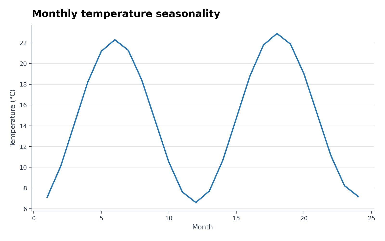 Exemplo
A prévia usa o conjunto de exemplo selecionado. Gere-a com Python ou envie seus próprios dados para criar outro gráfico.
Exemplos de Gerador de gráficos de séries temporais com dados para baixar
Abra um exemplo para conferir o gráfico, baixar o CSV correspondente ou carregar os mesmos dados no gerador acima.
O que Gerador de gráficos de séries temporais mostra?
Gerador de gráficos de séries temporais transforma dados de pesquisa estruturados na relação estatística própria desse gráfico. É útil para Dados climáticos sazonais, Casos epidêmicos e média móvel e análises semelhantes; Python cria uma primeira versão reproduzível e o SciVis cuida do acabamento visual.
Dados necessários para Gerador de gráficos de séries temporais
- Campos representativos: time, series, value, lower, upper.
- Cada linha deve conter uma observação, categoria, tempo ou par válido.
- Mantenha as medidas como números e informe as unidades no nome da coluna.
- Células vazias são tratadas como ausentes; remova totais e notas antes do envio.
Exemplos de pesquisa para Gerador de gráficos de séries temporais
- Dados climáticos sazonais
- Casos epidêmicos e média móvel
- Sinal contínuo de sensor
- Expressão gênica ao longo do tempo
- Acompanhamento do recrutamento clínico
- Previsão com intervalo preditivo
Por que usar Gerador de gráficos de séries temporais com dados de pesquisa?
- Confira primeiro o mapeamento dos campos com o exemplo incluído de Dados climáticos sazonais.
- Aplique a estrutura visual de Casos epidêmicos e média móvel a um conjunto de dados comparável.
- Use a renderização em Python sem precisar escrever ou depurar o código do gráfico.
- Mantenha os valores gerados e refine rótulos, cores e exportação no SciVis.
Como usar Gerador de gráficos de séries temporais
Escolha um exemplo ou envie um arquivo CSV, TSV, TXT, XLSX ou XLS. Confira as colunas detectadas, gere o gráfico e edite no SciVis. No Excel, a primeira planilha é importada.
O que um Gerador de gráficos de séries temporais claro deve incluir
- Eixos, grupos ou nós são mapeados de forma consistente a partir de time, series, value, lower, upper.
- O título informa o resultado ou a comparação apresentada por Gerador de gráficos de séries temporais.
- Rótulos, unidades, legendas e linhas de referência necessárias ficam legíveis.
- Uma paleta sóbria e resolução adequada funcionam em artigos, pôsteres e slides.
Gerador de gráficos de séries temporais ou Criador de gráficos de linhas?
Escolha Gerador de gráficos de séries temporais quando as colunas e a pergunta seguirem sua estrutura estatística. Se a comparação alternativa for o foco, use Criador de gráficos de linhas para evitar uma codificação visual enganosa.
Perguntas frequentes sobre Gerador de gráficos de séries temporais
Quais colunas Gerador de gráficos de séries temporais exige?
O CSV incluído mostra a estrutura recomendada. Os campos representativos são time, series, value, lower, upper; nomes equivalentes também funcionam quando cumprem o mesmo papel.
Quando usar Gerador de gráficos de séries temporais em vez de Criador de gráficos de linhas?
Use Gerador de gráficos de séries temporais para a relação estatística que esse gráfico foi feito para representar. Escolha Criador de gráficos de linhas se a comparação alternativa responder melhor à pergunta.
Posso editar uma figura depois de criá-la com Gerador de gráficos de séries temporais?
Sim. Abra no SciVis a figura gerada com Gerador de gráficos de séries temporais para alterar rótulos, cores, anotações, layout e outros ajustes visuais.
Posso usar figuras de Gerador de gráficos de séries temporais em um artigo?
Sim. Gerador de gráficos de séries temporais foi pensado para figuras científicas claras e adequadas à publicação. Antes do envio, confira os valores e as regras da revista.
Gerador de gráficos de séries temporais permite exportação em alta resolução?
Sim. Depois de editar uma figura Gerador de gráficos de séries temporais no SciVis, exporte-a para artigos, pôsteres, slides e relatórios.
Preciso saber programar para usar Gerador de gráficos de séries temporais?
Não. O envio guiado de Gerador de gráficos de séries temporais cria a primeira versão e os controles visuais do SciVis permitem fazer o acabamento.
Aprenda a plotar seus dados de pesquisa com o Gerador de gráficos de séries temporais
Confira critérios de seleção de gráficos, colunas de dados obrigatórias, interpretação científica e fluxos de trabalho de visualização antes de gerar a figura final para submissão.
Explore mais ferramentas
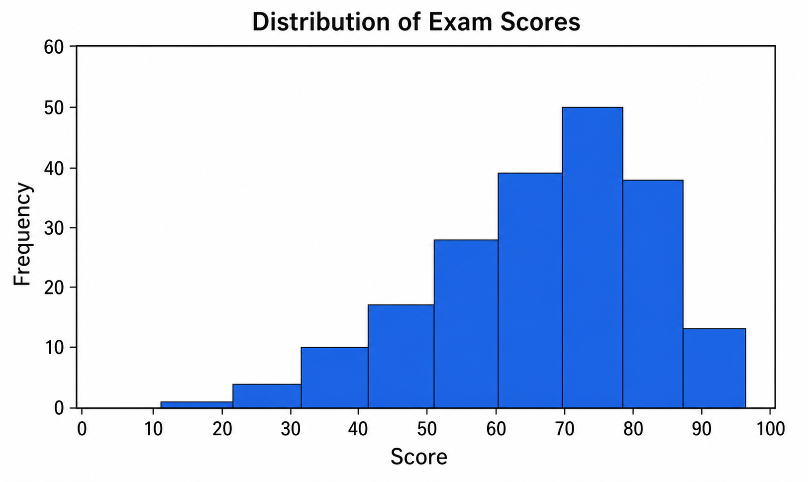
Criador de Histograma
Use Criador de Histograma com dados CSV ou Excel e refine no SciVis o gráfico gerado por Python.
Experimente grátis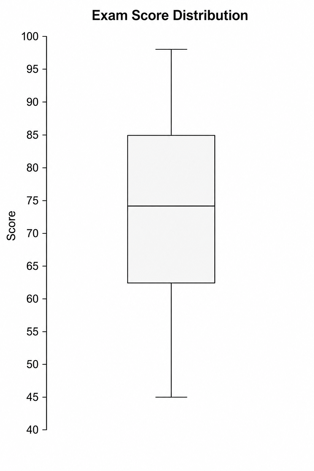
Criador de Boxplot
Use Criador de Boxplot com dados CSV ou Excel e refine no SciVis o gráfico gerado por Python.
Experimente grátis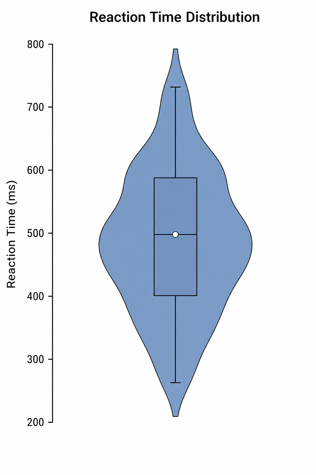
Criador de Gráfico de Violino
Use Criador de Gráfico de Violino com dados CSV ou Excel e refine no SciVis o gráfico gerado por Python.
Experimente grátisCrie uma figura com Gerador de gráficos de séries temporais
Comece com dados de exemplo ou um arquivo compatível e finalize a figura no SciVis.