折れ線グラフ作成ツール
実験・研究データから 折れ線グラフ作成ツール を作成
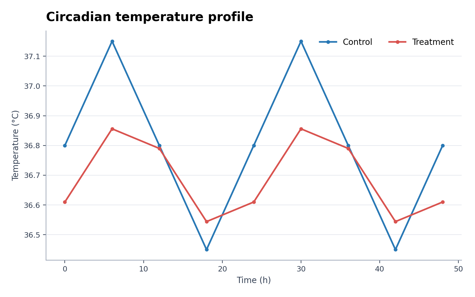
折れ線グラフ作成ツールでCSVまたはExcelデータを可視化。概日温度の時系列や複数濃度の酵素反応速度に使えます。Pythonで初稿を描画し、SciVisで注釈・体裁・書き出しを調整できます。
科学グラフを作成
ここにデータファイルをドラッグするか、クリックしてアップロードしてください
CSV, TSV, TXT, Excel · 最大 5MB
プレビュー
 サンプル
サンプル現在のプレビューは選択したサンプルデータを使用しています。Pythonで再作成するか、独自データをアップロードしてください。
折れ線グラフ作成ツールの作例とダウンロード用データ
作例を開くとグラフを確認し、対応するCSVをダウンロードするか、上の作成ツールへ同じデータを読み込めます。
折れ線グラフ作成ツールで何を可視化できますか?
折れ線グラフ作成ツールは、構造化された研究データをこの図に適した統計的表現へ変換します。概日温度の時系列、複数濃度の酵素反応速度などに利用でき、Pythonで再現可能な初稿を作成した後、SciVisで見た目を整えられます。
折れ線グラフ作成ツールに必要なデータ
- 代表的な列:follow_up_days, series, value。
- 1行に1観測、1カテゴリ、1時点、または有効な1組を記録します。
- 測定値は数値にし、単位は列名へ含めます。
- 空欄は欠損値として扱われるため、集計行や注記は読み込み前に削除します。
折れ線グラフ作成ツールの研究データ例
- 概日温度の時系列
- 複数濃度の酵素反応速度
- 学習・検証曲線
- 吸光スペクトル
- バイオマーカーの縦断コホート
- 臨床イベント累積発生率
研究データに折れ線グラフ作成ツールを使う理由
- 付属の概日温度の時系列で列の割り当てを確認してから、自分の値へ置き換えられます。
- 複数濃度の酵素反応速度と同じ視覚構造を類似データへ適用し、図の表現をそろえられます。
- 作図コードを書いたりデバッグしたりせずに、Pythonの描画処理を利用できます。
- 生成値を保ったまま、SciVisでラベル、色、書き出しを調整できます。
折れ線グラフ作成ツール の使い方
例を選ぶか、CSV、TSV、TXT、XLSX、XLS のいずれか1ファイルをアップロードします。検出された列を確認して図を生成し、SciVis で編集します。Excel は先頭シートを使用します。
読みやすい折れ線グラフ作成ツールの要点
- follow_up_days, series, valueから軸、群、ノードを一貫して割り当てます。
- 折れ線グラフ作成ツールが示す指標や比較をタイトルで明確にします。
- 手法に応じて、ラベル、単位、凡例、基準線を読みやすく示します。
- 論文・ポスター・スライドに適した抑制のある配色と解像度を使います。
折れ線グラフ作成ツールと時系列プロット作成ツールの使い分け
データ列と研究課題がこの図の統計構造に合う場合は折れ線グラフ作成ツールを選びます。別の比較が中心なら時系列プロット作成ツールを使い、誤解を招く表現を避けます。
折れ線グラフ作成ツール よくある質問
折れ線グラフ作成ツールにはどの列が必要ですか?
付属CSVが推奨構造を示しています。代表的な列はfollow_up_days, series, valueで、同じ役割なら別の列名も使用できます。
折れ線グラフ作成ツールを時系列プロット作成ツールより優先するのはいつですか?
折れ線グラフ作成ツールが対象とする統計関係を示す場合に選びます。別の比較が研究課題に合う場合は時系列プロット作成ツールを使います。
折れ線グラフ作成ツール で作成した後も編集できますか?
はい。折れ線グラフ作成ツール で生成した図を SciVis で開き、ラベル、色、注釈、レイアウトなどを変更できます。
折れ線グラフ作成ツール の図を論文に使えますか?
はい。折れ線グラフ作成ツール は読みやすく投稿に使いやすい科学図を想定しています。提出前に数値と投稿先の要件を必ず確認してください。
折れ線グラフ作成ツール は高解像度で出力できますか?
はい。折れ線グラフ作成ツール の図を SciVis で編集後、論文、ポスター、スライド、報告書に合わせて出力できます。
折れ線グラフ作成ツール にプログラミングは必要ですか?
不要です。折れ線グラフ作成ツール の案内に沿ってデータをアップロードして初稿を作成し、SciVis の画面操作で仕上げます。
研究データを用いた 折れ線グラフ作成ツール の作成・活用方法
論文投稿や学会発表のフィギュアを作成する前に、適切なチャートの選択基準、必要なデータ列の構成、解釈方法、および関連する学術データ可視化ワークフローを確認できます。