Confusion Matrix Generator
Create Confusion Matrix Generator from experimental or research data
Generate binary or multiclass confusion matrices from actual and predicted labels, with readable counts, normalized percentages, and publication-ready export.
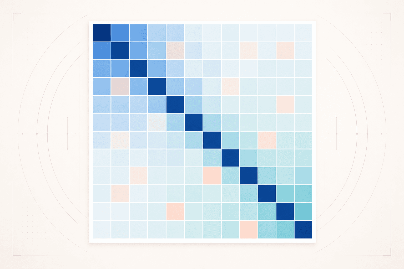
Confusion Matrix Generator examples
Explore six ready-to-use datasets and visual styles for real research scenarios.
What does Confusion Matrix Generator show?
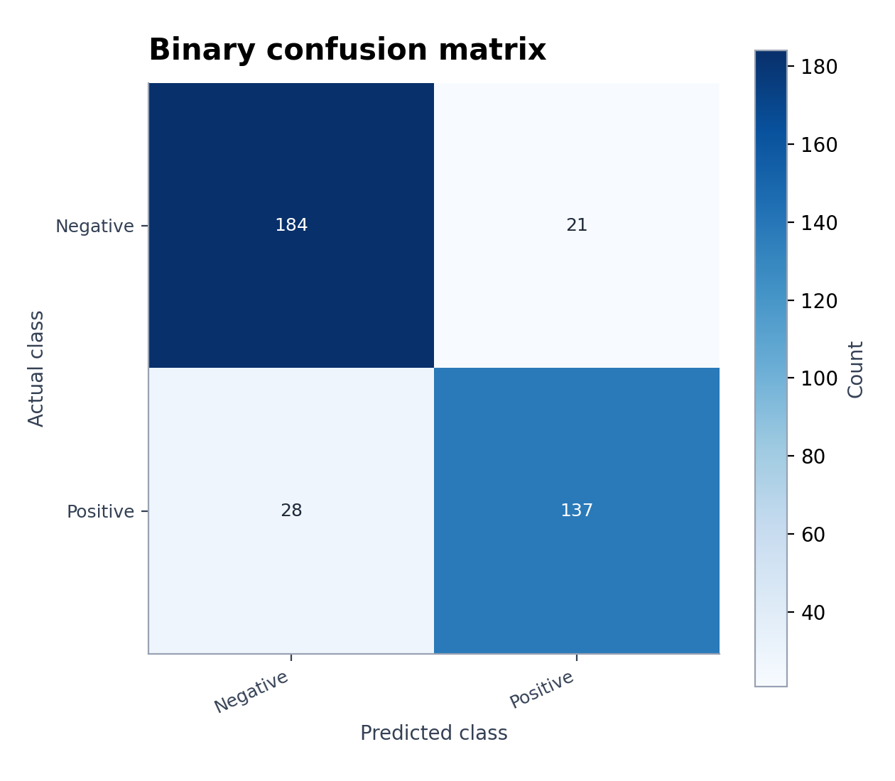
Confusion Matrix Generator compares actual and predicted classes so model errors remain visible instead of being reduced to one accuracy score. The diagonal contains correct predictions; off-diagonal cells show which classes the model confuses.
Data requirements for Confusion Matrix Generator
- Upload row-level actual and predicted labels, or a square table of class-by-class counts.
- Use the same class names and ordering for rows and columns.
- Include sample weights only when the evaluation protocol requires them.
- State whether cells show raw counts, row percentages, column percentages, or proportions of all observations.
Research examples for Confusion Matrix Generator
- Binary Confusion Matrix Example
- Multiclass Confusion Matrix
- Normalized Confusion Matrix
- Confusion Matrix Heatmap
- Machine-Learning Confusion Matrix
- Confusion Matrix with Precision and Recall
Why use a confusion matrix for model evaluation?
- Identify which classes drive false positives and false negatives.
- Detect high overall accuracy that hides poor minority-class performance.
- Compare raw counts with normalized class-level rates.
- Create a reproducible model-evaluation figure from exported predictions.
How to use Confusion Matrix Generator
Choose an example or upload one CSV, TSV, TXT, XLSX, or XLS file, check the detected columns, generate the chart, and continue editing it in SciVis. For Excel files, the first worksheet is imported.
What a clear confusion matrix should include
- Explicit Actual and Predicted axis labels.
- Class names in a consistent order.
- Cell values plus a readable sequential color scale.
- A caption stating the test set, normalization method, and sample count.
Confusion matrix or ROC curve?
Use a confusion matrix to inspect class-specific outcomes at a chosen decision rule. Use an ROC or precision–recall curve to evaluate performance across thresholds. For imbalanced data, a precision–recall curve is often more informative than ROC alone.
Confusion Matrix Generator FAQ
Which columns does Confusion Matrix Generator need?
The simplest input has one actual-label column and one predicted-label column. You may also provide an already aggregated square matrix of counts.
Should I normalize a confusion matrix?
Use raw counts to show sample volume and row-normalized percentages to compare recall across classes. State the normalization direction and denominator clearly.
Can I edit a figure after creating it with Confusion Matrix Generator?
Yes. Open the figure generated with Confusion Matrix Generator in SciVis to change labels, colors, annotations, layout, and other visual settings.
Can I use figures from Confusion Matrix Generator in a research paper?
Yes. Confusion Matrix Generator is designed to produce clean, publication-ready scientific figures. Always verify values and journal requirements before submission.
Can Confusion Matrix Generator export high-resolution figures?
Yes. After editing a Confusion Matrix Generator figure in SciVis, you can export it in formats suitable for papers, posters, slides, and reports.
Do I need coding experience to use Confusion Matrix Generator?
No. Confusion Matrix Generator creates the first version through a guided upload workflow, while SciVis provides visual controls for refinements.
Learn how to use Confusion Matrix Generator with research data
Review chart selection, required data columns, interpretation, and related scientific visualization workflows before preparing your final figure.
Explore More Tools
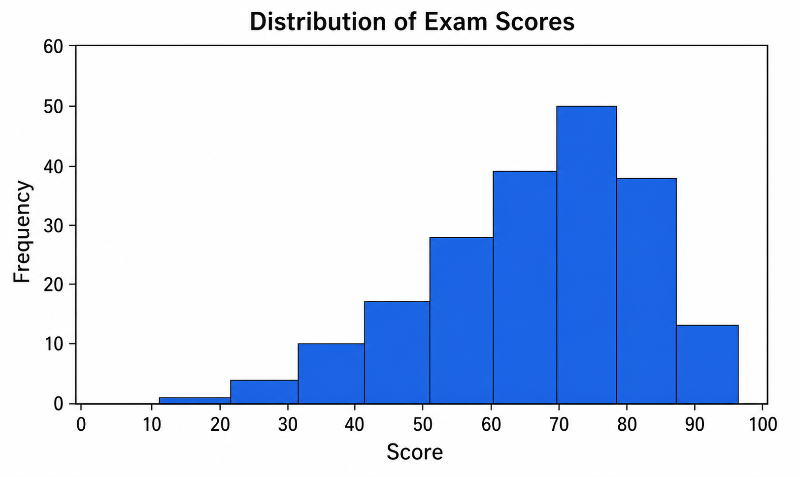
Histogram Maker
Use Histogram Maker with CSV or Excel data. Python renders the chart; refine labels, styling, and export in SciVis.
Try it free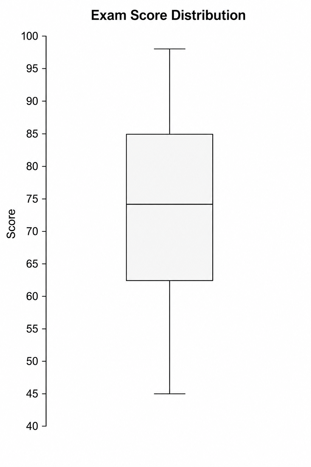
Box Plot Maker
Use Box Plot Maker with CSV or Excel data. Python renders the chart; refine labels, styling, and export in SciVis.
Try it free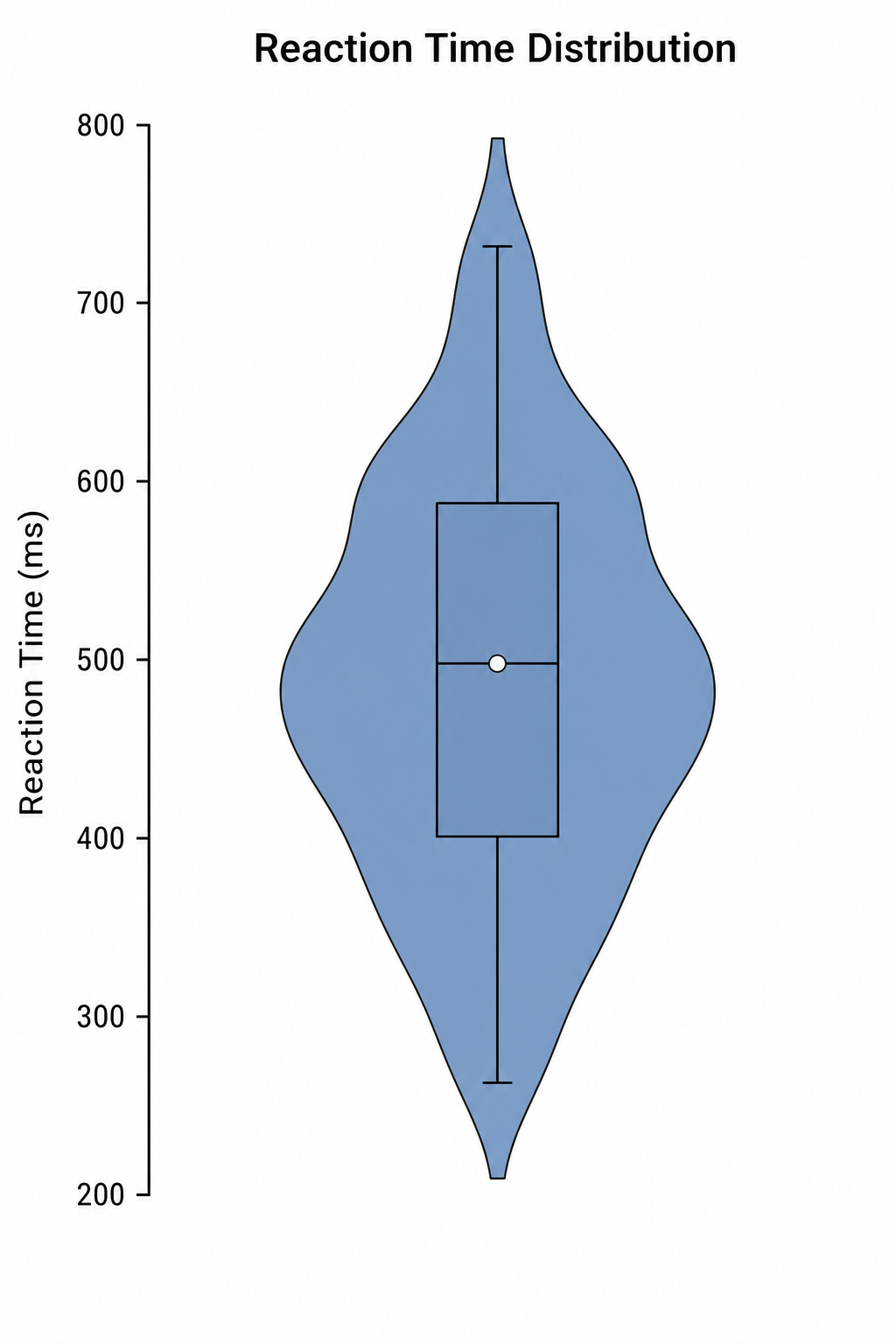
Violin Plot Maker
Use Violin Plot Maker with CSV or Excel data. Python renders the chart; refine labels, styling, and export in SciVis.
Try it freeCreate a figure with Confusion Matrix Generator
Start with sample data or upload one supported data file, then finish the figure in SciVis.