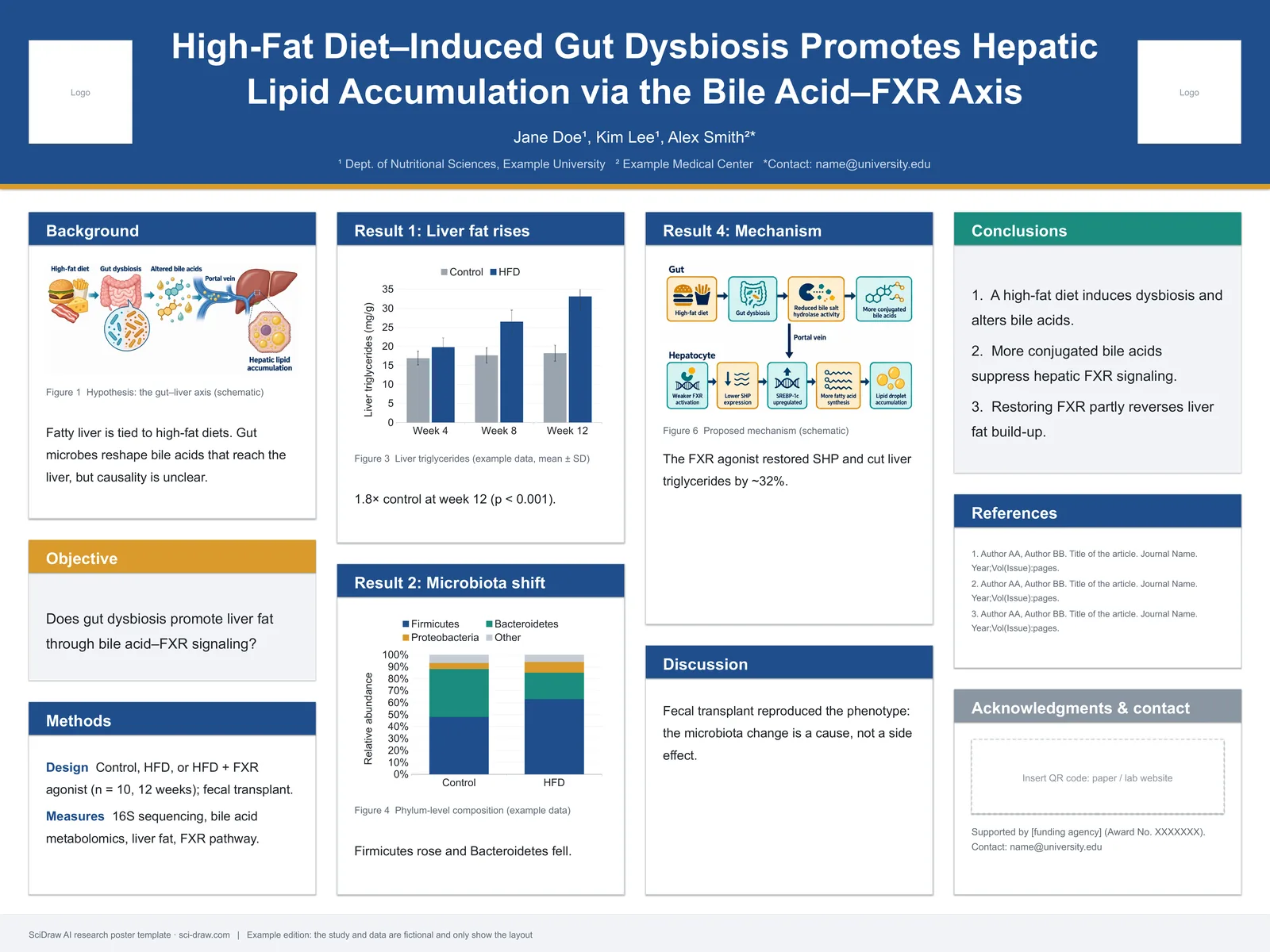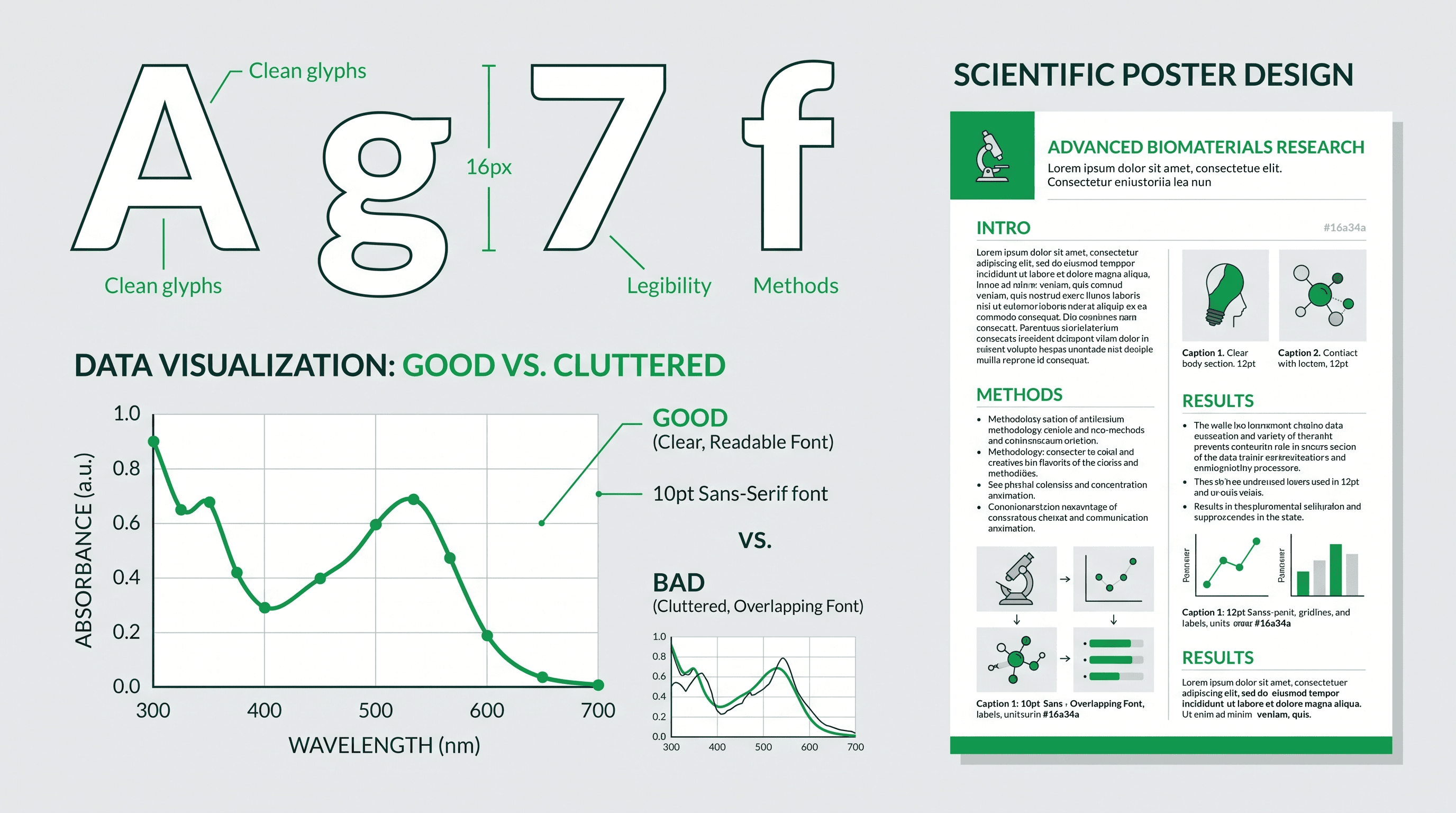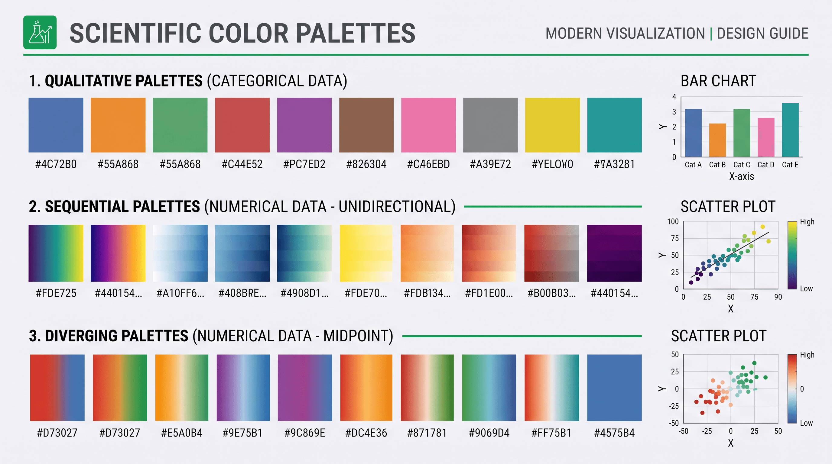
💡 SciDraw AI advantage: six graphic types, one tool, SVG vector export — describe what you need in plain English. Start free →
Your advisor just told you the manuscript needs "better scientific graphics." You nod, walk out of the office, and realize you don't know exactly what they meant. Data charts? Mechanism diagrams? The cover image? A poster-sized version? All of the above? "Scientific graphics" is one of those umbrella terms everyone uses and nobody defines.
This guide defines it properly — the six concrete categories you'll see in actual peer-reviewed papers, the workflow for making each one, and the journal requirements you'll run into at submission. Everything below is based on a review of 400+ recent journal figures across Nature, Cell, Science, JACS, PNAS, and PLOS ONE in the last 18 months.
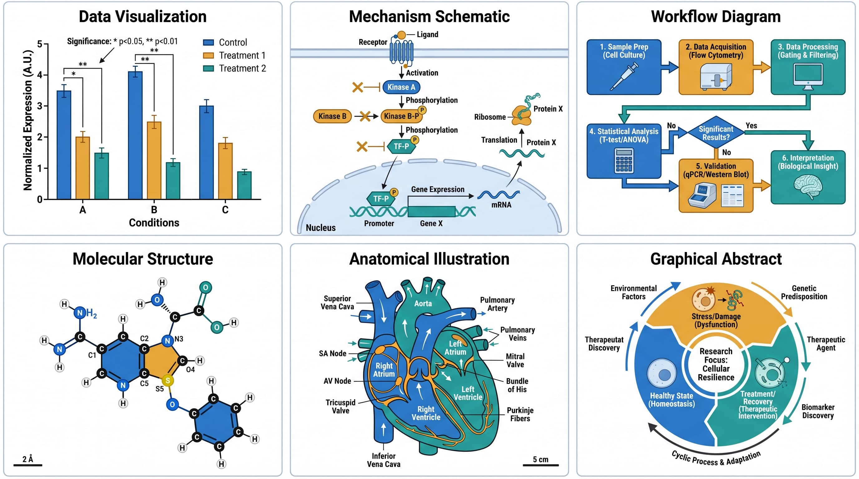
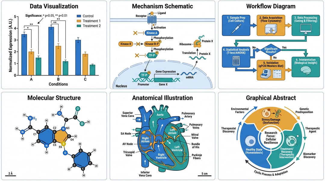 The six main categories of scientific graphics, each with a different purpose in a paper.
❌ Common misconceptions, cleared up first
Myth 1: "Scientific graphics = the charts in my results section." That's one category out of six. Scientific graphics also include mechanism schematics, experimental workflows, molecular structures, anatomical illustrations, and cover art. Each has its own conventions.
Myth 2: "A good graphic has to be made in Illustrator." Many of the figures in Nature Methods and Cell Reports are drawn in Inkscape, Affinity, PowerPoint, BioRender, or increasingly, AI tools. The software matters less than the design principles. See our guide on how to draw scientific figures for the principles.
Myth 3: "Scientific graphics don't need to look good because the science is what matters." This is half true. Reviewers spend about 60% of their review time looking at figures, per a 2023 PLOS Biology survey. Ugly figures get rejected more often, regardless of the underlying science.
The 6 types of scientific graphics
Type 1: Data visualizations
What it is: a chart that communicates quantitative results — bar charts, line graphs, scatter plots, box plots, heatmaps, volcano plots, Kaplan-Meier curves.
When you see it: in the Results section of every quantitative paper. Usually the main workhorse of Figures 2-5.
How to make one (right way):
- Generate the chart in your analysis tool (R with ggplot2, Python with matplotlib or seaborn, GraphPad Prism, or Origin)
- Export at 300 DPI raster or as SVG for vector (SVG is better)
- Import into a drawing tool (Illustrator / Inkscape / SciDraw AI) only to unify typography and add significance markers
Common pitfalls:
- Axis labels in serif fonts when the rest of the paper is sans-serif
- Three bar colors when two would do
- Significance stars that aren't aligned with the actual comparison brackets
- Error bars without specifying SD vs. SEM in the caption
Tool recommendations: R + ggplot2 is still the gold standard for data visualization. AI tools are weaker here because they don't know your actual numbers.
Type 2: Mechanism schematics
What it is: a diagram explaining how a biological, chemical, or physical process works — signaling cascades, reaction mechanisms, molecular interactions.
When you see it: the introduction figure of most mechanism-focused papers, or the concluding "model figure" that summarizes the findings.
How to make one:
- State the mechanism in one sentence before you open any tool
- List each step as a bullet (each bullet becomes one arrow)
- Decide aspect ratio: 16:9 for wide pathways, 4:3 for compact mechanisms
- Draw the primary pathway as a straight line
- Label every molecule with its full name in quotes
Common pitfalls:
- Trying to show the whole pathway when only one branch is relevant
- Arrow chaos (5 different arrow styles meaning different things)
- Using cartoon blobs instead of recognizable molecular shapes
Tool recommendations: BioRender for biology-canonical pathways, SciDraw AI for cross-field mechanism figures (works for biology, chemistry, materials science).
Type 3: Experimental workflow diagrams
What it is: a step-by-step diagram of your methods — sample prep, treatment, measurement, analysis, validation.
When you see it: figure 1 of most methods-focused papers, or the methods section itself in supplementary figures.
How to make one:
- Write out every step including washes and incubations
- Group steps into 3-5 phases
- Use a single horizontal arrow row
- Color-code by phase (never more than 4 colors)
- Add time annotations under each step — readers trust methods with timing
Common pitfalls:
- Skipping the "obvious" steps (the ones reviewers will flag as missing)
- Using different arrow styles for no reason
- Forgetting to label sample sizes
Tool recommendations: SciDraw AI, Inkscape, PowerPoint. For pure flowchart-style work, even Lucidchart or draw.io can work in a pinch.
Type 4: Molecular and structural figures
What it is: a representation of a molecule, protein, crystal, or nanomaterial — 2D structural formulas, 3D ball-and-stick models, ribbon diagrams, space-filling models.
When you see it: chemistry and structural biology papers, especially in figure 1 (to introduce the molecule) and figure 4+ (to show binding/conformation changes).
How to make one:
- For small molecules (drugs, metabolites): use ChemDraw or MarvinSketch — don't try to draw in Illustrator
- For proteins and macromolecules: use PyMOL, ChimeraX, or VMD; render to image
- For conceptual molecular cartoons: use AI tools (SciDraw AI) or icon libraries (BioRender)
Common pitfalls:
- Using ChemDraw's default colors, which don't match your paper's palette
- Overloading one figure with too many conformational snapshots
- Forgetting to include a scale bar on crystal structures
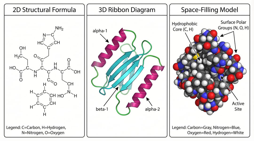 Three ways of showing the same molecule: 2D formula, 3D ribbon, and space-filling. Pick based on what property you want the reader to notice.
Tool recommendations: ChemDraw + PyMOL for the real work. SciDraw AI for conceptual "cartoon" versions that you embed in a larger mechanism figure.
Type 5: Anatomical and biomedical illustrations
What it is: drawings of body systems, tissues, organs, or clinical procedures — the kind of figure you see in medical journals and biology textbooks.
When you see it: clinical papers, review articles, medical education materials.
How to make one:
- Identify the specific anatomical structure (not "the heart" but "left ventricle, posterior view")
- Decide on style: schematic (flat colors, clear labels) vs. realistic (shading, texture)
- Check if your journal accepts flat-style illustrations — some medical journals still prefer realistic/semi-realistic
Common pitfalls:
- Anatomical inaccuracies (the vessel enters from the wrong side, the nerves are in the wrong plexus)
- Using a style that's too textbook-like for a research paper
- Missing scale references
Tool recommendations: SciDraw AI for schematic style, Adobe Illustrator for custom realistic work, BioRender for pre-drawn anatomy icons. Our medical infographic maker is tuned specifically for this category.
Type 6: Cover art and graphical abstracts
What it is: the single image that summarizes your entire paper — for the journal cover, the TOC graphic, or a social media post.
When you see it: submitted alongside the main manuscript as a separate file, or embedded in the manuscript front matter.
How to make one:
- Use square (1:1) or portrait (3:4) aspect ratio — check your journal's spec
- Pick one visual metaphor that captures the key finding
- Minimal text: title + one key insight, nothing else
- Style is allowed to be more illustrative than body figures
- Test it at thumbnail size — will it still communicate the finding at 200x200 pixels?
Common pitfalls:
- Cramming 4 metaphors into one image
- Text that's unreadable at thumbnail size
- Using a style so different from the body figures that it looks mismatched
Tool recommendations: Midjourney for art-forward covers, SciDraw AI for labeled cover figures, Photoshop or Affinity for final compositing. See our graphical abstract maker and TOC graphics requirements by journal for per-journal specs.
How the 6 types fit into a single paper
A typical research paper uses several of these graphic types in a predictable pattern:
| Figure | Type | Purpose |
|---|---|---|
| Figure 1 | Mechanism schematic OR workflow diagram | Introduce the problem / method |
| Figures 2-4 | Data visualizations | Main results |
| Figure 5 | Mechanism schematic (model figure) | Summarize the findings conceptually |
| Supplementary | Mix of all types | Supporting data and controls |
| Graphical abstract | Cover art / summary graphic | One-image summary |
Understanding this pattern helps you plan the figure set before you start drawing. You shouldn't sit down to make "a figure" — you should sit down to make "Figure 1, a mechanism schematic introducing the protein-protein interaction we studied."
Scientific graphics vs. art: where the line is
A common confusion: people think scientific graphics have to be "artistic" to be good. They don't. A good data chart is aesthetically pleasing because it communicates clearly, not because it has visual flair.
The rule of thumb:
- Body figures (Results section): favor clarity over style. Minimal colors, sans-serif labels, direct arrows.
- Cover art / graphical abstracts: you can lean into visual metaphor and style. This is the one place where "artistic" instincts help.
If you're a scientist who's been told your figures look "too basic" — that's almost always a compliment hidden as criticism. Basic and clear beats busy and clever, 10 times out of 10.
Tools, summarized
| Graphic type | Best traditional tool | Best AI-assisted tool | Our recommendation |
|---|---|---|---|
| Data visualization | R + ggplot2 / Python | N/A (AI doesn't know your data) | Traditional wins here |
| Mechanism schematic | Illustrator / BioRender | SciDraw AI | SciDraw AI for speed, Illustrator for polish |
| Workflow diagram | Illustrator / PowerPoint | SciDraw AI / Figurelabs | SciDraw AI |
| Molecular / structural | ChemDraw + PyMOL | N/A for accurate structures | Traditional wins |
| Anatomical illustration | Illustrator + references | SciDraw AI / Midjourney | SciDraw AI for schematic, MJ for realistic |
| Cover art / abstract | Illustrator / Photoshop | Midjourney / SciDraw AI | Midjourney + SciDraw AI hybrid |
Start creating your next scientific graphic
If you're drawing a mechanism figure, a workflow diagram, a conceptual molecular cartoon, an anatomical illustration, or a graphical abstract, SciDraw AI gives new users 10 credits on signup plus 5 daily credits. It exports as SVG so you can open the result in Illustrator or PowerPoint and polish to taste.
For data visualizations and molecular structure figures, stick with R/Python/ChemDraw — AI tools haven't caught up yet on the quantitative side.
How to use this guide, by who you are
- You're a first-year PhD student trying to understand what kind of figure your advisor is asking for: read the section header matching their request and match it to one of the six types. Then follow that type's recipe.
- You're a senior PhD student drafting your first independent paper: map your 5-6 figures to the pattern above (mechanism → data → data → data → model). This is the structure reviewers expect.
- You're a PI or group leader: share this guide with your students so everyone has the same vocabulary when you say "scientific graphics."
- You're a medical illustrator or freelance science communicator: Type 5 (anatomical) and Type 6 (cover art) are your zones. SciDraw AI speeds up Type 5; Midjourney speeds up Type 6.
A scientific graphic is an argument in visual form. If you can't state the argument in one sentence, no tool will save the figure.
👉 Try SciDraw AI free on your next scientific graphic
Related guides
- How to Draw Scientific Figures — Complete Guide — the 7-principle playbook
- Scientific Figure Generator for Research Papers — product deep dive
- Scientific Figure Types Guide — finer-grained figure taxonomy
- Graphical Abstract Examples by Field — 40 cover-art examples
- Scientific Diagram Maker — AI diagram workflow for research figures
- Medical Infographic Maker — anatomical illustration tool